Fine line floral trends dominate my feed right now, but the pieces that still read crisp at year five are rarely the Instagram darlings. On shoulders the curve, daily friction, and sun exposure together decide what survives. This list lays out 27 Japanese flower tattoo ideas tailored to shoulder anatomy, how each ages, what to ask your artist, and the wardrobe moves that make them pop when healed.
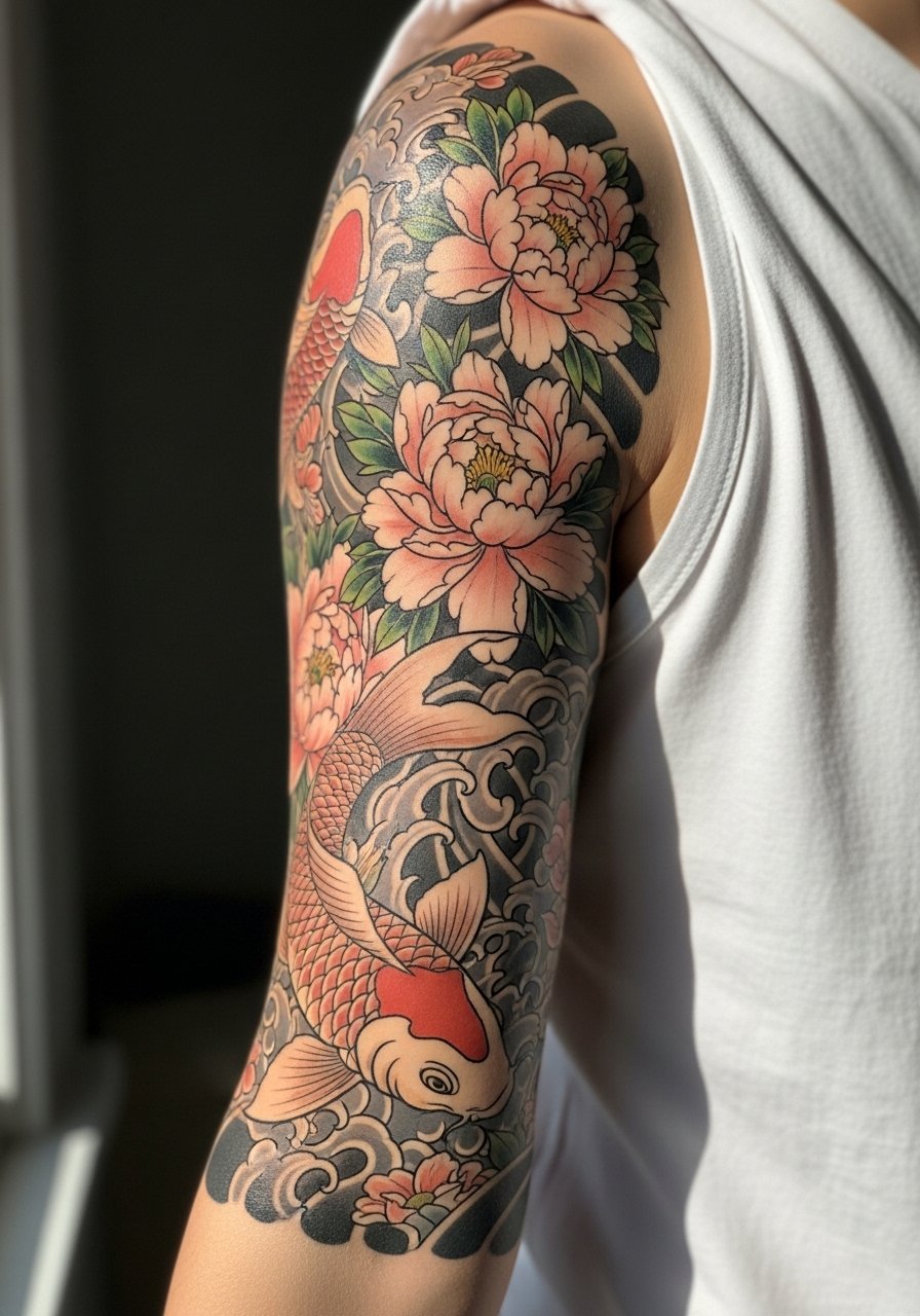
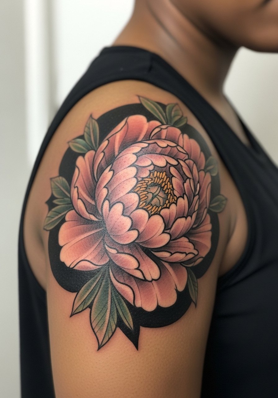
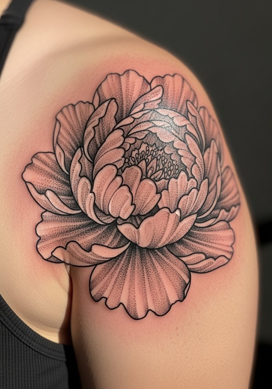
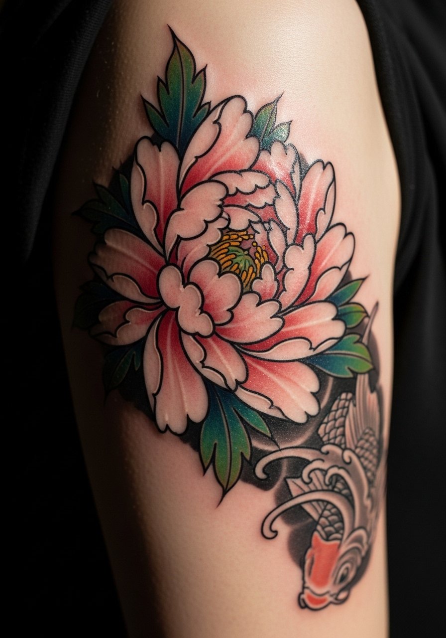
1. Irezumi Peony Blossom on Shoulder Cap
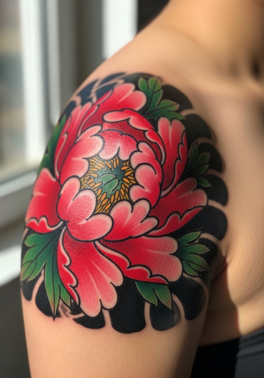
This is what people think of first when they say Japanese flower on shoulder. I recommend the shoulder cap if you want visibility without the deltoid flex issues. Tell your artist you want solid linework and saturated petal fills, not ultra-fine outlines, so the piece keeps its shape after a few summers. Expect moderate pain during large color passes and a two to four session build depending on size. Common mistake is shrinking the piece too small, which causes the petals to merge as it ages. For showing it off, sleeveless silk tanks in deep red frame the colors well, and a sleeveless silk tank makes the cap read like jewelry.
2. Black and Gray Lotus with Water Ripples on Deltoid
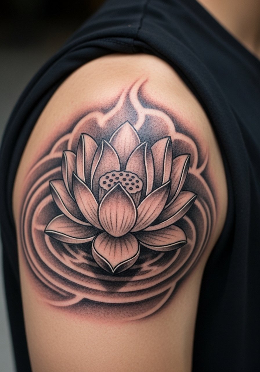
Choose this when longevity matters more than pop color. The black and gray approach resists sun fade and reads on medium and darker skin tones. Tell the artist you prefer smooth gray wash and stipple shading in the background rather than watercolor splashes. The deltoid moves a lot, so expect areas to soften at 2 years, but touch-ups at year three keep the ripples crisp. A common error is asking for tiny petals on the deltoid which blur into each other. For session comfort wear a fitted crewneck tee you can roll up to mid-deltoid without pulling on the skin.
3. Neo-Traditional Peony and Cherry Blossom Cluster
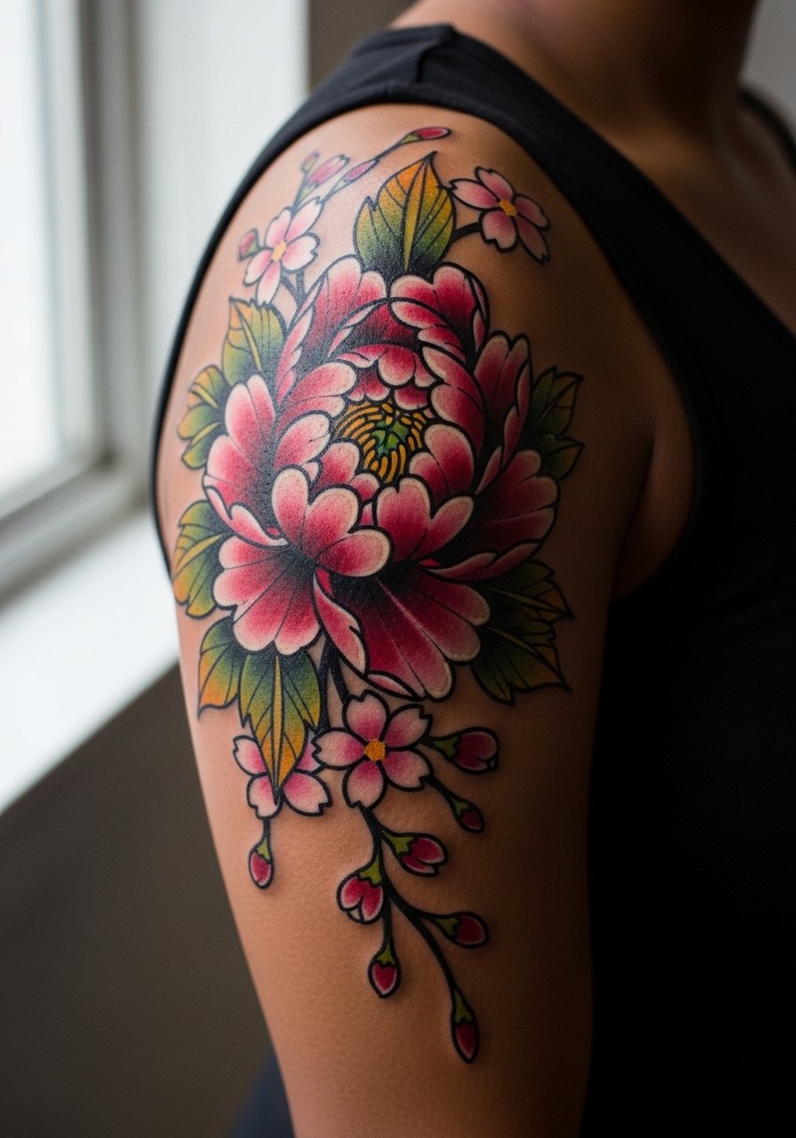
This hybrid blends Western bold outlines with Japanese motifs, which helps color retain its shape on active shoulders. Ask your artist for slightly thicker linework around petals and thinner internal lines so contrast holds up through touch-ups. Expect three to five sessions for a larger cluster. The aging reality is that the cherry blossoms will soften before the peony core, so plan a single-color refresh after two years. The mistake I see most is flattening the cluster so it reads like a sticker. Off-shoulder sweaters in neutral gray highlight the petals, and a off shoulder sweater helps show the wrap without overexposing fresh skin.
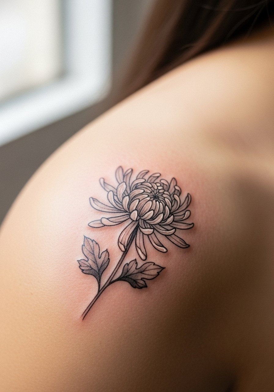
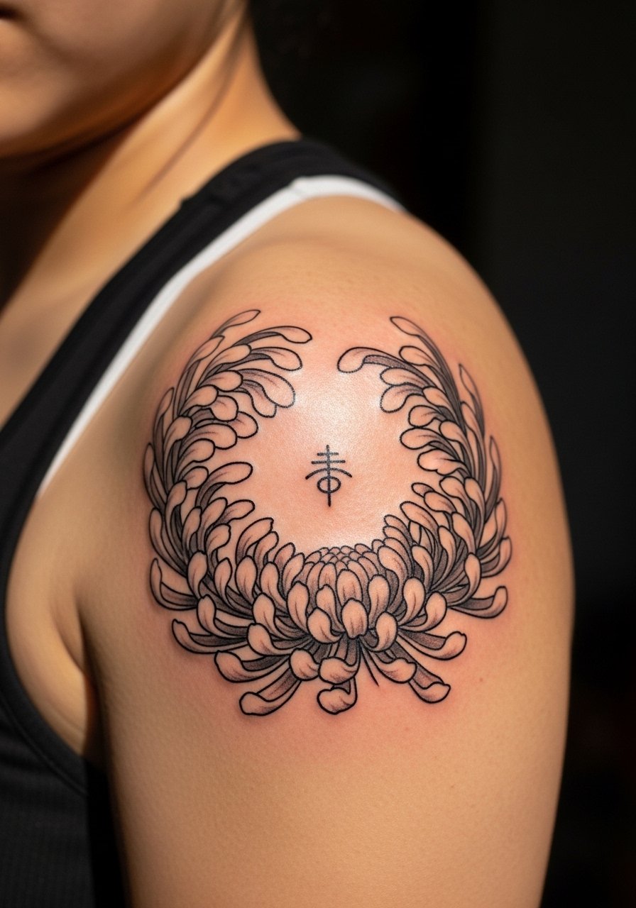
4. Ornamental Chrysanthemum Mandala on Shoulder Blade
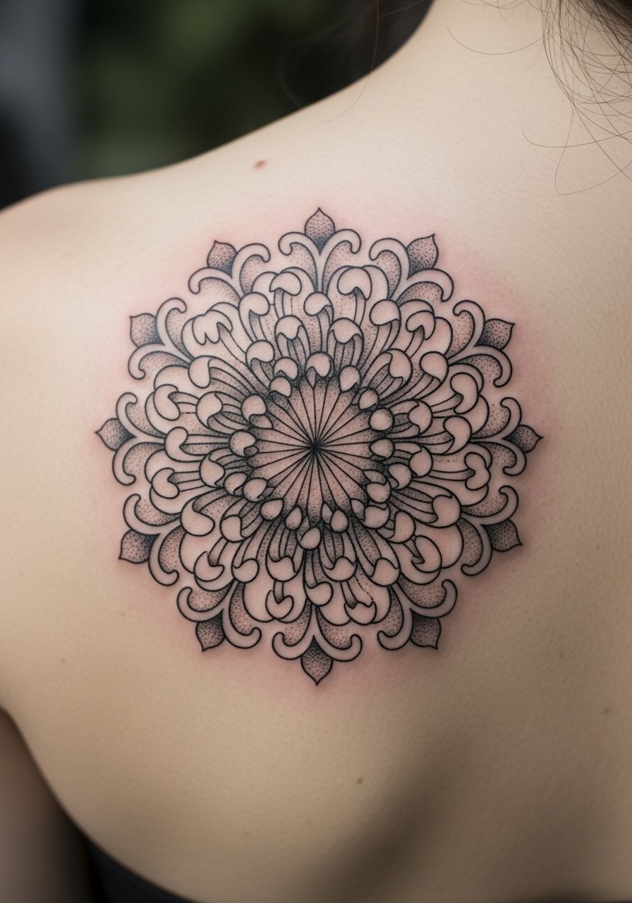
A mandala chrysanthemum creates a symmetrical focal point that hides well under straps. For shoulder blade placement ask for balanced negative space so the petals do not crowd the mandala core. Pain is lower here than on the deltoid. This style ages well when the center has room to breathe, and poor aging usually comes from overly dense inner linework. One useful consultation note is to request a mockup on rice paper to check how the curve reads. For showing it off, strapless tube tops in cream or olive pair cleanly, and a strapless tube top linen reveals the piece without rubbing the healing area.
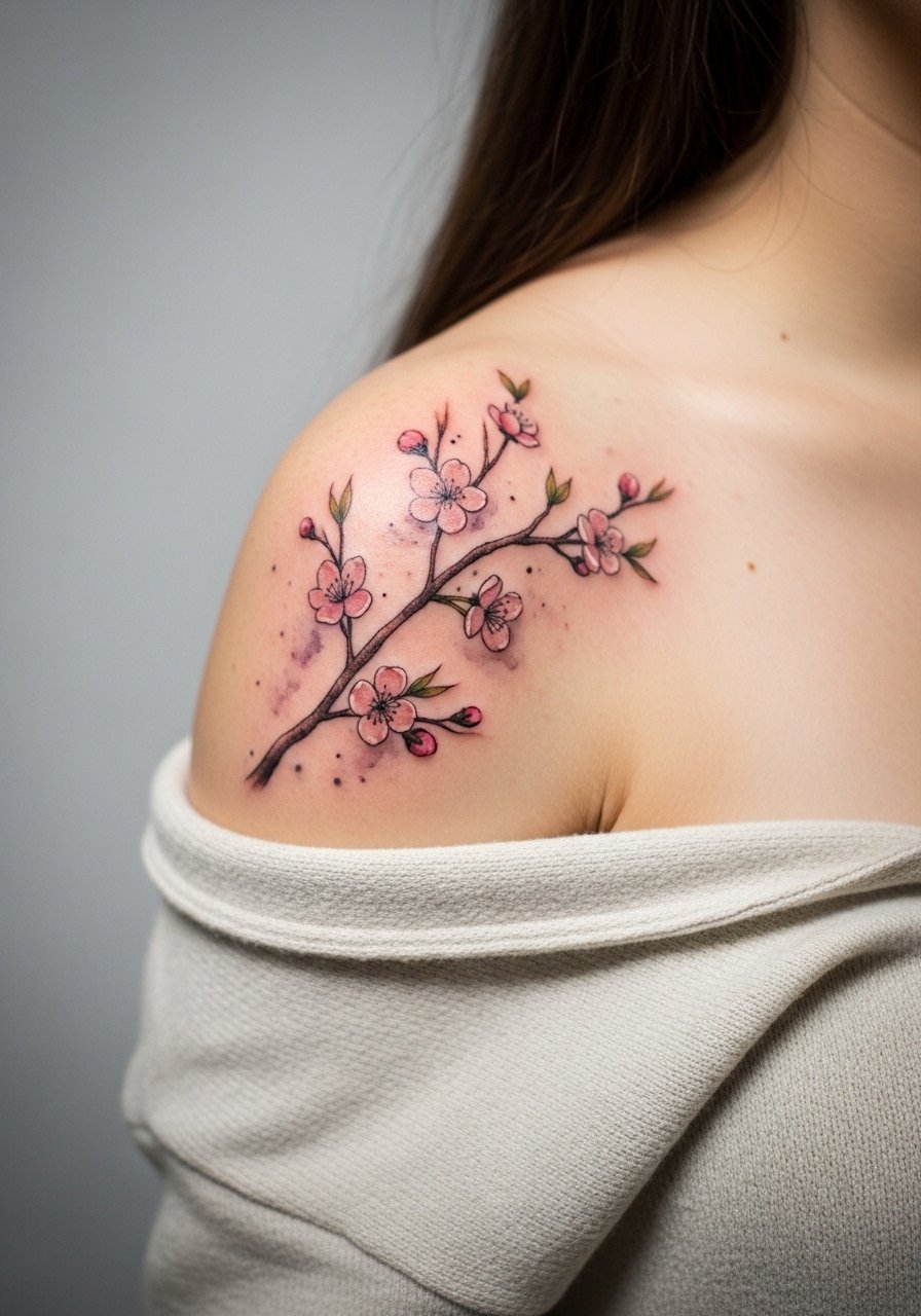
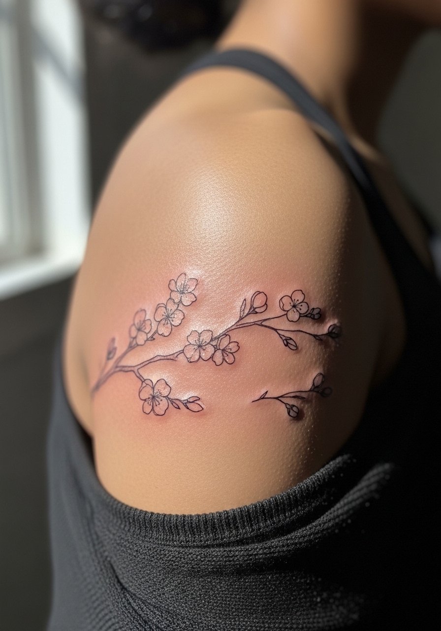
5. Watercolor Sakura Branches Draping Shoulder
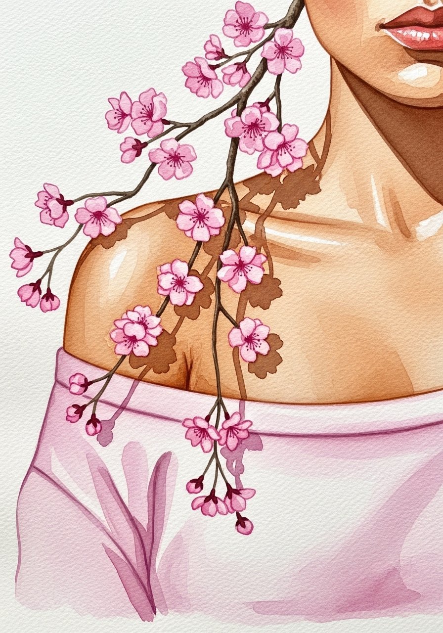
Watercolor sakura reads ephemeral in photos but can fade faster on shoulders. If you want this look, instruct your artist to anchor the design with faint but clear linework so the composition keeps form as pigments soften. Expect a quicker session, one to two appointments, but plan on touch-ups at year two to refresh the pinks. A common mistake is skipping an anchor outline, which makes the piece look patchy after sun exposure. For session wear, choose an open-neck shirt you can pull aside to protect the watercolor during healing.
6. Fine Line Plum Blossom at the Clavicle-Shoulder Junction
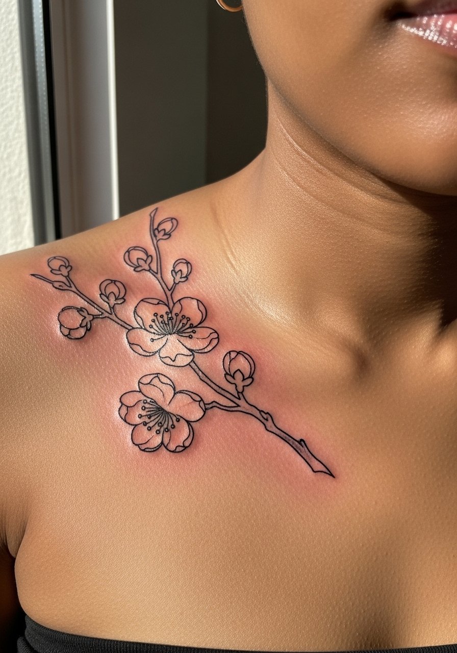
Fine line plum blossom suits minimalists who want a winter-bloom motif near the clavicle. Artists split on how fine line fares on this junction. One camp says the delicate skin and movement blur lines within two years. The other camp says with correct needle depth and spacing it holds for longer. Tell your artist you accept thin line but want slightly increased spacing between petals to avoid early merging. Pain is mild to moderate. The usual mistake is asking for extremely thin single-needle work with zero breathing room. For showing it off, pair this placement with a halter top silk so the linework sits just below the neckline.
Studio Day Picks
Those first six shoulder pieces range from fine line clavicle work to saturated peonies on the cap. A few targeted items smooth the appointment and the first week of healing for these specific placements.
-
KinuJoy Tattoo Balm. A thinner balm formula that users say handles shoulder sweat better than heavy petroleum options during the first week.
-
Australian Tea Tree Aftercare Spray. Useful for humid climates and shoulder pieces that trap moisture under straps.
-
Recover Balm travel tins. Breathable, non-petroleum balm alternative that helps color retention on irezumi pieces.
-
Fragrance free gentle body wash. Gentle cleansers reduce irritation for shoulder blade and chest-adjacent work without stripping pigment.
-
Aquaphor healing ointment. Thin application the first 48 to 72 hours can lock in moisture for fine line areas while you avoid heavy creams later.
7. Bold Traditional Rose and Peony Sleeve Start on Shoulder
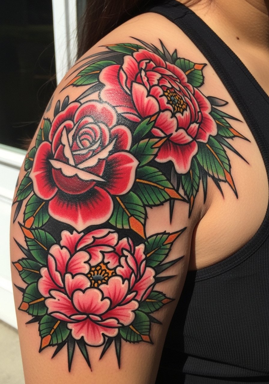
This is the shoulder starter for sleeve builders who want durability. The thick outlines and dense saturation survive sun and friction better than fine line. In consultation ask for clear negative space between major florals to prevent crowding as you extend the sleeve. Sessions feel long because color blocks need time, so expect multiple appointments. A common error is lining everything too thin when planning a sleeve, which forces heavy reworks later. For show-off outfits, a vintage leather jacket cropped thrown casually frames the shoulder color without overloading contrast.
8. Shoulder Cap Koi-Peony Modular Design
Try this if you plan seasonal expansions. The idea is a peony core on the shoulder cap that integrates with a detachable koi sleeve later. Tell your artist you want defined attachment points so the sleeve can be added without reworking the core. This design ages differently depending on sleeve choice. The risk is overbuilding the core so later additions look pasted on. A practical step is asking for a rice paper mockup on the skin to test the join before needle touches skin. Session-wise the core is moderate pain, the sleeve brings longer color time.
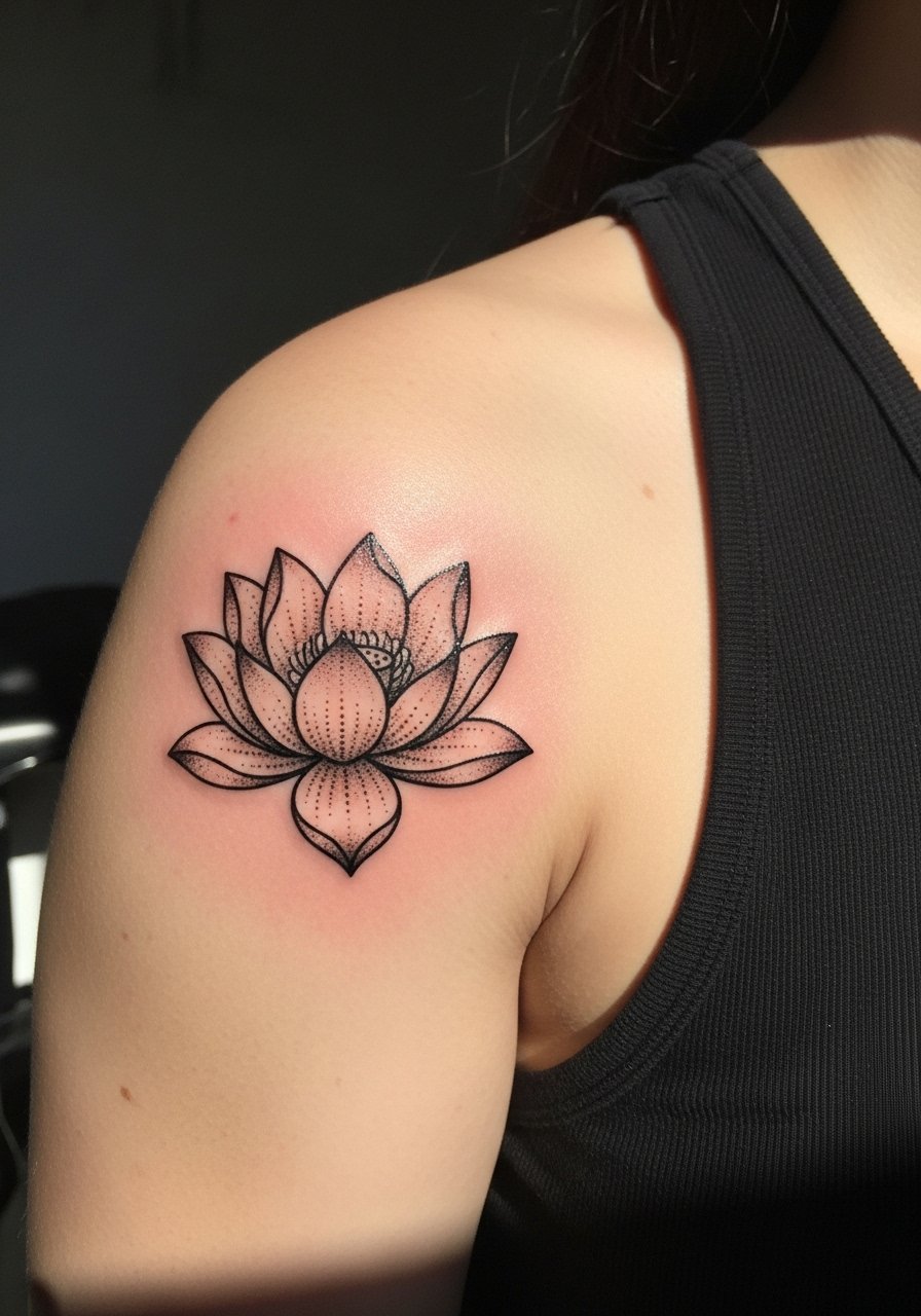
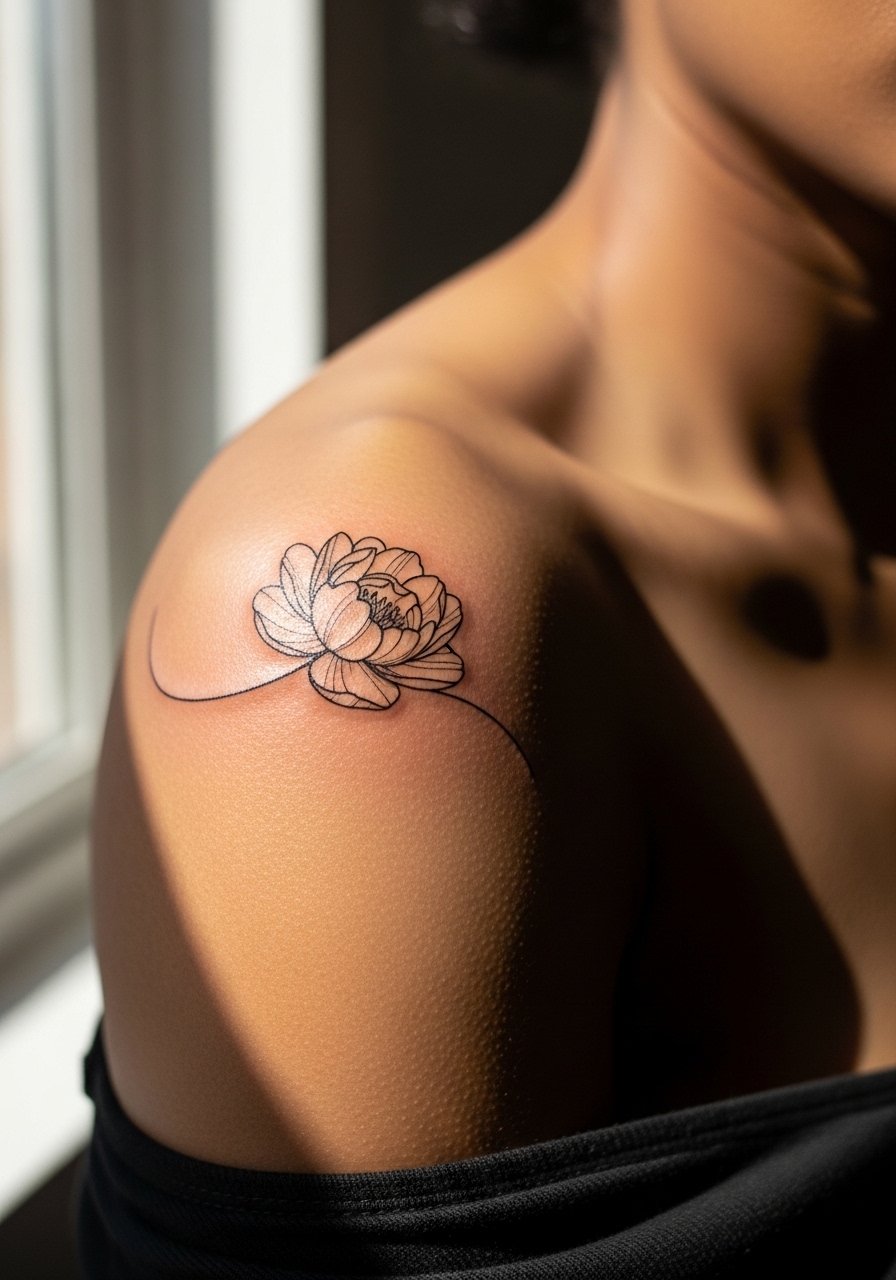
9. Inverted Lotus on Shoulder Blade for Yoga Visibility

This placement is subtle and intentional for movement-based visibility. The inverted lotus faces toward the spine and shows during poses. Say you want the central axis to align with the scapula so it reads straight when you extend the arm. Aging is gentle because the shoulder blade sees less friction than the cap. Mistakes include off-center placement that warps the motif in common poses. For session wear pick a sports bra that provides back access without chafing the fresh piece.
10. Blackwork Chrysanthemum Gradient Over the Curve

Blackwork chrysanthemum uses gradients to imply fabric movement over the curve. Ask for stipple and whip shading rather than heavy gray blocks to keep texture from flattening over time. This style resists color muddiness on darker skin and reduces the need for frequent color touch-ups. The mistake is too much solid gray which can look muddy as skin and pigment settle. Pain is moderate and sessions vary by size. For a subtle reveal, pair with a kimono cardigan short that slides to show the shoulder without rubbing the area.
11. Mini Peony Accent near the Shoulder Seam
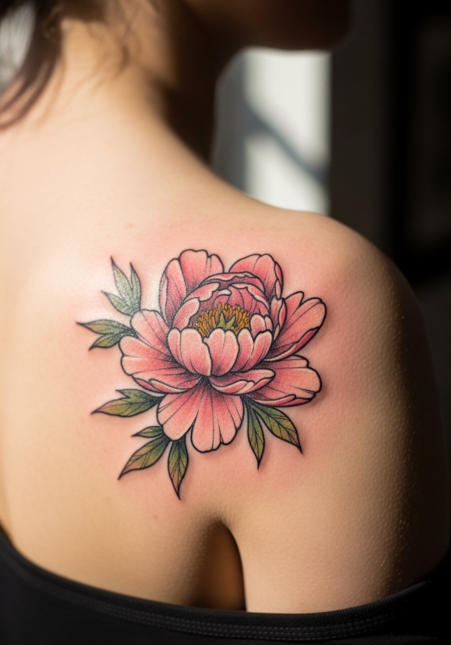
A small accent peony is a low-commitment way to wear Japanese florals while planning larger work. Size should be at least four inches to preserve petal detail over years. Tell your artist you want a compact composition with a modest outline and concentrated saturation in the center to let edges soften gracefully. The biggest error is under-sizing. Pain is short and tolerable. For session wear, throw on a loose tank top so the artist can access the seam area without fabric pressure.
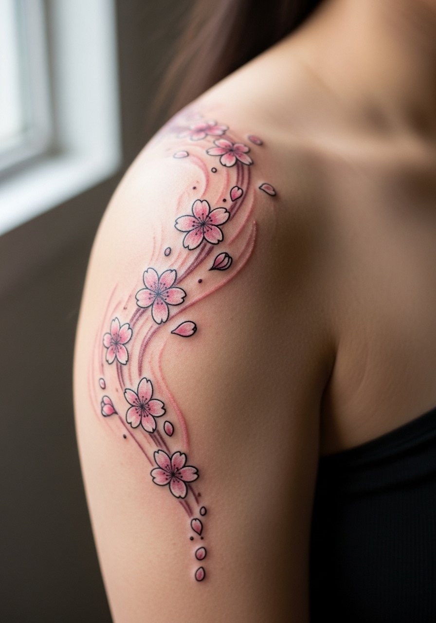
12. Sakura Falling Cluster Across the Shoulder Line

This design reads like motion and works well when you want a horizontal flow across the curve. Request varied blossom sizes and a faint anchor line to preserve composition. The aging pattern is that the smallest petals blur fastest, so plan the largest blossoms along the main curve. A common mistake is making every blossom the same scale, which flattens the arc after a couple of years. Sessions are quick. For showing off, an off shoulder blouse black highlights the arc without revealing fresh healing.
13. Stipple-Shaded Lotus on Inner Deltoid
The inner deltoid gives a softer canvas for stipple and dot work. Ask for larger spacing between dots in shadowed zones to avoid early saturation. Dot work ages predictably if not over-dense. The mistake is packing dots too tightly which reads as heavy gray over time. Sessions are low to moderate pain but require patience. For the appointment, a sleeveless athletic shirt keeps the arm mobile and exposes the inner curve cleanly.
14. Plum Blossom Trail Curving to the Back
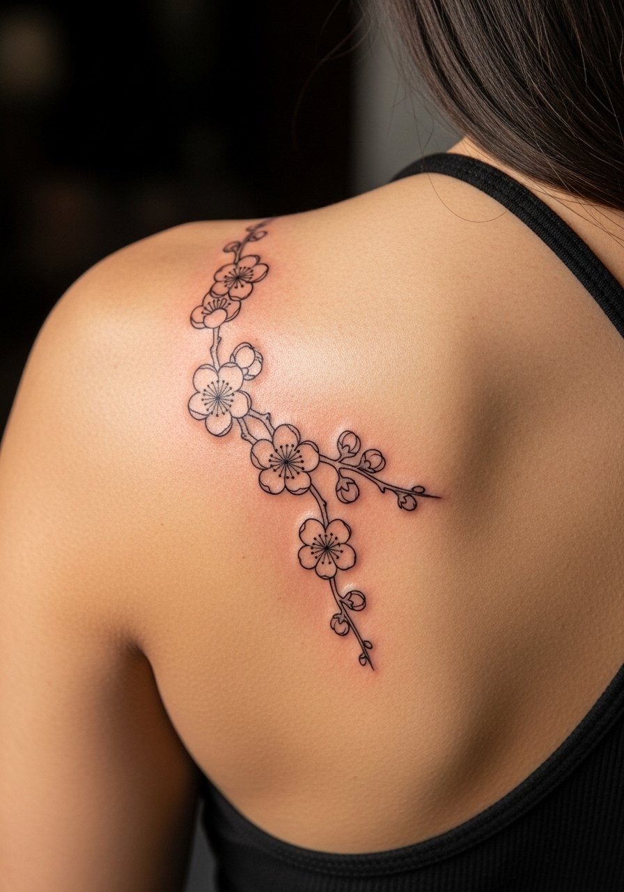
A trailing plum blossom is elegant when you want flow into a back piece eventually. Specify that the trail widens as it reaches the back so the transition to larger motifs feels natural. Fine line means quicker touch-ups on shoulder-to-back curves, so expect a refresh around year three. Mistakes include placing the trail too close to bra straps, which irritate healing. For revealing the trail, choose a backless crop top that shows the art without constant rubbing.
15. Peony with Bold Negative Space for High-Contrast Skin
On darker tones, negative space can create clarity where pastel color might wash out. Ask for deliberate dark outlines and strategic skin gaps inside petals to maintain readable silhouette. This approach reduces the risk of colors muddying and delays touch-ups. The session includes careful layering to avoid over-saturation. Common mistake is trying to force light pastels as the primary palette. For show-off style, pair with a sleeveless silk tank women in black to let the negative space breathe visually.
16. Watercolor Branch Tucking Under a Shoulder Strap
Design this when you want peek-a-boo visibility with clothing interaction. Tell the artist you want the branch to sit partially under a strap so the reveal looks intentional. Aging depends on how often that strap rubs the area. The mistake is ignoring daily wardrobe choices that will scuff the pigment while it heals. Session time is brief, but protect the area from straps for the first two weeks. For the session wear, a loose button-down shirt unbuttoned lets you expose the shoulder without fabric pressure.
17. Miniaturized Chrysanthemum on the Shoulder Tail
A mini chrysanthemum is a discreet option that hides under many collars. Make sure the flower is sized at least five inches across for petal detail longevity. Tell your artist to prioritize contrast between petal edges and center saturation so it does not flatten. Mistakes include underscaling which causes early merging. Pain is low and sessions quick. For showing it off, a backless crop top linen subtly exposes the rear shoulder without friction.
18. Sakura with Family Crest Integration on Upper Shoulder
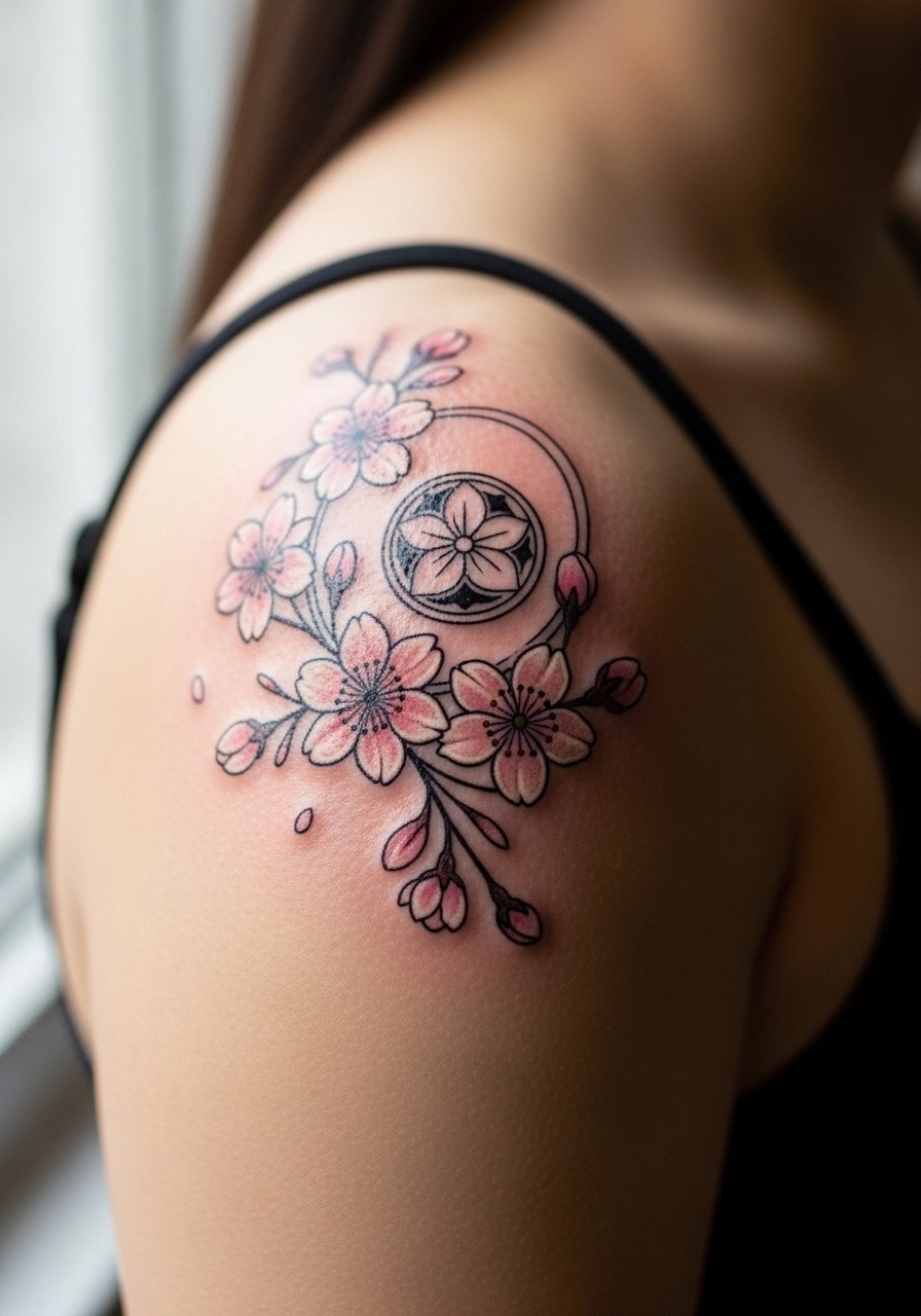
Combine memorial sakura with a crest for a personal nod without full sleeves. Ask for simplified crest lines so the sakura reads around it instead of over it. Expect moderate time if the crest requires fine detail. A known pitfall is overloading the crest with tiny elements that blur. Plan a mockup with discovery pathways like relevant hashtags and local guest spot searches to find someone comfortable with combined iconography.
19. Fine Line Sakura Band Around the Shoulder Cap
A band feels like a bracelet for your shoulder but fine line here faces controversy. Some artists say thin bands on curves blur quickly. Others claim careful spacing preserves the band decade-long. Ask for slightly thicker connector lines and open spacing between blossoms to reduce merging. The session itself is tolerable. Mistakes include making the entire band extremely thin without any negative space. This design pairs well with an off shoulder sweater women that frames the band under seasonal layers.
20. Peony with Stippling That Mimics Fabric Folds
Mimicking fabric with stipple shading gives depth without heavy gray patches. Ask for stipple gradients and avoid dense gray blocks. This keeps the peony readable on curves and on darker tones. Aging is favorable when the stipple is placed with breathing room. The error is asking for too heavy a gray wash which can look like a shadow stain over time. For the session, wear a loose tank top or button-down so the artist has clear access and your clothing does not stick to fresh work.
21. Reverse-Flow Sakura Leading to Upper Arm
A reverse-flow layout complements movement from shoulder to arm and makes future sleeve expansion intuitive. Tell the artist to treat the shoulder cap as the focal point with diminishing blossom sizes as they flow down. Expect the upper arm blooms to soften faster than the cap, so schedule touch-ups for the latter if the color is important. Common mistake is uniform bloom size that fights natural flow. For a fall reveal, stacked wood bead bracelets on the opposite arm balance visual weight and a wood bead bracelet stack is a simple accessory.
22. Lotus with Fine Whip Shading on the Inner Curve
Whip shading adds soft gradients that suit inner curves well. Ask for whip shading rather than solid fills so the piece keeps texture without heavy blocks. This technique reduces the risk of color pooling in recessed areas. A mistake is asking for dense color without acknowledging inner curve anatomy. Sessions are steady in pain and time. For session comfort choose a sleeveless halter tank that leaves the inner curve exposed and prevents rubbing.
23. Chrysanthemum Halo Around a Small Symbol
A halo composition frames a small symbol without overpowering it. During consultation specify the symbol scale and request air between petals and symbol so both elements age independently. Overcrowding is the main aging problem here. The session varies by detail and takes longer if the symbol is intricate. For showing off, a kimono cardigan short can slide to reveal the halo elegantly.
24. Neo-Japanese Peony with Koi Accent toward the Arm
If you plan a narrative sleeve, place the koi accent so it can extend into a full scene later. Ask for clear anchor points and slightly bolder outlines where the koi might meet other elements. Aging depends on how saturated the koi colors are, reds being the first to fade. Mistakes include mismatched style between peony and koi, which looks jarring as you expand. For the session, wear a raglan sleeve tee you can roll to expose the upper arm without pressure.
25. Minimalist Single-Petal on the Shoulder Edge
A tiny single-petal is discreet but vulnerable to fading if placed on high-friction edges. Size it slightly larger than you think and ask for a crisp anchor line at the petal's base. Expect a touch-up by year two for fine lines. The mistake is going too small with single-needle work here. For session access and comfort wear a loose drawstring linen pant if the artist needs you seated or adjusting posture.
26. Shoulder-Bridge Chrysanthemum for Concealability

This placement favors concealability for work and formal settings. Request positioning that keeps the main petals below common bra straps and slightly toward the blade. Aging is kinder here because straps protect the piece from sun when covered. The mistake is placing petals directly under straps where irritation during healing is likely. For the session wear a front-open button shirt so the artist can access the area without tugging.
27. Modular Peony with Temporary Rice Paper Mockup
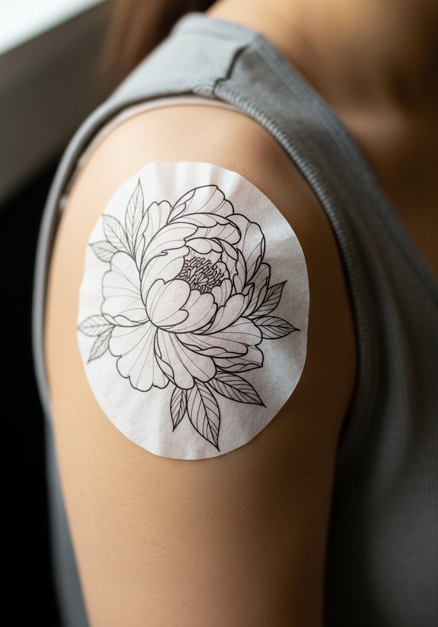
Testing a complex peony with rice paper before inking is an underused step that prevents sizing regrets. Ask your artist for a temporary transfer and then move through common motions, including lifting weights or wearing a jacket, to see how the design responds to stretch. This avoids the common mistake of committing to a static image that warps during movement. The session itself is typical for a peony but the mockup saves time and future touch-ups. For the test wear a loose tank or button-up shirt unbuttoned so the artist can place and adjust the paper easily.
Frequently Asked Questions
Q: How does a fine line plum blossom near the clavicle age compared with a bold peony on the shoulder cap?
A: Fine line pieces near the clavicle often need touch-ups sooner, around year two to three, because movement and sun exposure thin the lines. A bold peony on the shoulder cap with heavier linework and saturation tends to hold longer, with touch-ups typically at year three to five depending on lifestyle and sunscreen habits. Ask your artist about spacing and line weight during the consultation.
Q: If I lift weights regularly will a peony on the deltoid or shoulder cap stretch oddly?
A: Muscle gain can alter how petals look if the design sits directly on the deltoid belly. For anyone who lifts, I suggest placing the main blossom slightly on the cap and keeping the most detailed work away from the muscle belly. That reduces distortion as mass changes. Bring up your routine during booking so the artist can mock the design on your active pose.
Q: Should I pick black and gray lotus over watercolor sakura for better longevity on medium to dark skin?
A: Black and gray typically reads better over time on medium and dark skin tones because contrast stays clear and colors are less likely to shift. Watercolor sakura can be beautiful but it depends on saturation and how often the area sees sun. If you want color, ask for higher contrast outlines or negative space to keep the composition legible as pigments soften.
Q: Is Saniderm or dry healing better for shoulder pieces that rub under straps?
A: Artists and community members split into two camps. One camp likes Saniderm for a quick, clean barrier that cuts down on external irritation during the first days. The other camp prefers dry healing, arguing that occlusive films can trap sweat and disrupt saturation on sweaty shoulders. The right choice depends on your sweat tendencies and the artist's aftercare preference, so discuss both options before the session.
Q: How do I find the right artist for a Japanese flower shoulder piece without following specific Instagram handles?
A: Use discovery pathways like hashtag searches for #IrezumiFlower and #JapaneseShoulderTattoo on Instagram, check Tattoodo filters for "irezumi shoulder floral," and read regional threads on r/tattooadvice for guest spot recs. Book through apps with review histories like Booksy to reduce no-show risk and ask to see healed shoulder shots in portfolios to confirm how work ages.