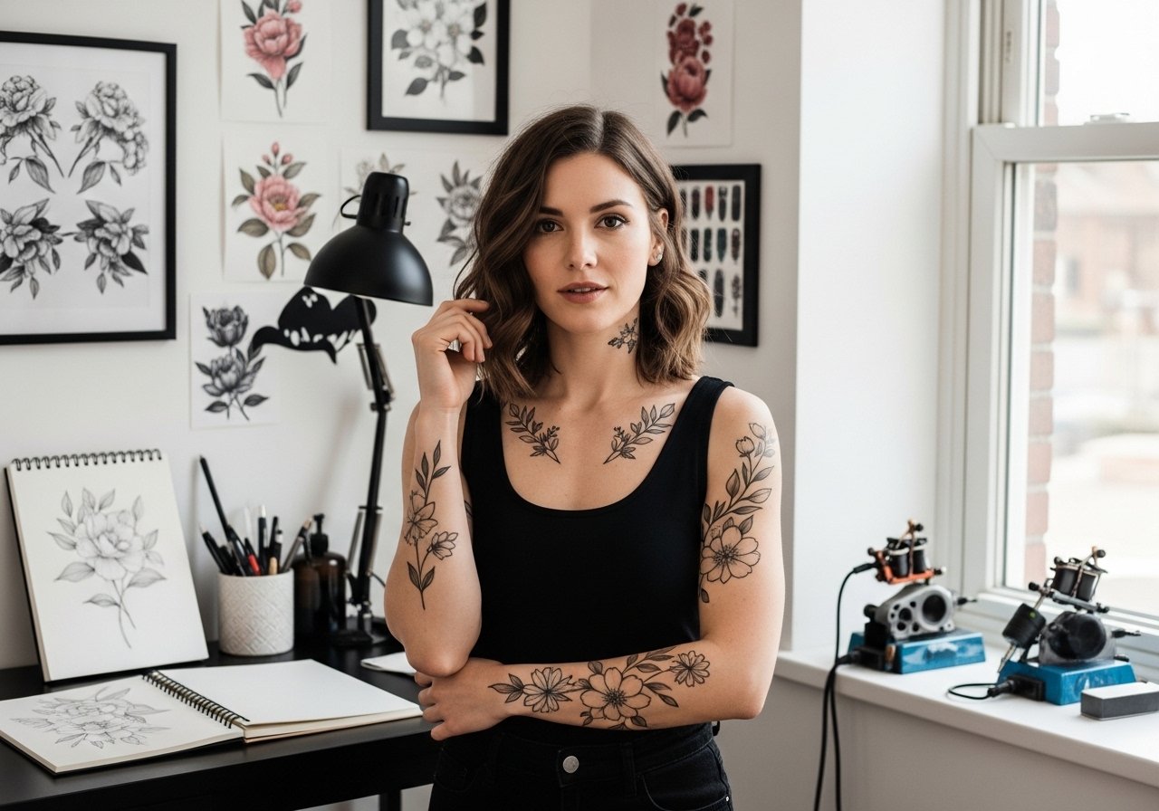
Fine line work is everywhere online right now, and the gap between what looks great in a photo and what lasts is wider than most people expect. Some pieces that score instant likes soften into indistinct marks after a few years, while bolder choices often age into clean statements. Read on for 21 tattoo ideas that balance style with longevity, plus what to ask your artist the minute the stencil hits your skin.
1. Fine Line Arrow on Inner Forearm
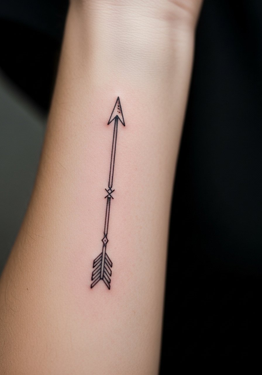
I've seen this layout on dozens of forearms and the small changes matter. For longevity, ask for slightly heavier linework than micro hairlines, and request a touch of spacing around the feathering so the lines do not merge in five years. Pain is mild to moderate and sessions run short, usually under an hour. A common mistake is asking for the arrow too small or putting dense detail near the wrist, which speeds blurring. For the consultation, bring a photo showing the exact shaft thickness you want. When showing it off, rolled sleeves and a loose button-down shirt frame the forearm without covering the work.
2. Minimalist Constellation on the Wrist
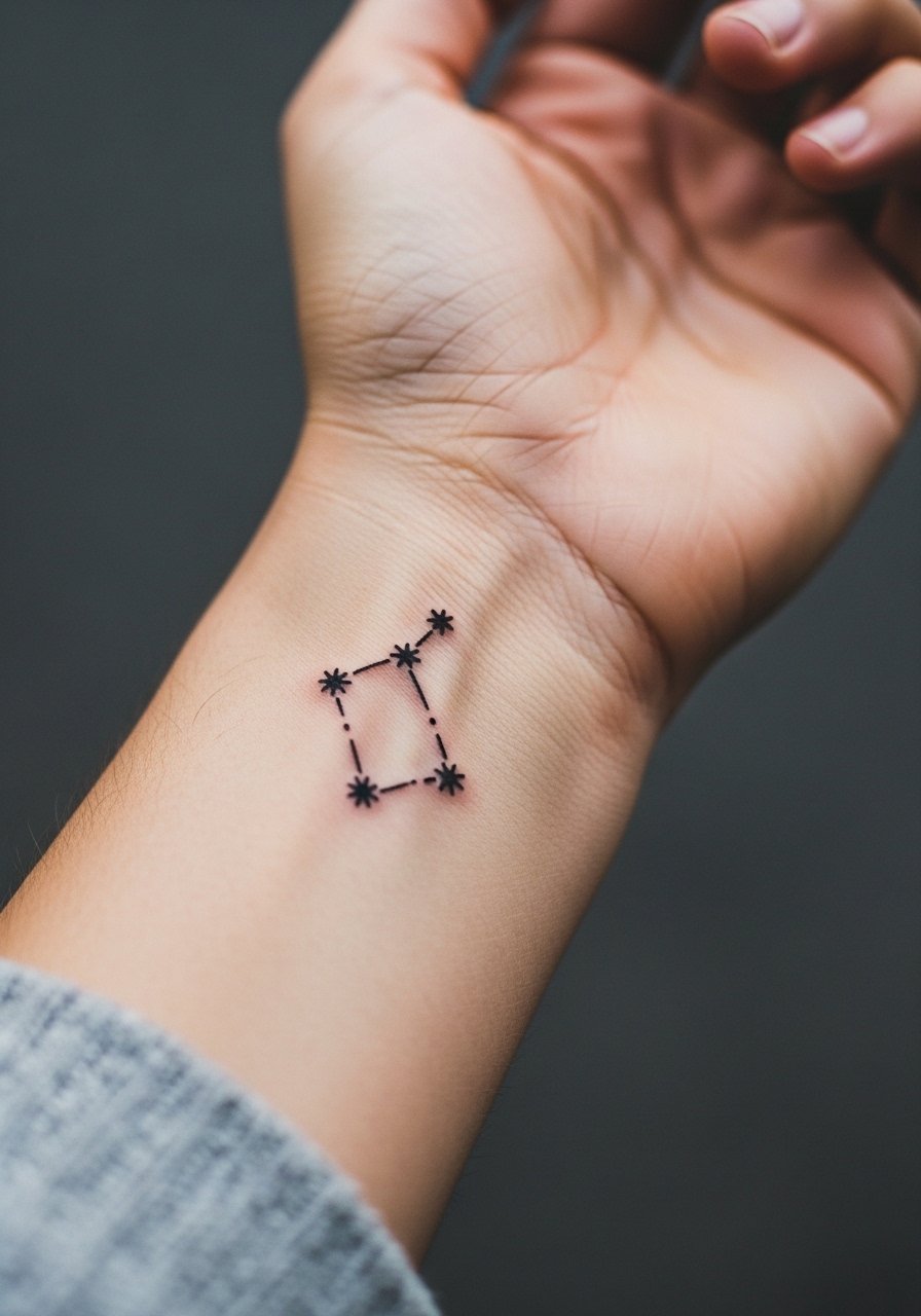
Fair warning: wrist skin gets friction from watches and bracelets, so the tiny dots and thin connecting lines need room to breathe. I recommend slightly increased spacing between stars so the points do not bleed together as the piece heals. Sessions are quick but touch-ups are common at year two for very fine work. The most frequent error is asking for dots too close together. During the appointment, wear a minimalist watch or bracelet that can be removed easily so the artist can position the stencil without obstruction and you can test placement visually.
3. Script Name Across the Collarbone
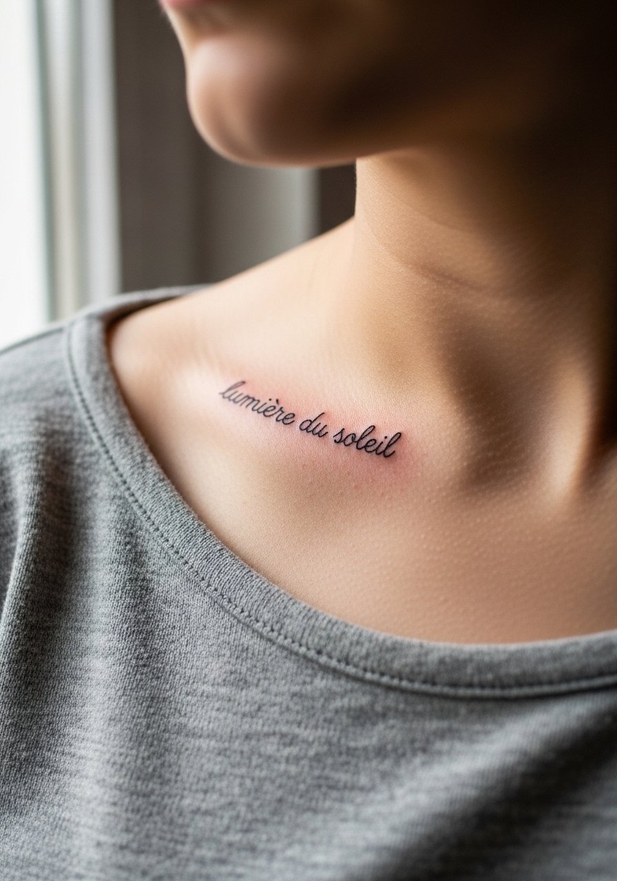
When a name in script sits on the collarbone, the curve of the bone can stretch and warp small letterforms over time. I advise slightly bolder strokes for letters that sit directly over bone, and request the artist mock up the phrase along the curve so the spacing reads natural from several angles. Pain is moderate near the collarbone and sessions usually finish in under an hour. A common mistake is using a dense flourished script that fills the space; that kind of detail softens in a few years. Pair this placement with open-neck shirts or thin chain pendant necklaces when you want it visible.
4. Vintage Crest on Upper Arm
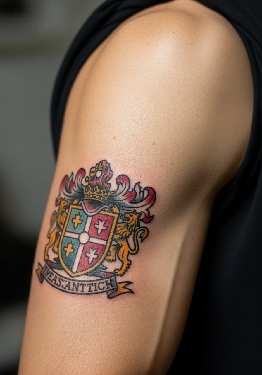
There is something about a crest that holds up because the thick linework and saturated fills age into a crisp silhouette. When you consult, ask for solid black outlines and moderate color saturation rather than tiny stipple shading packed into the badge. Sessions for this size are moderate, often one to two hours. The biggest mistake is over-detailing the shield face, which becomes indistinct as the piece heals. This placement is forgiving for touch-ups and a good option if you want a classic look that lasts. Wear sleeveless tees or a loose tank top to the session so the artist has clear access.
5. Tiny Symbol on the Finger
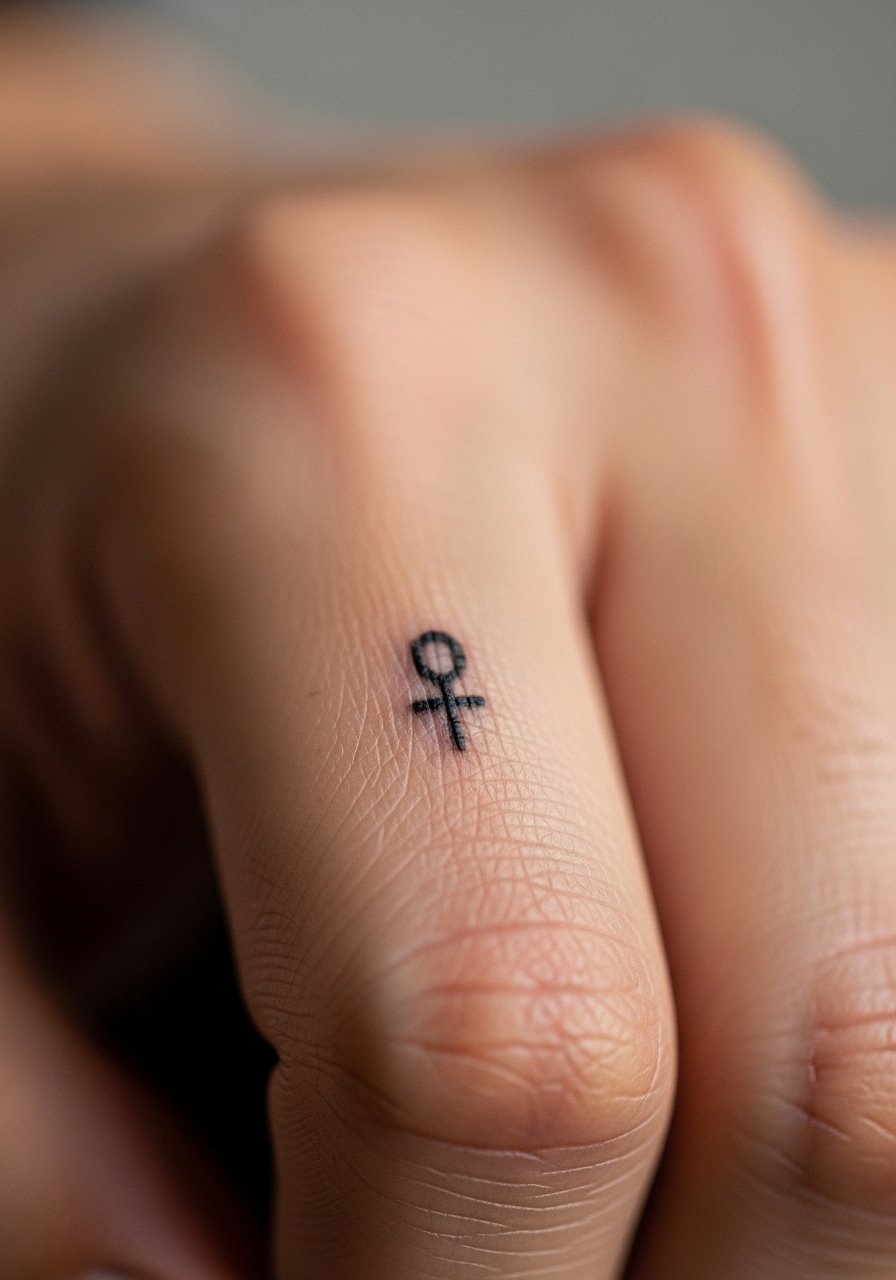
Finger tattoos are fashionable but they come with tradeoffs. The skin there regenerates differently and lines often lighten or blur sooner than on the forearm. Expect higher touch-up needs, often within a year. For this design, keep the symbol bold rather than finessed micro detail, and discuss ink depth with your artist so they avoid superficial placement that flakes out. A session can be short but stinging is sharper than expected. If you plan to display it, consider stacking with a slim stackable ring rather than covering the finger with large jewelry that rubs the area.
6. Geometric Mandala on the Ribcage
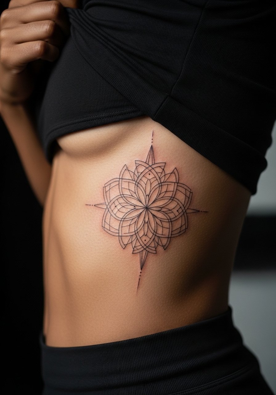
Artists split on whether fine mandalas belong on the ribs. One camp says the skin there shifts with breath and movement so dense lines blur quickly. The other camp argues that with correct spacing and deeper placement the pattern settles well. I advise spacing the concentric rings slightly wider than you might choose for a forearm version and asking for a mock stencil while standing and breathing to see how it moves. Pain is high on the ribs and sessions can be long. Many clients regret asking for very tight dot work in this spot, which looks crowded after healing. For the appointment, wear a cropped top you can lift easily so the artist can reach the area with minimal fuss.
Studio Day Picks
The collarbone, wrist, and ribcage pieces above ask for different prep and a few specific items smooth the session and early healing window.
-
Stencil transfer film kit. Lets you preview the exact placement on skin for small wrist and finger work so you can adjust before the needle touches down.
-
Low-residue topical numbing gel. Applied before rib or sternum sessions to take the edge off without leaving a greasy film that interferes with stencil adhesion.
-
Thin protective film roll. Ideal for covering wrist and finger tattoos during the first days when they face the most friction.
-
Fragrance-free gentle body wash. Good for cleaning delicate collarbone linework during showers without stripping pigment.
-
Aquaphor healing ointment. Thin layers help keep fine line areas moisturized during the initial healing phase without clogging needle channels.
7. Micro-Realism Owl on the Shoulder Blade
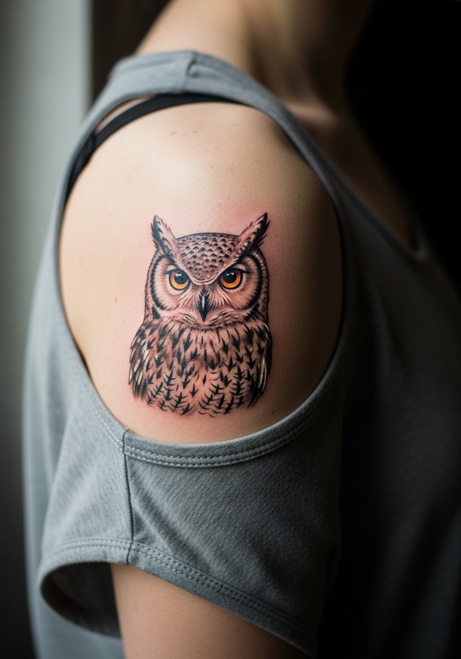
There's a visual impact to micro-realism perched on the shoulder blade that reads from a distance but rewards close inspection. When you sit with your artist, bring close-up references focusing on the texture you want, because shading techniques like stipple and whip shading translate differently on that canvas. Sessions can be moderate to long depending on size. A common mistake is cramming too much tiny contrast into a small area, which softens after a year. For the session, wear a loose tank top you can pull aside so the artist has full access without you getting cold.
8. Traditional Rose on the Calf
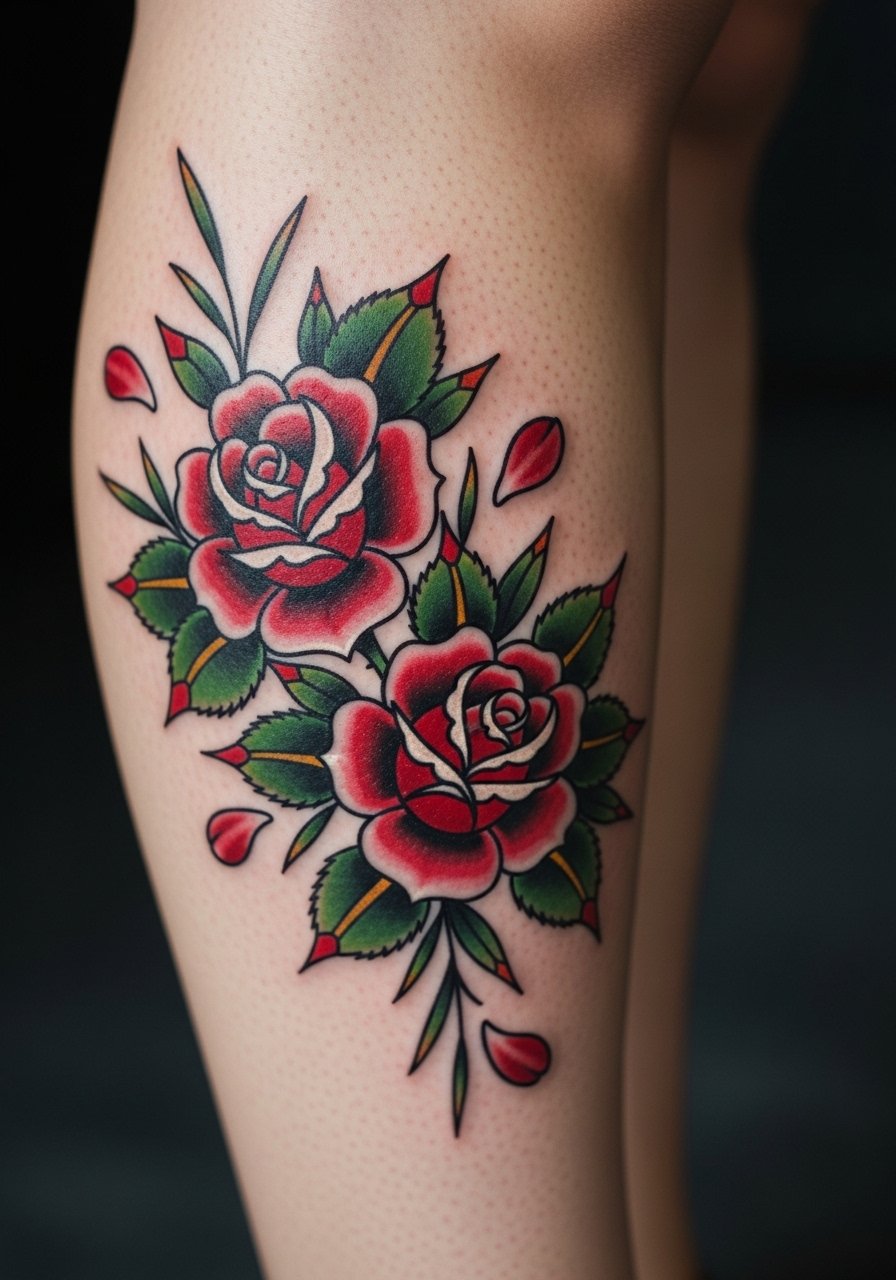
I've noticed traditional roses age better than very delicate floral work because the thick outlines hold pigment. The calf is a forgiving place for saturated color and larger fills. Pain is moderate and sessions vary from one to two hours. Avoid tiny inner-petal detail and ask instead for clear petal separation and bold shading. A realistic mistake is choosing too many small elements around the bloom that blend over time. Calf pieces pair well with mid-length skirts or rolled jeans when you want them visible.
9. Minimalist Spine Script
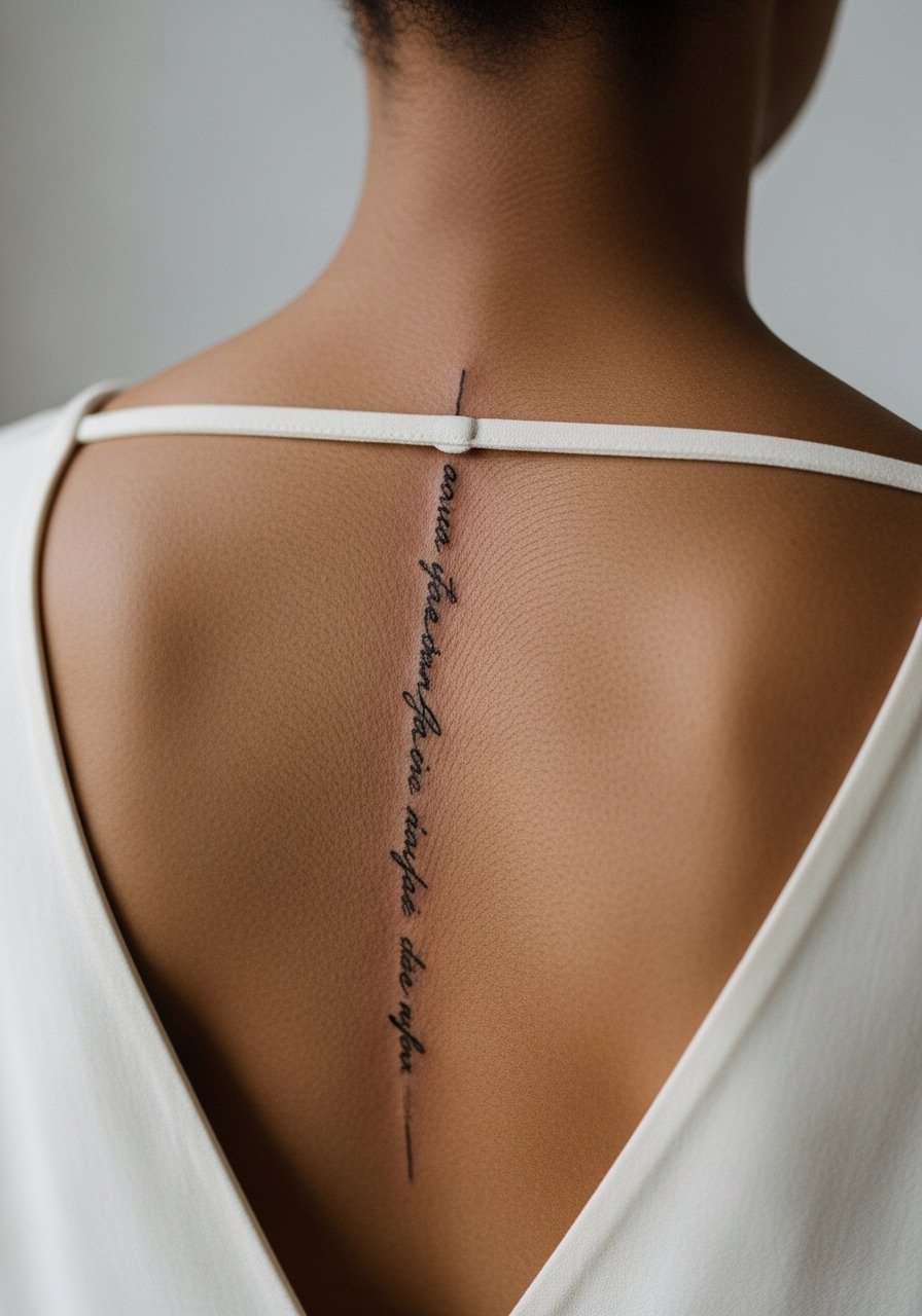
Visual impact lead is perfect here. A vertical script down the spine is elegant when letterforms are spaced to accommodate the natural curve and movement of the back. Pain runs higher near the spine and sessions are split into shorter passes. Common errors include overly tight lettering and very thin strokes placed directly over bony areas. Ask your artist to place letters with breathing and posture in mind so the phrase reads the same when standing or leaning. Pair this with open-back tops or a simple halter top when you want to show it off.
10. Blackwork Phoenix on the Upper Arm
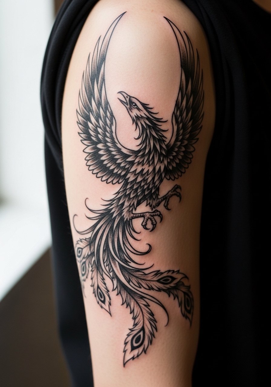
There's longevity in saturated blackwork that is easy to underestimate. A phoenix rendered in strong black silhouettes ages into a clear, wearable piece. For placement, the outer bicep is less prone to stretch than the inner arm. Sessions are moderate and involve heavier saturation work. A mistake I see often is adding tiny decorative lines inside solid wings, which get lost as the ink settles. If you want to wear the design, short sleeves or sleeveless shirts sit well with this piece, and a loose button-down shirt works for the travel home after your session.
11. Delicate Floral Thigh Cluster
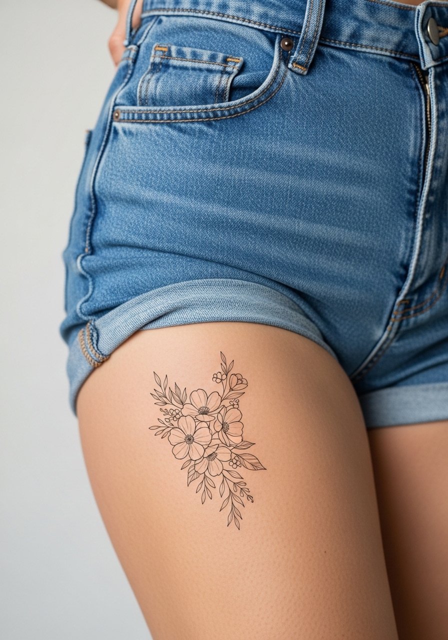
Most thigh skin holds detail well, so delicate clusters with negative space can stay readable longer than the same work on the hand or foot. Pain ranges from moderate to high depending on inner versus outer thigh location and session time can be longer if the cluster is expansive. A common mistake is packing too many tiny leaves into one area. For the session, choose high-waisted bottoms you can slide down slightly, or show up in high-waisted shorts to keep everything comfortable and private.
12. Tiny Script Behind the Ear
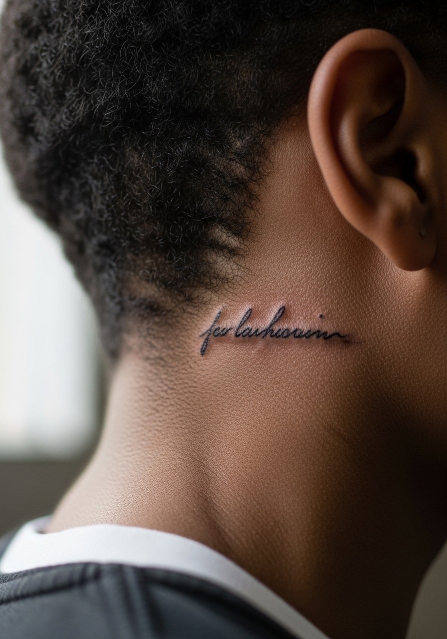
Behind-the-ear text needs exact placement because the skin is thin and the canvas small. The session is short but can sting. Expect quicker fading than on the forearm and plan touch-ups accordingly. A controversy exists about visibility and professional impact, so weigh that with your career plans. For the consult, specify exact font weight and ask to see the stencil at life size. Wear your hair up or in a style that exposes the area so you can watch the placement live.
13. Stipple Shaded Moon on the Ankle
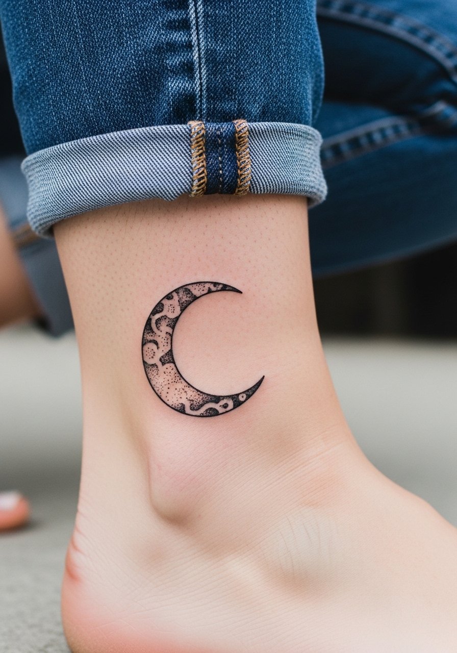
Visual texture from stipple shading reads well at small sizes when dots are spaced correctly. The ankle sees a lot of rubbing from shoes and socks, so avoid ultra-fine dot density near the joint. Sessions are short but have a stinging sensation. A typical error is choosing a too-dense dot pattern that merges under friction. For showing this piece off, roll your jeans and consider wearing simple strappy sandals that leave the ankle visible without rubbing the fresh ink.
14. Abstract Linework on the Outer Thigh
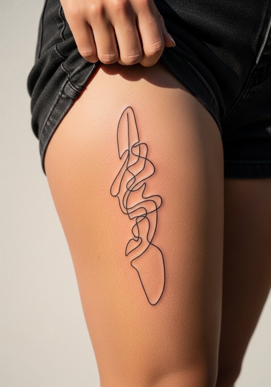
An abstract continuous line gains character as it ages if the line weight is consistent and spaced. The outer thigh holds pigment well so thin lines can stay readable longer than on hands. Sessions are comfortable because the area is padded, and touch-ups are infrequent if the initial punch is correct. A common mistake is asking for a single hairline stroke that ends up too fragile for later touch-ups. For the appointment, wear shorts you can shift easily and consider a loose drawstring linen pant to keep the area accessible.
15. Tiny Zodiac Glyph on the Side Rib
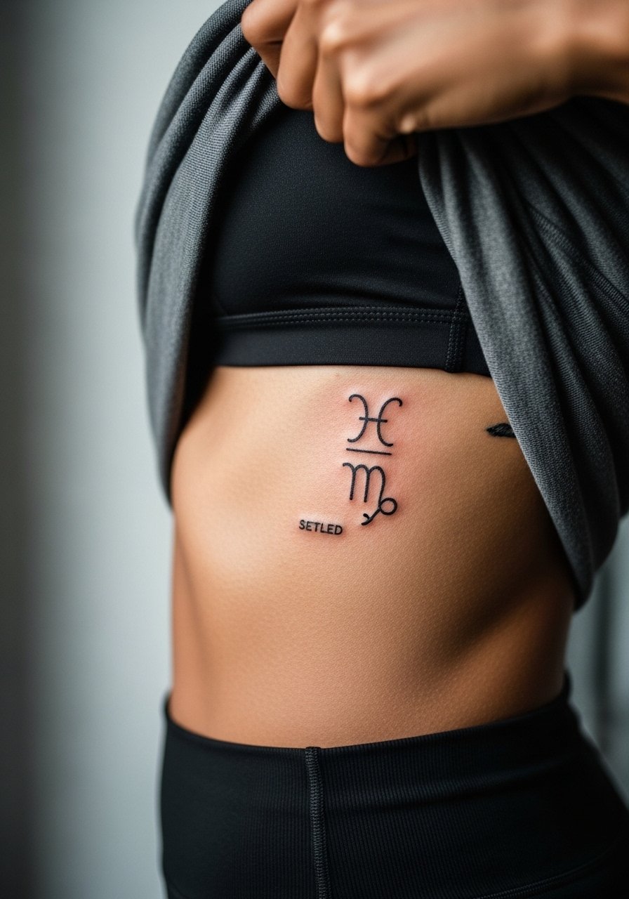
A short aging lead fits here. Tiny glyphs on the ribs face the same movement issues as mandalas. If you want this spot, ask for slightly thicker linework and less dense surrounding detail. Pain is high and sessions are short for the small size. The frequent error is wanting ultra-thin font which often needs a touch-up in less than two years. This placement is intimate and the session requires a clothing choice that keeps you comfortable while exposing only the area needed.
16. Dot Work Sunburst on the Sternum
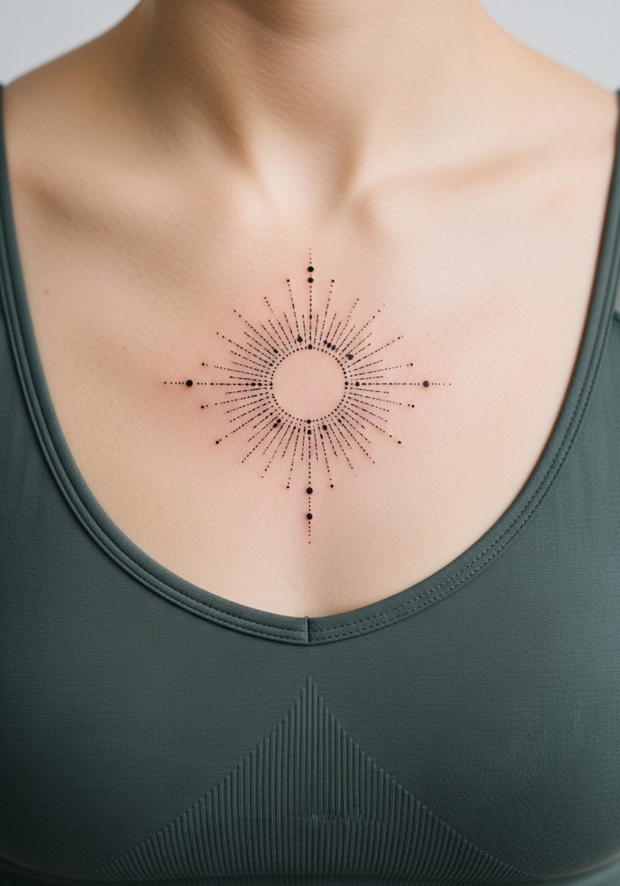
The sternum demands specialized care in stencil placement because the area moves with breathing and sits near bone. Dot work can look intentional and crisp if the dots are spaced for the chest canvas. Pain is high and expect shorter sittings with breaks. A common mistake is placing too much dense dot work near the center, which fills in over time. For the session, wear a fitted sports bra or bandeau you can pull aside so the artist has unobstructed access and you remain modest.
17. Geometric Thigh Sleeve Accent
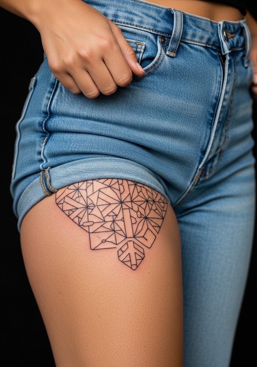
Consultation lead works here. When adding a geometric accent to a thigh sleeve, ask your artist for repeatable modules that scale. The thigh is forgiving for linework and large compositions. Sessions vary and can be long. A mistake is trying to force very small repetitive geometry into soft areas where lines will blur. For the session, comfortable bottoms like high-waisted shorts keep you at ease and allow easy access.
18. Watercolor-Style Feather on the Upper Arm
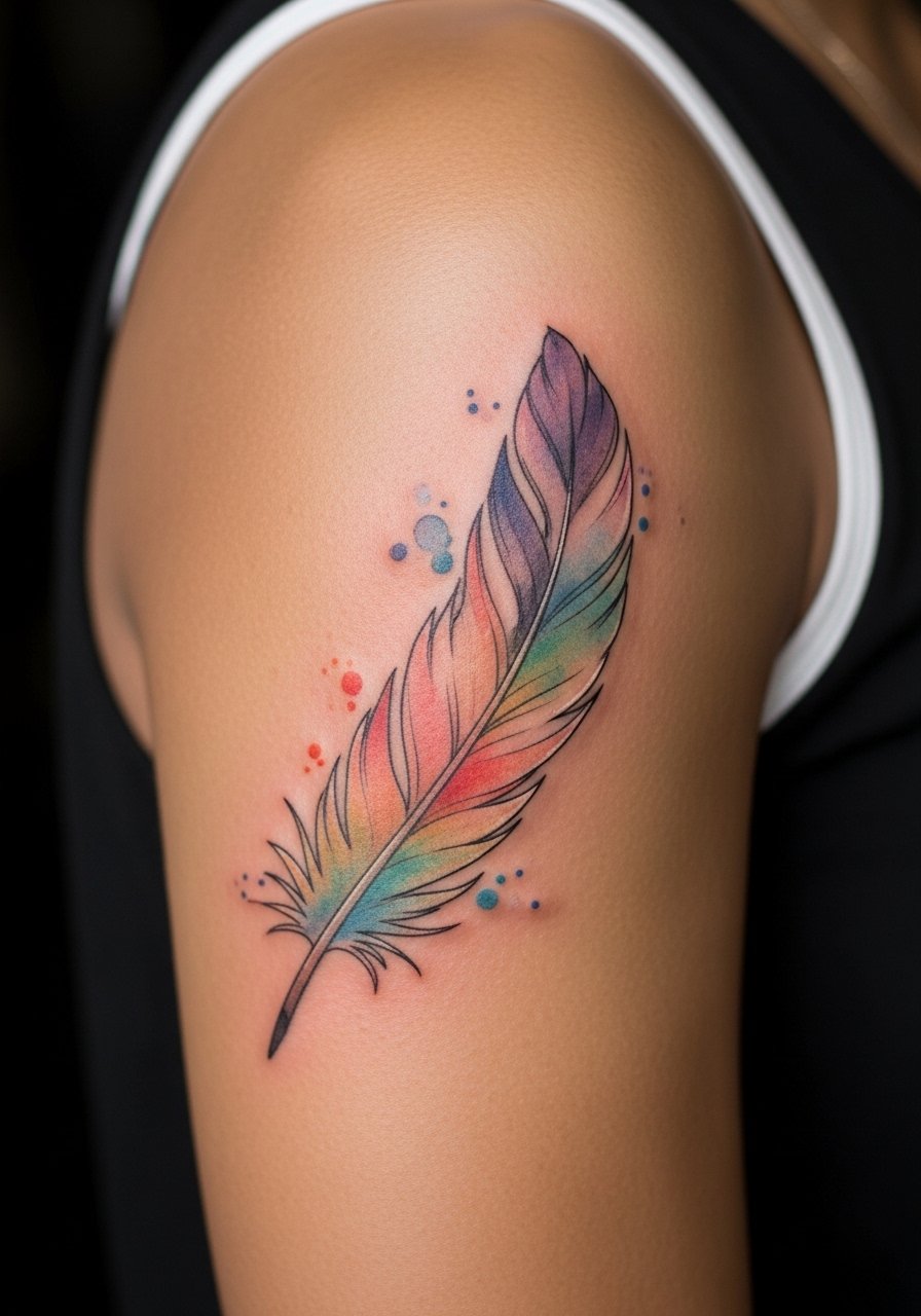
Aging reality lead applies. Watercolor washes look beautiful fresh but the softer edges can be the first to lose saturation. If you love this look, ask for anchored linework at key joints and slightly increased pigment saturation where the wash is most critical. Sessions are moderate and may require a touch-up once color softens. The mistake I see is requesting only wash with zero anchor points, which fragments as it heals. Wear a sleeveless top or bring a loose tank top for the session so the artist can work without fabric interference.
19. Fine Line Botanical on the Inner Bicep
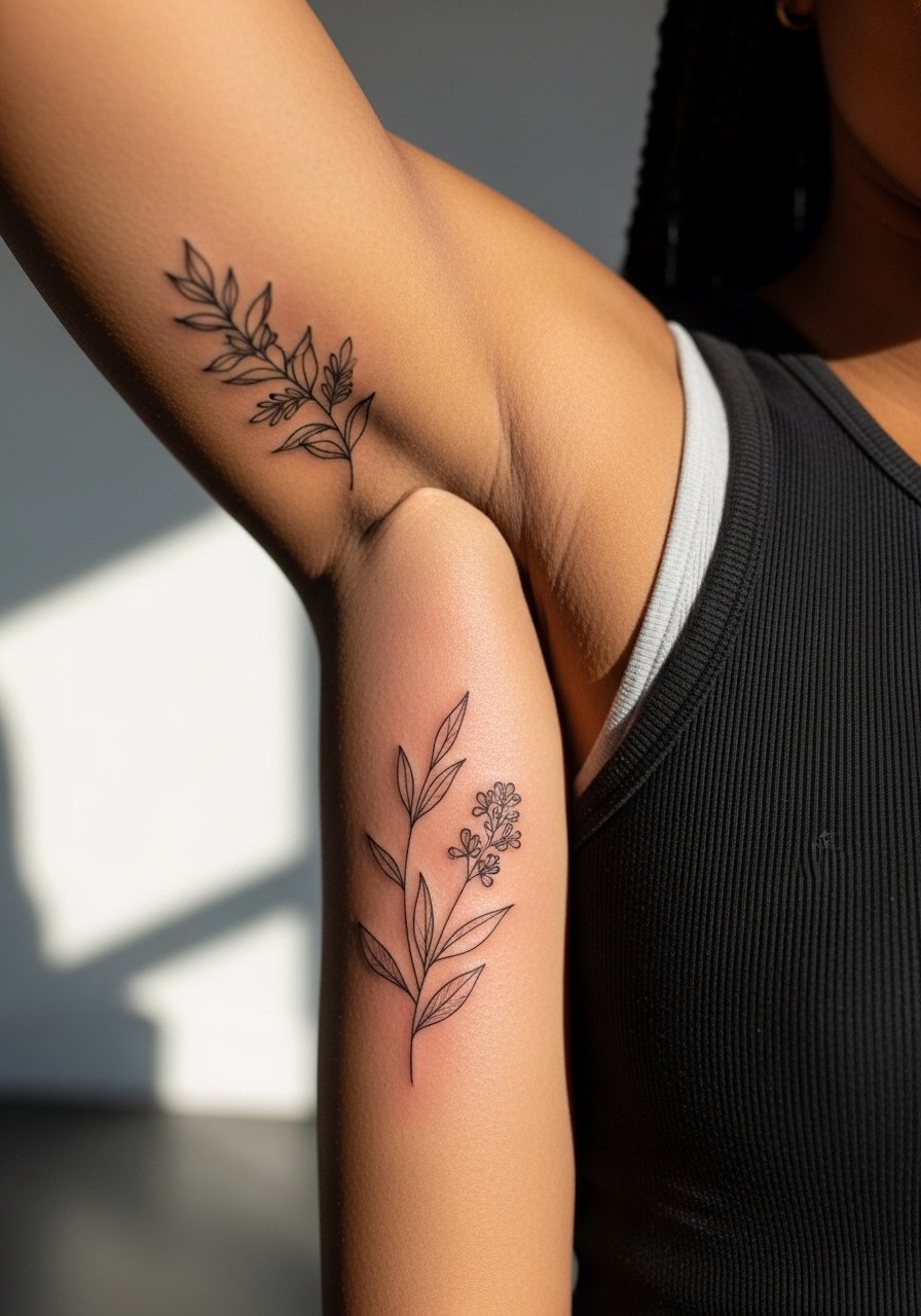
Pain warning lead fits this spot. The inner bicep can be tender and the skin is more elastic, so very fine linework risks blurring faster. I suggest slightly increased spacing and asking the artist for mockups both with the arm relaxed and raised. Sessions are moderate and often require gentle stretching breaks. A common mistake is packing too much detail in the narrow vertical space. For the session, wear a tank you can lift or a sleeveless shirt to give the artist room to work comfortably.
20. Script Banner Across the Lower Back
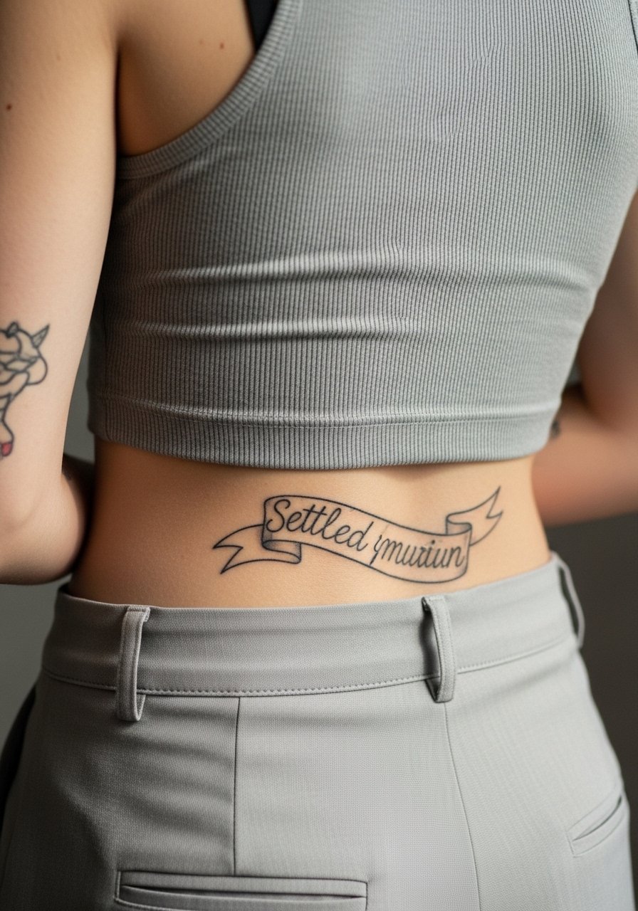
Decision-pressure lead applies here. Lower back script reads well when letterforms are spaced for the horizontal flow and not forced into a narrow band. Pain is low to moderate and sessions are usually short. The frequent issue is choosing an ornate font that compresses across the lumbar curve. Ask for a life-size stencil and try several sitting positions before the needle. For showing off, choose high-waisted bottoms or an open-back dress and consider a low-rise pant or skirt if you want that area visible.
21. Tiny Moon Phases Along the Collarbone Curve
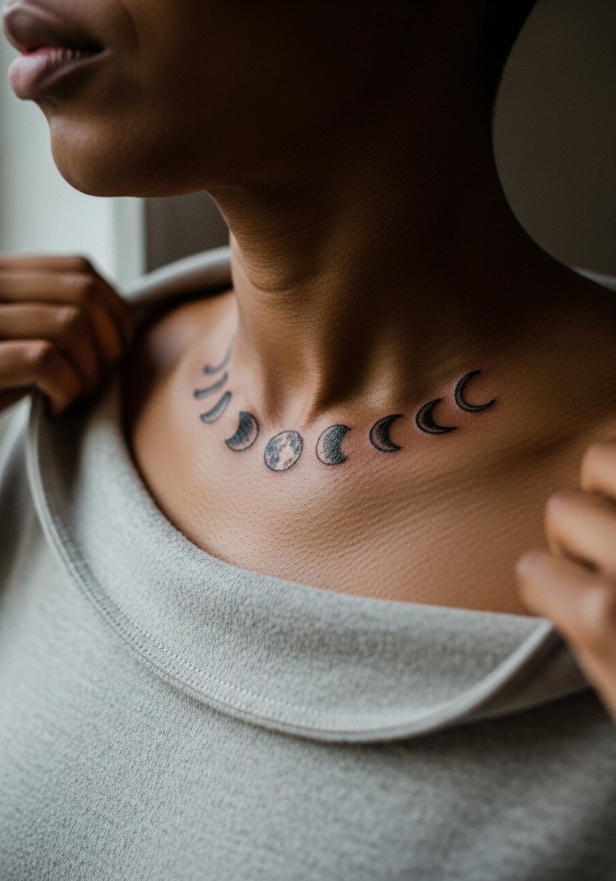
Mistake lead closes the ideas. The collarbone curve is flattering for a short run of small moon phases, but the biggest mistake is shrinking the moons so small that the crescents and dots merge over time. Ask for clean negative space between each phase and slightly bolder crescents near the bone. Sessions are brief and pain is moderate. For the consult, bring photos of spacing you like. A thin pendant or a delicate choker necklace can sit above the series without visually competing.
Frequently Asked Questions
Q: Will fine line tattoos like the arrow and the moon phases blur quickly on different placements?
A: It depends on placement and initial line weight. Fine line on the forearm often lasts longer than the same work on the wrist or ribcage. Ask for slightly thicker linework and increased spacing where movement or friction is a factor, and expect touch-ups earlier on high-friction zones.
Q: How should I dress for a session on the collarbone or sternum to stay comfortable and give the artist access?
A: For collarbone work, a wide-neck shirt that you can pull aside works well. For sternum or underbust pieces, wear a fitted sports bra or bandeau so only the area needed is exposed. If you need a quick option, a racerback tank offers both coverage and access.
Q: Do watercolor-style pieces on the upper arm need different care or expectations than blackwork?
A: In my experience watercolor washes fade faster than saturated blackwork. Anchoring washes with small areas of denser pigment and accepting a higher chance of touch-ups will keep the look vibrant longer. The arm is a decent canvas, but expect a maintenance conversation during the consult.
Q: Are finger and ankle tattoos worth it if they need frequent touch-ups?
A: That is a personal tradeoff. Finger and ankle skin regenerate and face friction, so plan for touch-ups at the one- to three-year mark. If that fits your lifestyle, design choices like bolder symbols instead of micro detail improve longevity.
Q: Should I be worried about getting a piece over bone, like the collarbone, spine, or sternum?
A: Bone-adjacent tattoos are possible and common, but letterforms and thin lines over bone can read differently. Request a life-size stencil and have the artist adjust depth and spacing. Expect higher discomfort at bony areas and schedule shorter passes if needed.