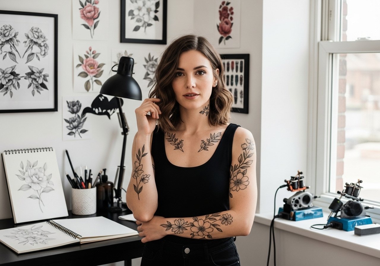
Fine line sleeves look delicate on a saved photo, but what holds up on skin is a different story. Placement, spacing, and realistic expectations about touch-ups matter more than chasing a trend. Pick a plan that balances detail with longevity, know where the design will age first, and bring the right wardrobe for the session. The first idea shows how a simple botanical band can anchor a full sleeve.
1. Botanical Band Running Up the Inner Forearm

I’ve seen this as the first piece people build a sleeve around. Keep the stems slightly separated to avoid crowding later, and ask your artist for slightly heavier anchor lines where the band meets denser elements. Fair warning, the inner forearm sees frequent sunlight, so plan touch-ups around year three for fine leaves. Session time is moderate, expect light vibration and a two to three hour block. Common mistakes are packing too much tiny detail at once, which blurs over time. For showing it off, roll up a linen button-down so the band sits cleanly against skin.
2. Watercolor Florals That Fade Into Linework

Watercolor on a sleeve splits opinions. One camp warns that pigment disperses and looks patchy over time. The other camp says controlled washes with grounded outlines age better. I tell clients to keep washes as accents around stronger linework, not as the primary fill. Expect a longer touch-up window for color saturation, and plan for a second session at year two if you want the same pop. The bicep is less painful than ribs, and sessions run in two to four hour blocks. For evenings out, pair the piece with an open-back midi dress that reveals the upper arm flow.
3. Tiny Constellations Scattered Like Jewelry on the Wrist

Wrist and hand placements pack a visibility punch but come with friction and frequent washing. Keep constellation dots slightly larger than you think and ask for a single-needle outline that sits shallow enough to avoid blowout. Expect a quicker fade than arm work, and budget for touch-ups around year two. The session itself is quick but sharp, and the skin there is unforgiving if lines are too dense. Style it with a thin chain bracelet to frame the tiny stars without covering the ink.
4. Script and Petal Half-Sleeve on the Outer Arm
A half-sleeve focused on script and petals reads personal. Tell your artist exactly which script weight you want and show examples of healed lettering, not fresh photos. Outer arm skin holds detail well, so fine script can last longer here than on the wrist. The usual mistake is choosing script that is too thin for daily movement. Plan for a two-hour session for lettering plus an extra hour for petal work. For casual days, a racerback tank keeps the outer arm visible without tugging at the area during healing.
5. Lace and Filigree Wrap Around the Shoulder Cap
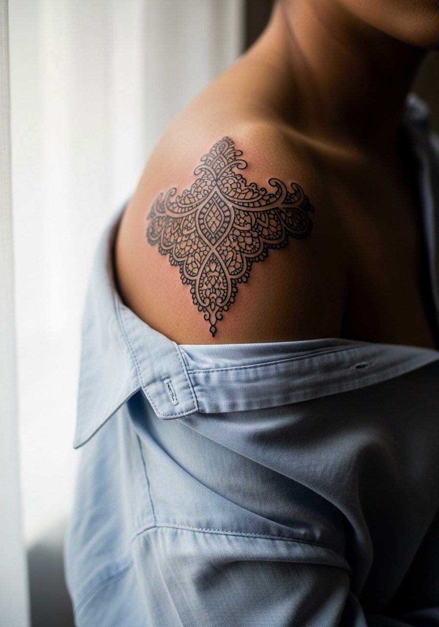
Shoulder cap sleeves look feminine without demanding too much daily exposure. The key is contrast, so request varied line weights and stipple shading to create depth that still reads after a few years. Pain is moderate and sessions can be split into two shorter appointments. A common error is cramming tiny lace details right at the seam of the shoulder where clothing rubs, which accelerates fading. For the session, wear a loose button-down shirt you can pull to the side so the artist has clear access without you being uncomfortable.
6. Celestial Sleeve with Moon Phases and Tiny Stars

There is a debate over tiny dot work for celestial themes. One camp says dense dot work will merge after a few years. The other claims proper spacing and stipple shading prevent that. I advise leaving breathing room between phases and asking for slightly larger negative spaces. Forearm placement reads well at arm length, and sessions vary from two to five hours depending on coverage. A frequent mistake is mapping too many moons in a narrow column. Pair this with a minimalist pendant necklace when the sleeve meets upper chest details.
Studio Day Picks
These first sleeve pieces span wrists, forearms, and shoulder work, so a few session-day items make the chair easier and protect the fresh linework in the first week.
-
Stencil transfer paper kit. Lets you test positioning on the skin before the needle hits, which is vital for aligning bands and celestial columns.
-
Topical numbing cream. Applied per instructions beforehand it can ease the sharp moments on wrist and shoulder without dulling the artist's feedback.
-
Thin protective film roll. Useful for keeping wrist and hand pieces clean during the busiest days of washing and typing.
-
Fragrance-free body wash. Gentle cleansing prevents irritation on areas like the outer arm and shoulder where fine line detail sits close to the surface.
-
Aquaphor healing ointment. A thin layer helps lock in moisture the first few days without suffocating the skin, which supports crisp healed linework on forearms.
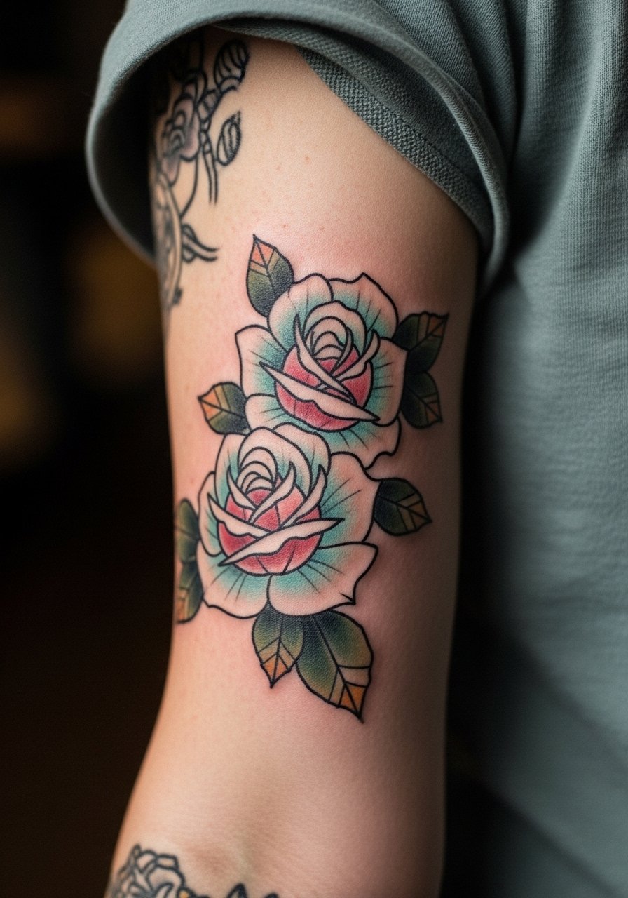
7. Pastel Neo-Traditional Roses with Soft Shading
Pastel fills are delicate and need saturated outlines to anchor them. Tell your artist you want the color to sit like a watercolor wash inside a bold silhouette rather than blended smudges. Expect color touch-ups earlier than blackwork, often around year two to three depending on sun exposure. The elbow region can be a stingy spot if the design crosses the joint. For outfit pairings, summer months work well with an off-the-shoulder top that frames the rose without rubbing the ink.
8. Micro-Realism Portraits Interwoven with Florals

Portrayed faces need scale and contrast to remain recognizable over time. I advise clients to keep portraits medium to large on a sleeve, not microscopic, so features do not merge. Bicep placement is forgiving for this technique. Sessions are long and require multiple sittings for saturation and healing checks. One common mistake is trying to fit a portrait into a tiny negative space between florals. For a classic look, wear an open-back blouse that lets the portrait peek through under hair or a jacket.
9. Butterfly Migration in Soft Color Gradients

A migration of butterflies reads like motion across a sleeve. Keep wing details bold enough to survive touch-ups and space each motif to allow future additions. Forearm placement shows the sequence well but sees frequent sun exposure, so plan for color refresh. Sessions are spread into short bursts, which helps manage soreness. Avoid very tiny wing veins that will blur. For daytime styling, a lightweight scarf can frame the forearm without rubbing the ink.
10. Peony and Peacock Tail Flowing to the Elbow
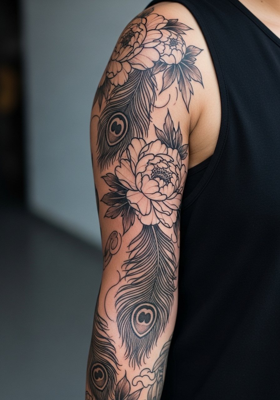
Layered peonies and a tail of peacock feathers create movement that suits a full-sleeve plan. Ask for varied saturation in the feather eyes to avoid a flat block of color that drains life after a few years. The elbow will distort dense color and linework, so keep that area airy. Sessions feel like long stretches of moderate discomfort when work nears the joint. Pair the flowing motif with a sleeveless wrap dress for formal events where the sleeve can breathe.
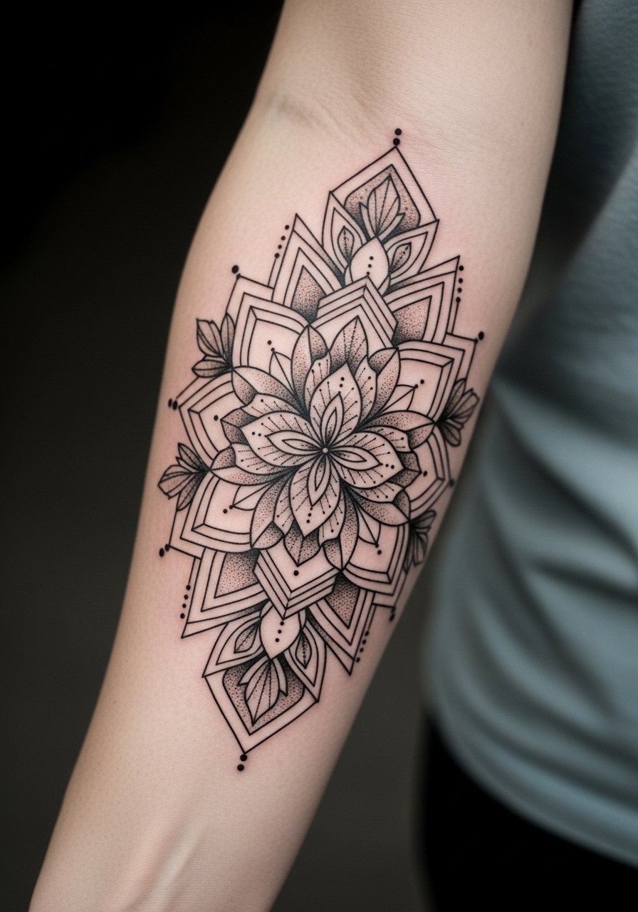
11. Mandala Lace Centered on the Upper Arm
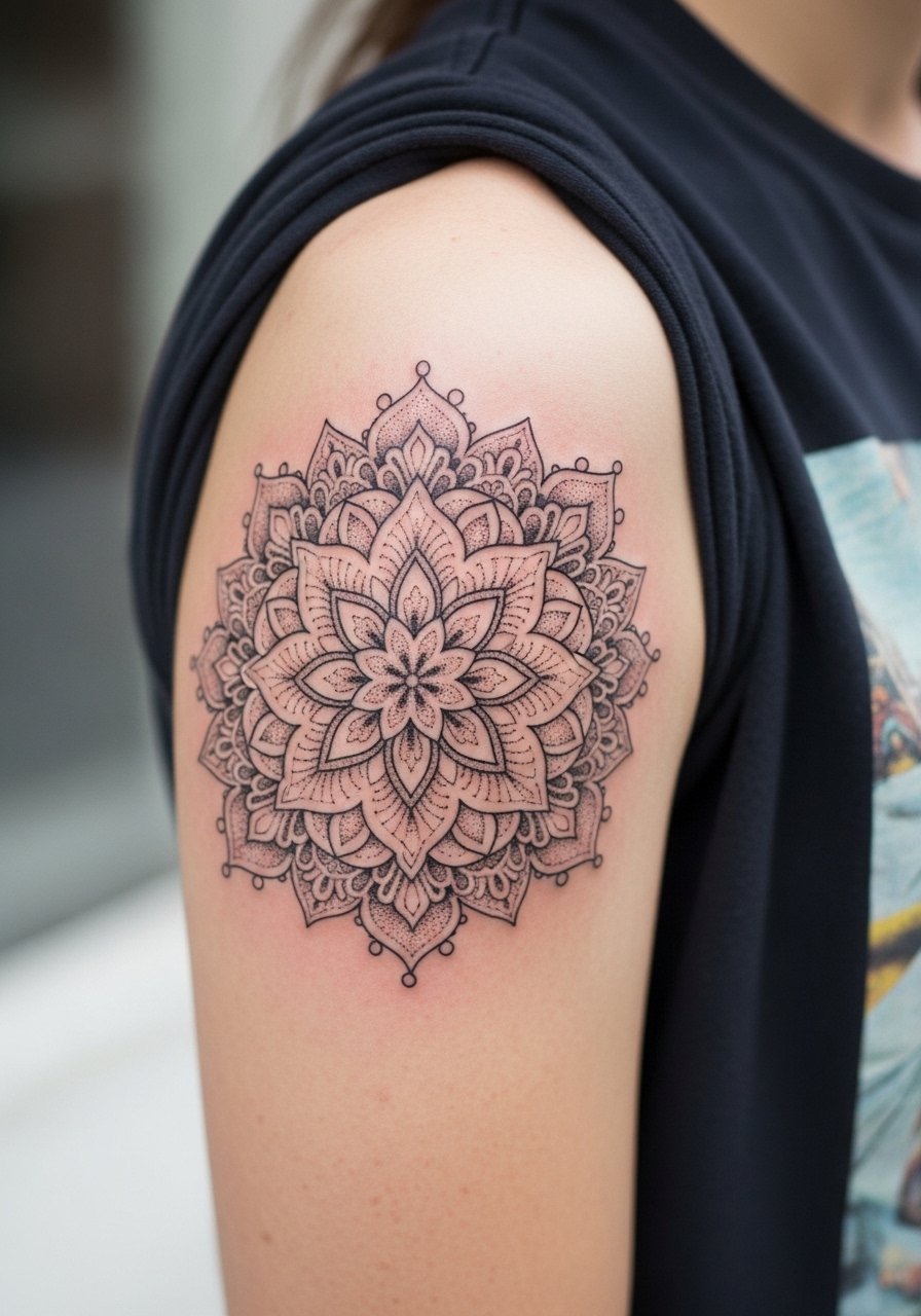
Mandala lace is popular for sleeve anchors. Designers disagree about placing dense mandalas on flexible skin. One camp insists large scale prevents merging. The other thinks tightly packed detail can hold if the artist spaces dots properly. I recommend a slightly enlarged mandala with negative bands around it to keep the pattern readable at year five. Upper arm sessions are manageable and less painful than ribs. For an evening out, a cap-sleeve blouse highlights the mandala without rubbing the edges.
12. Tiny Motifs Scattered for a Minimalist Girly Sleeve
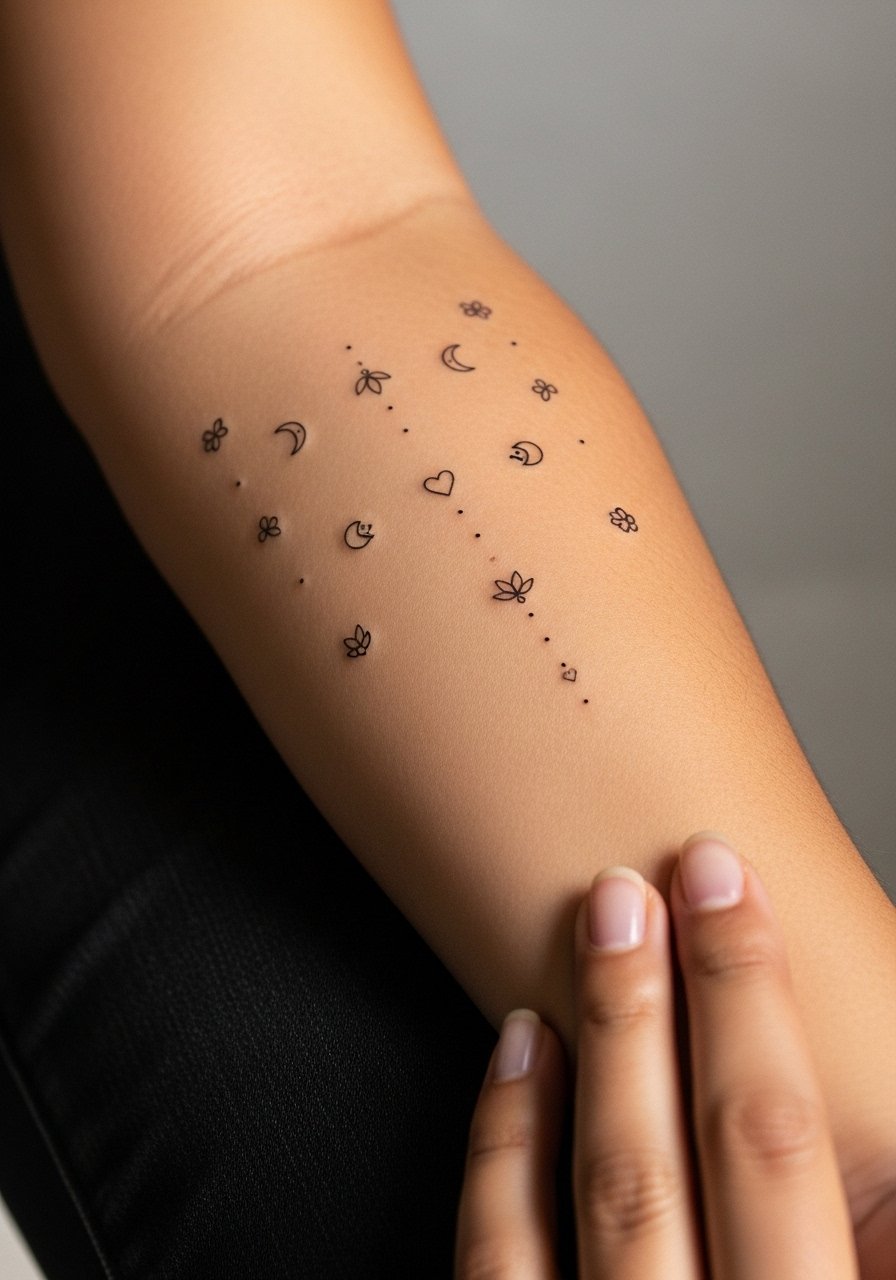
A sleeve made of tiny motifs needs intentional negative space. The most frequent mistake is packing too many micro designs close together, which creates a muddy appearance after a few years. I suggest spacing motifs by at least a thumb width, and grouping similar styles so the sleeve reads cohesive. Hand and wrist motifs will need more frequent refreshes. Sessions are short and social, which many clients prefer. Style these motifs with stacked dainty rings or a thin chain bracelet to keep attention on the tiny details.
13. Delicate Vine That Wraps From Wrist to Elbow
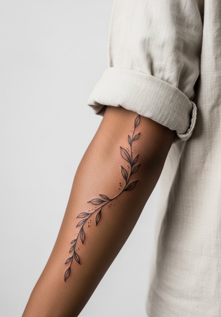
A vine sleeve reads organic and elongates the arm visually. Tell your artist you want alternating leaf sizes and occasional negative breaks so the vine breathes. Wrists are high abrasion zones and leaves near the hand will fade faster, so expect selective touch-ups in the first few years. The session will feel more continuous as the artist follows flow, and you might need two sittings. For casual days, wear a rolled-up linen shirt to show the vine without irritating the healing skin.
14. Geometric Floral Sleeve with Dot Work Highlights
Geometric florals combine precision and organic shapes. The aging risk is small lines merging if geometry is too tight. Request larger negative spaces around intersections and stipple shading for tone instead of heavy fill. Forearm placement gives the pattern room to breathe, and blowout risk is lower than in soft-tissue areas. Sessions balance precision with longer stencil checks. Pair the linear geometry with a minimalist leather cuff when you want a structured look.
15. Lace Sleeve That Mimics Jewelry on the Upper Forearm
A lace sleeve that reads like a permanent bracelet needs careful negative space. The typical mistake is running lace right into other elements without a buffer, which makes it look crowded after a few years. Expect the detail to soften, so plan a touch-up at year three if you want sharp edges. The session is detailed and can feel pins-and-needles near the wrist. Show it off with a stack of thin bracelets that complement without covering the lace.
16. Ocean-Themed Sleeve with Shells, Waves, and Tiny Fish
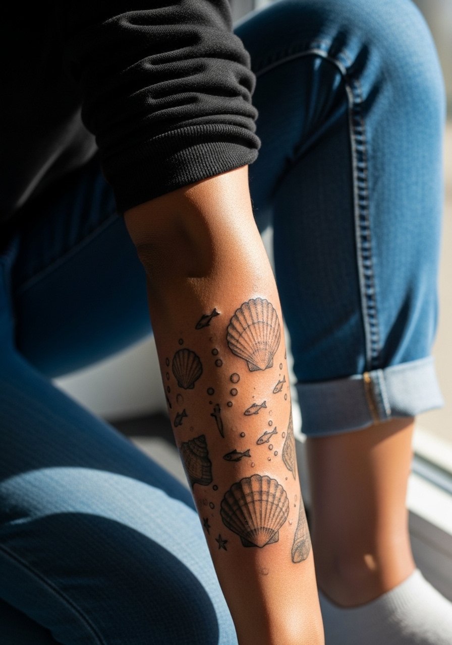
Ocean motifs pair well with subtle color gradients and linework. Shells that rely on soft shading can lose detail if overblended, so ask for crisp contours with gentle fill. Lower arm placement handles small fauna well, but watch for friction if you frequently lean on the area. Sessions are steady and mildly uncomfortable when lines are dense. For a beach-ready look, a beachy cropped top keeps the sleeve visible without rubbing.
17. Ribbon and Bow Elements That Frame Portraits

Ribbons and bows add a feminine frame but need anchors so they do not float over time. Tell the artist where you want the bow to sit relative to the portrait and ask for slightly bolder knot lines to retain shape. Upper arm material is forgiving, yet the ribbon tails can soften and blur after a few years. Sessions are medium length and can be paused between elements. Pair this with a v-neck blouse to balance the portrait and ribbon when dressing up.
18. Floral Sleeve That Fades into Script on the Inner Arm

Inner arm scripts and florals can look intimate and layered. The inner skin stretches and can make thin script lose definition, so choose slightly bolder letterforms. Floral elements should have negative gaps near the script to prevent overlap as the skin shifts. Sessions over the inner bicep are tender, particularly near the armpit, so expect slower sittings. For session comfort, wear a loose tank top that allows the artist to work without you feeling exposed.
19. Bee and Honeycomb Motif with Golden Hues

Bees and honeycomb combine geometric repetition and organic imagery. Repeating hexagons need consistent spacing to avoid the entire pattern becoming a blurred block. Tell the artist you want some hexes open and others filled to create texture. Forearm placement keeps the motif visible and less prone to friction than hands. Sessions are rhythmic and often satisfying for clients watching the pattern form. For a complementary look, a delicate gold ring pairs well with the warm tones.
20. Peeling Petals in Stipple Shading Around the Elbow

Designs that cross the elbow need purposeful gaps because joints distort dense work. Ask for airy petals at the joint and denser petals on either side. The elbow is a pain hotspot, and sessions that include the joint feel sharper. The most common error is not accounting for movement, which accelerates blurring. If you want this to age gracefully, plan touch-ups at the three to four year mark. Pair with a sleeveless summer dress when you want the elbow detail to show.
21. Ribbon of Tiny Hearts Up the Outer Forearm

A linear string of hearts works as an undercurrent for larger sleeve elements. Keep each heart slightly larger than micro scale so they do not merge. Outer forearm placement is forgiving, but high-traffic contact like bracelets and watches can wear the ink. Sessions are quick and can be added onto existing work. Avoid adding too many contiguous small elements without breaks. Style it with a minimalist watch worn opposite the ribbon to avoid rubbing.
22. Sunflower Trail with Tiny Bees and Leaves

Sunflowers bring contrast with dark centers and lighter petals. Ask for the centers to be slightly larger and textured so the detail survives. Bees near the petals should be bold and not overly detailed to avoid merging. The outer arm tolerates this contrast well, but bright yellows fade faster than darker pigments. Sessions are moderately long and can be split. For daytime wear, a wide-brim hat and a short-sleeve tee highlight the sunflower trail without rubbing.
23. Script Ribbon Winding Between Floral Clusters

A script ribbon looks cohesive when the lettering has consistent spacing and slightly heavier downstrokes. Ask your artist to write the phrase on tracing paper at actual scale so you see how it curves. Forearm placement keeps the ribbon readable, but thin script near joints loses crispness faster. Sessions may alternate between lettering and floral fill to let the script heal before surrounding color. For an understated reveal, a soft cardigan that can be shrugged off is useful.
24. Lace Mandala That Transitions into Dot Work Shading
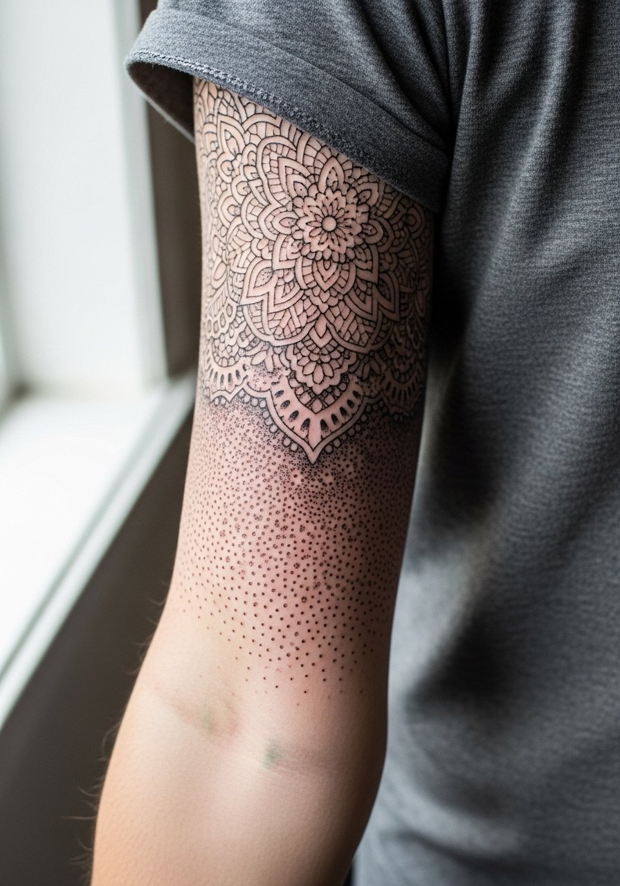
This hybrid lets dense lace sit beside airy stipple, which helps the design age without merging. The danger is putting too many dots close to lace edges. I recommend a 6 to 8 millimeter negative border between techniques. Forearm placement is ideal for this contrast, and sessions are detail-focused with a slower pace. For formal events, a three-quarter sleeve dress can frame the transition from lace to dot work.
25. Crescent Moon Wreath Around the Wrist and Forearm
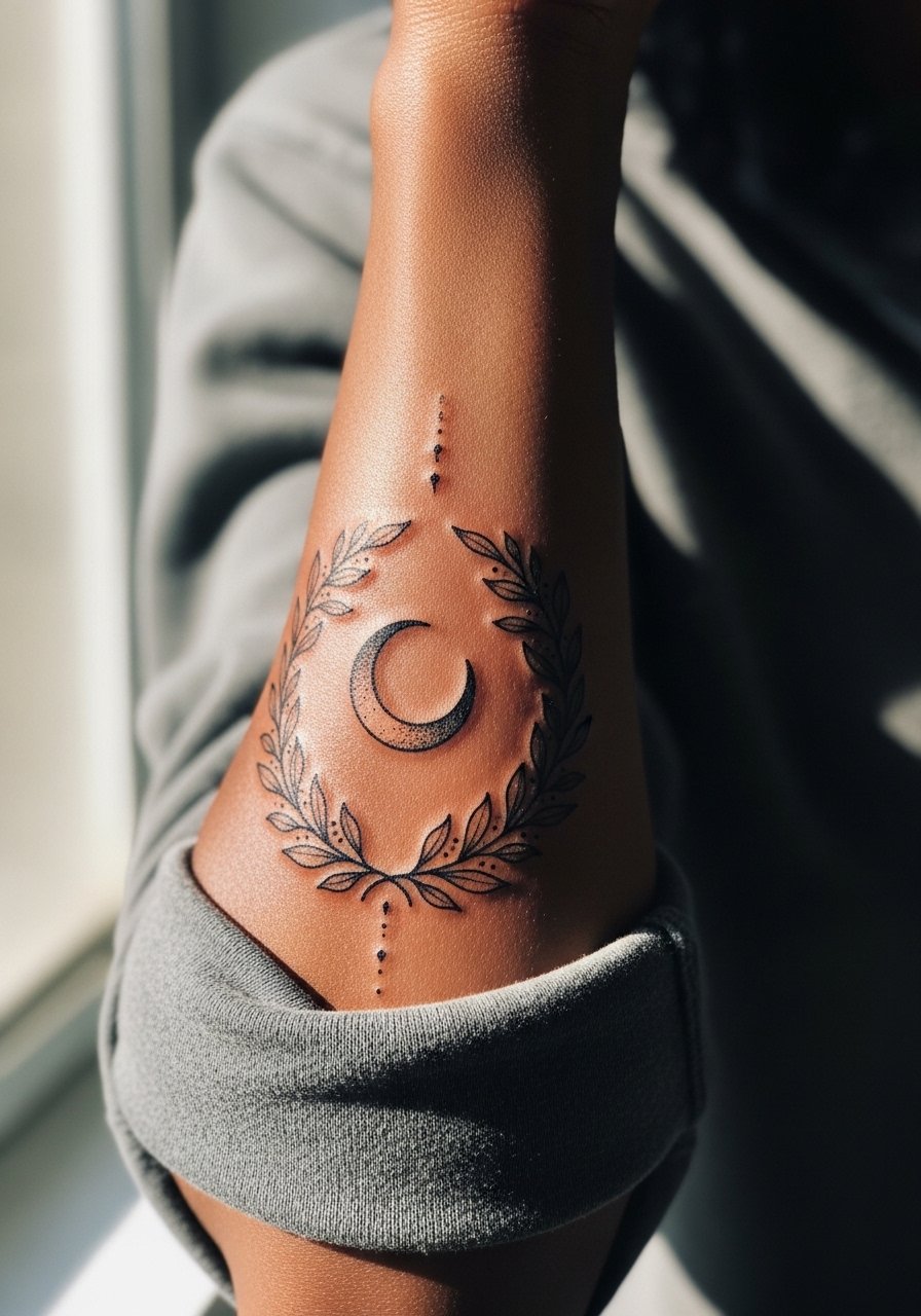
A crescent wreath looks like jewelry and suits a sleeve start point. Keep wreath elements slightly spaced and avoid tiny clustered filler shapes that age poorly. Wrist-to-forearm transitions see more abrasion, so leave a slightly wider gap at the wrist. Sessions here are short but sharp. For an accessorized look, a dainty cuff bracelet complements the wreath without covering the ink.
26. Vintage Ribbon and Cameo Elements for a Romantic Twist
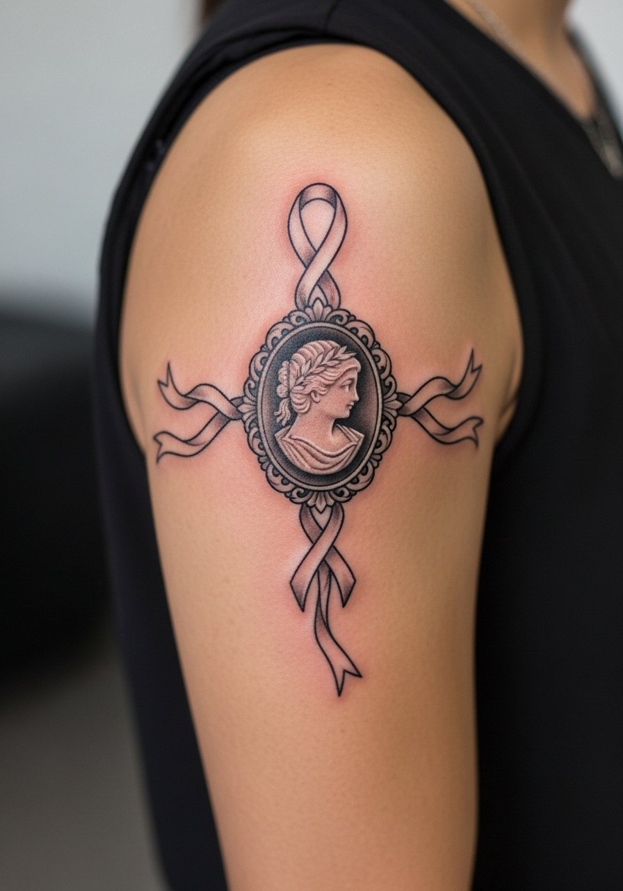
Cameos need scale to keep facial details legible over time. Make the cameo larger and let the ribbon be the delicate counterpoint. Upper arm placement protects the cameo from constant abrasion. Artists often recommend splitting the work into at least two sessions to refine the cameo and then weave the ribbons. A simple mistake is trying to cram multiple small cameos close together. Pair this look with a floral blouse for vintage-inspired outings.
27. Mixed Motif Full Sleeve That Tells a Story

A story-driven sleeve needs a coherent plan. During consultation, map narrative anchor points and leave connecting negative space for future elements. Expect multiple sessions over months and a varied pain profile depending on spots like the inner arm or elbow. The common error is letting references run the layout without a unifying palette or rhythm. Ask for a mockup that shows how negative space will age with the motifs. For a reveal, choose an off-the-shoulder top that lets the sleeve flow naturally.
Frequently Asked Questions
Q: Will a fine line girly sleeve blur into a smudge within five years?
A: It depends on placement and spacing. Fine line work on forearms and upper arms tends to hold up better than on wrists or hands. Ask for slightly larger negative spaces and slightly bolder anchor lines where details cluster, and plan to budget for touch-ups around year three to five.
Q: Are watercolor sleeves harder to care for during healing than traditional color work?
A: Watercolor fills can be more delicate because they rely on soft blends rather than saturated blocks. During healing, avoid heavy rubbing and sun exposure. Let your artist show you what healed watercolor looks like in their portfolio and ask about their typical touch-up timeline.
Q: What should I wear to a ribcage or sternum sleeve appointment?
A: For ribcage work wear a cropped tank or a sports bra you can lift slightly so only the tattoo area is exposed. That keeps you comfortable and maintains modesty while giving the artist clear access. Bring a loose zip-up sweater for after the session.
Q: How do I find an artist who understands girly, delicate sleeve work without naming specific accounts?
A: Search local shop directories, check portfolios on hashtag feeds like #femaletattooartist or #delicatelinestattoo, and browse convention lineups. Look for healed photos in portfolios rather than fresh work. Reach out with specific references and ask about healed results and touch-up policies.
Q: Can I mix micro-realism portraits with neo-traditional florals in one sleeve?
A: Yes, when you plan transitions. Use anchor pieces like bands or negative space to separate styles, and pick a shared palette to keep it cohesive. Expect multiple sittings and a consult to map how the pieces will interact as skin moves and ages.
Q: Do hand and finger parts of a girly sleeve affect job prospects?
A: They can in some industries. If career considerations matter, keep the most visible pieces higher on the arm or plan placements that can be covered by sleeves. You can still have very personal motifs on wrists or fingers, but know they may need more frequent refreshes and could be seen differently in certain workplaces.