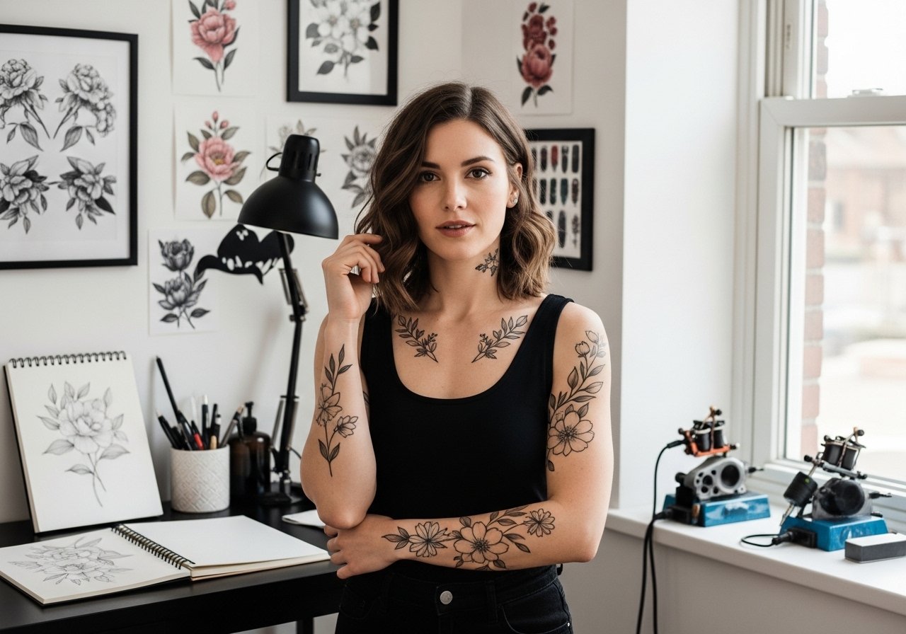
Fine line script tattoos look flawless on a mood board, and the reality behind them is messier. Trends push ever-smaller type and single-needle quotes, then people show healed photos asking why lines blurred. The gap comes down to placement, needle depth, and realistic expectations about touch-ups. Below are 27 minimalist fine line script ideas with what to ask your artist, how each ages, session notes, styling tips, and the common mistakes that actually matter.
1. Fine Line Script Quote on Inner Forearm
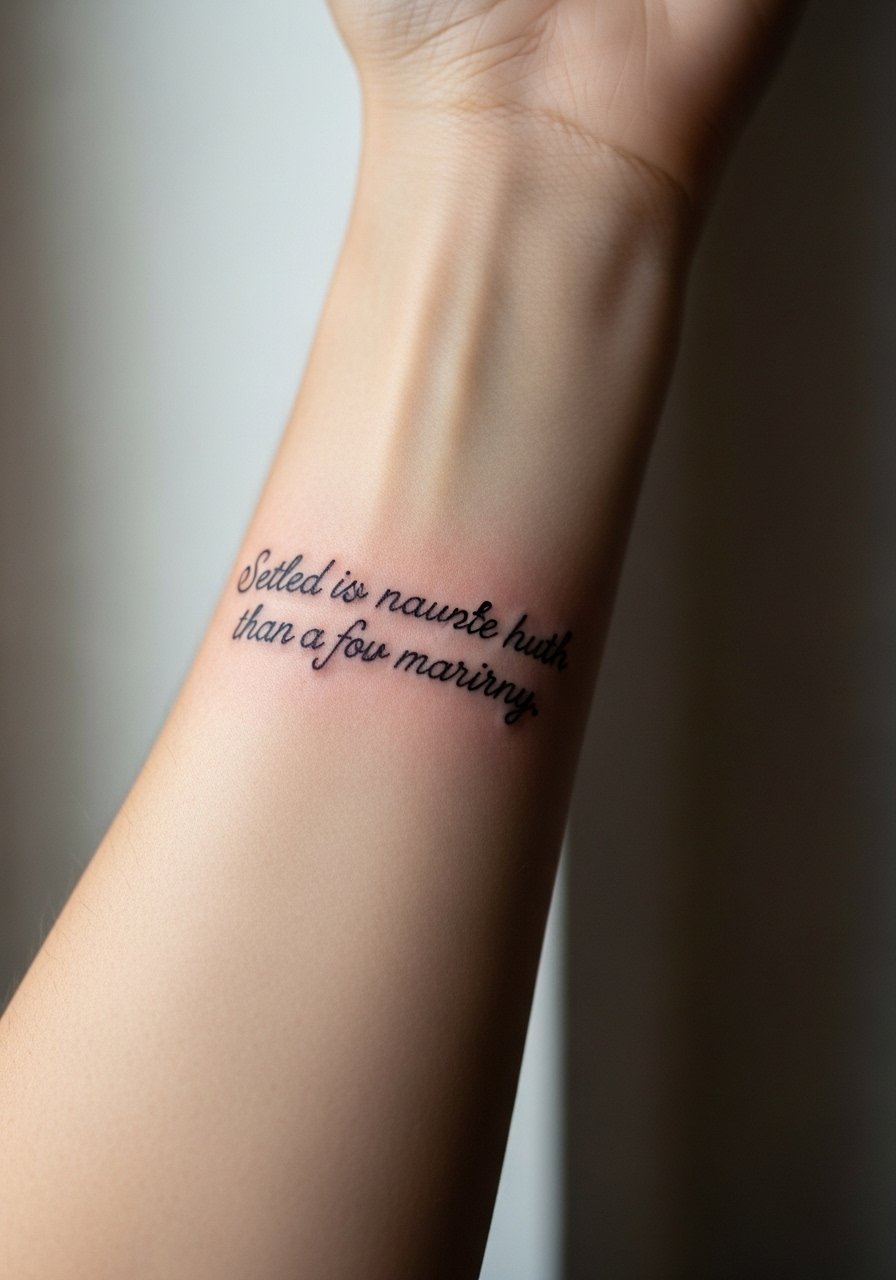
I’ve seen inner forearm quotes last best when kept at 2 to 4 inches tall and spaced so letters breathe. Tell your artist you want consistent single-needle linework and to avoid hairline flourishes that merge after a year. Pain is low to moderate since this spot has soft tissue, and most sessions finish in under an hour. A common mistake is asking for ultra-tiny cursive that reads like a blur once healed. For showing it off, roll up a sleeve or wear a linen short sleeve blouse so the quote sits in clean light.
2. Fine Line Micro-Realism Pet Portrait on the Wrist
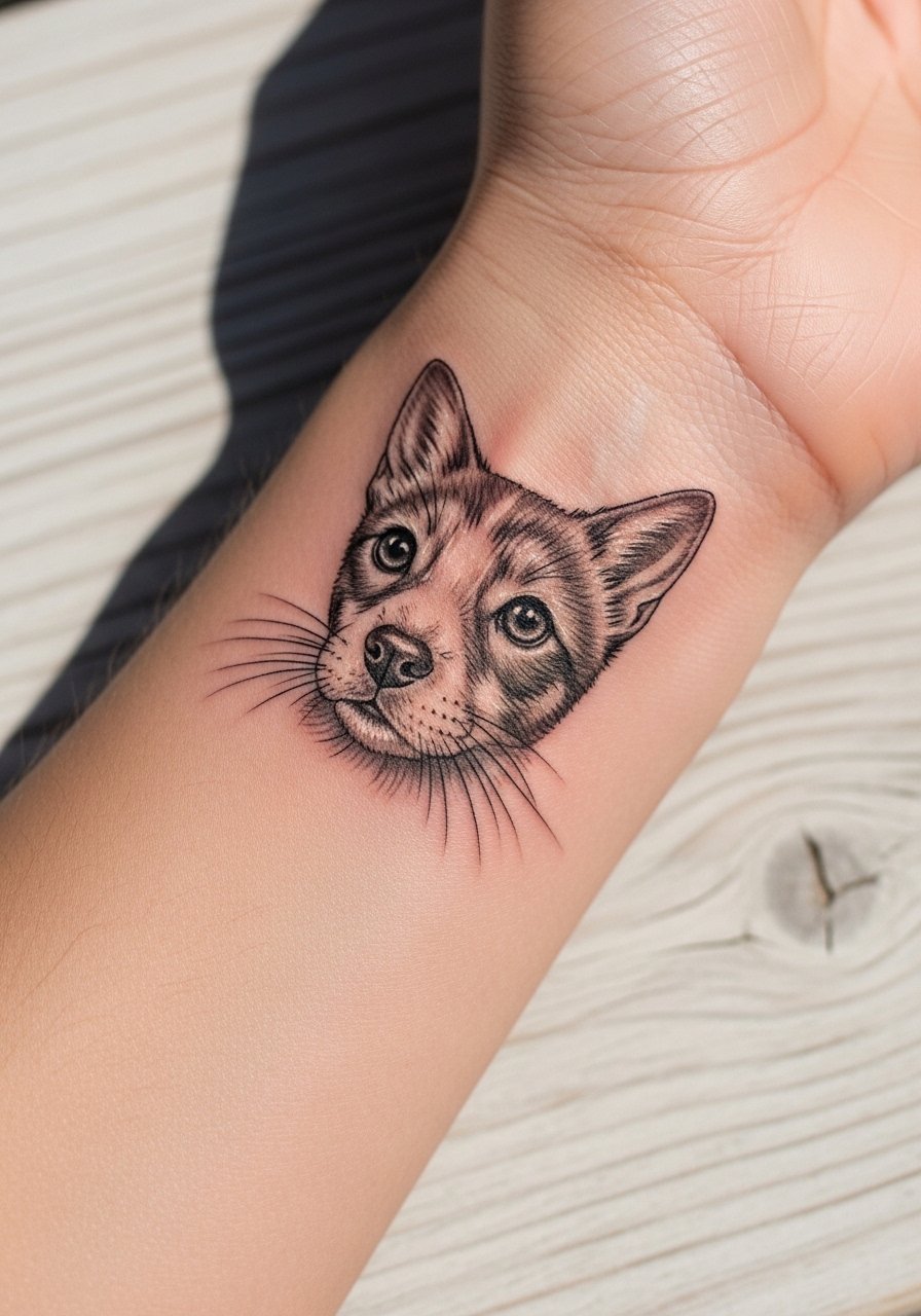
Wrist pet portraits are tiny memories that read best under 2 inches and in black and gray. Expect one to two short sessions if there is shading. Tell the artist you want higher contrast in the reference photo, because on darker tones micro-realism holds better than pure linework. Fair warning, wrists see a lot of sun and friction, so touch-ups are common at year two. The skin there feels more sensitive near the bone. For styling, keep the wrist bare or pair with a micro chain bracelet to frame the portrait without crowding it.
3. Fine Line Floral Branch on Collarbone
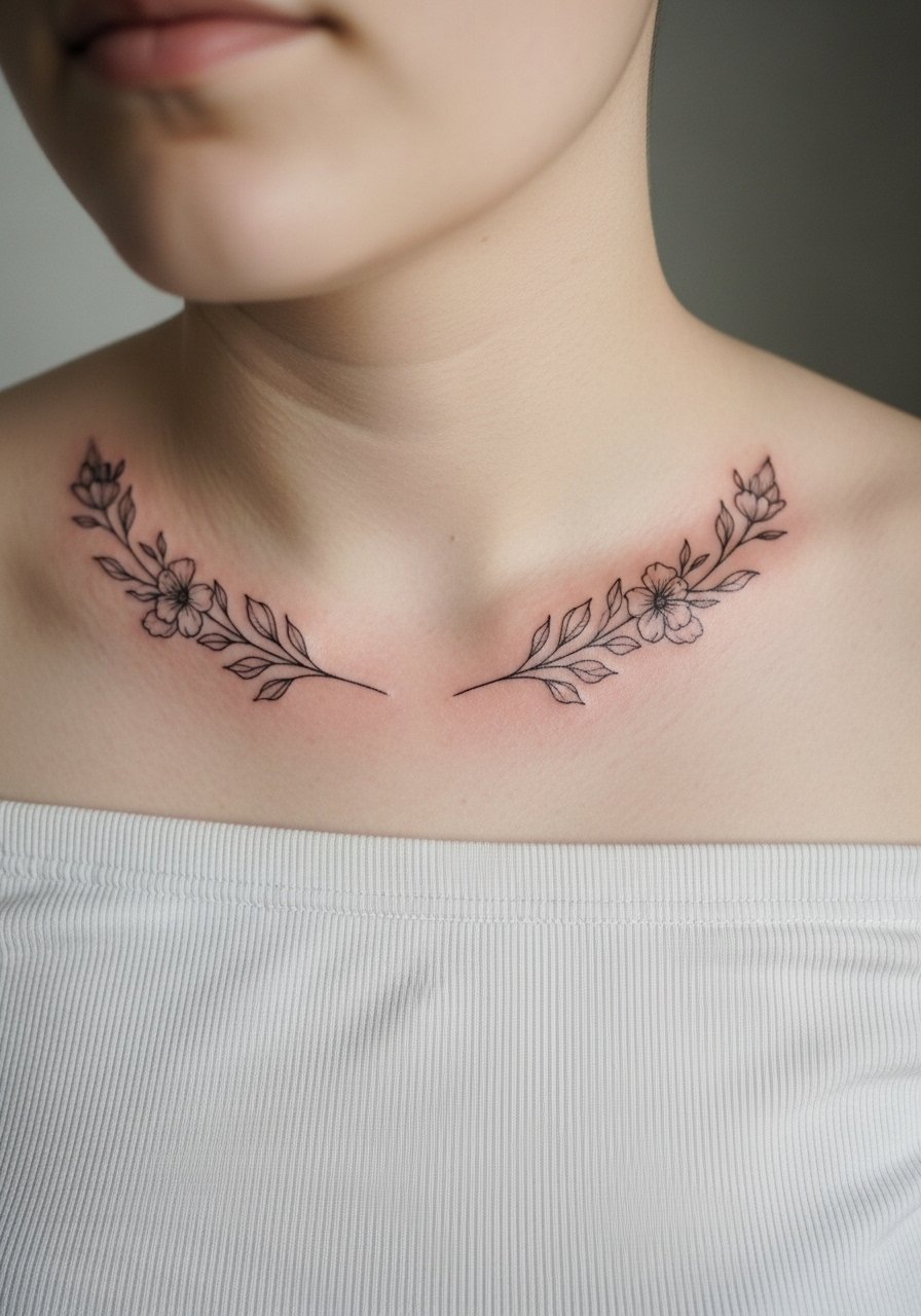
Collarbone branches follow the contour of the bone and age well when drawn with elongated spacing between leaves. In consultation, ask for slightly longer stems and avoid dense petal shading that will fuse. Pain ranges from low to medium depending on how close the line is to bone. This design looks particularly good with summer tops, so pair it with an off shoulder blouse when you want to show it. A common mistake is trying to cram a full bouquet into a four-inch area. Give the lines room and the stems will read clean at year three.
4. Fine Line Constellation Map on Ribcage
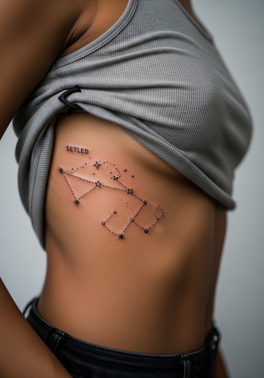
Fair warning, the ribcage is a high-pain zone and a high-movement area that stretches with weight change. Artists split on the ribcage. One camp says fine line blurs quickly there because the skin moves and stretches. The other camp argues that with proper depth and slightly increased spacing, single-needle script holds fine. Ask your artist which side they are on and request a small patch test if possible. Plan for a one-session piece that might need a touch-up by year two if you wear tight clothing against it. For the appointment, wear a loose tank you can lift easily.
5. Fine Line Single-Line Abstract Wave on Ankle
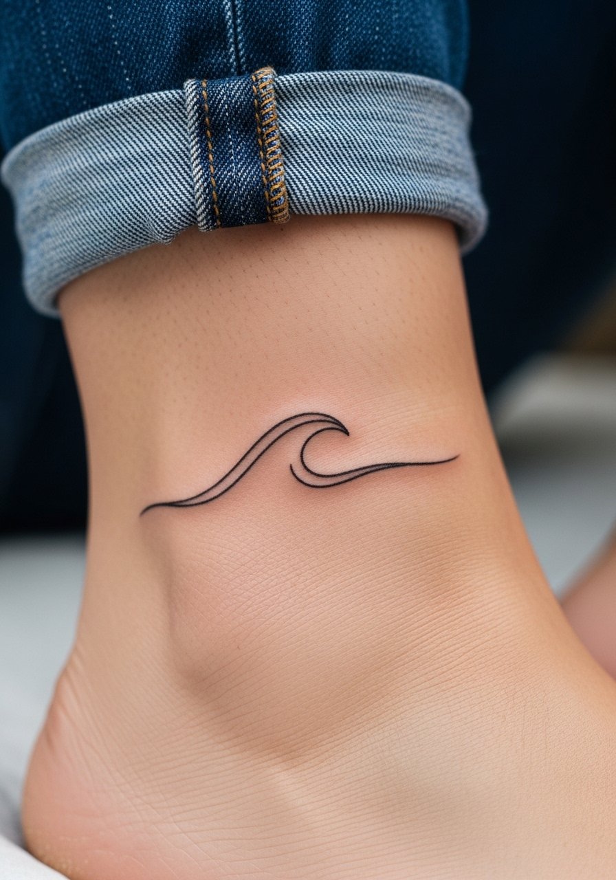
Ankle lines read like jewelry and hurt less than ribs, though the area can be finicky due to thin skin. Keep designs around two inches and ask for a continuous one-line flow so the tattoo reads at a glance. The mistake is packing too many curves into a tiny footprint. Expect a short session and touch-ups if you wear ankle-covering footwear constantly. For show-off outfits, cuff wide-leg linen pants or choose strappy flat sandals to keep the wave visible without friction.
6. Fine Line Botanical Stem on Spine
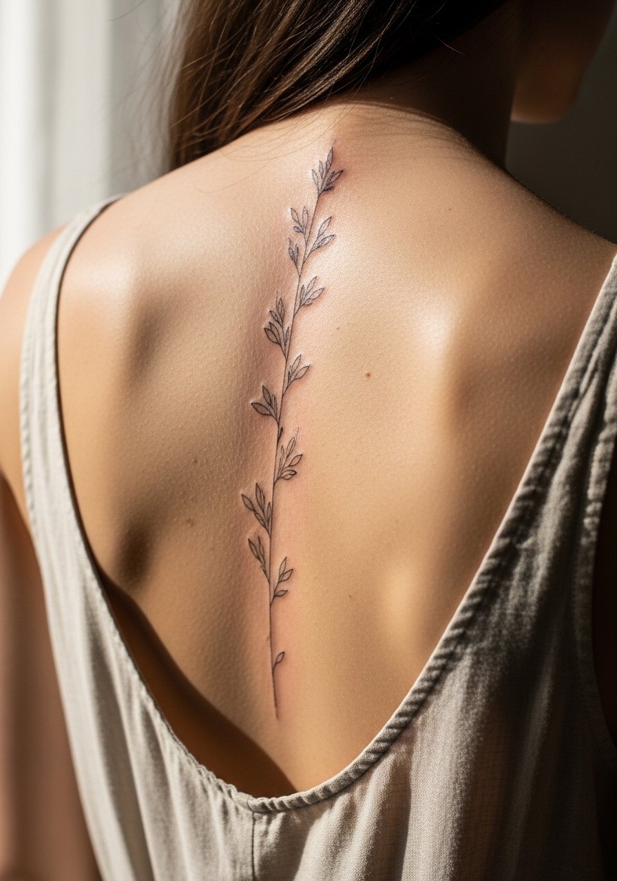
Spine scripts and stems demand vertical composition and patient spacing so the piece elongates instead of blurring. Pain is moderate to high at the bony junctions, and sessions often run one to two hours for 6 to 8 inches. Tell your artist you want slightly wider gaps between leaves to prevent merging after a year. Healed at six months, the lines sit crisp if sun exposure is controlled. Pair this piece with an open-back dress when you want it to do the visual work. Expect a touch-up around year three for most skin types.
Pre-Session Essentials
The inner forearm, wrist, collarbone, ribcage, ankle, and spine pieces above each ask for slightly different prep. A few small items smooth the session and the first week of healing.
-
Vegan thin tattoo balm. Less greasy formulas help fine line work breathe during the later healing phase and reduce pore clogging that can soften crisp lines.
-
Breathable second-skin protective film. Useful for humid climates and wrist placements that face constant water exposure.
-
Rice-based moisturizer for dry skin. Lightweight hydration without heavy occlusion helps line clarity on forearms and collarbones.
-
Tea tree gentle balm from small-batch makers. Mild antibacterial properties can soothe the first-week itch on exposed spots like wrists and ankles.
-
Aquaphor healing ointment. A thin layer for the initial 48 hours can protect very fine lines in high-friction zones like the wrist.
7. Fine Line Lettering Name on Inner Bicep
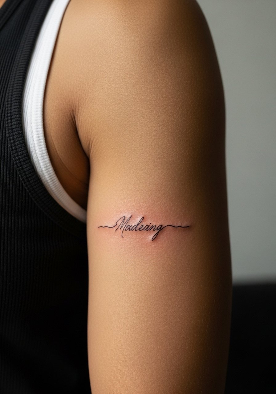
Inner bicep lettering reads best at 1 to 3 inches with clear kerning between letters. The skin there is softer so touch-up needs tend to be lower than hands. During consultation state you want thin cursive with letter spacing rather than connected loops that can fill in. The session is moderate pain and usually under an hour. For appointment day, wear a loose tank top so the artist can access the area without tugging. Common mistakes include asking for micro-cursive that only reads at arm distance.
8. Fine Line Minimalist Heart Outline on Finger
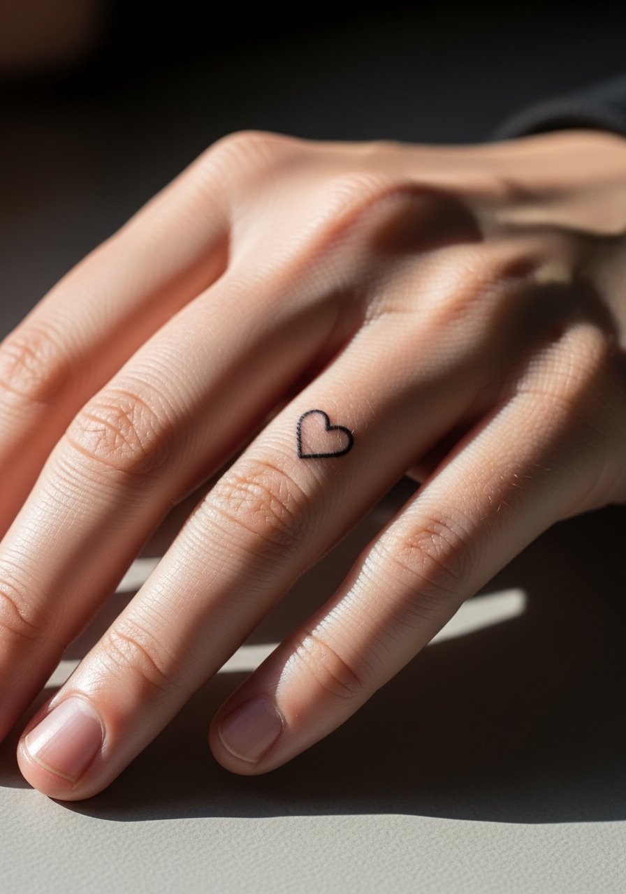
Finger tattoos test the limits of fine line durability because the skin there regenerates quickly and sees tons of friction. Expect a faster fade and plan for touch-ups every 1 to 2 years. Ask the artist to slightly thicken the outline compared with a wrist piece, and accept that multiple sessions may be needed to maintain crispness. Pain is brief but sharp near joints. If you work with your hands a lot, consider inner finger placement or a tiny companion piece on the knuckle that is easier to retouch. Hand and finger pieces are where the pro-fine line versus anti-fine line debate is most vocal, so be realistic about longevity.
9. Fine Line Geometric Dotwork on Shoulder Blade
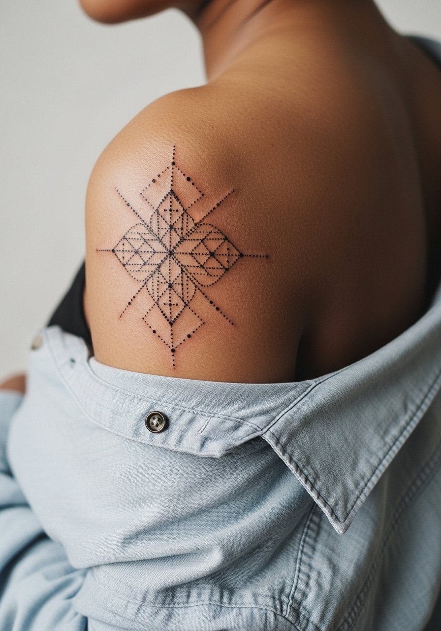
Shoulder blade dotwork benefits from spacing and dot scale that gives negative space to breathe. I recommend stipple shading rather than dense lines in tight areas to avoid merging over time. Pain here is low and sessions are short for three-inch pieces. Ask your artist to show healed portfolios with dotwork at 6 months to judge how their stippling holds. For the appointment, wear a loose button-down shirt you can pull aside without friction on the design. Avoid trying to miniaturize highly geometric clusters into pinhead-sized patterns.
10. Fine Line Inspirational Phrase on Thigh
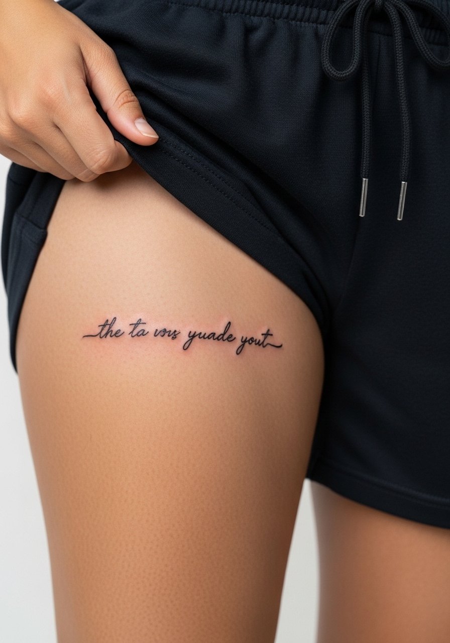
Inner thigh phrases are private and benefit from wider letter spacing because the skin there can stretch with weight fluctuations. Sessions are low to moderate pain and usually completed in one sitting for four-inch phrases. Tell your artist where you want it to sit relative to natural curves so the phrase reads straight when standing. A common mistake is using a font with heavy loops that pull into one another after healing. When you want to reveal it, pair the piece with high cut shorts or a thigh-slit skirt.
11. Fine Line Vine Wrap Around Calf
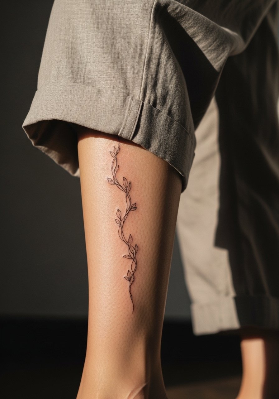
Calf wraps follow the leg's natural movement and are forgiving of slight shifts, so you can space leaves more tightly than on ribs. Expect a one to two-hour session for a 5-7 inch wrap. Tell your artist if you want the vine to spiral or appear as separate sprigs when standing. The calf has low to moderate pain and holds linework well with minimal touch-ups. For summer wear, cuff wide-leg linen pants or choose wide leg linen pants to show the wrap without compressing it under socks.
12. Fine Line Micro Feather on Neck
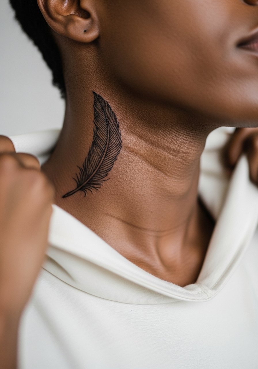
Neck placements are visible and age under constant sun and friction from collars. Micro feathers can be striking at about two inches high if the quill lines are spaced for longevity. The area is higher pain and heals with more attention required to aftercare. Ask your artist how they approach neck line depth and whether they recommend slightly bolder lines for extra longevity. For styling, a v neck silk blouse or pulled-back hair frames the feather without crowding it. Note this placement may affect some professional settings.
13. Fine Line Script Coordinates on Outer Forearm
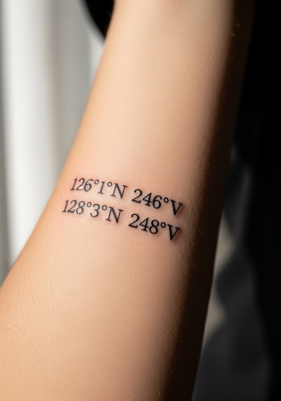
Coordinates are a clean way to carry a location without a full phrase. Keep numerals around three inches long and choose a simple monospace that stays legible when healed. Forearm skin is stable and tends to hold single-needle work well if the artist paces depth evenly. The session is short and low in pain. For showing it off, roll up a sleeve or wear a thin silver chain bracelet on the opposite arm so the coordinates read like a subtle accent.
14. Fine Line Crescent Moon Behind the Ear
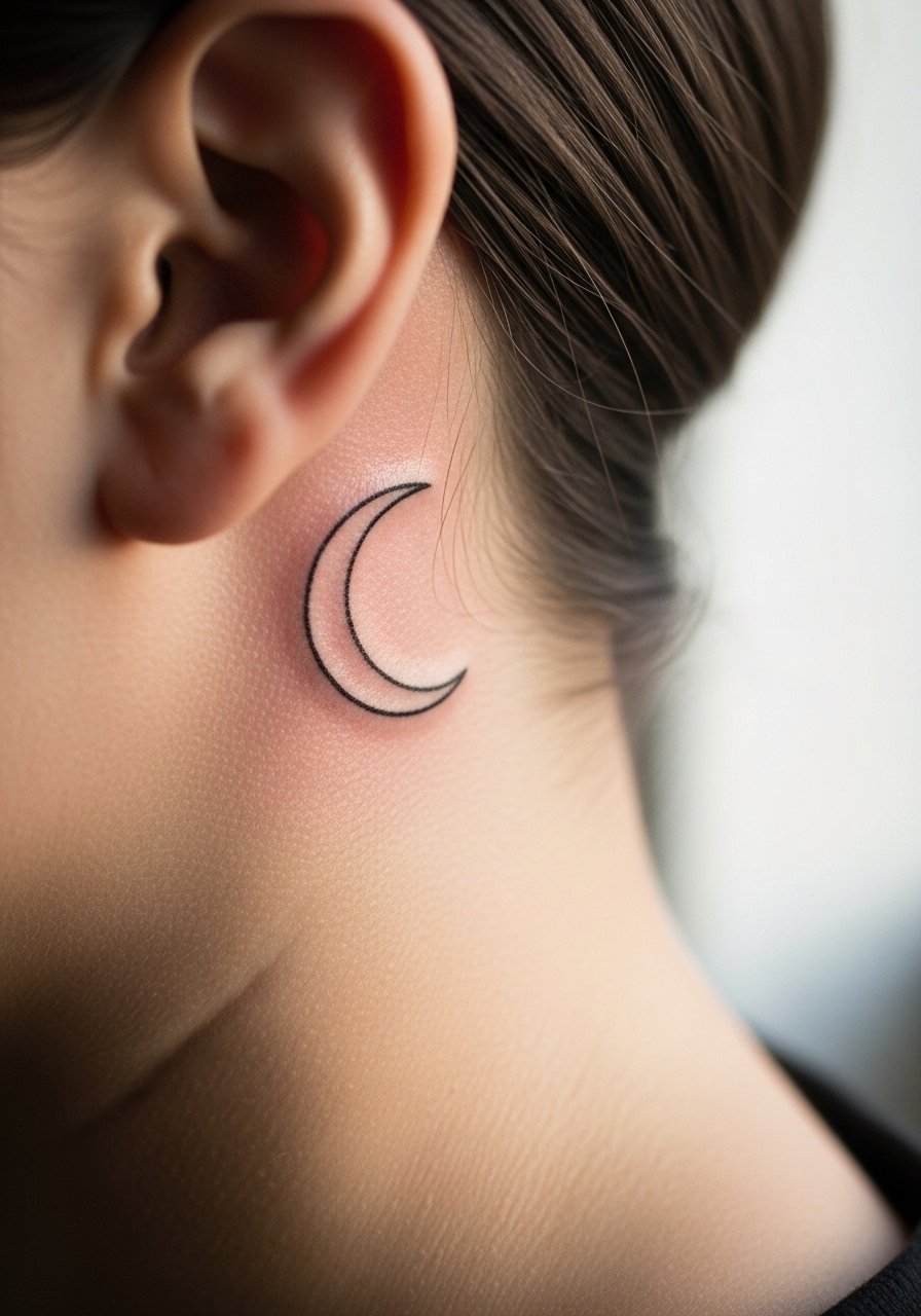
Behind-ear work is tiny and needs careful stencil placement since that area moves with hair and collars. Keep the crescent under an inch and ask the artist for a precise placement check before needle down. Pain is brief but sharp given the thin skin. This is a highly visible micro spot when hair is up, so think about daily hairstyle choices. For the session, tie your hair up so the artist can reach the area without tugging. Expect yearly touch-ups on such a high-friction micro spot.
15. Fine Line Script on Outer Ankle with Jewelry Pairing
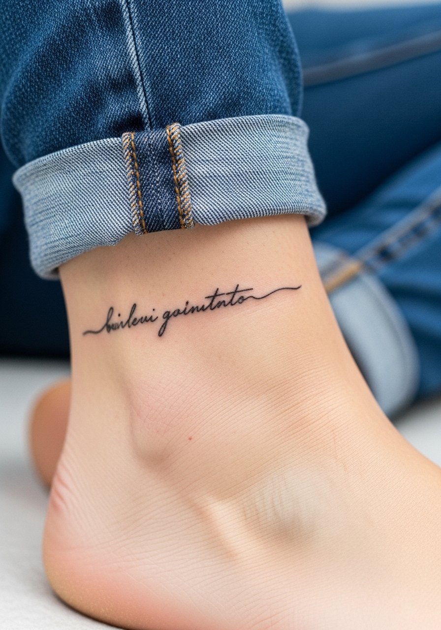
Outer ankle scripts need slightly bolder line weights than a forearm quote to survive shoe friction and socks. Keep letters compact but avoid loops that can fill. Session time is short and pain is low to moderate near bone. When showing it off, pair with cuffed pants or a strappy flat sandal to avoid rubbing. Common mistakes include requesting micro-cursive that reads as a smudge after walking season.
16. Fine Line Tiny Script on the Side of the Rib Near the Bra Line
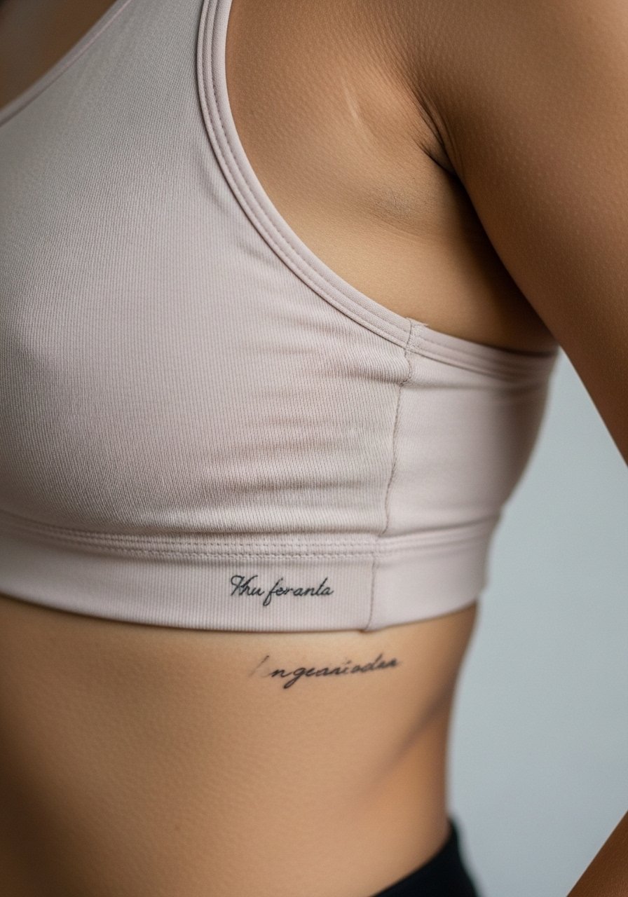
Scripts tucked under the bra line are private and benefit from slightly larger letter spacing because clothing can rub during healing. This is a sensitive area that can be a 6 to 8 on many pain scales. Tell the artist exactly where the fabric sits on you when standing so the placement does not ride under a strap. Dry healing preferences vary among artists, so ask which method they recommend. Expect to schedule touch-ups if you frequently gain or lose weight. For session wear, choose a strap that can be moved aside without removing the bra.
17. Fine Line Single-Needle Cross on the Wrist
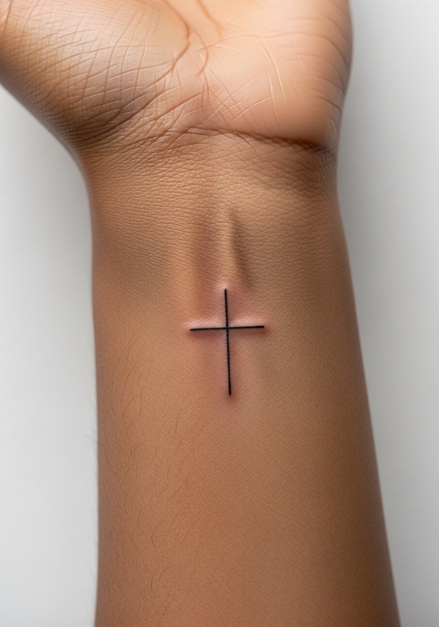
A wrist cross is a minimal statement that ages like other hand-area pieces. The key is to request single-needle depth that avoids shallow placement which can scab out and fade. Pain is moderate near bone and sessions are short. The controversy around hand and wrist longevity applies here too. One group of artists says hands blur fast, and the other says consistent depth and spacing will keep lines readable for longer. Plan for touch-ups at year two for most wrist placements. For show-off styling, pair with an oversized cuff sleeve or a micro chain bracelet on the opposite wrist.
18. Fine Line Script Under the Collarbone as a Nameplate
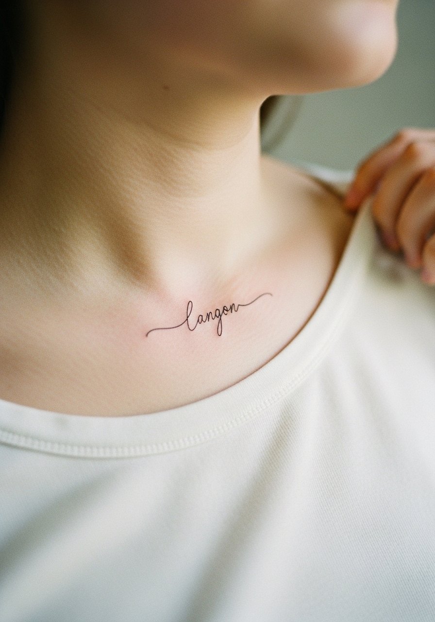
Under-collarbone nameplates sit flatter than clavicle tattoos and like slightly thicker lines to maintain legibility. Ask for clear letter spacing and a stable baseline so the name does not wave with posture. Pain is low and the session is brief. For showing it off, choose a delicate chain necklace that sits above the script rather than over it. Avoid very ornate flourishes that collapse into a single dark line after healing.
19. Fine Line Script Wrap That Mimics a Bracelet on the Forearm
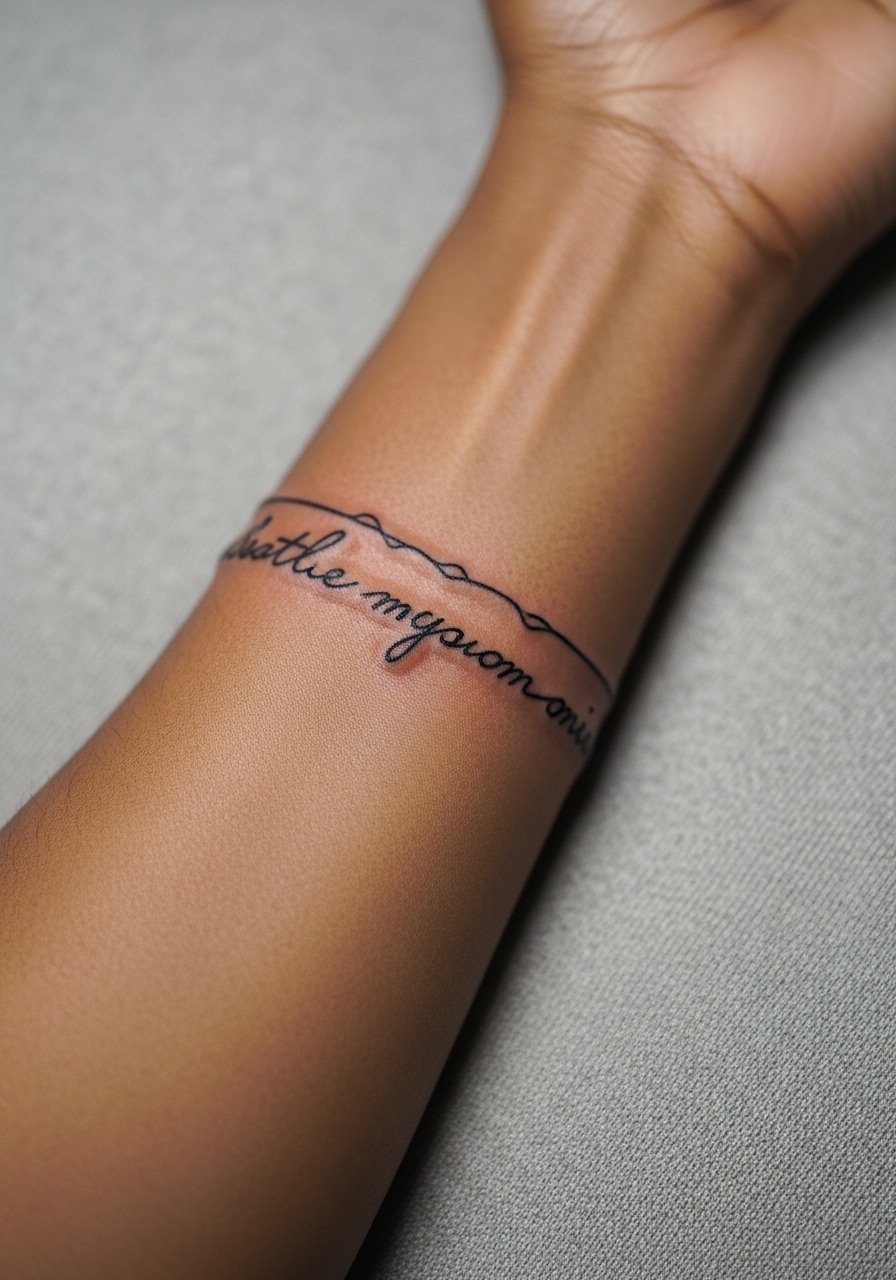
Wrap scripts that mimic bracelets need even spacing and a slightly larger scale than a single-line quote so they remain legible from all angles. Tell your artist you want the wrap to read both hanging at rest and when the wrist rotates. Pain is low and sessions are short. A common error is making the text too small to read when the forearm curves. For session wear, bring a loose short sleeve button-up you can push up without pinching the area.
20. Fine Line Minimal Script Along the Finger Side
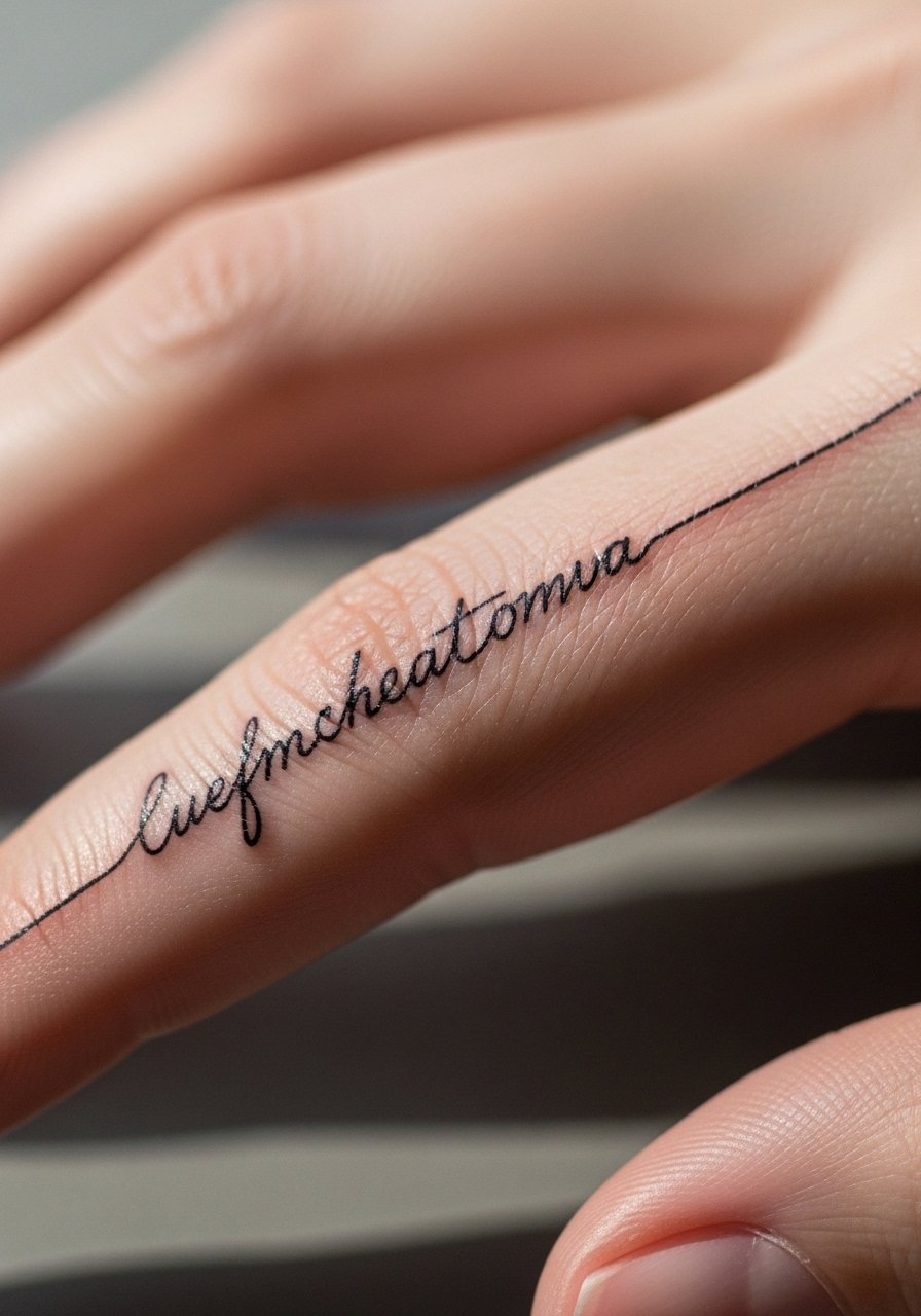
Side-of-finger scripts are even more prone to fade than top-of-finger work because the skin flexes in different directions. Keep characters at a moderate size and accept that annual touch-ups are likely. Ask for slightly denser line placement compared with a wrist script to compensate for rapid cell turnover. Pain is short and noticeable near the joint. If you want the piece to last longer without frequent retouching, consider a tiny band on the adjacent area that sees less abrasion.
21. Fine Line Script Along the Collarbone Curve for Asymmetry
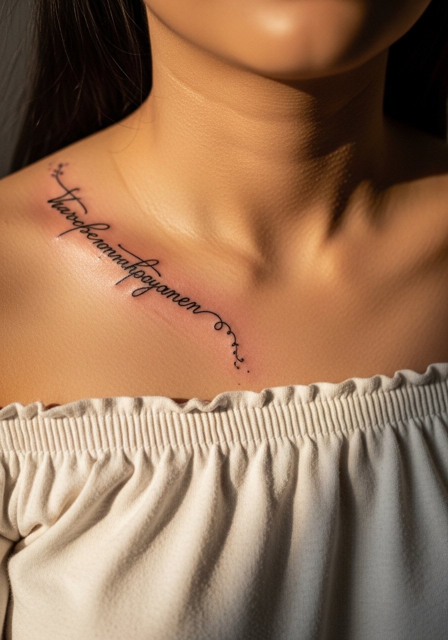
Asymmetric collarbone scripts play with negative space and look intentional when letters are spaced to follow the bone. Tell the artist you want baseline variation that flows with posture rather than a rigid straight line. Pain here is low and sessions are quick. Avoid tiny ornate fonts that create an unreadable band over time. For styling, choose an off shoulder blouse that frames the curve without collapsing fabric onto the ink.
22. Fine Line Micro-Realism of a Small Symbol on the Upper Back
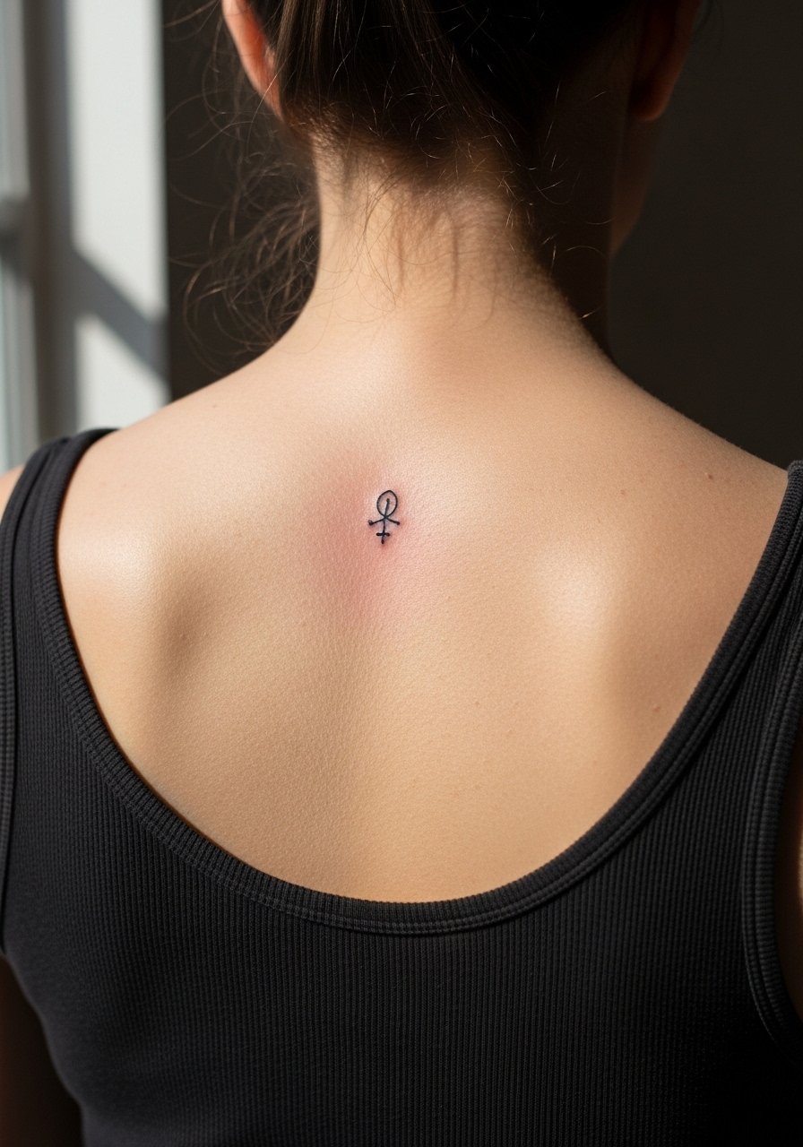
Upper back micro symbols sit on an area that heals well and tolerates slight density in shading. For a one-inch symbol, the artist may use a touch of dot work to suggest texture without heavy fill. Pain is moderate because of pressure points during the session and most pieces finish in one short visit. Specify whether you want slightly bolder lines to account for future sun exposure if you plan to be topless in summer. For the session, wear a loose tank top so the artist can work without fabric rubbing the design.
23. Fine Line Script Along the Side of the Stomach Strip
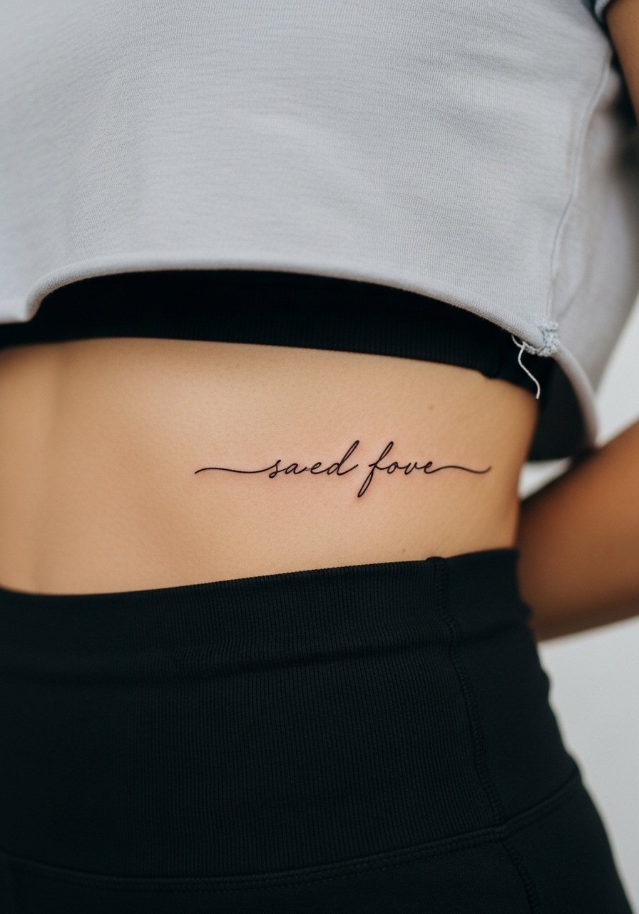
Side-stomach scripts move with the torso and need slightly wider letter spacing to avoid distortion with bending and weight change. Session pain varies and can be low to moderate. Tell the artist how you stand and where waistbands sit so the line avoids constant friction. Don’t choose extremely fine cursive here unless you are prepared for touch-ups. For the appointment, wear a cropped tee and high-waisted bottoms so the artist can easily expose the narrow strip without tugging.
24. Fine Line Script Around the Calf Inner Curve
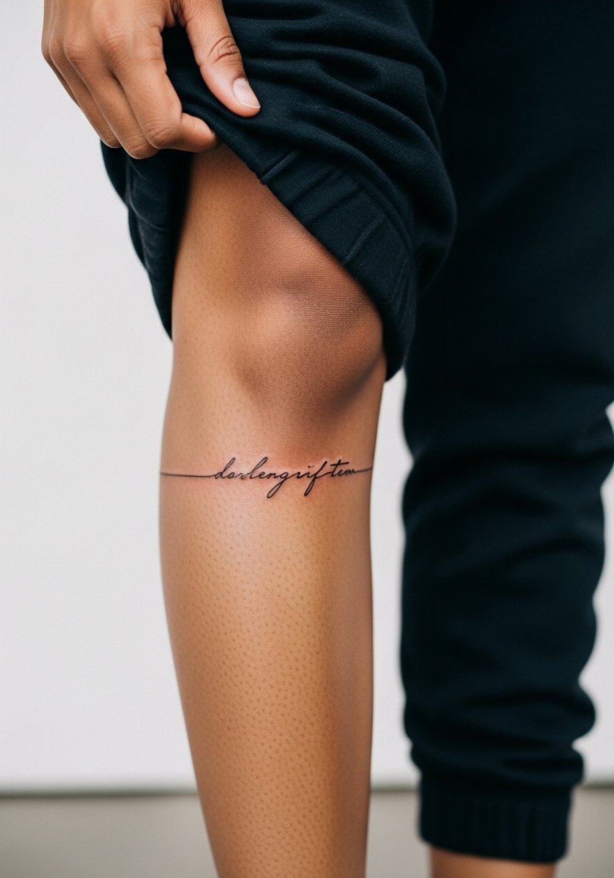
Inner calf scripts are less exposed than outer calf wraps but still need placement that reads while standing. Ask for slightly heavier line weight than a forearm quote to survive friction from pants. Pain is low and sessions are brief. A common mistake is placing script too low where socks rub constantly. For session wear, bring loose joggers you can roll up without pinching the skin.
25. Fine Line Micro Script Near the Belly Button Edge
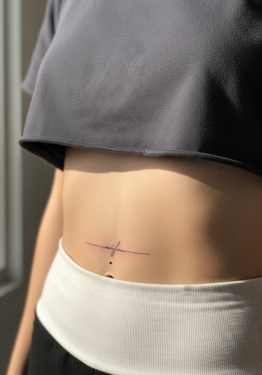
Micro script near the belly button should avoid the high-movement center and sit just off the midline where skin tugs are less intense. Expect a low to moderate pain level. Tell the artist you want the letters a touch bolder than a wrist quote to survive the daily friction from waistbands. Healed photos at three months are helpful to judge how their fine line approach fares on abdominal skin. For the appointment, choose a cropped tee with high-waisted jeans that can be shifted without exposing the full abdomen.
26. Fine Line Script Along the Lower Back Edge
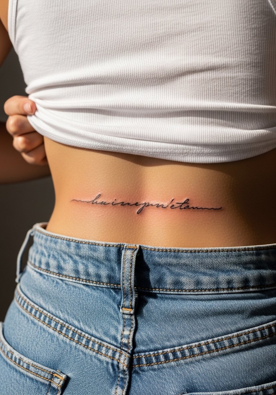
Lower back scripts need careful placement just above pant lines so everyday clothing does not rub the fresh ink. Session pain here is low and sessions are quick for short phrases. Ask the artist how they manage baseline straightness with natural spine curvature. Avoid fonts that compress into a dark bar when healed. For showing and hiding, pair the piece with a tank top and high-waisted bottoms that let you reveal the lower back intentionally.
27. Fine Line Script Along the Collarbone with a Mini Floral Accent
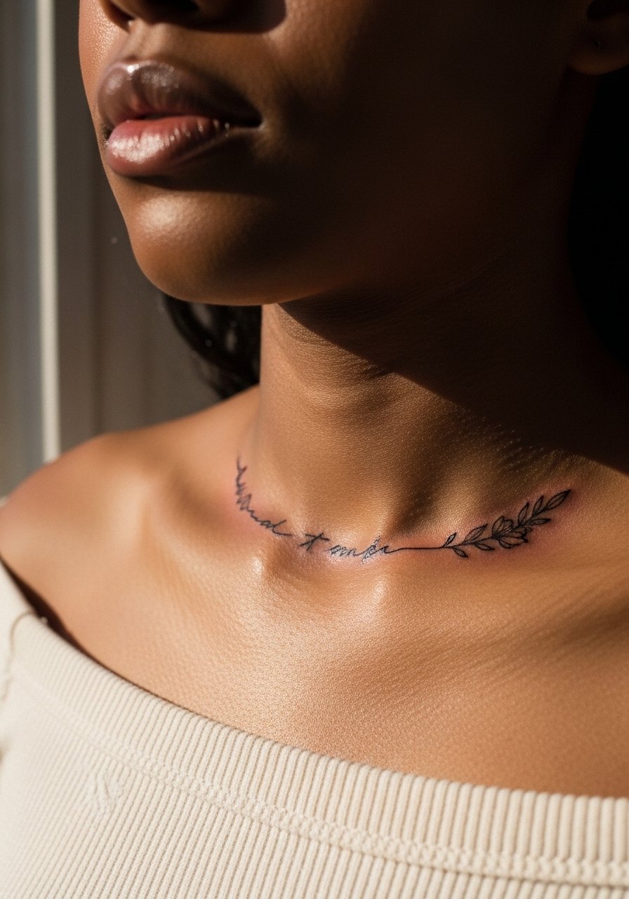
Combining short script with a single floral accent is popular because the motif frames rather than competes with the text. Keep the phrase to three to five words and position the flower at the end so the composition breathes. Pain is low at this site and sessions are typically under an hour. Ask the artist to make the floral dot work minimal so it does not fill in with the script over time. For show-off styling, an off shoulder blouse in cream keeps the eye on the script without overwhelming the neckline.
Frequently Asked Questions
Q: Do fine line scripts blur faster on hands and fingers than on forearms?
A: Yes, hands and fingers generally blur faster because the skin there renews quickly and sees constant friction. One group of artists says fine line will always soften on hands within a couple of years. Another group says careful single-needle technique and slightly bolder line weight can slow that process. Expect touch-ups every 1 to 2 years on hands, and plan placement accordingly.
Q: Should I use second-skin or dry healing for fine line pieces like those on ribs and forearms?
A: Artists disagree openly. Some prefer breathable second-skin in humid climates to reduce infection risk. Others believe dry healing preserves crisp lines by letting a scab form naturally. Ask your artist which method they recommend for the placement you picked and follow their timeline closely. If you live in a humid area and your artist favors second-skin, follow their application instructions to the letter.
Q: How do I pick a script font that reads well after healing?
A: Pick fonts with clear spacing and avoid extreme flourishes and ultra-tiny loops. Bring a sample at the size you want to the consult and ask for a stencil check on your skin. If the artist suggests slightly wider spacing or heavier line weight for durability, consider that guidance seriously.
Q: How often will I need touch-ups for wrist and ankle fine line pieces?
A: For wrists and ankles plan for touch-ups roughly every one to three years depending on sun exposure, footwear friction, and how you care for the area. Lower friction spots like the inner forearm will need touch-ups less often. Keep realistic expectations and budget touch-ups into your plan.
Q: What should I wear to my appointment for a collarbone or shoulder blade script?
A: Wear clothing that gives the artist clear access without bunching on the area. For collarbone or shoulder blade pieces a wide-neck shirt or an off-shoulder top you can pull aside works best. Loose, comfortable clothing also helps you sit or lie down without creating pressure on the fresh ink.