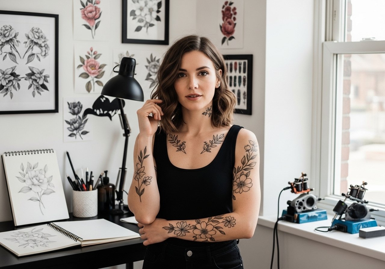
Fine line tattoos are trending for a reason, but the lines between homage, fan art, and legal gray areas are blurrier than most people expect. Abstract takes on iconic silhouettes let you nod to a childhood symbol without copying a poster-perfect image. Below are creative, wearable options and what to tell your artist at the consultation to keep the design legal, long-lasting, and flattering on skin.
1. Fine Line Abstract Wrist Silhouette
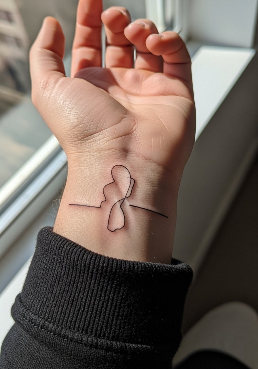
This tiny silhouette works if you want something discreet that still reads as playful. Fair warning, the wrist is a high-friction area so the smallest details can blur by year three. Tell your artist to keep the negative space intentional and the linework slightly bolder than ultra-micro lines so the shape stays legible as it settles. The session is quick and usually under an hour but expect some tenderness. For showing it off, pair it with a thin chain bracelet that sits just next to the tattoo, the metal draws the eye without crowding the silhouette.
2. Watercolor Splash Inner Forearm
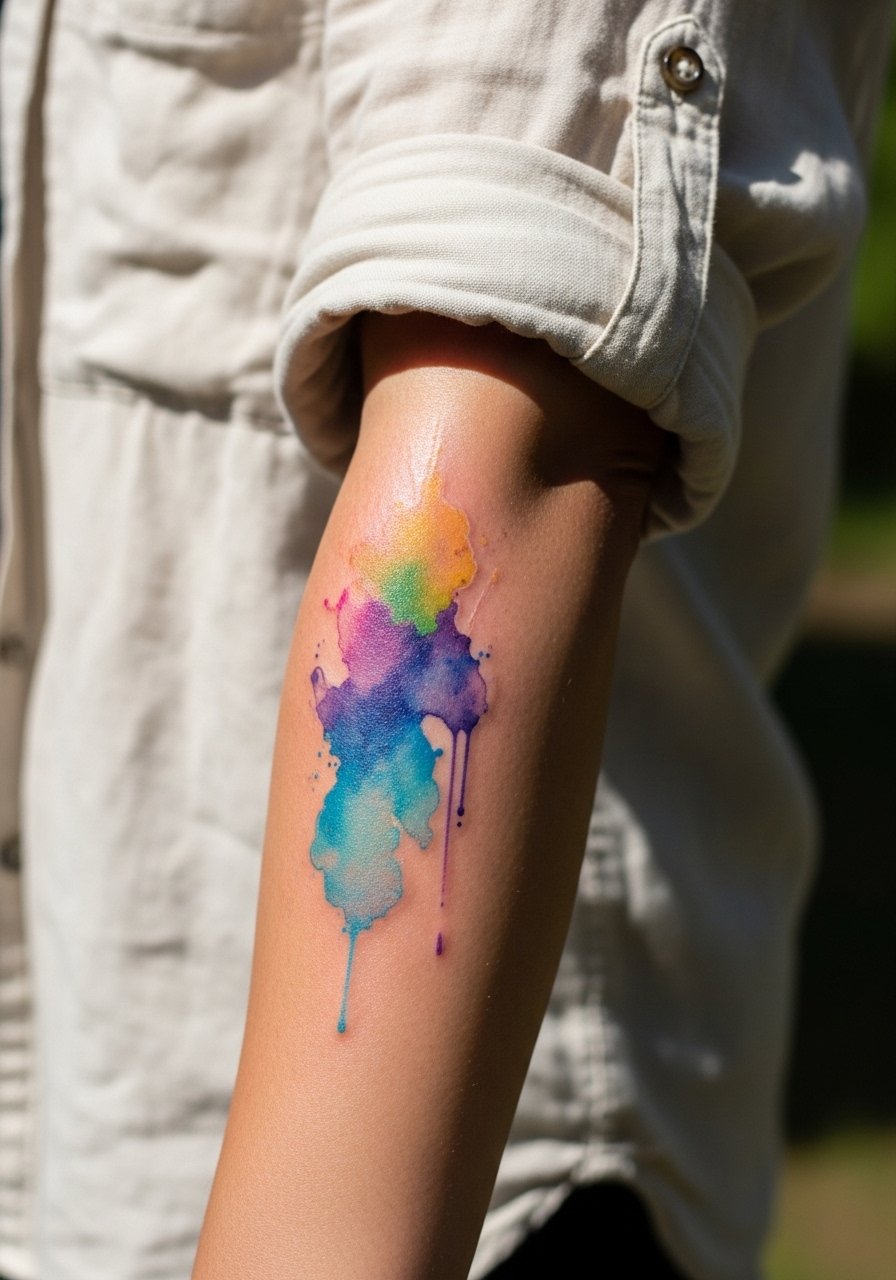
A watercolor approach turns the familiar shape into a suggestion rather than a literal illustration. The inner forearm gives you a long canvas so the splash can breathe. Common mistake is asking for overly diffuse edges with low saturation, which leaves nothing to read after a year. Ask for saturated anchors in the design, small pools of color the artist will reinforce to help the piece age better. The session feels like steady buzzing, with less breakthrough than ribs. Roll your sleeve up and wear a loose button-down shirt on appointment day for easy access.
3. Minimalist Single-Contour Ankle
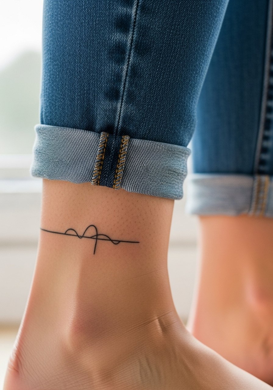
An ankle piece reads clean from across a room when it uses one confident contour line. The biggest mistake is going too intricate for that small spot. Ask your artist to simplify the shape to one or two continuous strokes and to scale it so the line has room to breathe. Expect more soreness on the ankle than forearm because of shallow tissue. For show-off styling, a pair of minimalist sandals keeps the ankle visible without distraction.
4. Geometric Fragment on Upper Arm
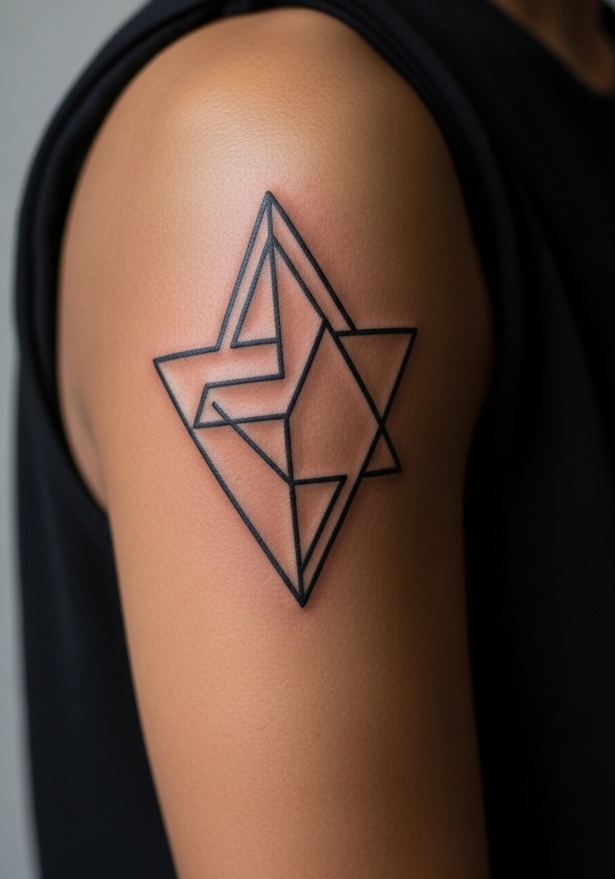
Geometric fragmentation takes the recognizable ears and reduces them to intersecting shapes that form a nod without copying a reference image. The outer upper arm is forgiving for detail and ages well because there is more tissue to hold linework. A common version that ages poorly packs shapes too tightly. Ask for spacing between shapes and for slightly heavier lineweights where angles intersect so the pattern keeps definition at year five. Session time is usually two to three hours. Pair this with a sleeveless linen top to show the geometry cleanly.
5. Negative Space Collarbone Outline
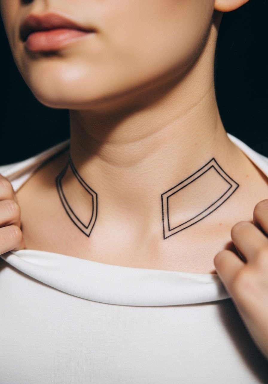
A collarbone placement uses skin as the linework by relying on negative space inside a block of black or color. The clavicle area moves with clothing so choose a size that avoids tiny internal detail. The real mistake is expecting micro detail to hold where skin creases. Expect tenderness and sharp needle sensation from the thin skin. For styling, open-neck dresses or a thin chain pendant necklace frame the negative space without covering it.
6. Tiny Abstract Finger Mark
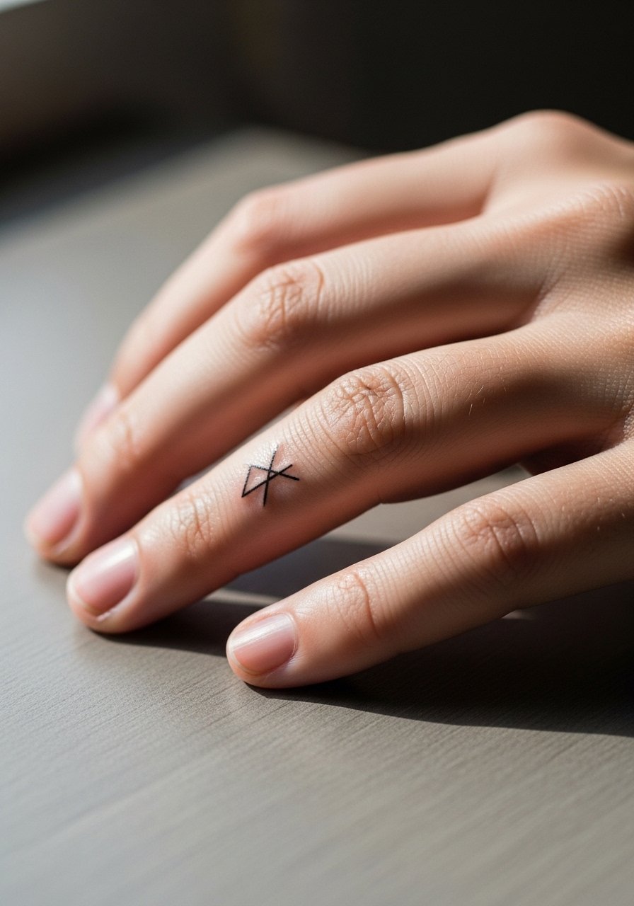
Finger placements age differently because of constant washing and movement. Tiny marks that suggest an iconic silhouette can look crisp at first and then require touch-ups sooner than forearm work. The advice most artists give is to keep the design bold and compact, and to plan for a touch-up at year two. The session is short but painful and can sting more than expected. For the session, bring a pair of loose-fitting gloves to keep hands warm on the ride home if it's cold, and avoid tight rings that press on the fresh ink.
Studio Day Picks
The varied small placements above, from fingers to collarbones, each ask for slightly different prep and first-week protection. These five items smooth the appointment and the first healing window for the pieces in ideas 1 through 6.
-
Stencil transfer paper kit. Lets you preview placement and size directly on skin, especially helpful for the wrist silhouette and collarbone negative space pieces.
-
Thin protective film roll. Useful for finger and wrist tattoos to reduce friction during the first few days of healing.
-
Unscented gentle body wash. Cleanses delicate areas like the ankle and inner forearm without irritating fresh linework.
-
Small cooling gel patches. Apply after the initial crusting to ease soreness for thin-skin spots like the collarbone and fingers.
-
Aquaphor healing ointment. A thin layer in the early days protects small-line work while allowing the skin to breathe.
7. Stipple-Shaded Ribcage Pairing
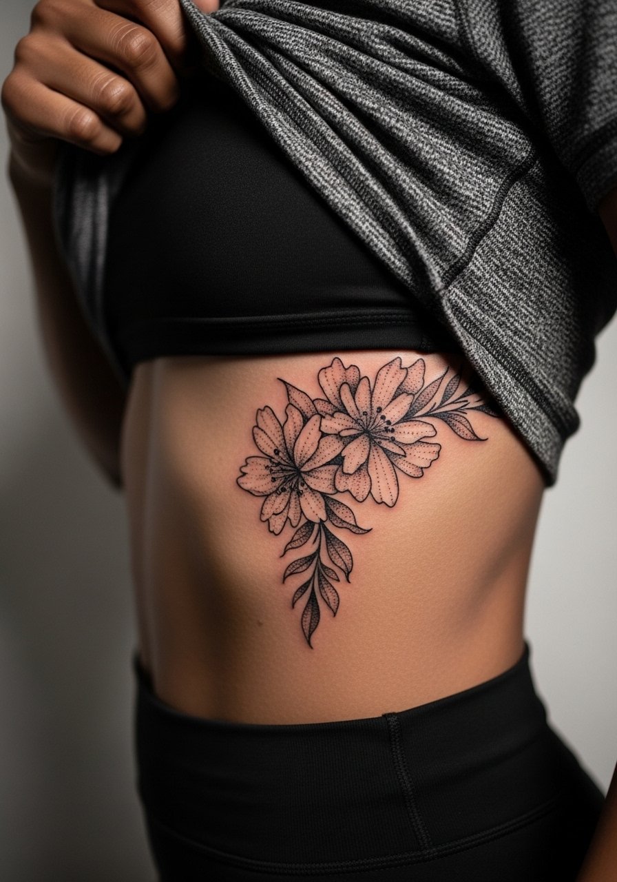
Ribcage pieces are dramatic but demand respect for aging. Artists split into two camps on fine line there. One camp says the stretch and movement blur lines within two years. The other camp argues that with proper depth and spacing, fine line settles fine on ribs. Name both viewpoints during your consult and ask where your artist stands. Stipple shading helps here because dot work holds texture better than continuous thin lines on curved, moving skin. The session can be long and sore, plan for breaks and wear a zip-up hoodie you can lift for access and pull down easily after.
8. Surrealist Back Shoulder Patch
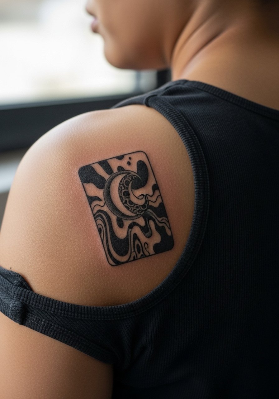
An upper back patch gives room for surreal abstraction that reads at a distance. Common mistake is compressing complex elements into a small patch and then wondering why it looks muddled after healing. Tell your artist to prioritize negative space and clear focal shapes so the piece retains its surreal identity over time. Sessions can be multiple hours. For the appointment, bring a loose tank top you can shift for access without rubbing the fresh area.
9. Micro-Realism Calf Portrait
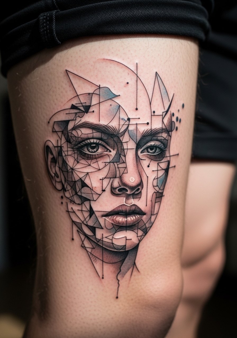
Calf tattoos tolerate micro detail better than extremities because of thicker tissue. A micro-realism take can include tiny cues that reference a well-known silhouette without copying it exactly. The mistake is pushing contrast too high in the initial session, which can create overly dark saturation that looks muddy once healed. Ask for layered sessions if the artist suggests it, and plan for a touch-up at year two for micro shading. For outings after healing, mid-calf pieces look great with cropped trousers or high-top sneakers that stop just above the tattoo.
10. Continuous Line Ear-Behind Accent
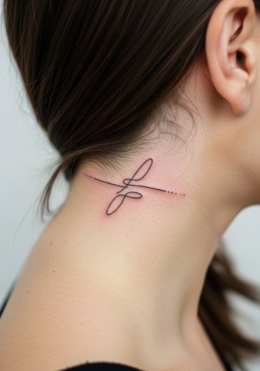
Behind-the-ear placements read as an intimate accent that peeks through hair. The key is to describe exactly where you want negative space because the area is compact and curves. Pain is moderate and the session is brief. Keep expectations realistic about longevity because exposure to sun and hair products can fade delicate lines faster. For the appointment, wear a wide-neck shirt so you can comfortably expose the area and keep hair out of the way.
11. Collage Sleeve Pocket Cluster
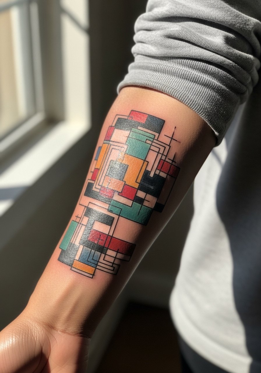
A pocket cluster sleeve mixes several small abstract references scattered along the forearm, which keeps each element readable. The trap is packing too many micro elements into the same vertical space. Tell your artist to plan negative space pockets and consistent lineweight so the cluster reads like a cohesive whole at year three. Sleeve sessions are staged across multiple visits. For showing it off in warm months, rolled sleeves over a linen shirt frame the cluster without hiding details.
12. Dotwork Sternum Motif
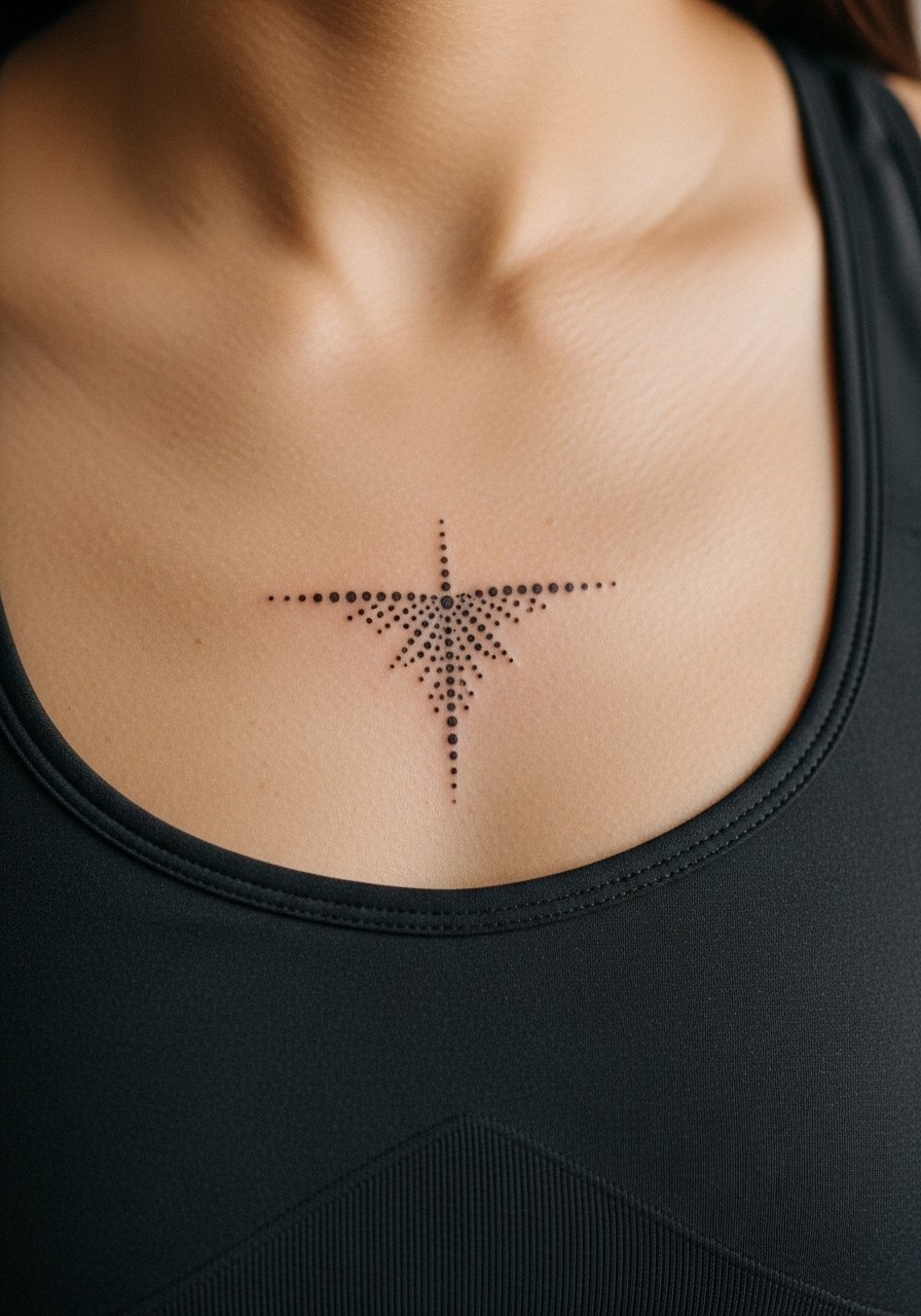
Sternum tattoos are intimate by design and require an artist experienced with the area. Skin there moves and stretches differently so dotwork is often safer than continuous thin lines. The common mistake is asking for tiny script or dense micro detail that loses clarity as the skin shifts. Sessions can be uncomfortable and may take several sittings. Consider a specialist and ask to see healed sternum examples in their portfolio before booking.
13. Neon Ink Outer Thigh
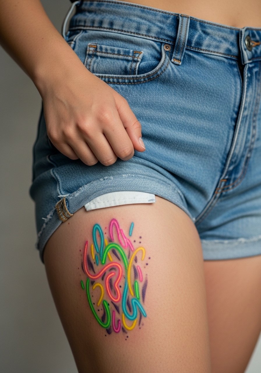
Outer thigh placements allow for bolder color choices because the area rarely gets daily abrasion. Neon or fluorescent tones can look vivid fresh and hold surprisingly well when packed properly. The mistake is using thin lines with neon alone, which can fade into a washed look. Ask for a saturated base color with a few darker anchors to keep contrast. For the session, wear high-waisted shorts you can slide down slightly for access without exposing more than the tattoo zone.
14. Blackwork Minimal Hip Bloom
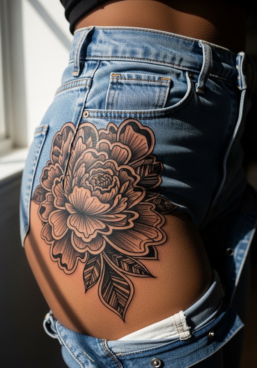
Hip tattoos are sensual and private, and blackwork blooms read clearly on that canvas. The biggest mistake is attempting dense micro detail too close to the pant line where friction will speed fading. Plan for a margin of skin between the design and typical clothing seams. Sessions can be medium-length and the area is moderately painful. If you plan to wear swimwear, think about placement in relation to bikini or pant lines.
15. Abstract Constellation Near Collarbone
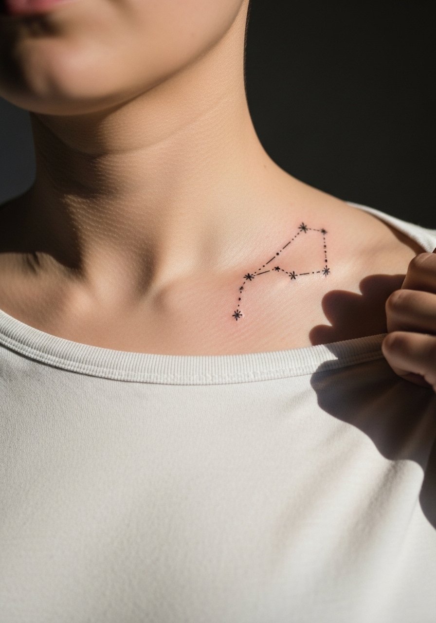
A constellation approach uses tiny dots and connecting lines to suggest a figure without a literal depiction. On the area near the collarbone, spacing is critical so dots do not merge over time. Tell your artist to space the stars and use slightly heavier dots to retain presence as the skin moves. This placement responds well to simple jewelry and looks intentional with a thin chain pendant that sits above the cluster.
16. Asymmetrical Eye on the Hand
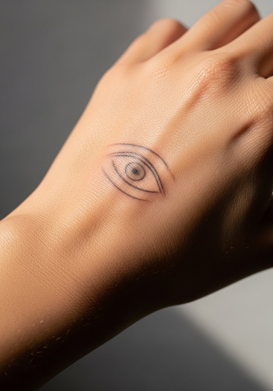
Hand tattoos are visible and fast to show, but they live in one of the harshest wear zones. An asymmetrical eye design can age into a textured mark rather than a crisp illustration. The realistic expectation is touch-up sooner than arm work. Discuss with your artist how heavy to make the outer contour and ask about pigment choice. For the session, avoid tight rings for a week and consider keeping the hand elevated briefly after the appointment to reduce swelling.
17. Split-Face Collarbone and Shoulder Flow
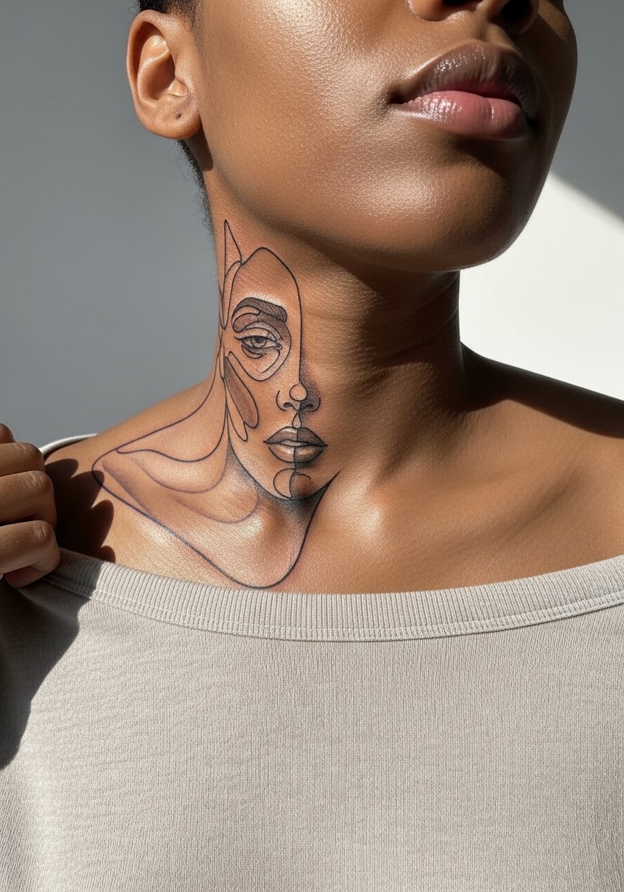
Flowing pieces that cross the collarbone and shoulder need a design that reads as one across two moving surfaces. The error is treating each side as separate. Tell your artist you want a single visual rhythm and consistent spacing so the piece stays coherent as you move. Sessions can be split into two visits. For styling, a one-shoulder top showcases the transition.
18. Fragmented Geometry on Nape of Neck
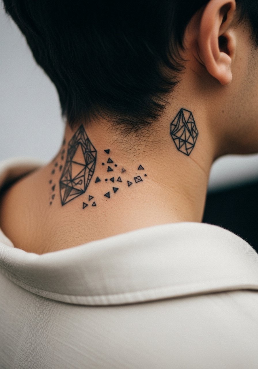
Nape placements are discreet and peek out with certain hairstyles. Geometry here must account for hairline and neck movement. A common mistake is over-detailing close to the hairline, which can get rubbed by collars or hair. Ask for slightly larger shapes with clean negative space. The session is brief and sensitive. For appointments, wear a collar that pulls to the side so you can expose the nape without removing more clothing.
19. Palm-Side Wrist Chain Link
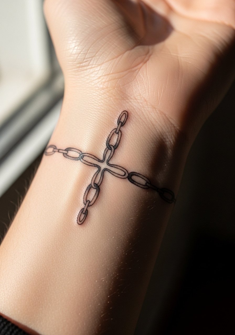
A chain-link motif on the inner wrist acts like an accessory that does not require daily jewelry. Keep lines moderately bold; ultra-fine chain links can blur with constant motion. The common mistake is asking for open gaps in tight spots where the skin folds. Expect frequent hand washing to affect the early weeks, so guard the area when possible. For showing it off, a minimalist watch works well but avoid tight straps during the first month.
20. Micro Script Along Inner Bicep
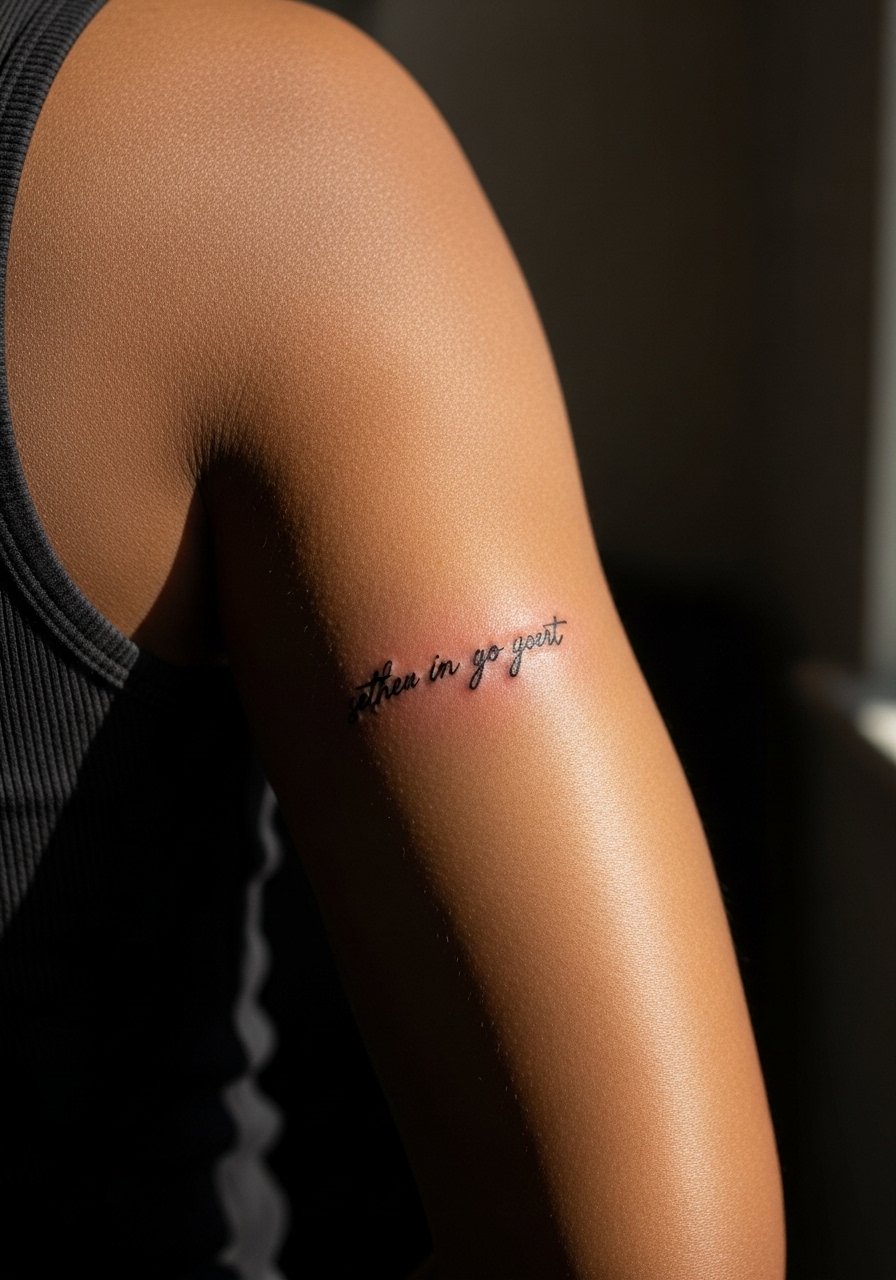
Inner bicep is a sheltered spot, so micro script and tiny motifs can last well compared with hands or ankles. Still, dense micro letters can spread if the script is too fine. Ask for slightly heavier stroke than you think, and request a spaced layout so the letters do not merge over time. Sessions are moderate and the area is less painful. For the appointment wear a loose tank top you can lift without discomfort.
21. Minimalist Calavera-Ankle Mix
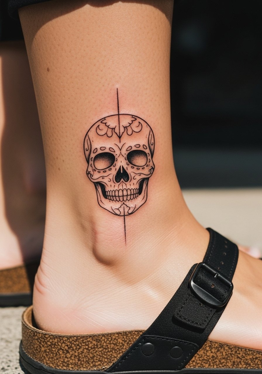
A small calavera nod reshaped into an abstract element keeps imagery suggestive and personal. The ankle tolerates simple silhouettes well but loses micro detail. The mistake is compressing too many motifs into a coin-sized patch. Opt for bold, spare elements and plan for a touch-up at year two. Pain is moderate and the session is fast. For showing it off, sandals or cropped pants keep it visible without aggravating the area.
Frequently Asked Questions
Q: Will abstract watercolor techniques hold up on forearms compared with blackwork?
A: From what I've seen, watercolor-style pieces can look gorgeous for the first year but often need a touch-up by year three if they rely solely on soft washes. Blackwork or saturated anchors help watercolor elements stay readable longer. Placement, sun exposure, and pigment saturation matter more than technique alone.
Q: Are character-inspired tattoos a legal risk if they are clearly abstracted?
A: There are two camps. One warns that close replicas can attract legal attention or cause issues for artists who sell prints. The other camp sees abstracting a silhouette as personal art and expression that rarely causes problems. If this is a concern, discuss originality with your artist and favor suggestions and geometric reductions rather than exact copies.
Q: How often should I expect touch-ups for fine line work on high-movement areas like the wrist and hands?
A: Expect touch-ups around year two to three for hand and wrist work more often than for the forearm or calf. The exact timing depends on how you care for the piece, daily friction, and sun exposure.
Q: What should I wear to a sternum or ribcage session to make it easier for the artist and more comfortable for me?
A: Wear a fitted sports bra or a cropped top that you can lift slightly so only the tattoo area is exposed. This protects modesty and limits skin rubbing after the session.
Q: Can I combine dot work and geometric fragments to avoid literal imagery while keeping a recognizable nod?
A: Yes. Dot work provides texture and longevity where geometry gives structure. Ask your artist for a layout that balances spaced dots with geometric anchors so the piece reads as intentional rather than a hidden replica.