
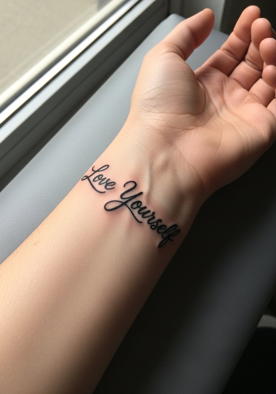
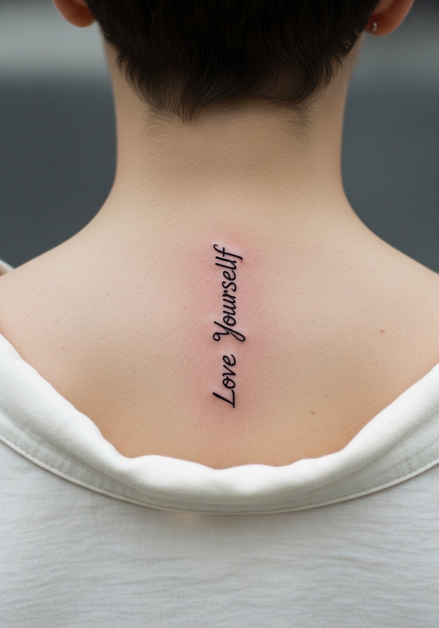
Fine line trends look gorgeous on a feed, but blackwork holds up in the long run. Bold, saturated black reads the same washed-out winter or sunlit summer, and it hides minor touch-ups better than fragile micro lines. If you want a "love yourself" reminder that still reads at year five, think about scale, placement, and contrast. The first idea below is a simple inner forearm script that tests those choices in practice.
1. Bold Script "Love Yourself" on Inner Forearm

I recommend a thicker, slightly condensed script for inner forearm text because the area moves and stretches when you bend the arm. Tell your artist you want the phrase in a bold blackwork hand so the counters stay readable as the skin ages. Fair warning, too-small lettering blurs into a smudge by year three. Pain here is low to moderate and sessions are usually short. For showing it off, roll a sleeve or wear a loose button-down shirt that can be pulled aside during the session and frames the forearm afterward.
2. Tiny Heart, Heavy Fill on the Wrist

Fair warning, the wrist is high friction and fine details fade fast. A tiny black heart with heavy fill survives better than one made of hairline strokes. When you consult, ask for slightly thicker linework and a dense fill so touch-ups are less frequent. Expect the session to sting more on the top of the wrist and take under an hour. For the appointment wear a short-sleeve tee you can push up easily. A common mistake is asking for micro detail in a zone that sees constant washing and bracelets.
3. Scripted Sternum Piece, Centered Under a Sports Bra
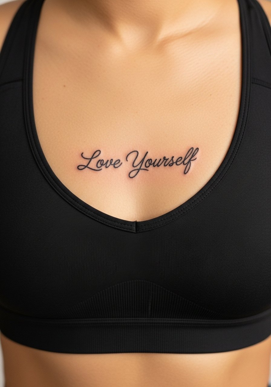
Most people underestimate how a centered sternum script reads with clothing. A slightly curved baseline that follows the rib arc reads cleaner than a straight line. The sternum is more sensitive, so plan for a longer session and bring an extra layer you can remove easily. For the appointment choose a fitted sports bra that the artist can work around without you being uncomfortable. Some artists split on whether fine script holds on sternum. One camp says movement causes blurring, the other says precise depth and spacing make it settle. Ask where your artist stands.
4. Blackwork Mandala Over the Ribcage

Pain warning, ribs are high on most scales, but the result can be striking. Dense blackwork mandalas survive stretching better than wispy mandalas. Tell your artist you want room between concentric layers so the dots and stipple shading do not merge over time. Sessions can run long, so break the work into two sittings if you prefer. There is a controversy here too. One group of artists avoids dense mandalas on ribs citing skin movement and blowout risk. The other group uses larger spacing and heavy saturation and reports good longevity. Be explicit about spacing in consultation.
5. Negative Space Rose on the Outer Shoulder

There's something about negative space in blackwork that looks deliberate from a distance. On the outer shoulder you get longevity and readable silhouette. Mention to the artist you want the petal outlines bold with internal negative zones rather than fine detail that will soften. The session is tolerable and often under two hours. For showing it off try a loose tank top so the shoulder sits at the edge of the fabric, which draws attention to the motif. Avoid asking for tiny text inside petals because fine letters age poorly here.
6. Thick Script Around the Wrist as a Band
Visual impact lead works here because a script band reads like jewelry. Ask for slightly larger letterforms and a dense black fill so the band keeps its rhythm through daily wear. The wrist is a touch-sensitive area so expect the artist to work more slowly and carefully. Wear a minimalist watch when showing the piece, not heavy bracelets that will rub the ink. The common mistake is crowding the letters into a small circumference, which forces the lines too close and causes early blurring.
Studio Day Picks
The wrist and sternum pieces above demand different prep than the shoulder and forearm pieces, so these items smooth the session and the first week.
-
Stencil transfer paper kit. Lets you test the exact placement on the forearm or chest before the needle touches skin, which is crucial for text pieces.
-
Topical numbing cream. Applied as directed about forty five minutes before a wrist or sternum session can reduce surface pain without interfering with linework.
-
Thin protective film roll. Useful for small wrist or finger pieces that face friction during the first week of healing.
-
Fragrance-free gentle body wash. Cleans the healing area without stripping oils that help fine line and dense blackwork alike.
-
Aquaphor healing ointment. A thin layer in the first few days helps lock moisture for dense fills so saturation sets evenly.
7. Small Script Behind the Ear, Visible with Hair Up

The behind-the-ear spot is discreet and reads as a private reminder when your hair is up. Because of the sensitive area and visibility, the session is short but precise. The artist will likely use a single pass for text to avoid overworking the thin skin. For the appointment wear a hairstyle or a clip so the artist can access the area easily. A common mistake is requesting extremely fine micro script here. Thicker, legible lettering lasts longer. Also note that some workplaces view visible neck or ear tattoos differently, so consider placement and career before booking.
8. Block Lettering on the Calf

Personal observation lead fits for calf work because it often ages well. Block lettering and tight black fill resist the stretch the leg goes through more than delicate cursive does. Sessions here are moderate in pain and can be done in one sitting. Tell your artist you want letters spaced generously so each character preserves its negative space over time. For showing it off, roll a pant leg or wear a high-waisted short so the calf becomes a focal point. Avoid requesting hairline serifs that will merge with skin texture.
9. Stipple-Shaded Heart Over the Collarbone
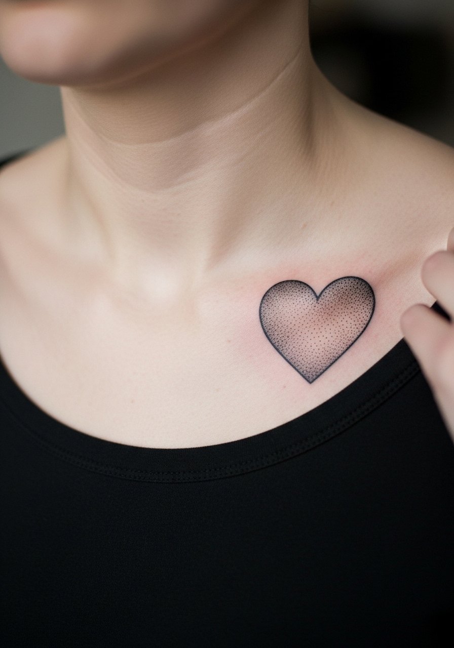
Aging and healing lead applies here because stipple shading shows its texture best after six months. Ask for dot work density rather than solid blocks to keep a soft halo effect. Collarbone is bony and the needle feels sharper there, so plan for a short but sensitive session. For show-off outfits choose an open-neck blouse that frames the clavicle without covering the work. A common mistake is asking for heavy saturation too close to the bone, which creates longer-lasting swelling and can affect dot clarity.
10. Thick Black Anchor on the Side Wrist

Mistake lead: people often pick intricate anchors with thin lines for the wrist and wonder why the detail softens. A chunky anchor with solid black blocks reads longer and handles constant hand motion. Sessions usually finish quickly. Tell your artist to avoid micro cross-hatching in that spot. For the appointment wear a short-sleeve shirt you can move up without tugging. Also be mindful of bracelets or watch straps that will press on the area while it heals.
11. Chain-Link Band as a Finger Wrap

Pain warning lead is appropriate because finger skin is thin and ink migrates easily. A heavier blackwork chain-link band has a better chance of staying readable than a delicate filigree ring. Sessions are short but may need touch-ups at year one. Ask your artist for slightly exaggerated links and leave space between links so they do not merge. For showing it off choose thin rings that do not cover the ink. Be aware some employers still have conservative policies about visible hand and finger tattoos.
12. Blocky Script on the Side Rib

Consultation lead: when you sit with your artist for rib text, show them exactly how you hold your torso when standing and sitting. The skin there stretches differently, so the wording should follow the body's curve rather than sit flat. Pain is higher and sessions may be split. The common mistake is demanding tiny, ornamental letters in a stretched zone. For the session wear a cropped top you can lift slightly without discomfort. If longevity is critical opt for blocky type rather than delicate cursive.
13. Solid Black Heart on the Back of the Hand
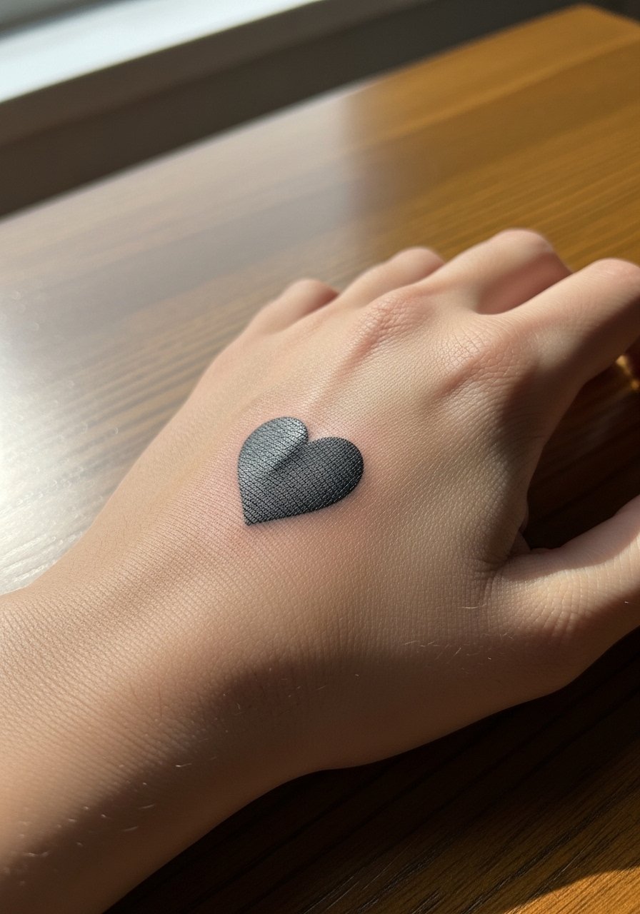
Visual impact lead applies because hand pieces read immediately and demand presence. Back-of-hand work sees heavy exposure to sun and washing, so expect touch-ups sooner than forearm pieces. Tell the artist you accept a maintenance plan and discuss how often you are willing to touch up. For the session avoid rings or jewelry that impede access. Also remember hand tattoos affect job prospects in some fields. The trade-off is clear visibility for frequent personal reminders.
14. Minimalist Spine Script from Nape to Upper Back
Pain warning lead: a spine script is sensitive at the nape and more tolerable lower down. Make sure the script follows the spine's natural curve and that letter spacing is generous. Sessions vary depending on length, but small scripts fit into a single appointment. For the session choose a wide-neck shirt you can pull aside easily. A common mistake is asking for tiny continuous lines that blur where skin flexes.
15. Bold Geometric Wrist Cluster
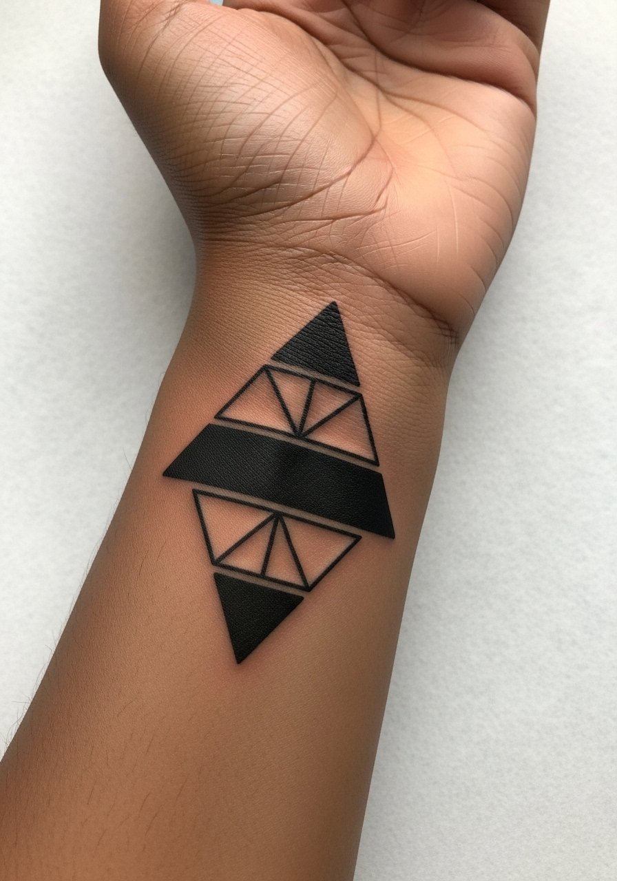
Mistake lead: small geometric shapes need breathing room or they fuse. On the wrist choose bold, simple blocks and allow negative space to separate forms. Pain is moderate and the session time is short. Tell the artist you prefer shapes with clear negative margins to prevent the design from melting into a single dark patch over time. For showing the work, try a slim bracelet that sits beside the cluster without crowding it.
16. Heavy Black Floral on the Upper Thigh
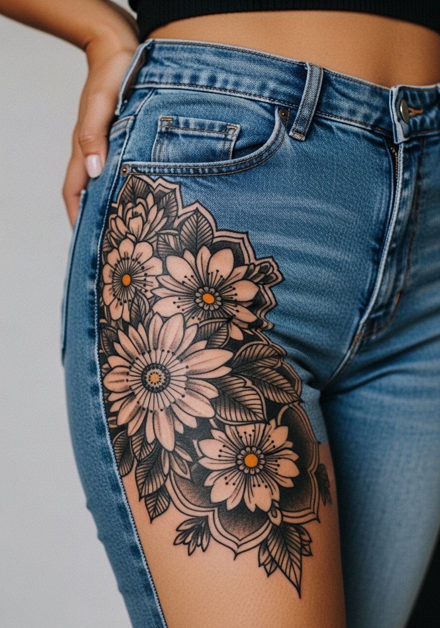
Aging lead: thigh pieces tend to hold black saturation well because the area is less sun-exposed. A heavy black floral ages better than tiny shaded petals in this zone. Sessions can be long and the pain is usually moderate. For the appointment wear high-waisted denim you can lower slightly so the artist has access without you feeling exposed. Avoid asking for micro stippling in tight areas that will lose definition with time.
17. Bold Script Around the Ankle
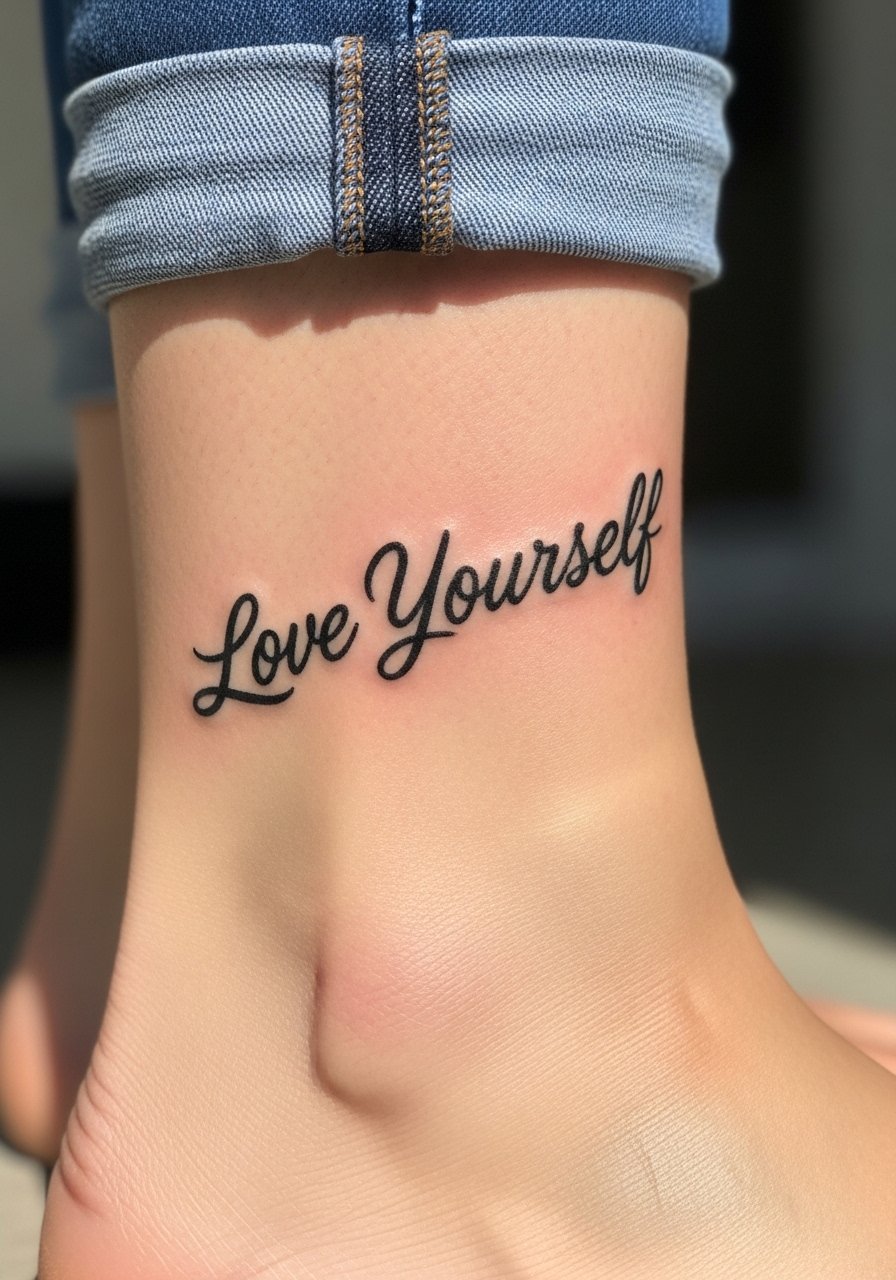
Consultation lead: ankle bands look best when letters have room and a steady baseline so shoe movement does not distort the reading. The ankle takes less time but the skin can be bony, so expect a sharper sensation. During the session wear shoes you can remove easily and pants you can roll up. A lightweight ankle sock pulled below the cuff keeps the area clean after the artist bands it. The common mistake is wrapping too much text into a small circumference which compresses the lettering.
Frequently Asked Questions
Q: Will tiny black script on the wrist need touch-ups sooner than a thick black band?
A: Yes, thin script on high-friction zones tends to soften faster than dense bands. Expect touch-ups earlier for micro letters. If longevity is a priority ask for slightly larger letterforms and discuss a planned touch-up timeline with your artist.
Q: Is fine line safe for sternum or rib placements given stretching and movement?
A: It depends on size and spacing. One group of artists avoids fine line on ribs because skin movement can make lines blur. Another group says proper needle depth and larger spacing help fine line survive. For sternum ask for slightly bolder line weights or spaced scripts to improve long-term clarity.
Q: How should I dress for a shoulder or collarbone session to give the artist easy access?
A: Wear something that can be pulled aside without getting in the way, like a wide-neck shirt or a tank you can remove. Looser fabrics reduce pressure on the area after the session and make the setup faster.
Q: Do hand and finger tattoos still affect job prospects?
A: Some industries remain conservative about visible hand tattoos. If career flexibility matters discuss placement alternatives or hidden spots with your artist. In creative or service fields policies vary widely, so weigh visibility against your day-to-day needs.
Q: How long after a dense blackwork mandala on ribs should I expect to see how it truly healed?
A: Plan on six to eight months to judge the healed look. Early swelling and scab can hide the final texture. After that period you will see how stipple and negative space settled and whether a touch-up is needed.