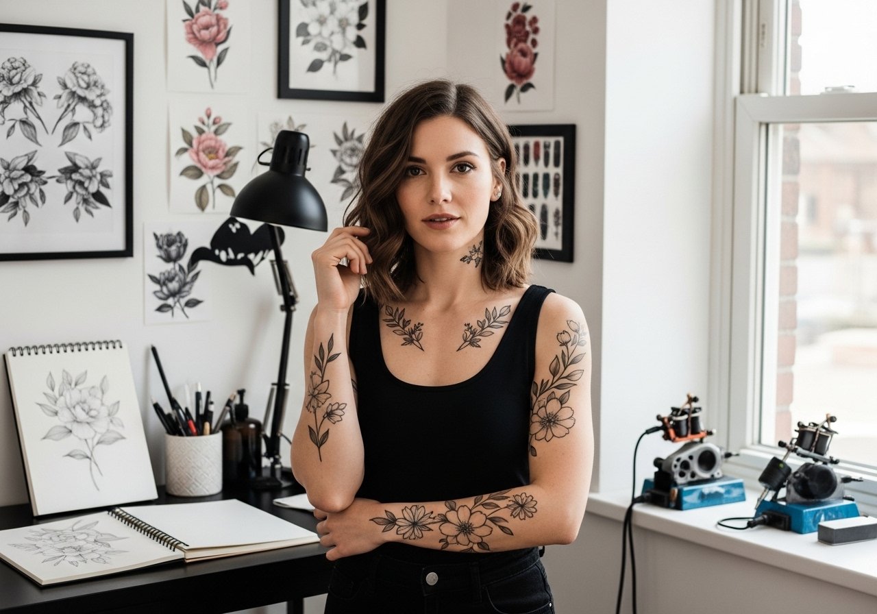
Fine line sleeve trends look delicate on a phone screen, but the moment you sit in the chair you learn that placement, spacing, and skin type decide longevity. Saturated neo-traditional color holds differently from watercolor washes, and sleeve pieces that plan breathing room between elements usually need fewer touch-ups. Below are 21 colorful girly sleeve ideas with notes on what to ask your artist, how they age, and how to style them so the work reads like part of your wardrobe.
1. Fine Line Botanical Inner Forearm Sleeve
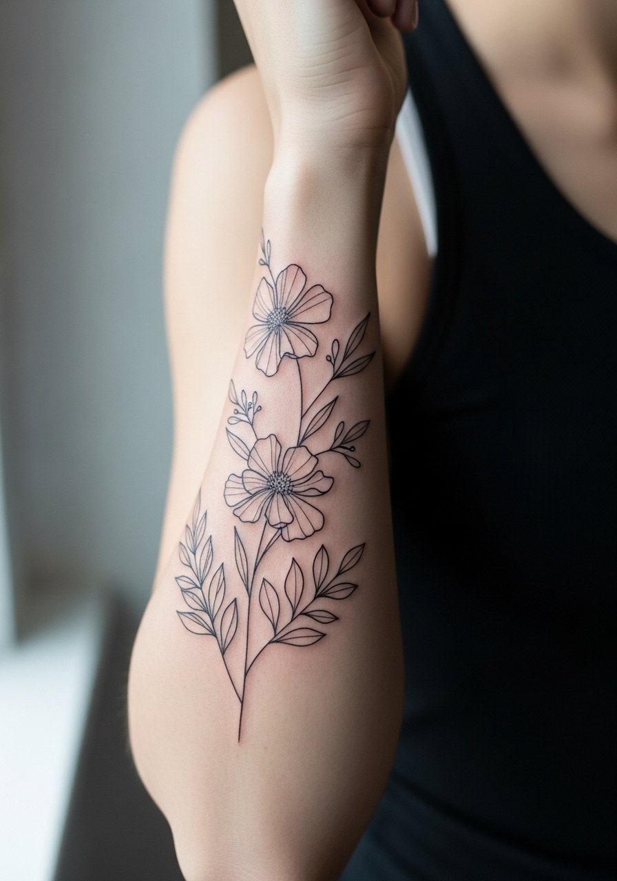
I’ve seen this version last best when artists space leaves and stems instead of crowding tiny details together. Ask your artist for slightly heavier line weight in the outer contour so the silhouette stays readable as the piece settles. Fair warning, the inner forearm can feel like a 4 out of 10 on most pain scales, but sessions are tolerable in 90-minute blocks. Common mistakes include asking for ultra-fine tiny veins that blur into fuzz after year two. For showing it off, roll sleeves or wear a loose button-down shirt in neutral tones to frame the botanical flow.
2. Pastel Watercolor Floral Half Sleeve
Most watercolor pieces fade into soft bruising when done without anchoring outlines. The trick I recommend is asking for subtle black or dark gray anchors around key petals so the color has structure as it ages. Artists disagree on whether watercolor needs standard ointment or protective film during healing. One camp favors occlusive films for less scabbing and color retention. The other camp prefers breathable, dry-healing approaches to avoid trapped moisture. Decide where your comfort lies and ask how they handle scab management. For appointments, bring a racerback tank so the artist can access the shoulder and upper arm easily.
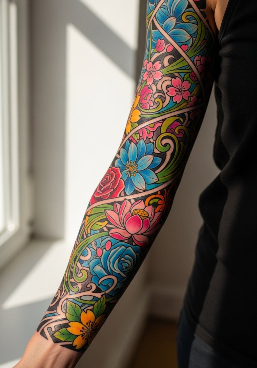
3. Neo-Traditional Rose and Ribbon Full Sleeve
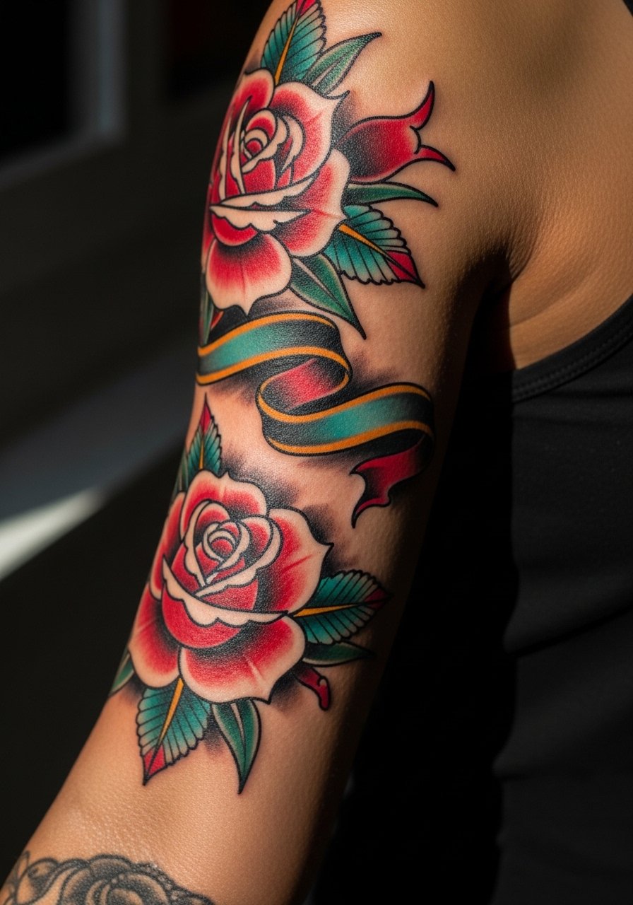
There is something about saturated color fields with bold outlines that reads from a distance. If you want strong color longevity, tell your artist to build saturation in layers across sessions rather than blasting too much color in one pass. Expect touch-ups around year three for mid-tones and highlights. A common error is requesting tiny roses in a dense band that later merge; scale the roses to the arm width. For a night out, this sleeve pairs well with an open-back midi dress that reveals shoulder and upper arm work without competing.
4. Celestial Script and Tiny Star Clusters
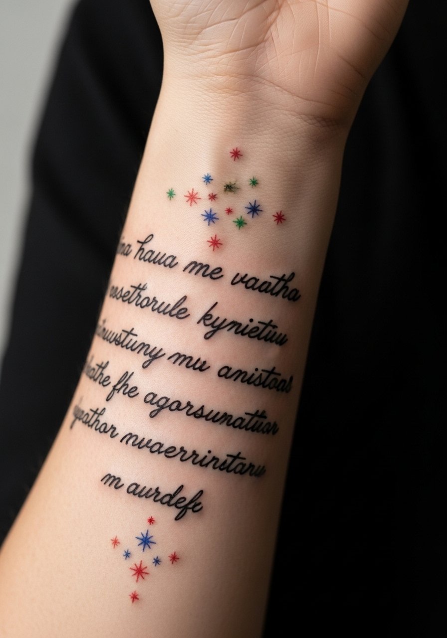
When you want readable words integrated into a sleeve, always supply exact text and preferred typography during consultation so the stencil matches your vision. Text can blur over time if letters are too close, so wider spacing protects clarity. Session feels minor on forearm but wrist segments can spike toward a 5 or 6. Wear thin bracelets that do not rub the wrist during the first month. Pair the sleeve with a thin chain pendant necklace for balanced jewelry that keeps the arm the focal point.
5. Colorful Butterfly Migration Sleeve
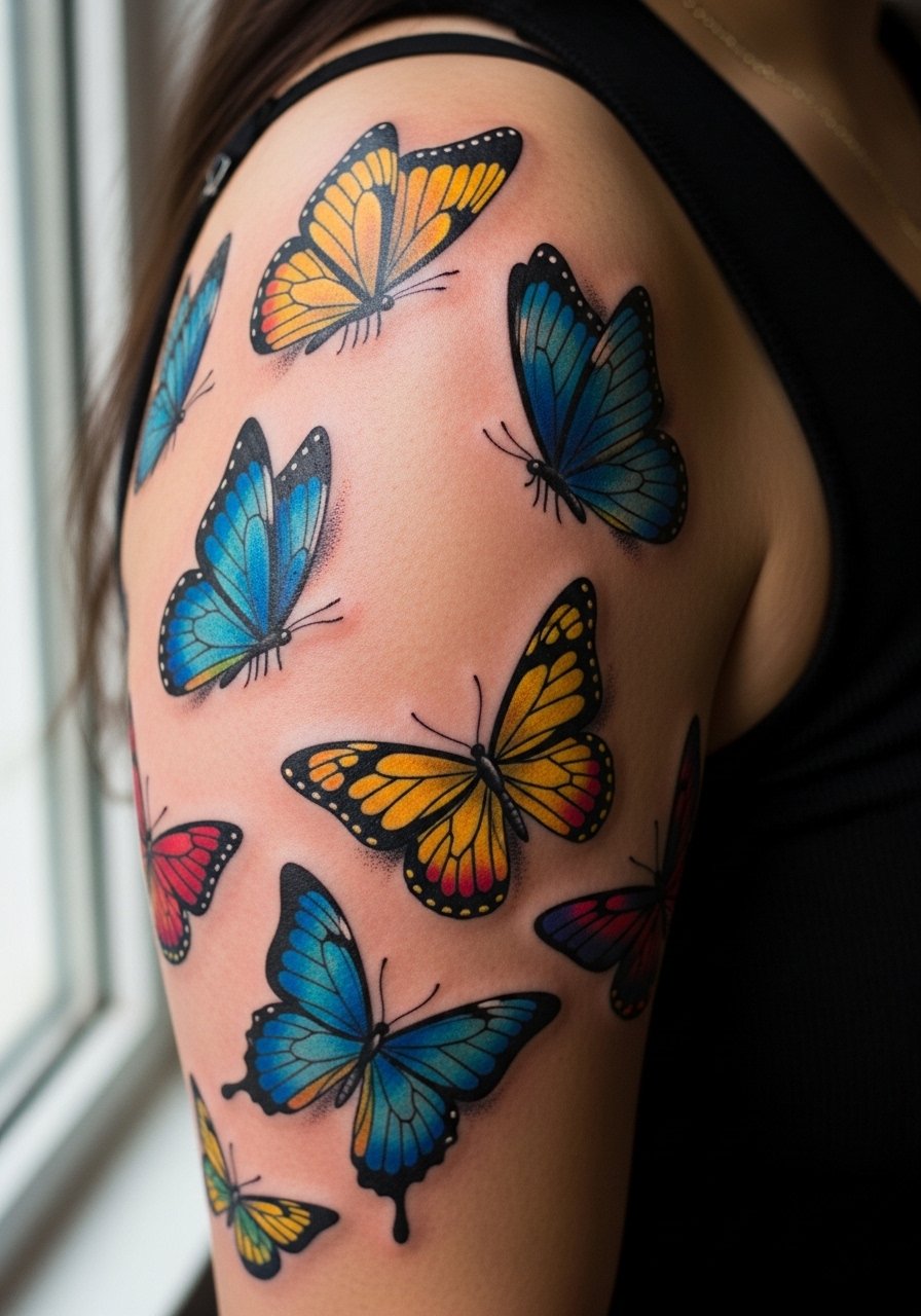
A migrating butterfly composition reads best when the largest wing shapes sit on the shoulder and taper down the arm. During consultation, point out focal butterflies you want crisp versus background ones that can be more painterly. Expect the bicep area to take color more easily than the outer elbow, which can be patchy. The biggest mistake is packing identical wing detail across sizes; vary detail so tiny butterflies remain suggestions rather than miniatures that blur. For session comfort, wear a loose drawstring linen pant if you expect long sittings and prefer breathable natural fibers.
6. Pastel Sailor Moon–Inspired Character Sleeve
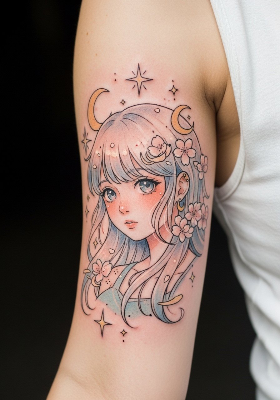
When bringing character art into a sleeve, bring full-turnaround reference images and agree on scale in the consultation. Characters with fine facial detail often need larger canvases to avoid losing expression after healing. Expect about three-hour blocks for a portrait zone and plan touch-ups at year two for line refinements. Some people worry about cultural sensitivity with specific iconography. If the art references a known character, consider stylizing key features rather than copying exact trademarked elements. For showing it off, pair the sleeve with a loose button-down shirt worn open to reveal the upper arm artwork.
Studio Day Picks
The upper-arm florals and delicate forearm scripts above demand different prep than full bicep portraits, so a compact kit will keep the session smoother and the first week easier.
-
Stencil transfer paper kit. Lets you preview stencils on skin and confirm placement, critical for script and character panels in the first six ideas.
-
Topical numbing cream. Use as directed before wrist or inner bicep work for a gentler session in sensitive zones.
-
Thin protective film roll. Helpful for wrist and hand-adjacent pieces that face daily friction in the first week.
-
Fragrance-free gentle body wash. Keeps healing color clean without irritating delicate areas like inner forearm script.
-
Aquaphor healing ointment. Thin layers during the initial days protect fine line work without clogging the pores.
7. Rainbow Stipple Shading with Dot Work Accents
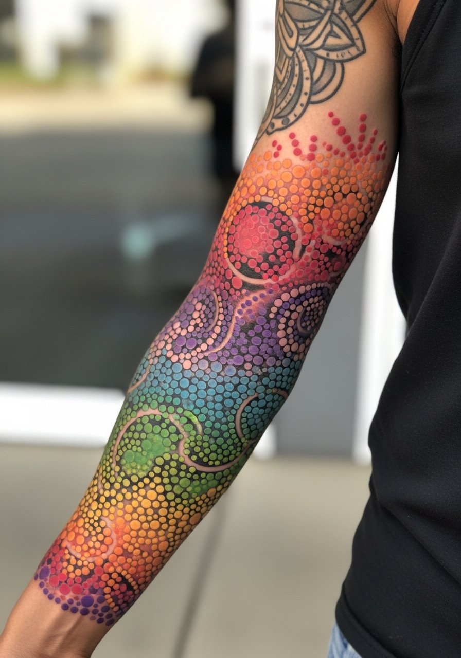
Stipple shading uses dots to build gradient, which ages differently than whip shading. If you want crisp gradients at year three, ask for slightly denser stippling in shadow zones so the texture remains visible as skin changes. The elbow and inner arm can lose dot definition faster, so plan for touch-ups around year three. A common error is demanding overly tight stipple across a large band, which reads muddy when it heals. For casual wear, short sleeves or rolled cuffs keep the stipple visible without competing fabrics.
8. Watercolor Galaxy Sleeve with Metallic Highlights
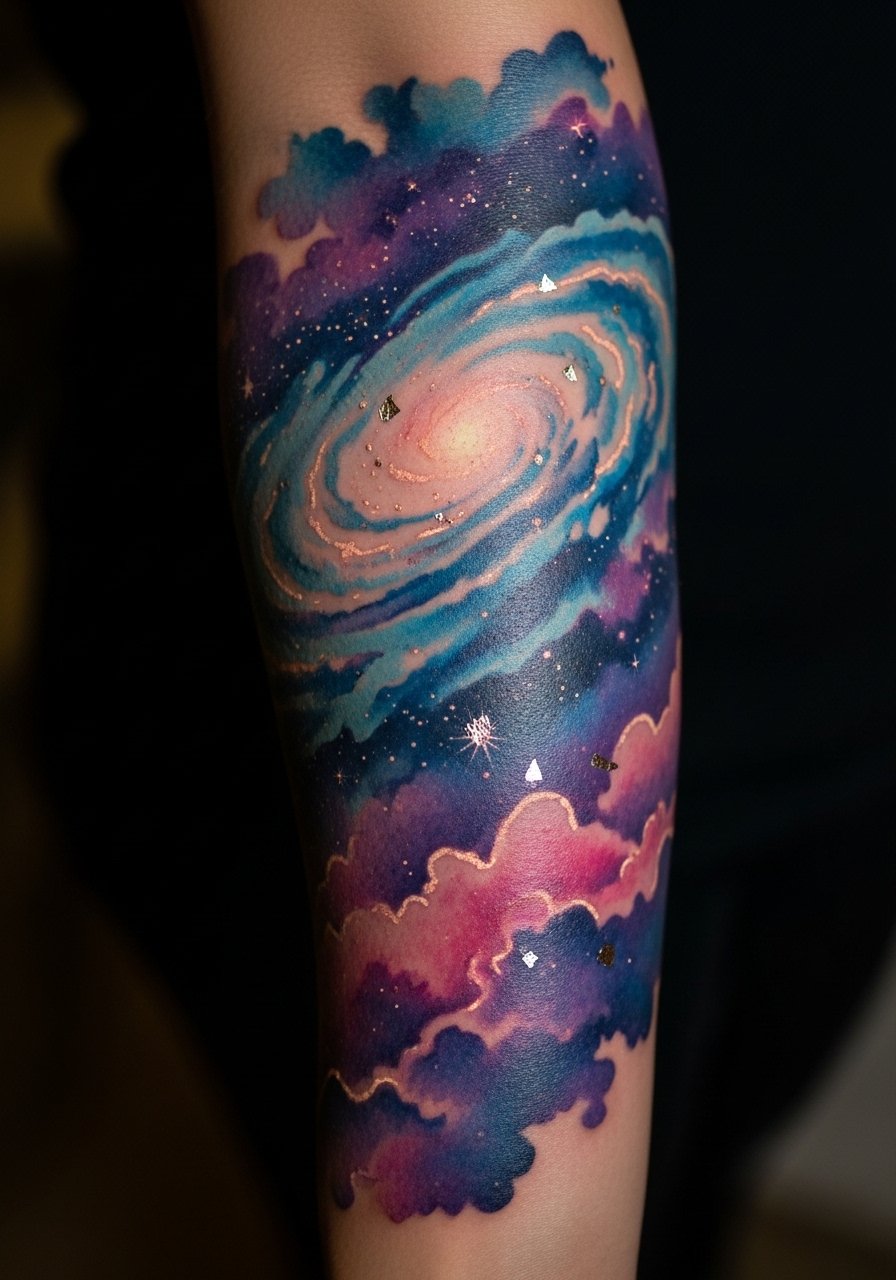
Metallic highlights can look amazing when fresh but may fade faster than pigments. I advise asking for the metallic effect to be paired with a solid pigment outline in light areas to preserve contrast. Sessions that include dense touring color can run long, so book multiple sittings under two-hour blocks if you want less fatigue. One mistake is asking for all-over watercolor with no dark anchors. That leaves no reference points as washes soften. For an evening look, pair this sleeve with a sleek strapless top so the arm reads against clean lines.
9. Playful Animal Motifs in Neo-Japanese Palette
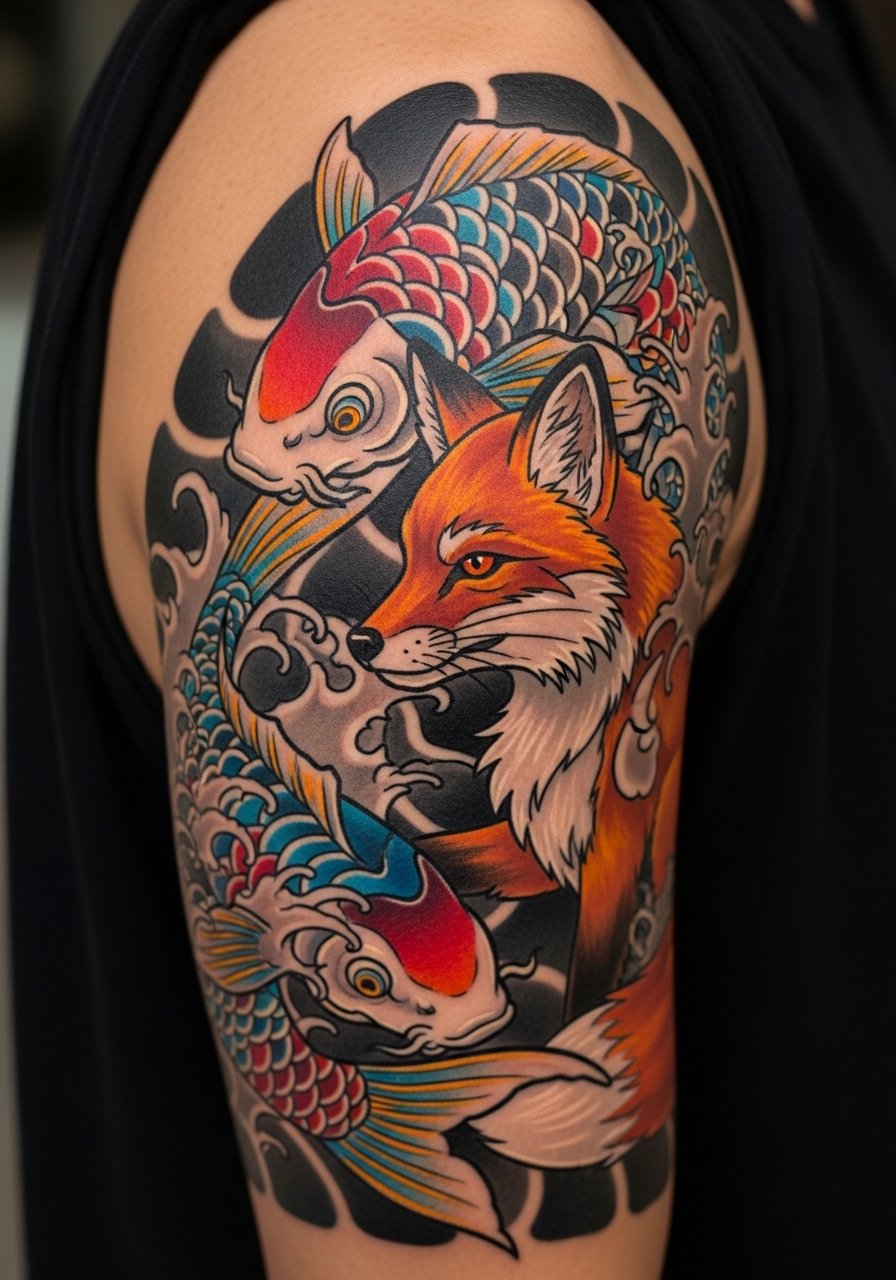
Neo-Japanese palettes take intense saturation and large flat fields to hold color over time. If you prefer longevity, tell your artist you want heavy saturation in the initial sessions and a planned touch-up in year two. Pain is moderate on the outer arm but spikes near the elbow and inner bicep. A regular error is stacking too many small motifs; scale assures each animal reads after healing. For daytime styling, try a cropped denim jacket with sleeves rolled to frame the artwork.
10. Pastel Mandala Sleeve for the Outer Arm
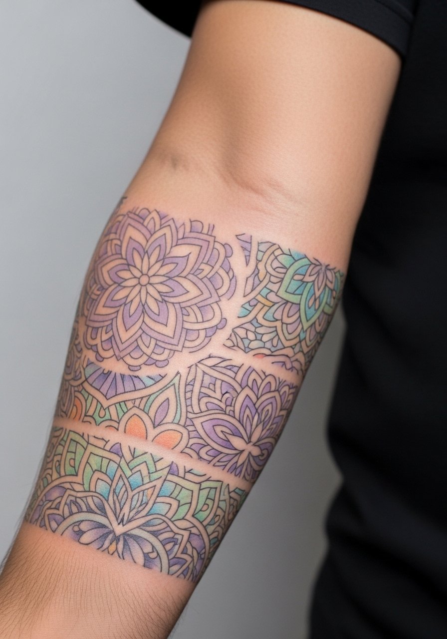
Mandala linework demands spacing, because tight, dense geometry is where lines can merge with time. Artists split into two camps on mandala scale. One camp says small, dense mandalas can be executed with micro-line control and stay stable. The other camp argues that larger spacing always wins because the skin shifts. Name both approaches in consultation and ask which the artist prefers based on their portfolio. Expect need for touch-up around year three in high-motion zones near the elbow. A rolled-sleeve linen shirt highlights circular patterns without over-layering.
11. Gradient Ombre Floral with Script Band
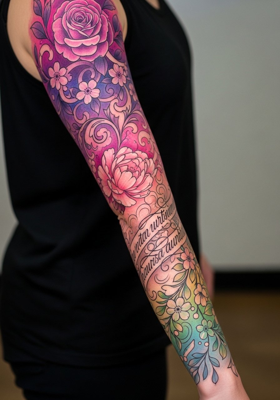
An ombre floral sleeve benefits from planning where color saturation fades to prevent patchiness. Ask your artist for staging the gradient in two sessions to ensure smooth transitions. Scripts inserted as bands need extra spacing from petals so letters do not become lost as colors fade. The wrist band section is prone to friction and color loss, so expect earlier touch-ups there. For session day, wear a loose button-down shirt you can slide aside without stretching the shoulder.
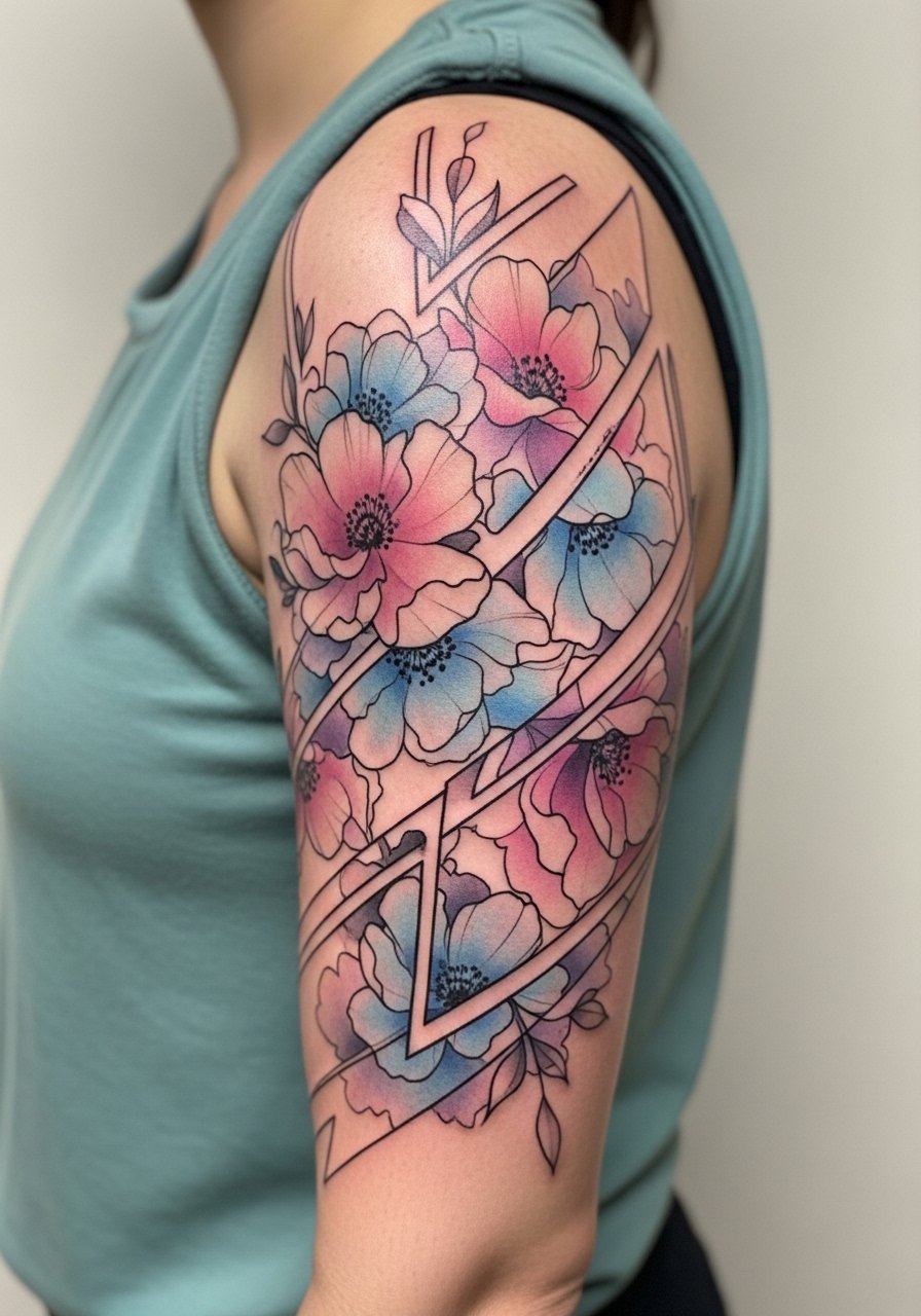
12. Playful Candy-Colored Geometric Sleeve
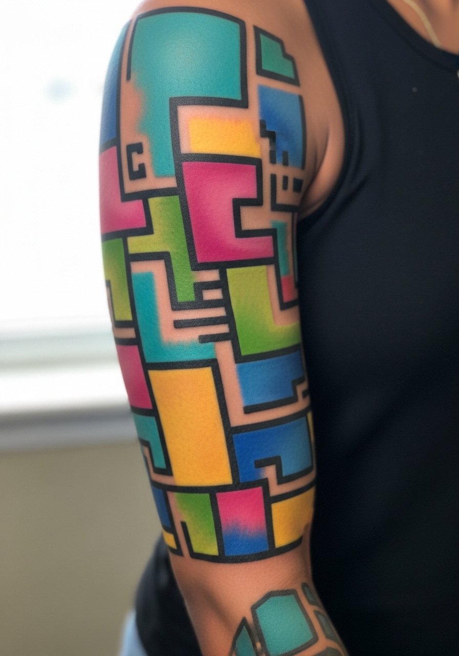
Geometric work needs breathing room between elements to avoid lines merging. If you love color blocking, request negative-space buffers between shapes so each hue keeps its edge as saturation softens. Geometric bands near the elbow can warp as the skin folds, so larger shapes around joints help. A frequent misstep is asking for perfect symmetry across the entire sleeve without accounting for muscle movement. For a polished daytime look, cuff a fitted blazer and roll the sleeve to reveal intentional geometry.
13. Tiny Constellations and Floral Fillers Sleeve
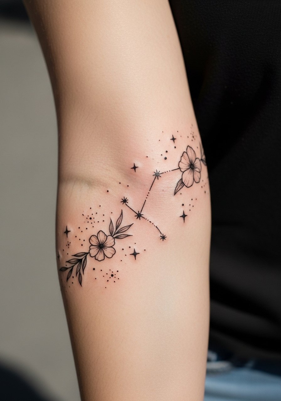
Small constellation dots look delicate but need spacing strategy. Ask your artist to map negative-space anchors so clusters do not drift together. Tiny elements on the inner forearm age differently than on the outer arm, with inner areas sometimes losing crispness faster. The session is tolerable but the wrist zone can require short numbing if you are anxious. For after sessions and show-off outfits, pair the work with stacked dainty bracelets like a set of slim bangles that do not sit tightly on the wrist.
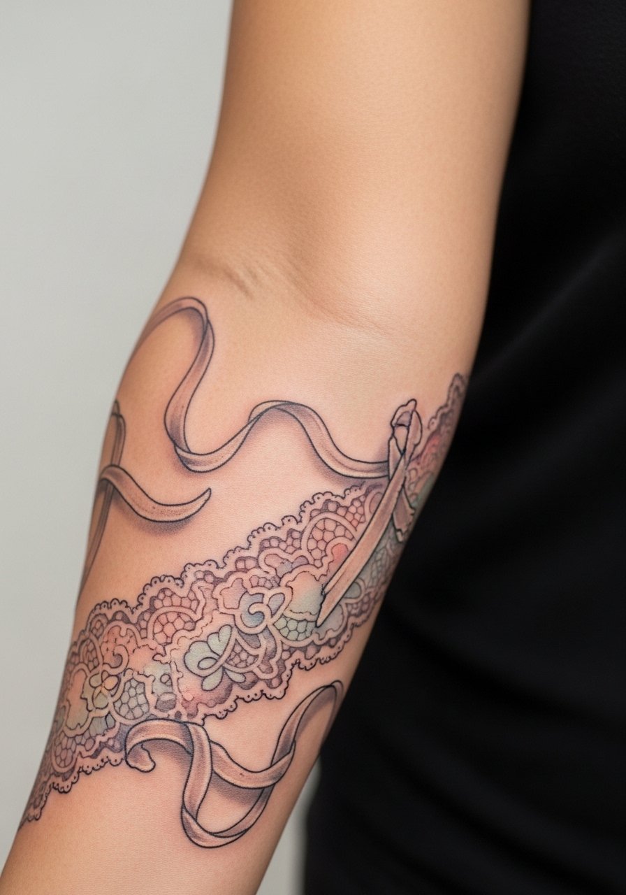
14. Pastel Gothic Lace Sleeve
Lace patterns rely on contrast to read, so I recommend mixing tiny open negative spaces with darker anchors rather than all pastel fills. The lace over the wrist is susceptible to friction and may need a touch-up sooner than shoulder lace. A common mistake is asking for ultra-fine inner filigree that later merges into gray clouds. For session comfort choose a soft cotton tee you can roll up and avoid tight sleeves that press on the fresh artwork.
15. Floral Sleeve with Subtle Metallic Line Accents
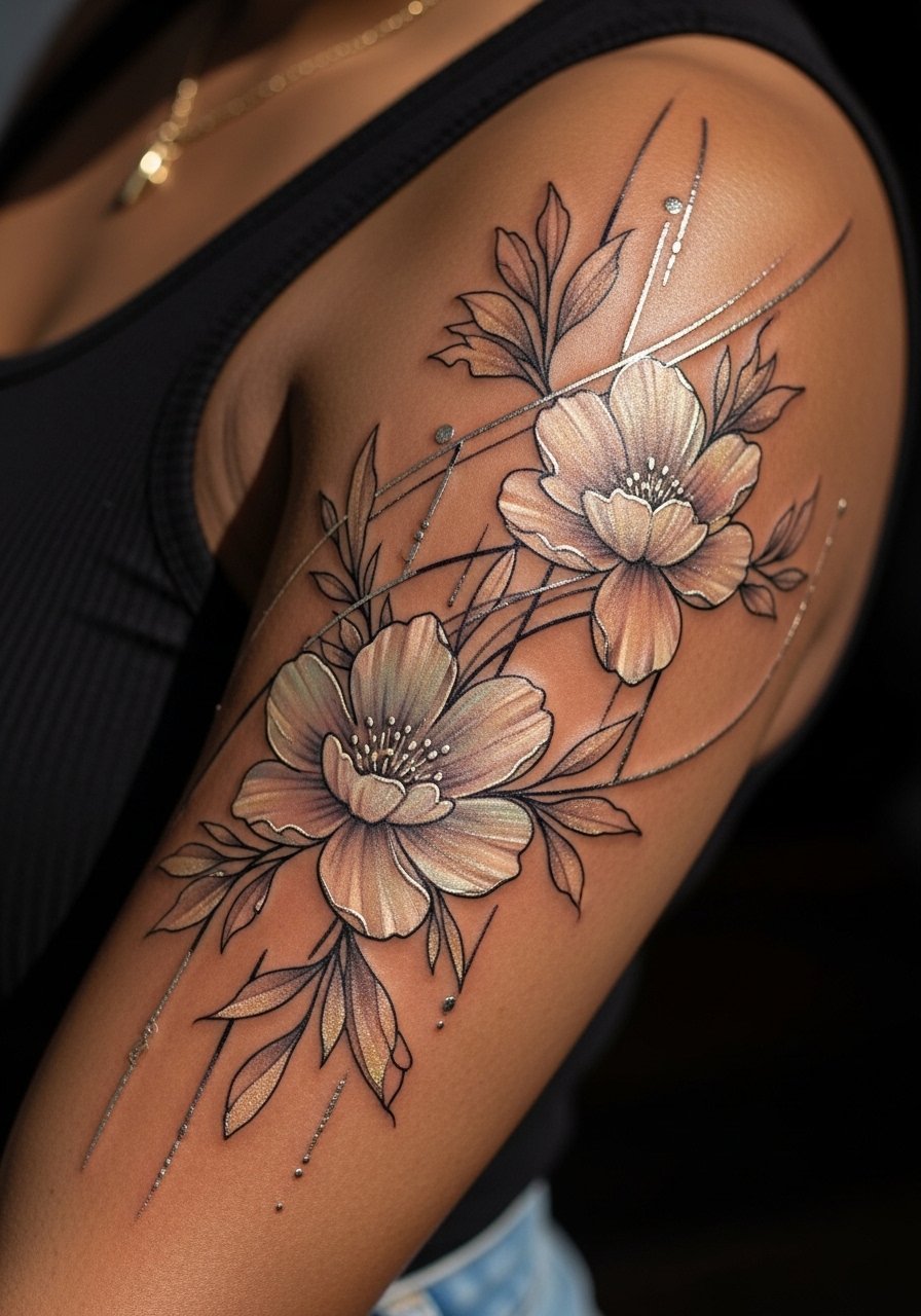
Metallic line accents can create a modern shimmer that photographs well but they do differ in retention. Ask your artist how they create metallic effects in permanent pigment so you know what to expect after healing. Sessions that include metallic techniques can take longer because of layering. One error is placing metallic highlights too close to high-motion zones like joints. For evening wear, an open-back top reveals floral back-of-arm work without competing elements.
16. Scripted Coordinates and Tiny Icons Sleeve
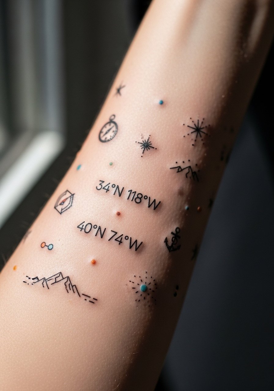
When including coordinates or specific text, provide exact spelling and spacing so the stencil is correct. Numbers and roman numerals can remain readable longer if the script is slightly bold and letters are spaced. The common mistake is choosing ultra-thin script for a full sleeve and then being surprised by blurring in two years. For the session, wear a loose tank top so the artist can access the forearm freely without fabric interference.
17. Anime Floral Collage with Bold Saturation
Graphic anime-collage work favors bold outlines to maintain separation between bright fills. If you want the look to last, plan for color layering across sessions so pigment settles evenly. A pitfall is asking for micro-details in hair or eyes that lose clarity on a curved arm. Expect touch-ups in shadowed color fields as pigment can soften quicker in high-motion areas. For sessions longer than three hours bring a lightweight hoodie you can unzip so you can adjust temperature without moving the arm too much.
18. Vintage Tattoo Flash Reimagined in Pastel
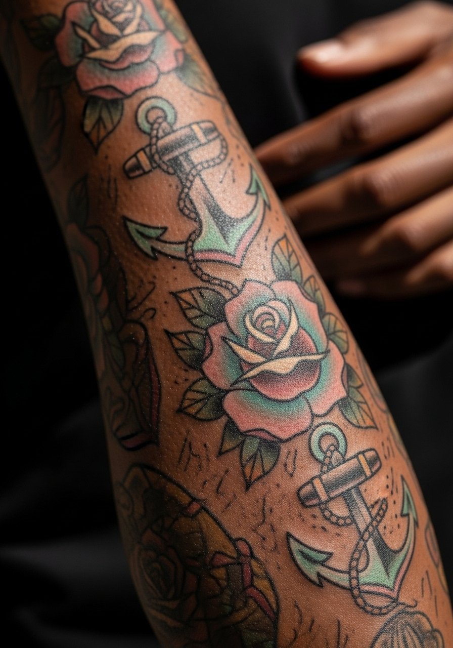
Flash-inspired pieces rely on composition balance. Reimagining classic motifs in pastel means keeping strong outline anchors so shapes do not dissolve with time. Tell your artist you want the silhouette of classic flash but the palette of pastels so they can plan shading accordingly. A common error is diluting outlines to match pastel tones, which weakens structure. For a day-out look, a cropped tank dress shows off the arm and keeps the outfit clean.
19. Botanical Sleeve with White Ink Highlights
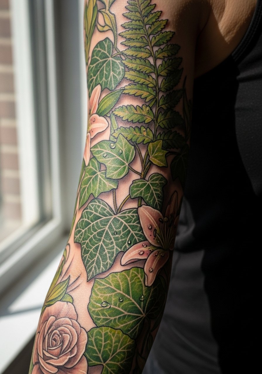
White ink highlights can pop initially but fade faster than pigments, so request conservative use in areas where contrast is helpful but not essential. The white will likely need periodic refreshes if you want it to remain bright. A common mistake is relying on white to define fine details that should instead be built with darker anchors. For session wear, choose a button-down shirt you can pull aside to give the artist clear access without rubbing the area.
20. Lace and Ribbon Sleeve with Soft Shading
Ribbon motifs should flow with the arm's natural movement so the piece does not look disjointed when you bend. Ask your artist to sketch the ribbon path on your arm while standing and moving so you can approve the flow. Mistakes happen when ribbons are mapped flat on reference images without testing for muscle motion. The inner bicep section is more sensitive and may blur slightly faster, so plan touch-up timelines accordingly. For showing off, a halter top frames the inner arm and shoulder elegantly.
21. Full Sleeve Collage with Pastel Portraits and Florals
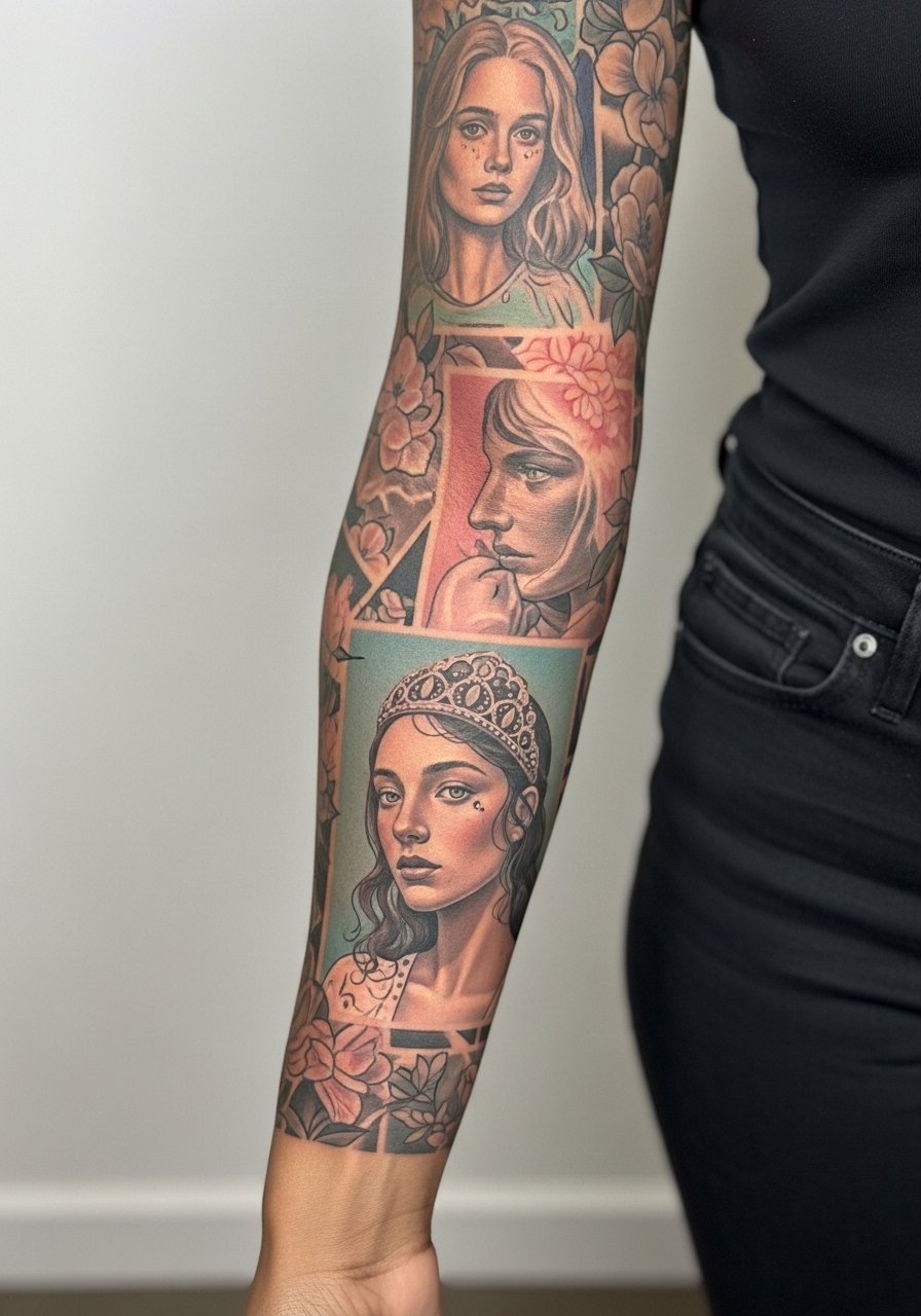
Collage sleeves work best when the artist stages distinct panels with breathing space between portraits and floral fills. In consultation, map out focal points and decide which panels get the most detail and which serve as color fields. Portraits need scale to retain expression as skin ages, so resist tiny face panels. Sessions are long for collages, so schedule breaks and plan multiple sittings. A common mistake is trying to cram too many high-detail elements into a narrow sleeve. For long sessions, wear comfortable drawstring pants and bring a water bottle to stay hydrated.
Frequently Asked Questions
Q: Will pastel watercolor sleeves fade faster than saturated neo-traditional color?
A: From what I have seen, watercolor washes often soften sooner because they rely on subtle gradients rather than heavy saturation. Neo-traditional blocks hold up longer in areas with less friction. Plan touch-ups earlier for watercolor washes, and discuss layering strategies with your artist.
Q: How should I prepare clothing for a full-sleeve session that hits shoulder, bicep, and forearm?
A: Wear layers that you can easily shift without tugging at fresh ink. A good combo is a loose button-down shirt over a racerback, so the artist can access shoulder and inner arm without you exposing more skin than necessary.
Q: Do fine line mandalas on the outer arm need different spacing than on the inner forearm?
A: Yes, outer arm skin tends to hold geometry better because it moves less and has fewer sweat-related changes. Inner forearm lines can blur sooner. Ask for larger spacing on denser mandalas and plan touch-ups where geometry is tight.
Q: Are metallic and white inks safe to mix with pastel pigments in a sleeve?
A: They can look great but expect them to need refreshes sooner. White and metallic pigments often lose contrast more quickly, so use them as accents rather than the structure of the piece.
Q: How do I find an artist who specializes in pastel palettes without naming anyone?
A: Search niche hashtags, browse portfolio sections on local shop sites, check recent convention lineups, and read community threads. I have found that artists who show multiple healed photos of pastel work and who list staged touch-ups are a safer bet.
Q: Do sleeve tattoos affect job prospects in creative industries versus corporate settings?
A: In creative fields the impact is smaller because visible tattoos are common. In corporate settings it still varies by region and company policy. Consider sleeve visibility and where you want to work when planning placement.
Q: If I want minimal pain, which sleeve placement is gentlest for colorful work?
A: Outer upper arm is usually the least painful zone for long color sessions. Areas near the elbow, inner bicep, and wrist tend to feel sharper, so break sessions accordingly.