
Fine line trends dominate feeds right now, and the pieces that still look deliberate after five years are not always the ones that get the most likes at day one. Color, spacing, and placement carry the load for a quarter sleeve. Plan with how the skin moves and what you want visible when you roll up a sleeve, and the following 27 ideas give clear directions you can bring to your consultation.
1. Neo-Traditional Koi and Lotus on Upper Arm
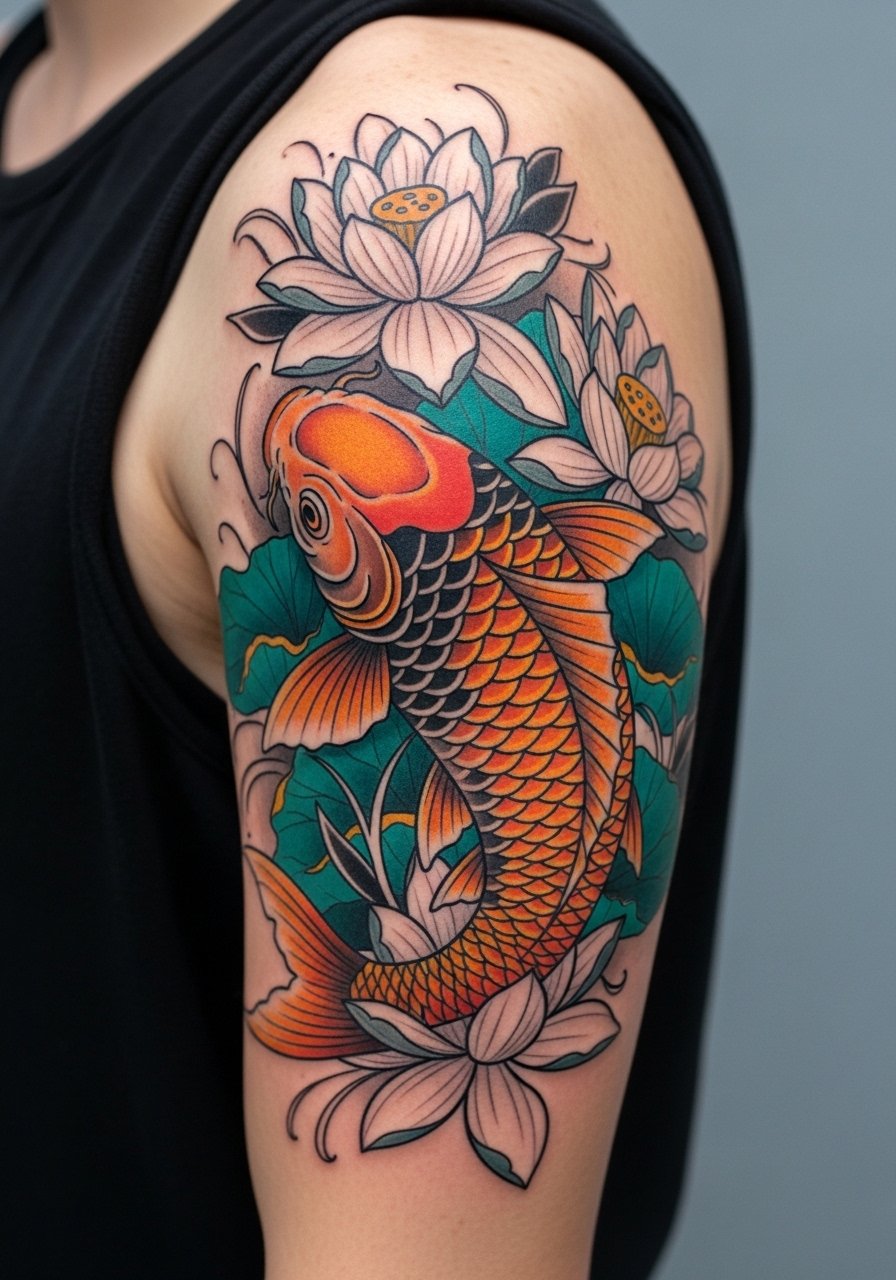
I've seen this setup hold up exceptionally well when artists use bold outlines around the koi while keeping midtones layered. Ask your artist for intentional negative space around scales so the color won't merge into a flat block as the piece heals. Mistake to avoid is asking for every scale to be tiny and detailed, because that density ages into muddiness. Expect a session that feels like steady machine work, not a quick wash of color. For showing it off, roll up a short-sleeve henley and let the upper arm read as part of the outfit.
2. Watercolor Galaxy Wrap with Stellar Accents
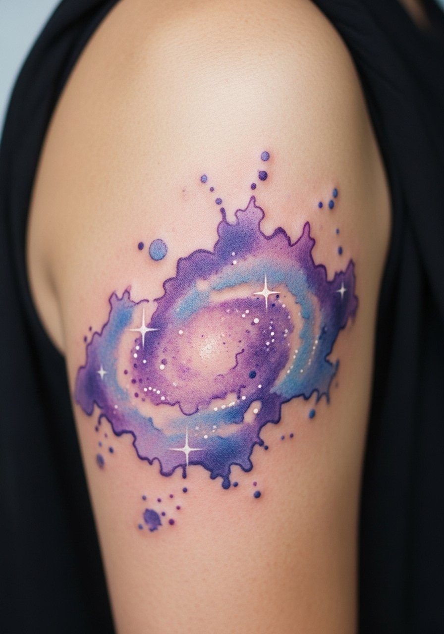
Fair warning, watercolor techniques that have soft, edge-less fills can soften further over time. This version keeps tiny bold anchors like dark nebula outlines to slow that fade. Tell your artist you want saturated centers with gradual feathered edges and a few crisp white highlights tattooed at the end of the session. The common mistake is letting the wash reach the wrist too thinly, where rubbing and sunlight accelerate breakdown. Session feel is more ink layering than heavy blackwork. Pair with a crew-neck tee when you want the color visible without a full sleeve.
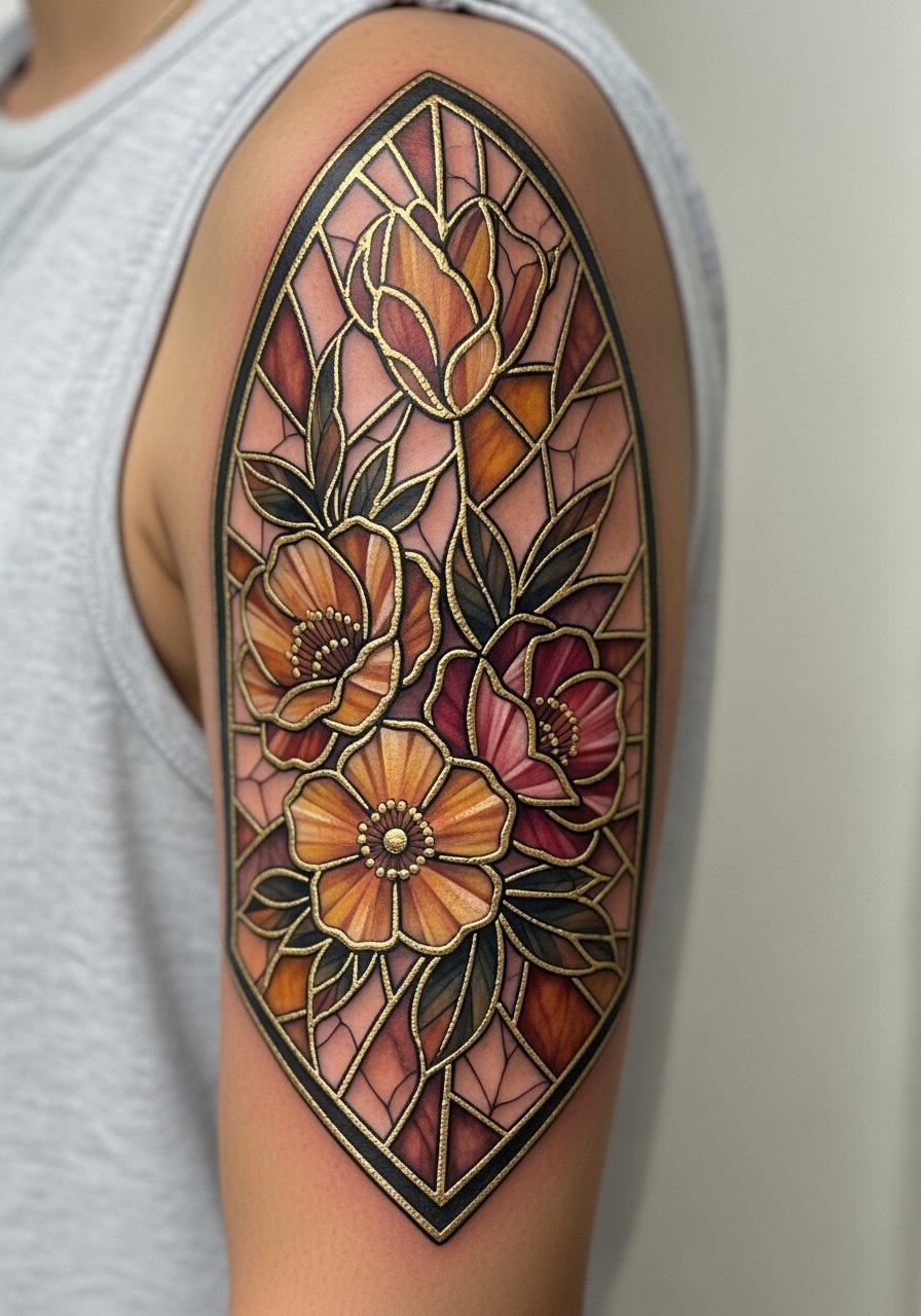
3. Stained-Glass Mandala Around the Bicep
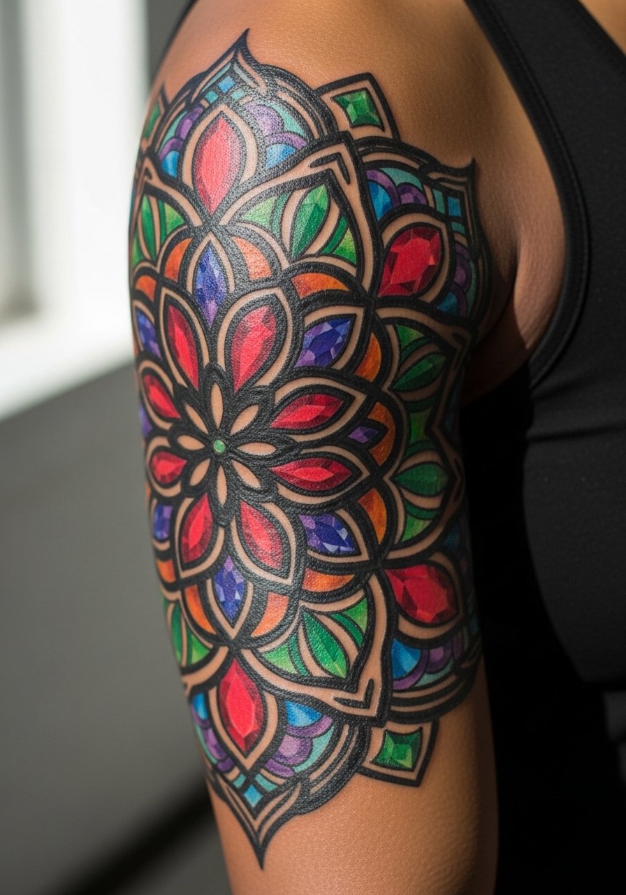
There is a trade-off between floral detail and lead-line thickness in stained-glass mandalas. The look lasts when lead lines are firm and colors are slightly oversaturated to account for later softening. In consultation, specify the thickness of the blackwork so the "panes" stay distinct after a few years. A frequent mistake is shrinking the pattern to fit too many repeats around the arm. Expect longer sessions to saturate color fully and a touch-up around year three if you spend a lot of time outside. Roll a sleeve up on a linen button-down to frame the symmetry.
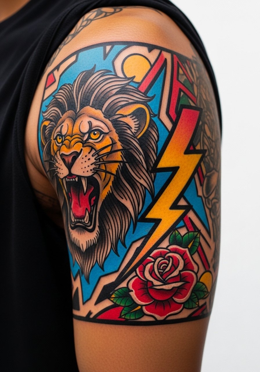
4. Neo-Traditional Lion with Floral Mantle
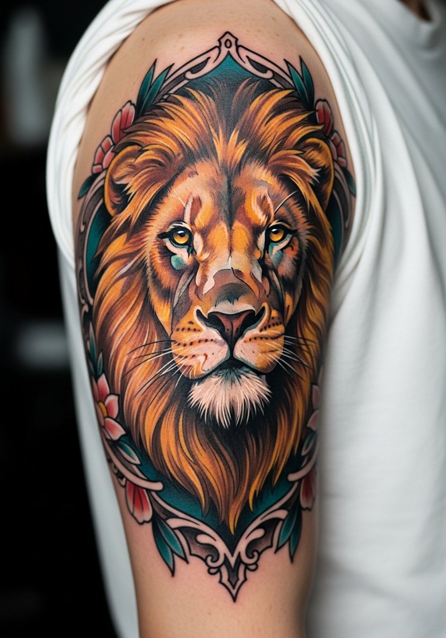
There's a visual impact to a saturated animal head that reads from a distance. For longevity ask for slightly thicker linework in the mane where color meets skin. A mistake I see is putting the face too low toward the elbow, where movement blurs edges. The session feels like alternating detail blocks and wash fills. Expect touch-ups for the fine whisker lines by year two or three. To show it off, wear a rolled-sleeve denim shirt which keeps the arm visible without competing with the palette.
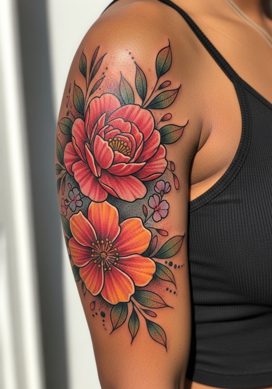
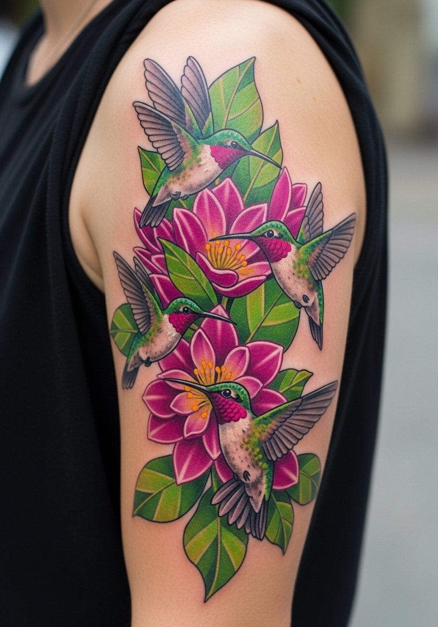
5. Botanical Sleeve with Hummingbird Accent
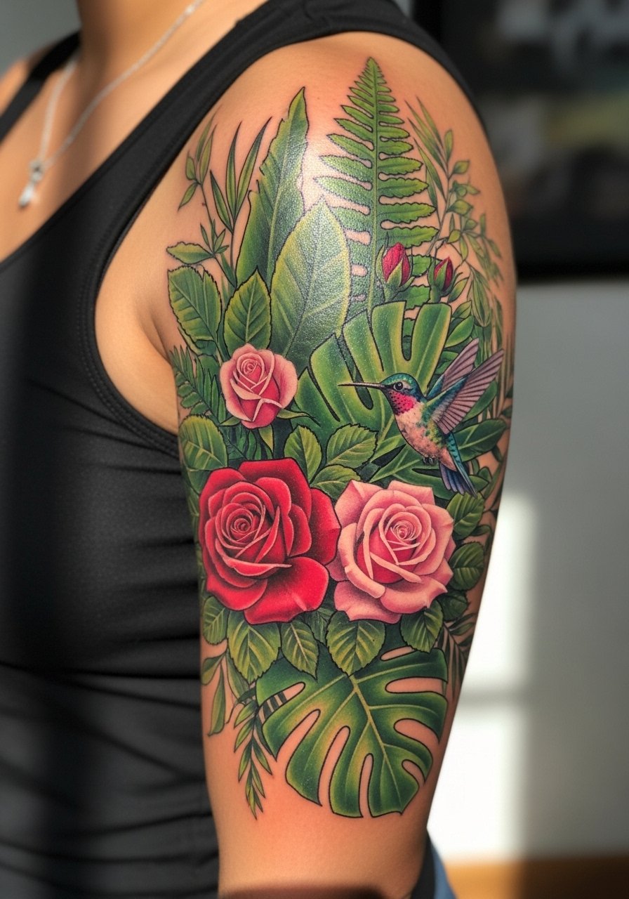
I've noticed botanical work that uses layered color planes holds depth better than single flat fills. Tell your artist to build leaf saturation in passes and keep the hummingbird slightly brighter than surrounding foliage. The common mistake is over-detailing tiny petals that blur together over time. This placement is forgiving but sensitive where the inner bicep meets the arm pit, so expect a bit more discomfort if the design wraps under. For the session wear a tank top you can raise so the artist has clear access.
6. Ukiyo-e Wave and Mount Motif
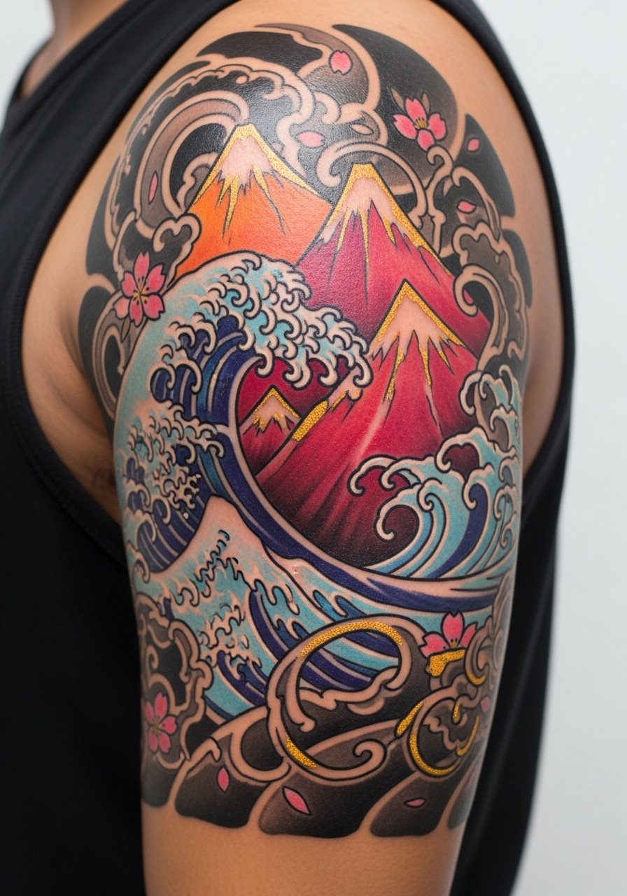
This style splits artists into two camps. One camp favors heavy outlines and classic saturation to keep motifs legible. The other camp wants softer brushwork and a modern palette. Name both preferences in the consultation and ask which they practice. A typical mistake is shrinking the wave details so they become a wash with age. Plan for a multi-session build to lock in flat color and crisp wave lines. Pair this with a rolled sleeve chambray shirt to echo the Japanese aesthetic without overwhelming the image.
Pre-Session Essentials
Those upper-arm and wrap-around quarter sleeves above ask for different prep than smaller wrist pieces, so a few targeted items smooth the session and the first week.
-
Stencil transfer paper kit. Lets you preview placement on the arm and make micro-adjustments before the needle hits skin.
-
Topical numbing cream. Applied per instructions 45 minutes before can ease longer saturation sessions, especially where color packing repeats.
-
Thin protective film roll. Useful for covering the area after a heavy color day to reduce friction from clothing.
-
Fragrance-free gentle body wash. Cleans the skin during the first week without stripping pigment or irritating the area.
-
Aquaphor healing ointment. A thin layer in the initial days helps lock moisture without suffocating the tattooed channels.
7. Surreal Portrait with Color Blocking
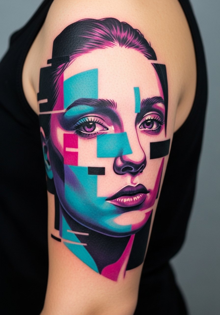
Personal observation tells me portraits with deliberate color blocks age more gracefully than photoreal pieces that depend on tiny midtones. Ask for color separation between skin tones and blocks so the face does not wash out. The mistake is expecting micro-realism at the same session length as a color block layout. Sessions feel slow and precise when the portrait sits on the upper arm. Expect a touch-up at year three if you spend a lot of time in the sun. Pair it with a short-sleeve linen shirt to keep the portrait visible and balanced against neutral fabric.
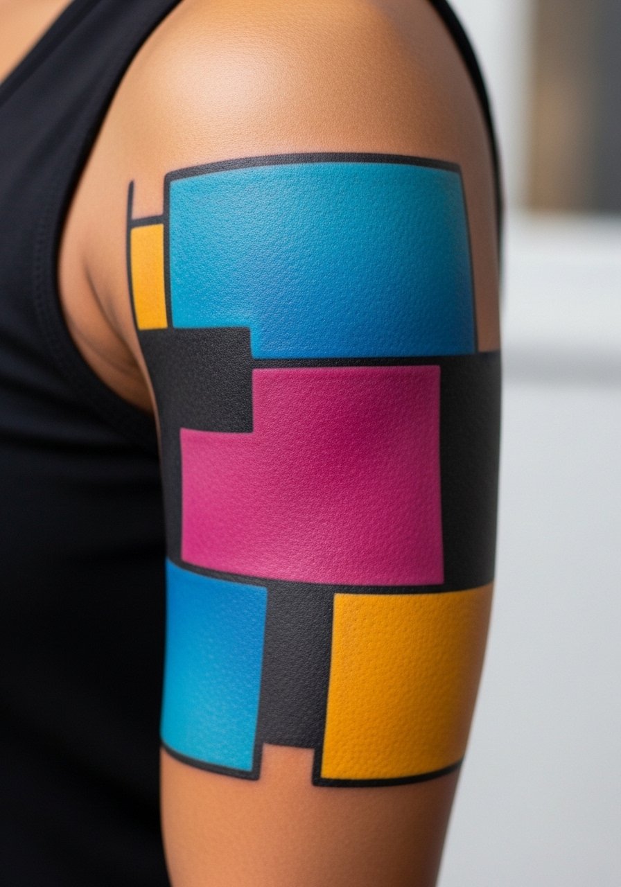
8. Geometric Color Field with Negative Space
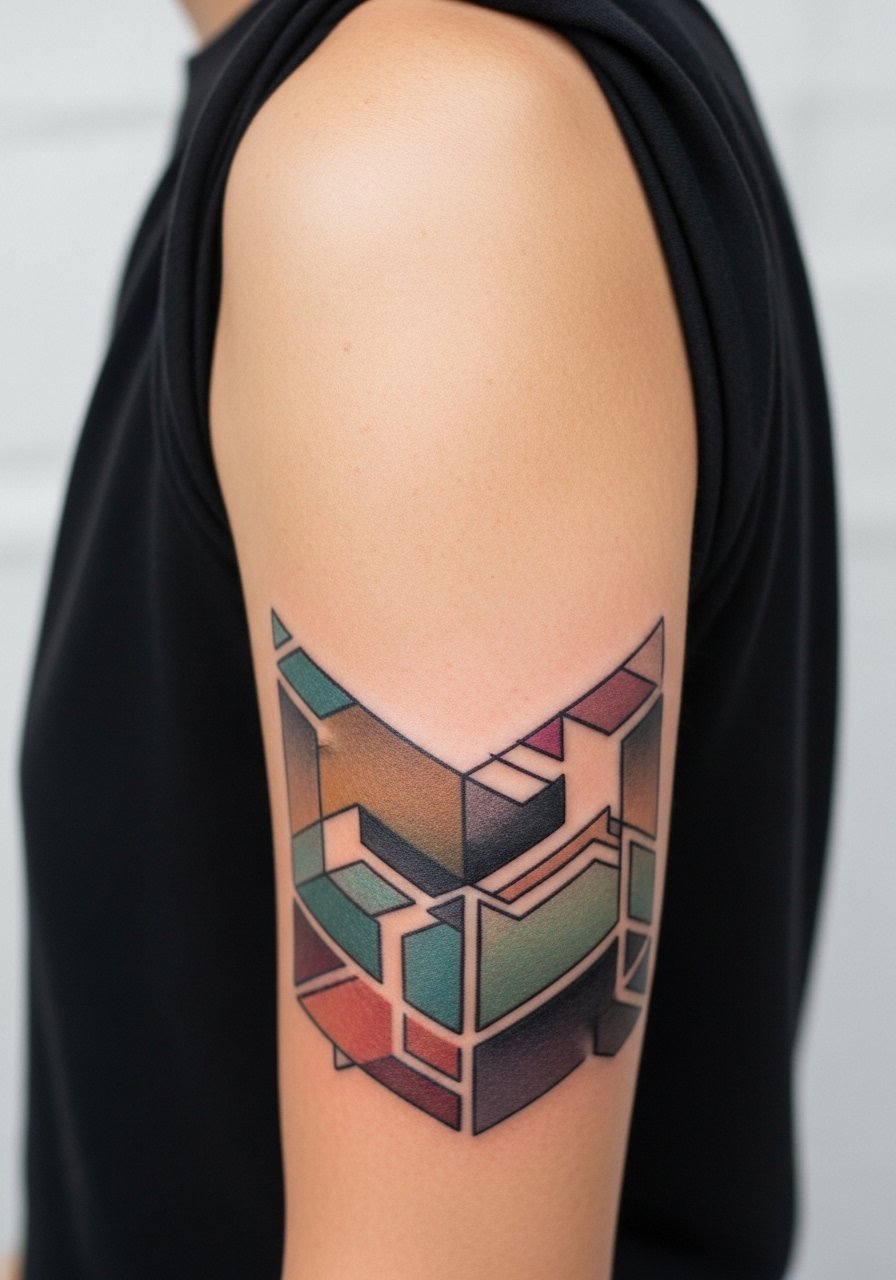
The visual rule here is leave breathing room. Dense geometry cramped into a quarter sleeve often muddies. Tell your artist to scale shapes so edges sit comfortably when the arm is relaxed. A common error is forcing too many repeats into a small arc. Expect stable results at six months, then gentle softening by two to five years that keeps the structure if spacing was respected. The session is repetitive and careful, similar to stencil work. For shows off, a short-sleeve polo keeps the negative space readable.
9. Stained-Glass Skull with Floral Highlights
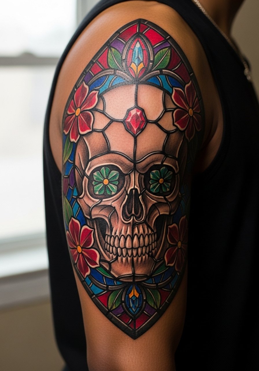
Visual impact lead: a skull done in stained-glass reads as graphic and holds well if lead lines are decisive. Ask your artist to over-emphasize the dividing lines slightly so the panes do not merge in a few years. The common mistake is shrinking the floral details into the skull, which then becomes a patch of color. Sessions alternate between linework and color packing, and expect a modest touch-up where colors meet black. Wear a band tee with rolled sleeves to show the piece without making it feel staged.
10. Tropical Jungle Scene with Parrot Accent
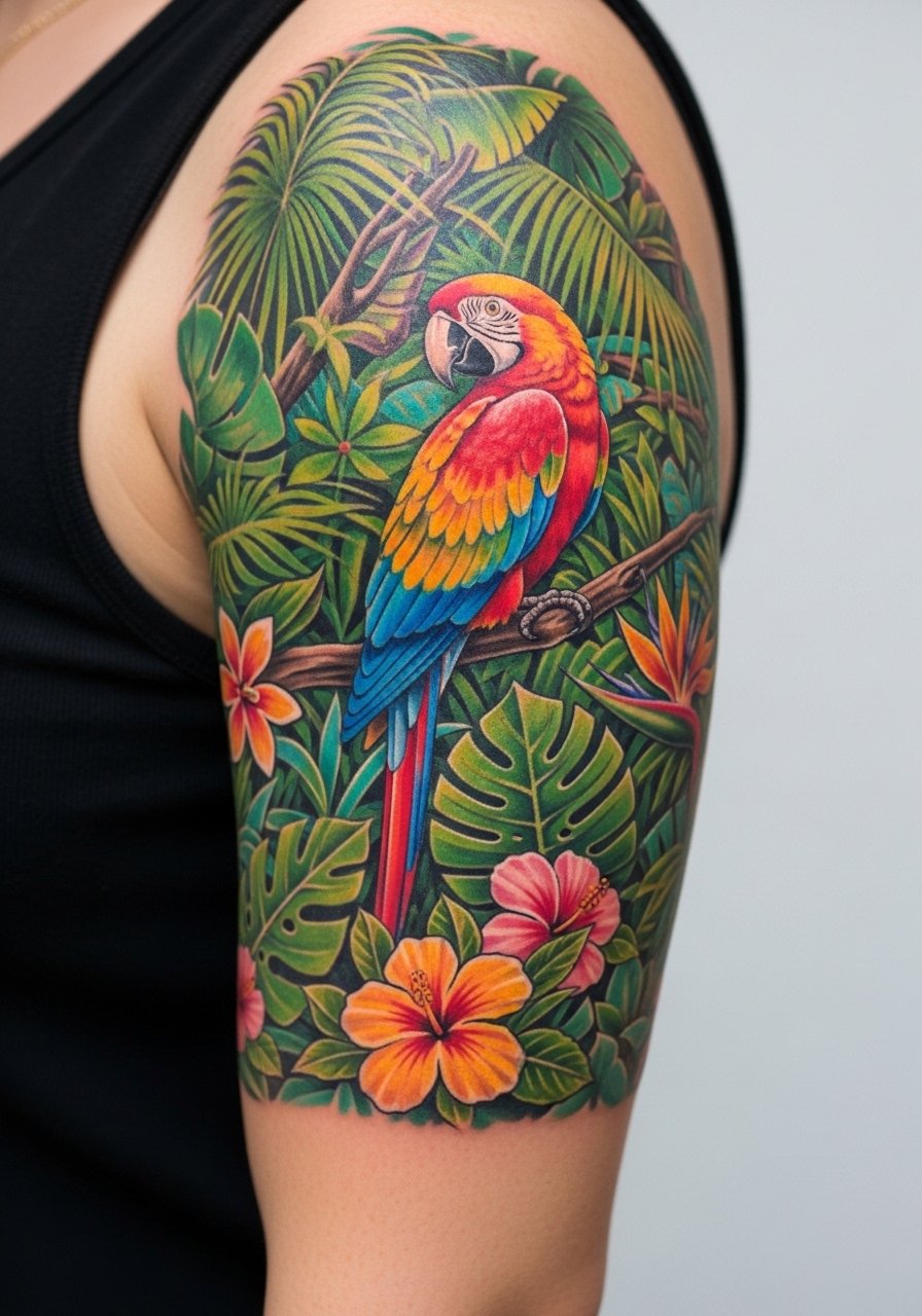
Mistake lead: people ask for every leaf to be different and end up with visual chaos. The better approach is grouped leaf shapes with varied saturation to suggest depth. Tell the artist to prioritize a single focal parrot with slightly higher contrast. The session has long fill periods and a few detail passes for feathers. Watch for touch-up needs in greens which can thin with heavy sun exposure. Pair with a linen short sleeve shirt for warm-weather visibility.
11. Comic-Book Panel Sleeve with Halftone Color
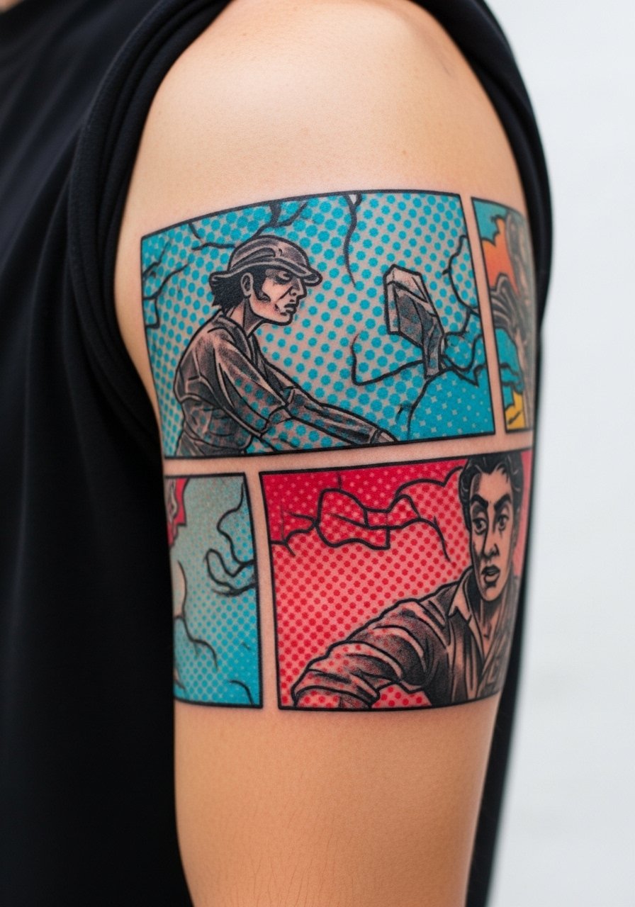
Consultation lead: bring reference panels that show how you want the panels to read at arm distance. A common error is crowding too many panels into a narrow arc. Halftone dot work can lose definition if scaled too small. The session alternates fast blackwork with layered color passes. Plan for a minor touch-up after year two where the dots start to soften. For casual display, a graphic tee with rolled sleeves keeps the panels visible and on-theme.
12. Abstract Brush Stroke Quarter Sleeve
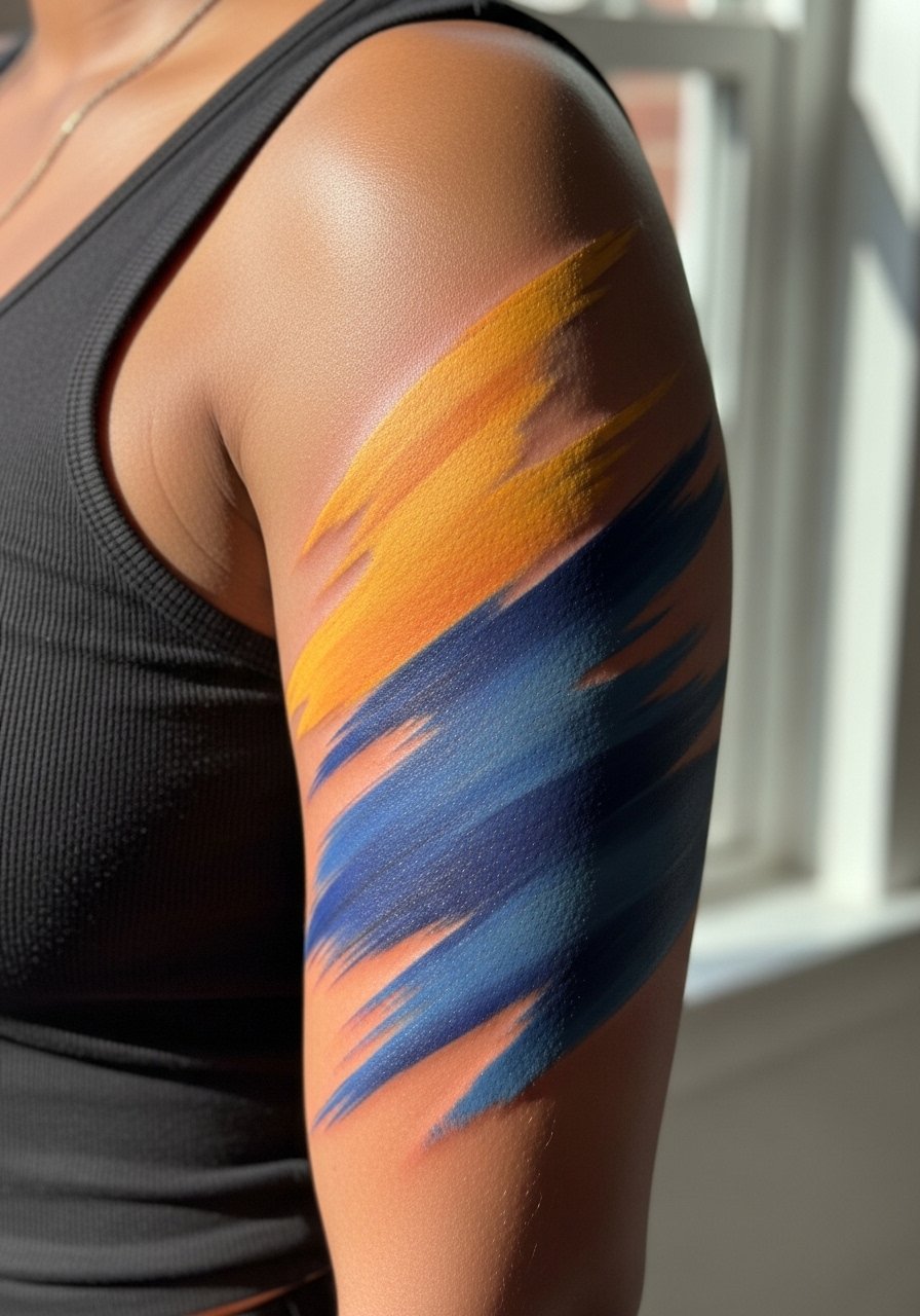
Aging/healing lead: large painterly strokes can thin at the edges, turning feathered tips into faint smudges. Ask for a slightly stronger edge near the elbow where fabric rub is constant. Mistake to avoid is requesting watercolor-level feathering across the entire sleeve. The session feels like layering color as if on a canvas, and that slower build protects saturation. Expect the broad strokes to remain readable but softer over several years. Pair with a plain white tee with sleeves rolled so the colors pop without distraction.
13. Neo-Japanese Dragon with Cloud Motifs
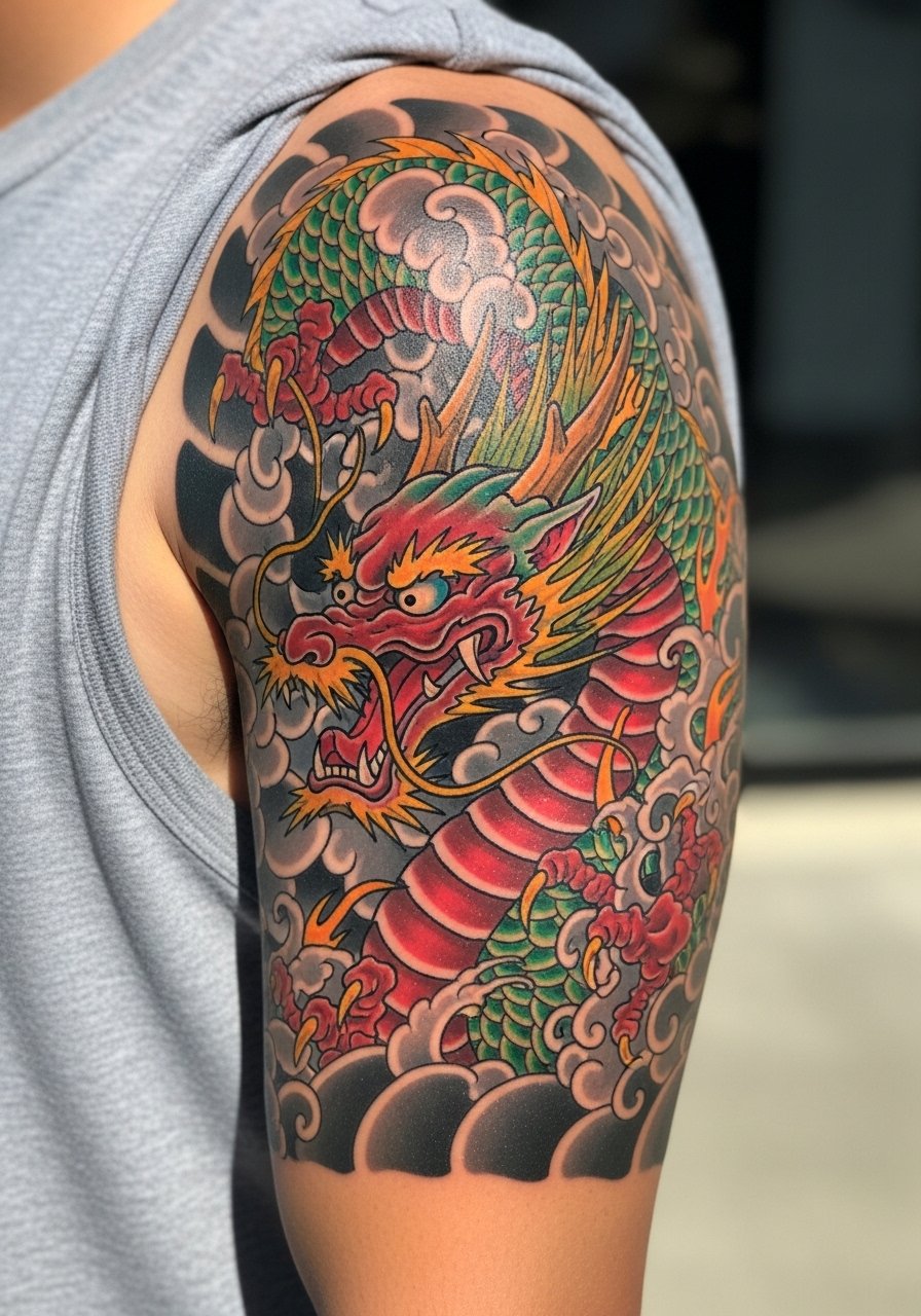
Personal observation: dragons that curve with the arm's musculature age much better than ones forced into a straight line. Tell your artist you want the tail to move with the bicep so movement reads naturally. A recurring mistake is compressing the dragon's coils into a small area which causes the scales to blur. Sessions require careful outline then layered color packing. For evenings out try a button-up shirt with the sleeve casually pushed to let the dragon be visible without being loud.
14. Color Pop Blackwork with Neon Highlights
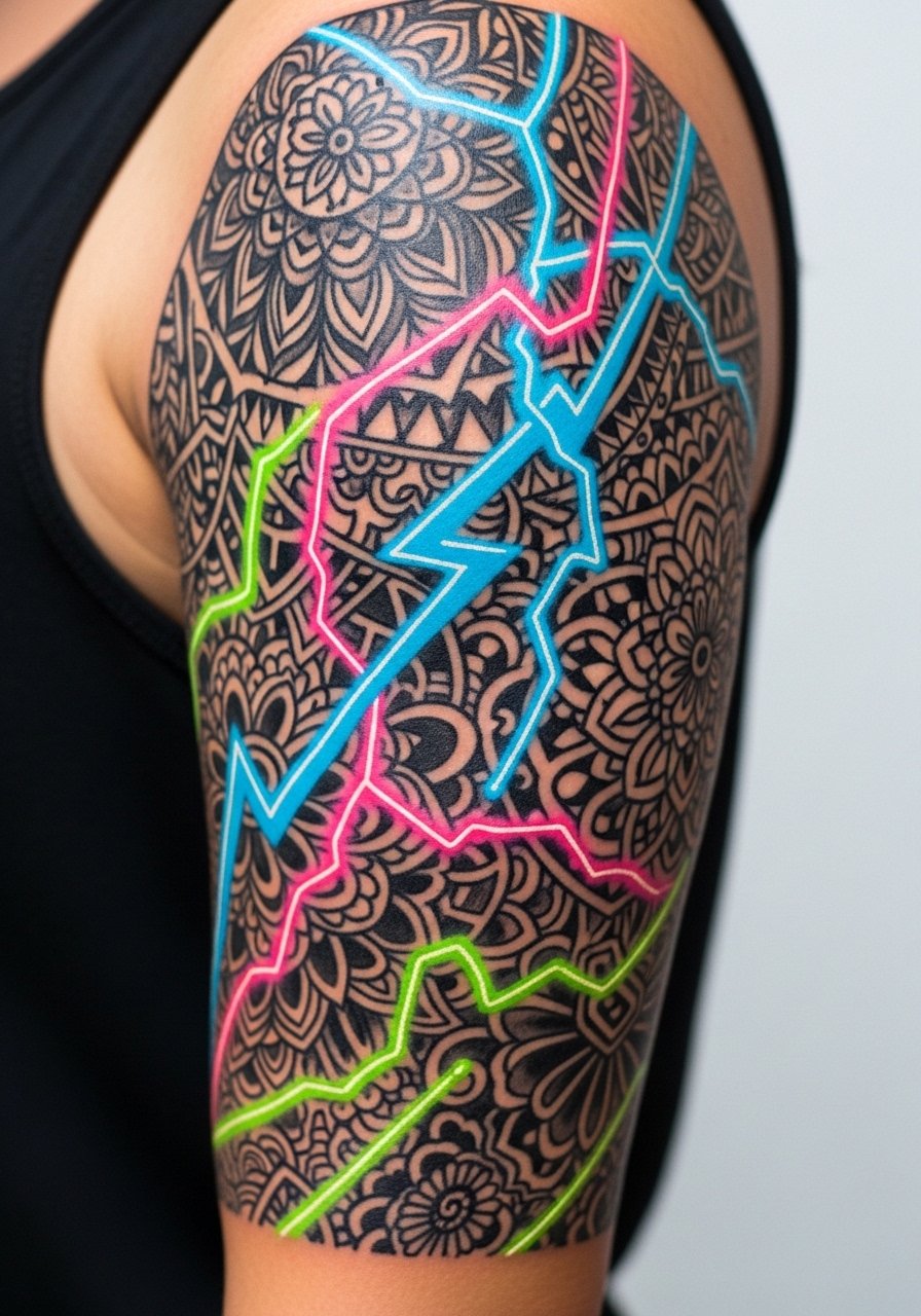
Visual impact lead: a strong black base gives neon pops something to sit against and that contrast helps colors last visually. In consultation, request the neon applied over a matte black fill so it reads on darker tones. A common mistake is sparing the black, which leaves neon without contrast. Sessions can be more abrasive when packing matte black. Expect a touch-up on colored accents where they meet black after a couple of years. A minimal leather bracelet can frame the lower arm without stealing focus.
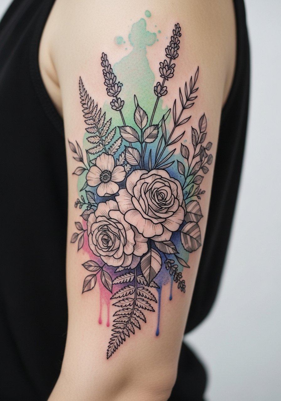
15. Botanical Sleeve with Stipple Shading and Color Blooms
Styling lead: stipple shading keeps texture while color blooms add focal points and that mix reads as refined in shirts with short sleeves. Specify dot work density so it does not become a gray patch later. The usual error is pairing stipple with over-saturated flat color without transitional tones. Sessions are meticulous and slower than flat fills. Expect touch-ups to the tiny dot gradients by year three if exposed a lot to sun. For showing it off, a rolled sleeve oxford shirt keeps the arm visible while matching the understated texture.
16. Surreal Landscape Band with Color Gradient
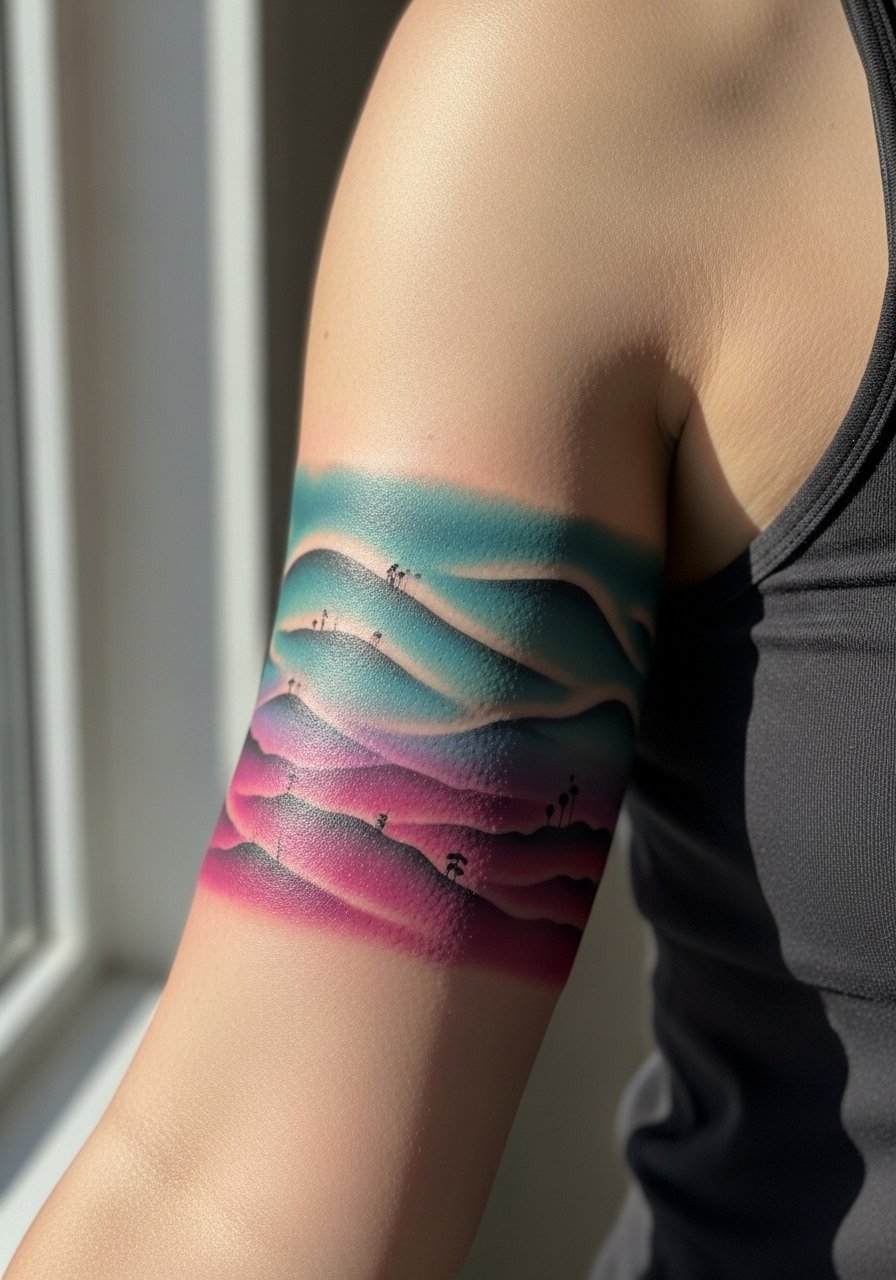
Mistake lead: squeezing too many silhouettes into a thin band kills the negative space that makes the piece read. Ask for wider gradients and fewer focal silhouettes for clarity. The session is mostly careful fills and edge cleanup. Over time gradients can flatten, so plan a refresh if you want the same punch at year five. Pairing with a soft cotton tee keeps the band unobstructed.
17. Neo-Traditional Anchor and Sail Motif
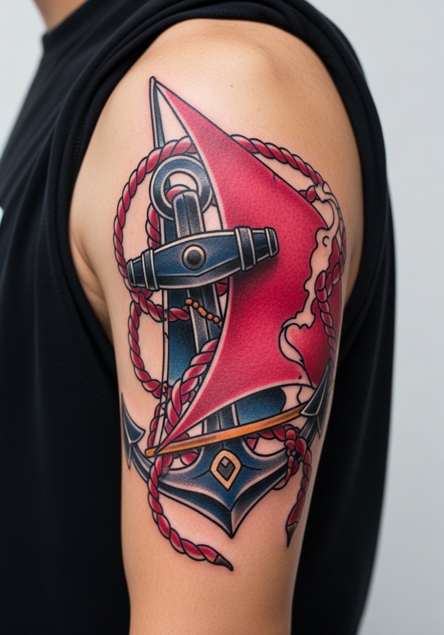
Personal observation: maritime motifs benefit from deliberate aging lines and bold anchors so the core shapes remain legible. Tell your artist to keep the rope slightly thicker than you think is necessary. A mistake is packing tiny rope detail that becomes indistinct with movement. The session alternates crisp linework and saturated color. Expect minor touch-ups where rope meets skin after a few years. Wear a striped sailor tee to lean into the theme without feeling costume-like.
18. Biomechanical Color Fusion
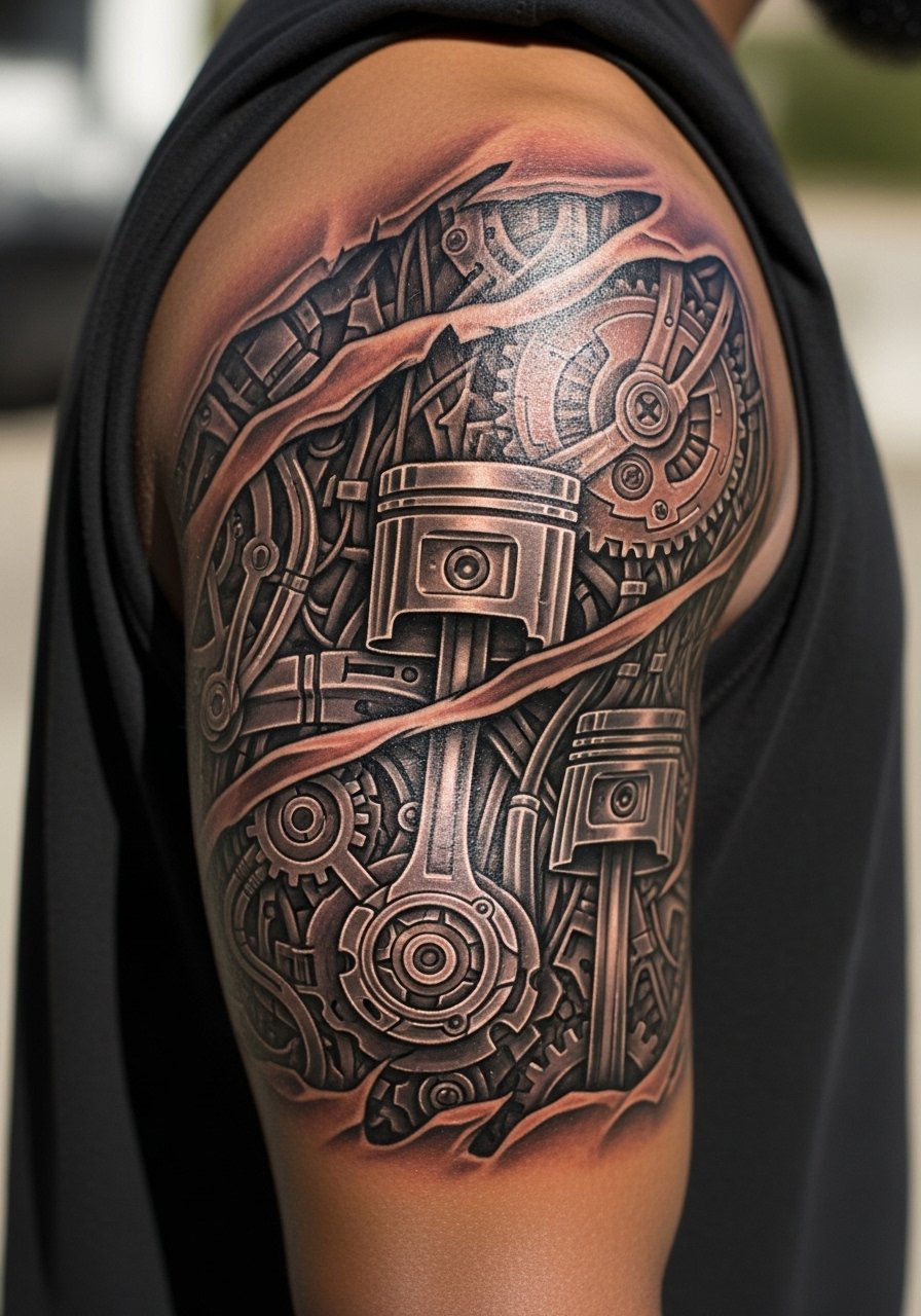
Aging/healing lead: metallic effects rely on contrast that can dull if placed too close to high-motion areas. Ask for clear separation between metallic parts and adjacent skin tone colors. The common mistake is over-detailing fine teeth and gears which blur with time. Sessions feel like alternating washes and linework. Have a touch-up plan for the highest-contrast seams after year two or three. This piece reads well against a fitted short sleeve tee.
19. Botanical Sleeve with Hazy Watercolor Backdrop
Consultation lead: the trick is anchoring hazy washes with crisp foreground flora so the image stays readable. Tell your artist which flowers should stay crisp and which should dissolve into the wash. The mistake is letting the wash dominate the entire sleeve. Sessions require careful layering so the foreground does not get overwhelmed. Expect color softening in washes within two years but sharper flowers to persist. Pair with a linen short sleeve button-down to balance the softness.
20. Stained-Glass Geometric with Metallic Accents
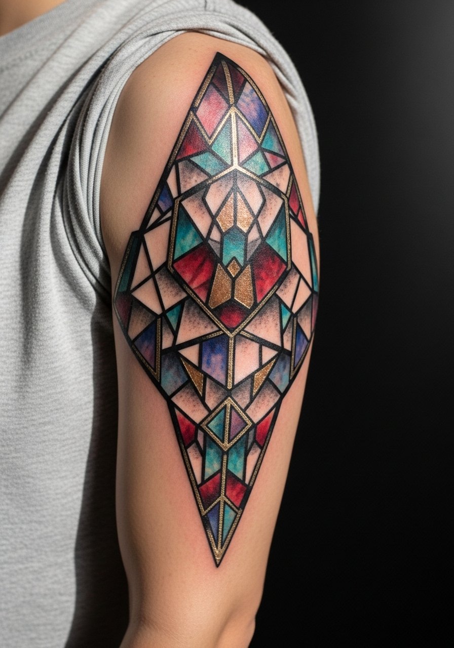
Visual impact lead: metallic hints read best when used sparingly against darker facets. During consultation ask for reflective accents only in the largest panes to avoid flattening. A common error is overusing metallic tones which then simply look like pale color after a few years. Sessions require patience to lay down reflective pigments evenly. Touch-ups may be needed on metallic areas as they can fade unevenly. A short-sleeve henley lets the geometry be the outfit's focal point.
21. Mythic Creature Montage with Saturated Palette
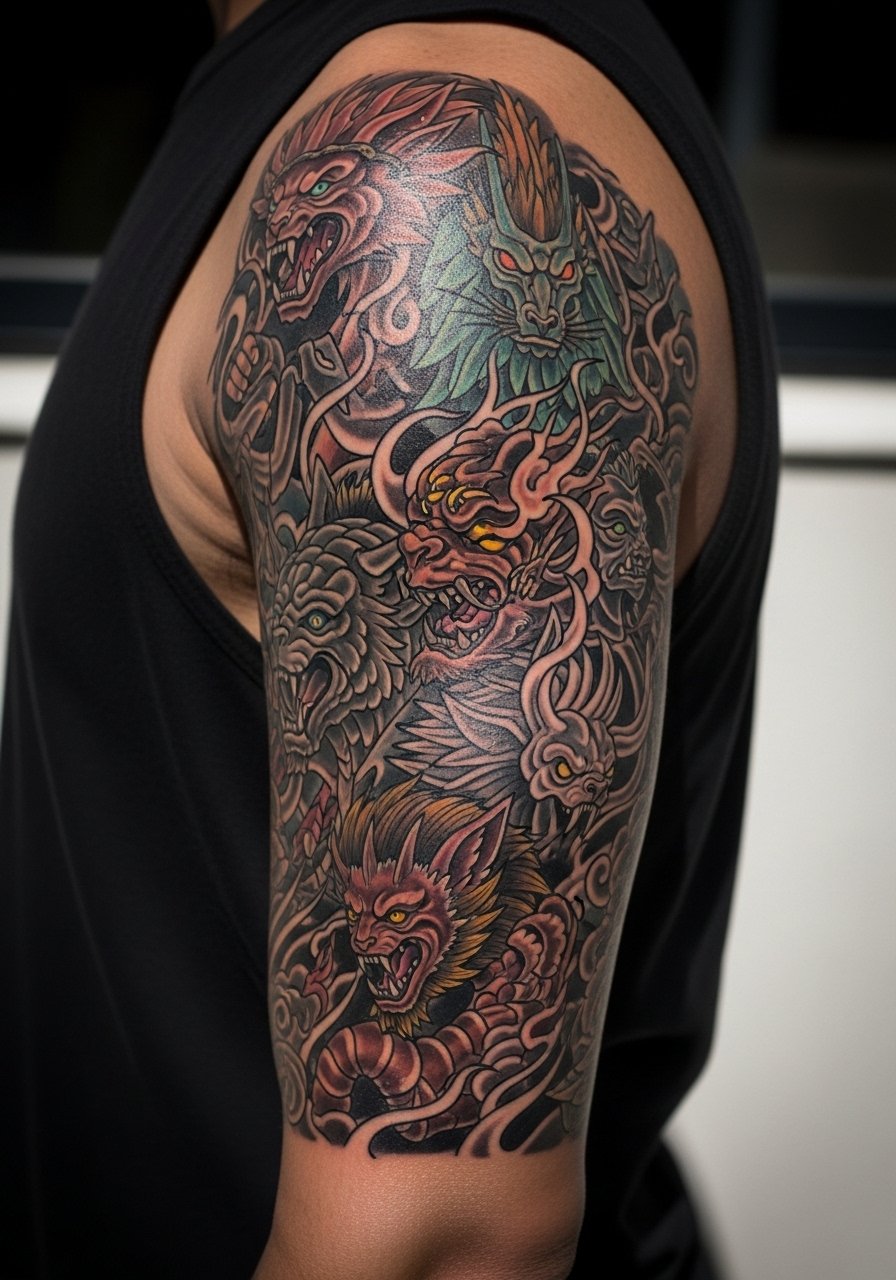
Mistake lead: packing too many creatures without clear hierarchy leads to a visual tangle. Ask the artist to set a primary creature and let others play supporting roles in lower contrast. The session is long due to overlapping elements and color depth. Expect touch-ups in overlapping edges after a few years where friction and sun take their toll. For nights out a short-sleeve blazer look with shirt sleeves rolled can keep the arm visible while feeling intentional.
22. Cosmic Serpent with Jewel Tones
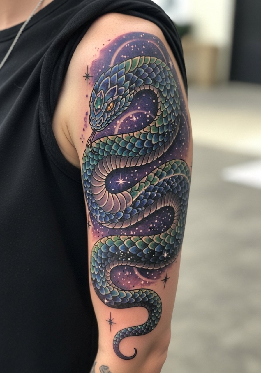
Aging/healing lead: serpents that spiral into high-motion joints can lose scale definition over time. Tell your artist to stagger scale sizes and leave breathing room where the arm bends. A frequent mistake is making every scale identical which reads as texture loss later. Sessions alternate fine line scale work and color fills. Expect a touch-up along the spiral where skin creases most. A rolled sleeve chambray frames the motion nicely.
23. Floral Lace Band with Color Highlights
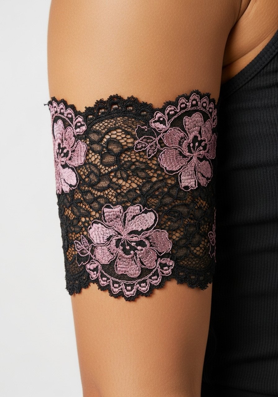
Styling lead: lace bands read elegantly when contrast is kept between lace and bloom color. Ask for slightly bolder black lace lines so the pattern survives a few years of wear. Common mistake is making lace too thin which bleeds into a gray tone later. Sessions are precise and require steady handwork. Touch-ups to lace edges are common around year three. A short-sleeve oxford keeps the band visible and refined.
24. Comic Neo-Traditional Mix with Pop Color
Mistake lead: mixing comic half-tones with neo-traditional shading without a clear palette rule results in noise. Decide in consultation which technique dominates each panel. Sessions jump between heavy black outlines and layered fills. Over time the spots where techniques overlap may need small touch-ups to preserve contrast. For casual wear, a band tee with sleeves rolled keeps the look cohesive.
25. Botanical Sleeve with Hummingbird Trio
Personal observation: repeating small focal elements like three hummingbirds helps the eye travel and keeps individual birds readable. Tell your artist where you want each bird's motion to suggest flight across the arm. The common mistake is placing them all the same size which flattens depth. Sessions include multiple small passes for feather saturation. Pair with a sleeveless tank for session day to give the artist room and to show off the motion after healing.
26. Stained-Glass Floral with Gold Leaf Effect
Controversy lead: some artists reserve faux gold leaf for larger pieces believing small gold fades too fast. Others apply it sparingly and say it reads well on healed skin. Ask your artist if they use metallic inks and how they perform on your skin type. Common mistake is overusing metallic where normal pigment would read better. Sessions require careful layering for reflective areas. Expect a touch-up if metallic areas lose sheen. A short-sleeve linen shirt complements warm gold tones.
27. Abstract Color Block Quarter Sleeve with Negative Space
Mistake lead: forcing perfection into geometric color blocks often ignores how the arm moves and the blocks warp. Tell your artist you want the layout tested with a few arm positions to check distortion. A common error is insisting on perfect right angles which will curve with muscle and look off when you move. Sessions are straightforward but require mock-ups before ink. Expect the blocks to soften slightly over time but negative space helps maintain legibility. For showing it off, a short-sleeve tee with a clean hem keeps the composition visible.
Frequently Asked Questions
Q: Will a colorful quarter sleeve need touch-ups more often than a blackwork sleeve?
A: It depends on the palette and exposure. Bright pigments can fade faster if you are often in direct sun, and areas near joints see more abrasion. Plan for a touch-up around year two to four for saturation refresh, especially on thin watercolor washes.
Q: Can fine line details survive across a full quarter sleeve with color fills?
A: Yes if the artist balances lineweight and spacing. Fine lines paired with heavy color should be given extra breathing room and slightly bolder anchor lines where they meet saturated fills. Ask to see healed portfolios with similar mixes before booking.
Q: How should I dress to the session for a quarter sleeve that wraps toward the inner bicep?
A: Wear a tank top or a shirt that you can raise without pinching the area. The key is clear access and comfort for longer sessions.
Q: Are cultural motifs okay to use in a colorful quarter sleeve?
A: They can be, but be intentional. For imagery tied to specific traditions, acknowledge origins and opt for respectful variation instead of direct replicas. Ask your artist about their familiarity with the motif and how they recommend adapting it.
Q: Does placement on the upper arm versus outer bicep change aging expectations?
A: Yes. Outer upper arm areas that see less friction and sun tend to retain saturation better. Inner arcs that wrap toward the elbow or pit can soften sooner. Discuss movement and your clothing habits with your artist so they can place focal points where they will last.