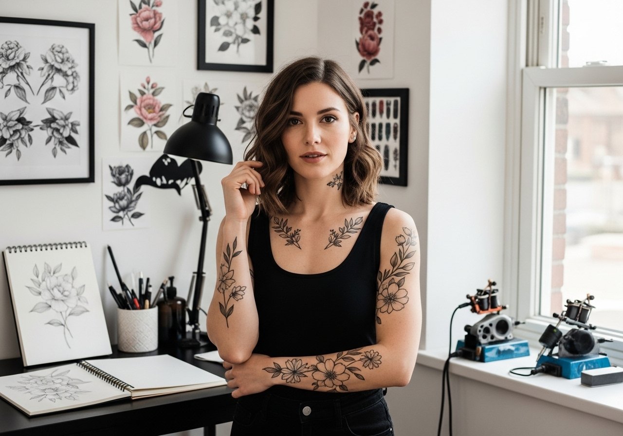
Bold color, careful placement, and a clear plan make the difference between a photo that gets likes and a piece that still reads sharp after years of sun and sleeves. Expect some pain, plan for touch-ups, and pick placements that match your daily wardrobe so the pieces get the air and care they need. Below are 21 colorful ideas inspired by the look Vinnie Hacker often favors, with notes on aging, session logistics, and what to tell your artist.
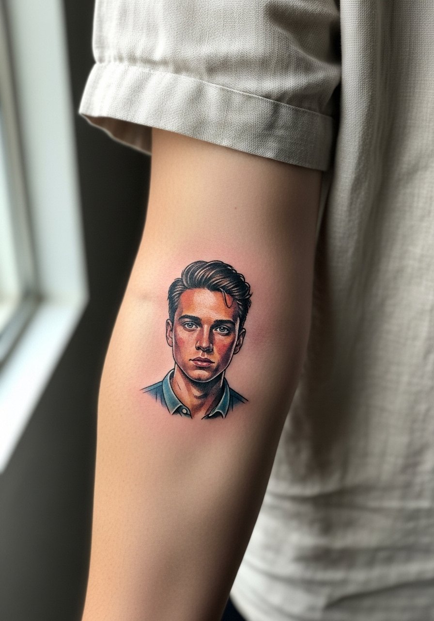
1. Inner Forearm Mini Portrait in Warm Tones
I've seen this placement hold color well for people who want a visible statement without committing to a sleeve. The inner forearm is a mid-level pain area, usually a two-hour session for a small portrait with layered color saturation. Tell your artist you want slightly increased spacing between facial features so the pigment has room to stay crisp as it ages. A common mistake is packing too many tiny details into a 2-inch frame, which leads to loss of definition by year three. Expect the color to sing at six months and to soften by year five, with a likely touch-up around year three. For showing it off, roll sleeves or wear a crisp short-sleeve linen shirt that keeps attention on the forearm.
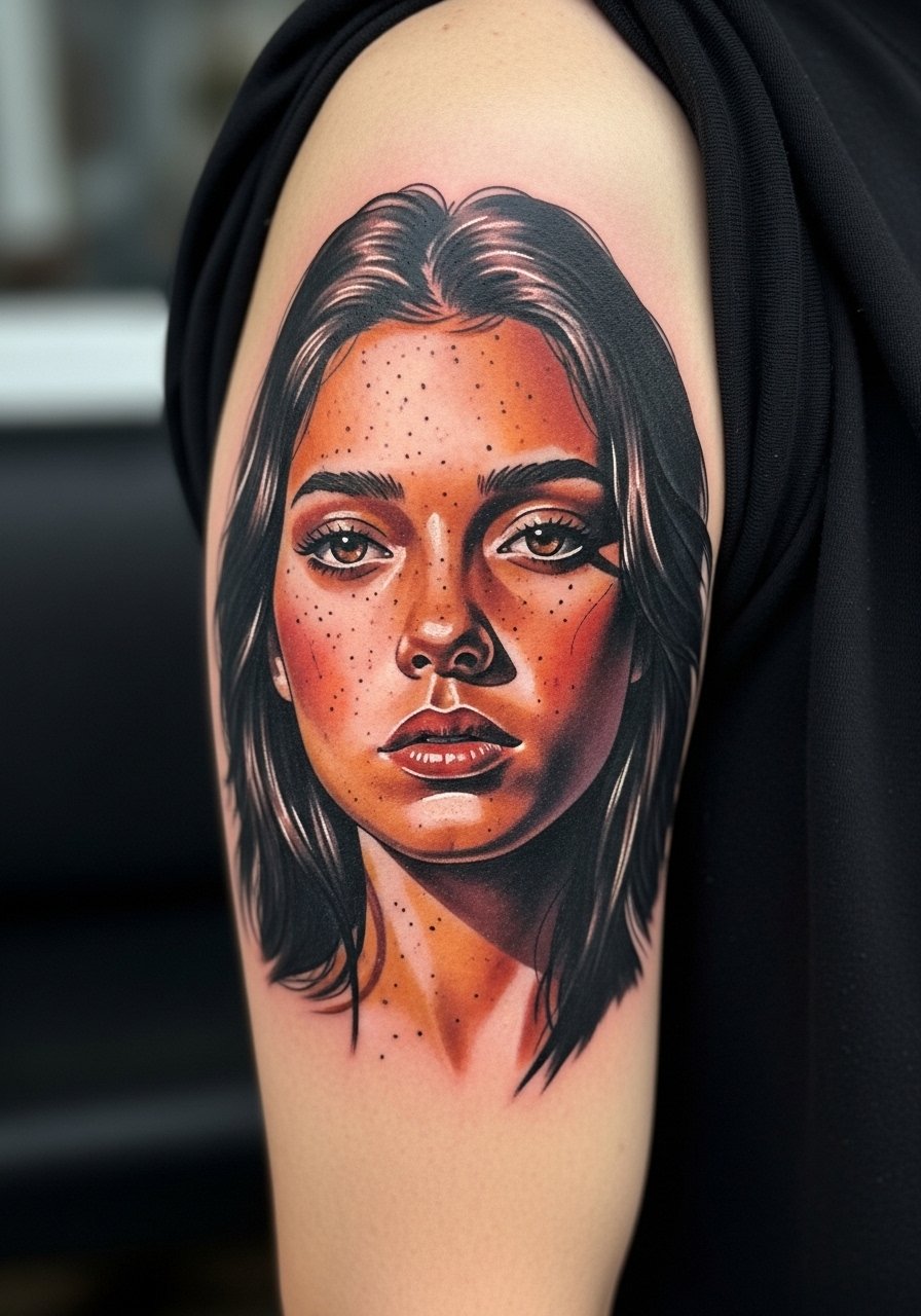
2. Saturated Upper Arm Portrait with Painterly Washes
There is a split in taste around highly saturated, painterly portraits. One camp loves the graphic, saturated color for photos and screens. The other camp worries that heavy soft shading in bright pigments can age into fuzzy patches on the arm. If you lean toward the saturated look, plan for strong saturation and punchy outlines at the edges so the portrait keeps form as the pigment settles. Upper arm sessions are moderate pain and usually two to four hours for a single portrait. Avoid asking for ultra-fine facial details at small sizes. For evenings out, a sleeveless button-down frames an upper arm portrait without covering it.
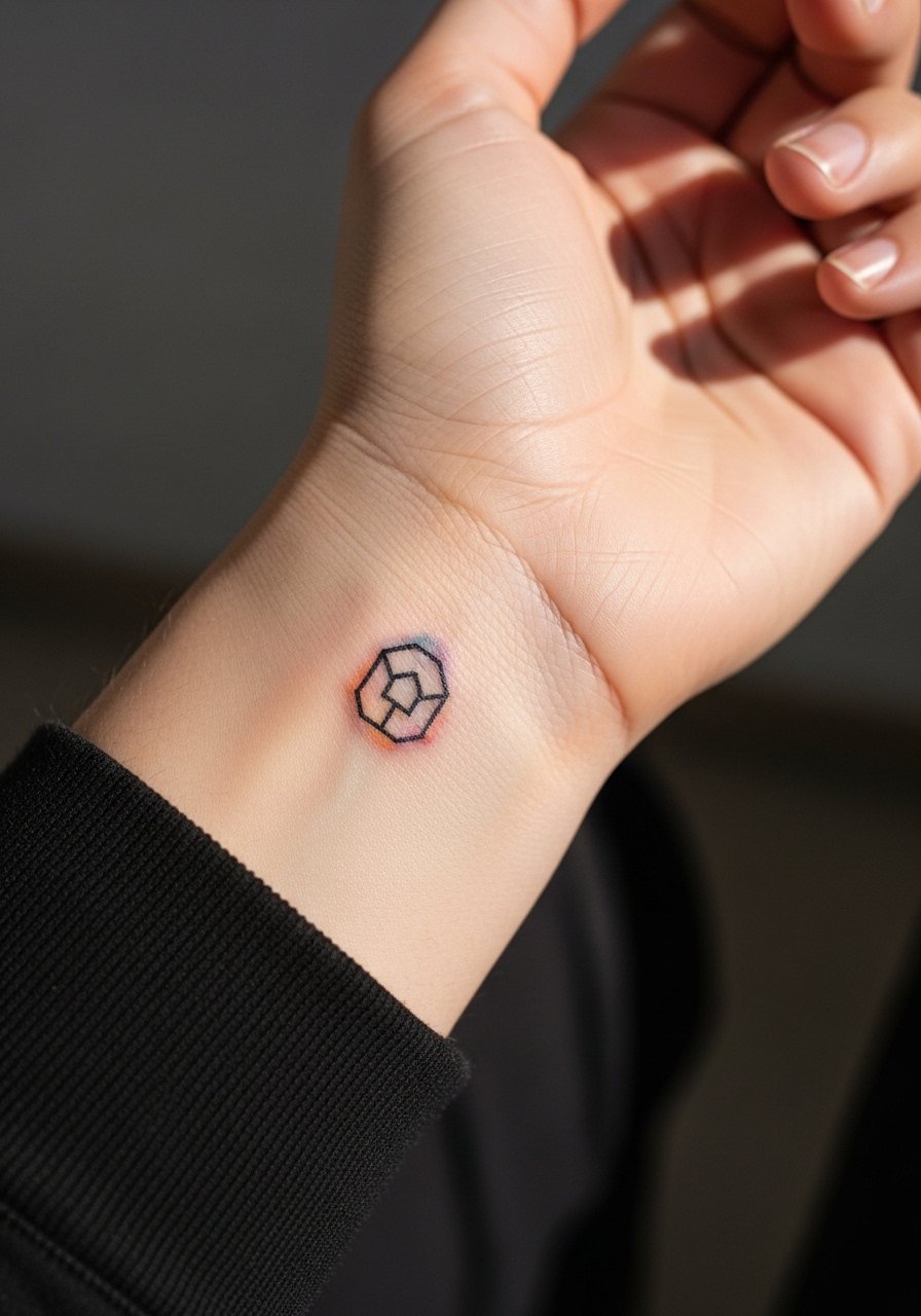
3. Tiny Wrist Color Glyph with Minimal Black Outline
Fair warning, the wrist is a high-friction spot and the tiny color glyphs there rub against watches and cuffs. Sessions are short, often under an hour, but expect touch-ups sooner than for larger work. The most common mistake is choosing a dense color fill with no outline. I recommend a thin black outline to lock the shape then soft color fill to resist early blurring. At six months the color will still be bright, but by two years it may need a light refresh. Wear a minimalist watch or thin bangles on the opposite wrist to keep the tattoo visible and protected during daily activity.
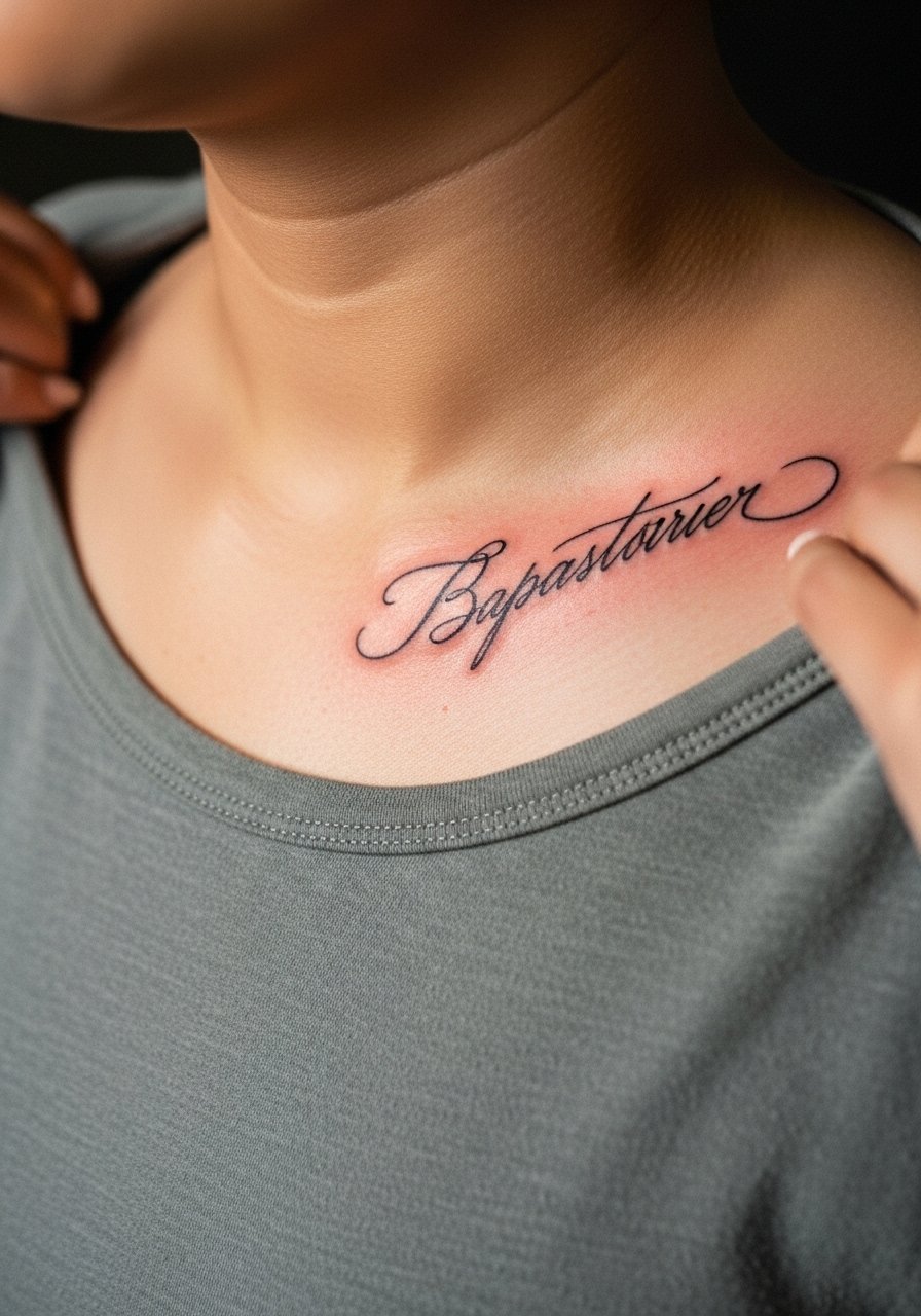
4. Collarbone Script with Color Accents
When you sit down with an artist for a collarbone piece, say exactly where you want the script to sit relative to your neckline and which letters should be emphasized. The collarbone can be sensitive, so expect a longer session if you want color gradients behind the letters. A common aging issue is laying color too close to thin script, which causes the ink to merge. Space the color back a few millimeters from the lettering and ask for slightly bolder linework in key letters. Session wear tip, arrive in a wide-neck shirt you can pull aside. Pair the piece with a thin chain pendant necklace that sits above the script for a balanced look.
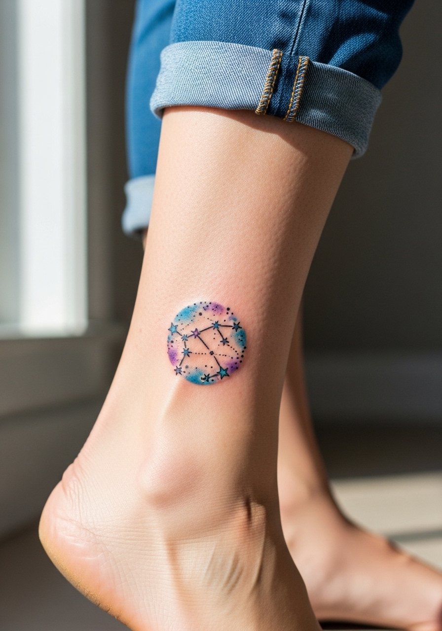
5. Ankle Constellation in Jewel Tones
There is something about jewel-tone colors on ankle placement that reads delicate but durable. The ankle is a low to moderate pain area, depending on bone proximity, and sessions are typically under two hours for a small clustered design. A frequent error is going too tiny with complex spacing. Give the stars a little breathing room and ask for slightly stronger saturation on the lower points to counteract shoe friction. Healed at six months the tones will be vivid. At year three expect some softening where socks or shoes rub. For showing it off, roll up jeans or wear strappy sandals to keep the ankle visible without rubbing the fresh ink.
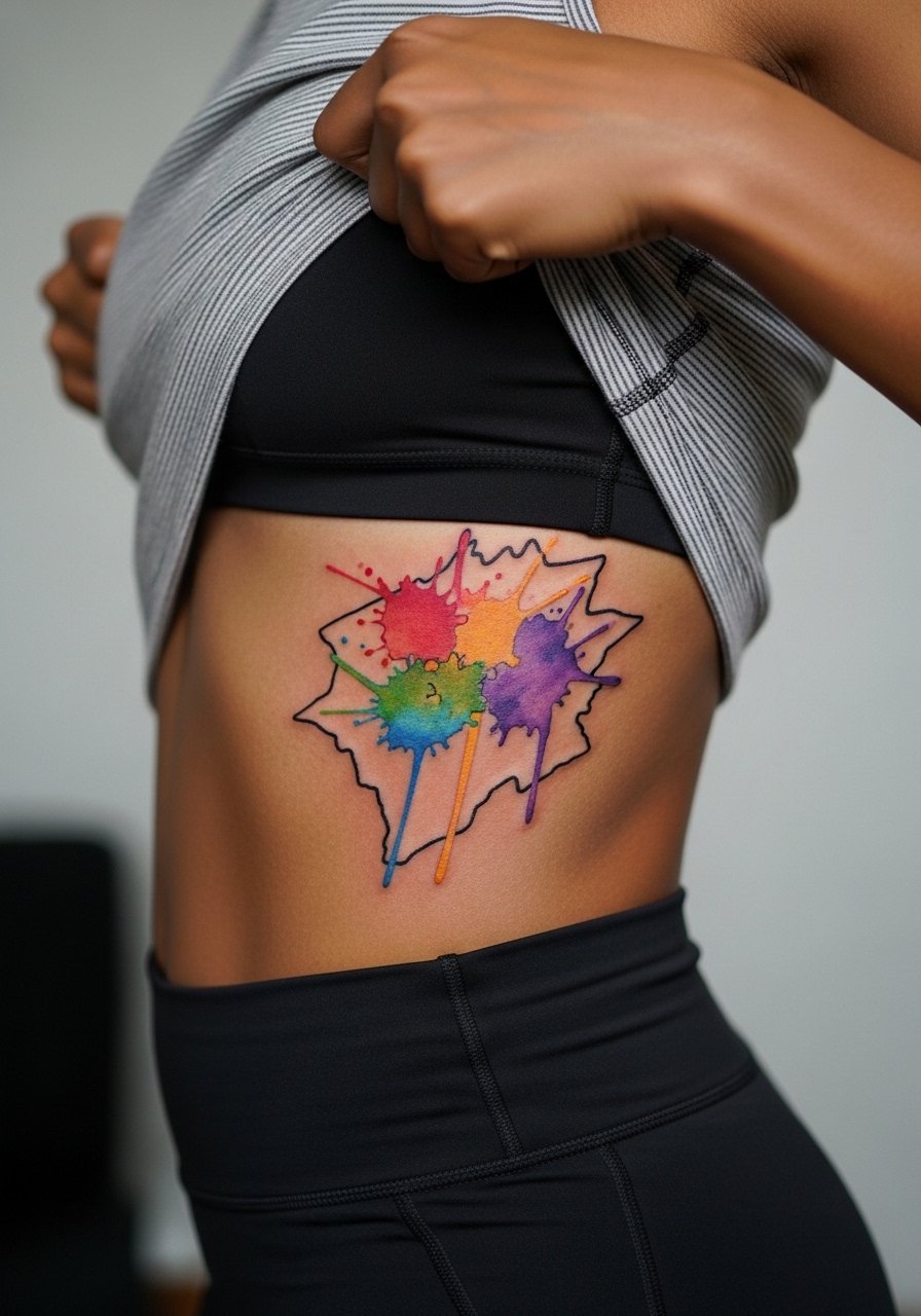
6. Ribcage Watercolor Splash with Defined Edge
Ribcage placements are controversial for fine detail. One camp argues the skin stretch and movement blur fine lines within two years. The other camp says with proper needle depth and spacing, the result settles fine. A practical compromise is a watercolor approach with a defined inked edge to protect the composition. Expect higher pain and longer sessions, often split into two visits. Tell your artist you want bold anchor lines and softer internal washes so the piece keeps form as the colors soften. Dress for the session in a cropped top you can lift easily. Sensitive placement note, pick an artist familiar with ribcage work and who has healed photos to show.
Studio Day Picks
The ribcage and collarbone sessions above require different prep than wrist or ankle work, and a few targeted items smooth the day and the first week.
-
Stencil transfer paper kit. Helps artists preview placement on curving areas like ribs and collarbones so you avoid last-minute shifts during the session.
-
Topical numbing cream. Useful for high-pain placements such as the ribcage, applied according to the product instructions before the appointment.
-
Thin protective film roll. Keeps ankle and wrist tattoos cleaner during the first week when shoes and sleeves cause friction.
-
Fragrance-free gentle body wash. Cleans delicate color work without stripping pigment, helpful for larger colorful pieces in the first two weeks.
-
Aquaphor healing ointment. Thin layers during the first few days lock in moisture on small delicate pieces like wrist icons without suffocating the skin.
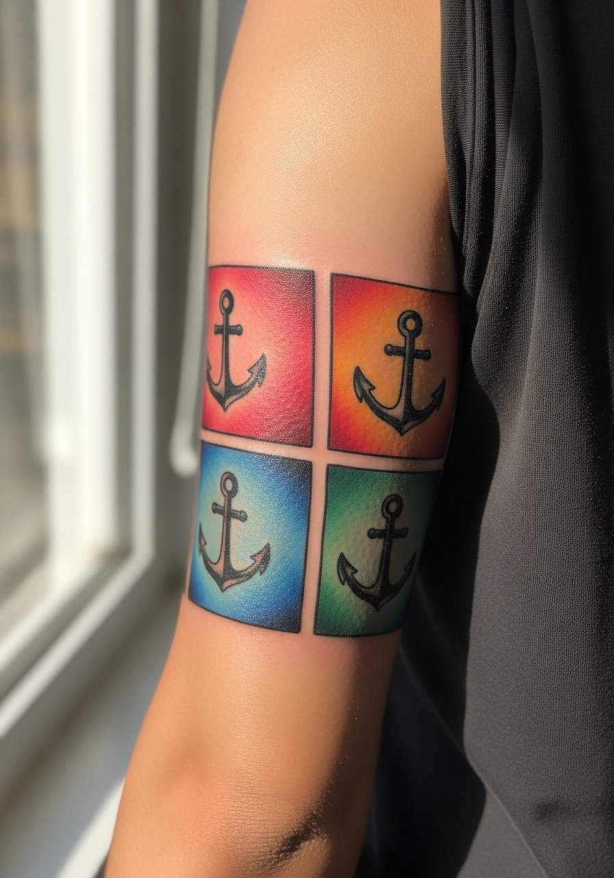
7. Half-Sleeve Color Block with Bold Outlines
There is visual weight to bold outline color blocking that keeps a half-sleeve readable from across a room. For this placement, sessions are longer, often multiple four-hour blocks. The biggest mistake is relying solely on soft color transitions without anchors. Ask for solid outlines or dark anchors in focal shapes, then layer color inside. Aging looks favorable for this approach because the dark anchors retain the composition even as saturation softens. Expect touch-ups at year three to refresh the saturation. For daily wear, a sleeveless denim jacket or rolled tee sleeve shows off the half-sleeve while protecting the inner arm.
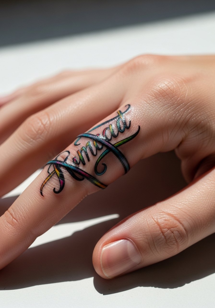
8. Colorful Script Wrapped Around the Finger
Finger tattoos are high maintenance and often fade faster. Fair warning, expect touch-ups sooner than other placements and consider slightly larger letterforms for longevity. A common error is asking for ornate script in a space that cannot hold the detail. For a colorful take, use small color fills behind each letter and a strong outline. Sessions are short but may sting more because of bone proximity. At six months the contrast will still be clear. By two years the edges may soften. Hand and finger work still affect some workplaces, so think about professional considerations before booking.
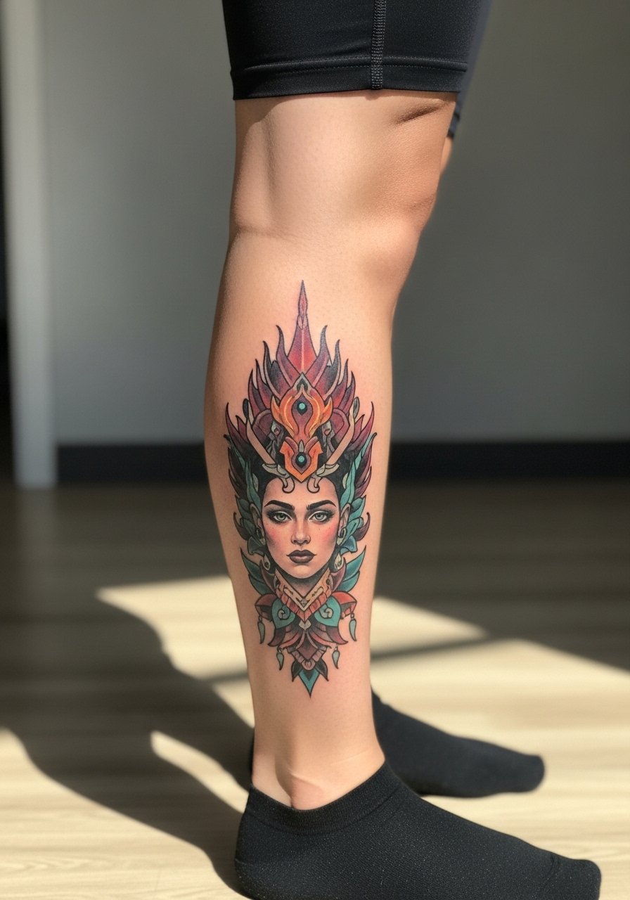
9. Bold Calf Illustration with Gradient Colors
There is something satisfying about a calf piece that reads like a poster. The calf is low pain and sessions vary from one to three hours depending on size. Tell your artist you want strong midtones and a gradual gradient rather than tiny stippling in large color fields, because stipple densities can flatten at distance. A real mistake is over-detailing a design meant to read from far away. Expect stable color at six months and a gradual softening by year four. For casual showing, wear athletic shorts with a mid-thigh cut that keep the calf visible while avoiding shorts that rub during recovery.
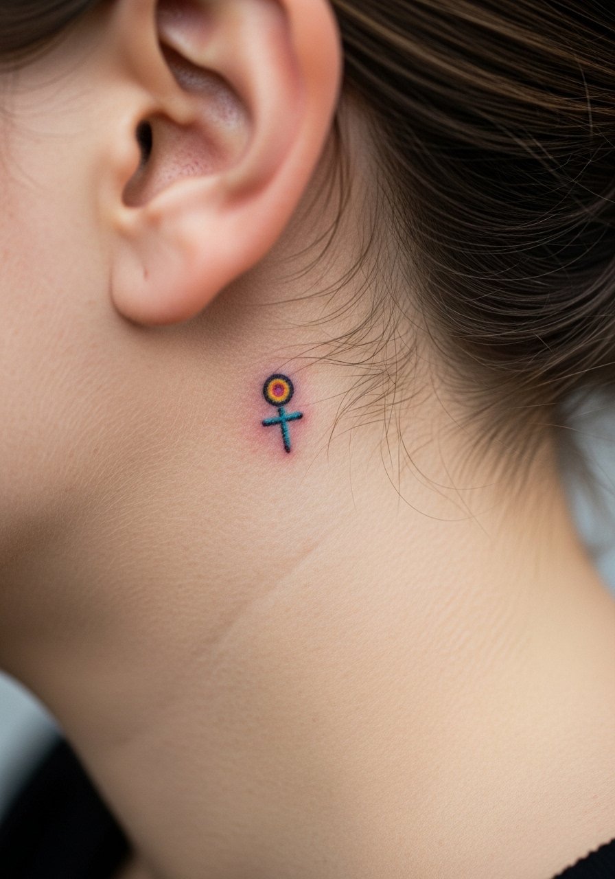
10. Tiny Colored Ear-Behind Symbol
This placement requires care in consultation because the area is small and the skin texture is delicate. The session is quick, but the stencil must be placed carefully. The mistake people make is asking for too much detail in a very small zone. Use a simplified icon with a saturated pop of color and ask your artist for slightly increased line weight at the boundaries. Sensitive placement note, describe where the design sits relative to the hairline. For subtle wear, keep short hair or a pulled-behind-ear style to reveal the piece. No affiliate link here because session wear is the focus.
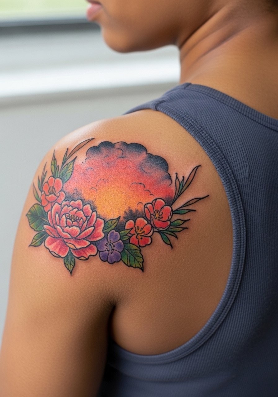
11. Back Shoulder Blade Floral with Sunset Palette
I've seen shoulder blade florals age well when artists use strong petal anchors and layered saturation. The placement is moderate pain and usually a two to three-hour session for a medium piece. The common mistake is putting dense color right against delicate thin details. Ask for negative space and midtone shading that gives the petals depth without overcrowding. Expect six-month vibrancy and a gentle fade across four to five years. For evening wear, an open-back dress or a strappy tank top shows the shoulder blade without exposing the rest of the back.
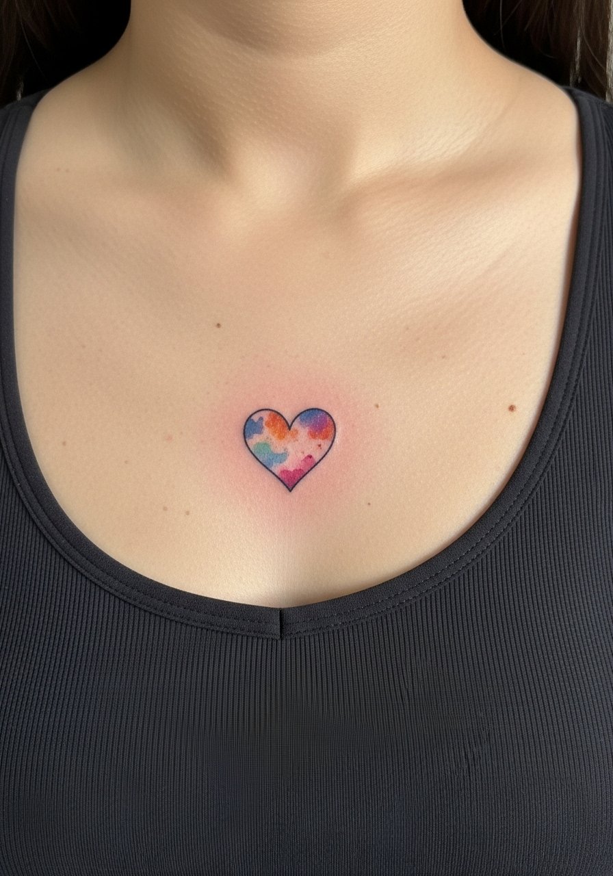
12. Tiny Chest Heart with Watercolor Glow
Most watercolor chest pieces lose their edge if the artist blends color into fine script or tiny motifs. For a small heart with a watercolor glow, pick a fitted sports bra or wide-neck shirt for the session so the artist can access the area cleanly. Expect moderate pain and a short session that focuses on layering light washes. A mistake is pushing pigment too deep when the skin there is thin. For longevity, ask for a subtle outline or halo to define the shape as the washes soften. Sensitive placement note, the chest can be tender for some, so plan a rest day after the appointment.
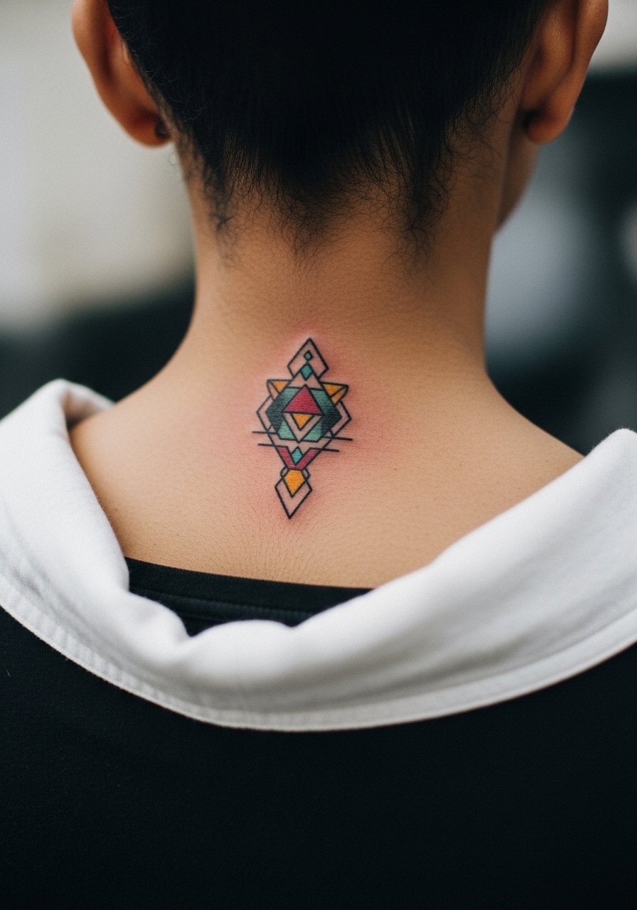
13. Bright Neck Nape Accent with Geometric Shape
The nape ages differently because the area sees sun and movement. The biggest mistake is making the geometry too fine. I recommend a slightly bolder geometry outline filled with saturated color so the shape holds up. Sessions are short but the skin is sensitive. For showing it off, wear a wide-neck shirt or a low-collar top that reveals the nape without exposing the chest. A lightweight cropped hoodie you can pull aside during the session keeps access clean and comfortable.
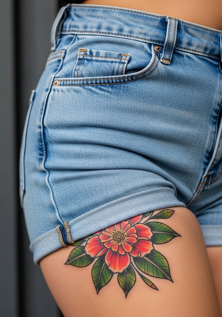
14. Thigh Botanical with Rich Color Layers
Most inner thigh tattoos fog with friction if clothing constantly rubs the area. The tip is to schedule the session in cooler months or plan loose bottoms for the first two weeks. This placement can be sensitive but rewards with large canvas time for color layering. A mistake is choosing very fine linework that will be lost to friction. Ask for bold petal anchors and layered saturation. For the session wear, pick loose shorts you can shift easily. Sensitive placement note, inner thigh pieces require an artist who documents healed photos for similar placements.
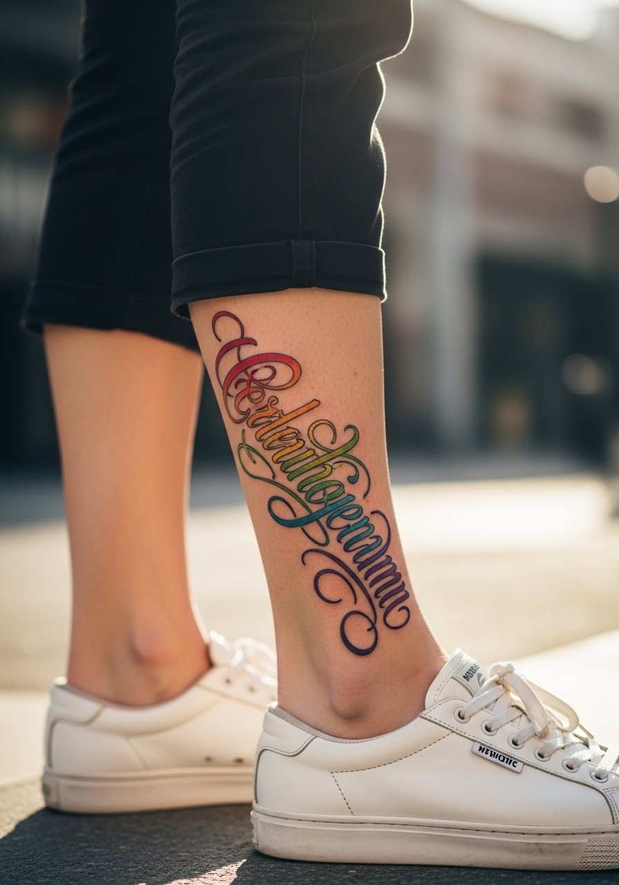
15. Calf-to-Ankle Flowing Script with Color Fill
Visual impact lead works here because flowing script that runs from calf to ankle reads like motion. Sessions for a long script can be two to three hours split across visits. The common mistake is using too narrow a letter width. Ask for slightly increased letter spacing and a color fill that contrasts the skin tone. Healed at six months the piece will look fluid. By year four expect softening in the thinner strokes, which is why a touch-up at year three makes sense. For shoes and style, a pair of low-profile sneakers and cropped pants show the run without rubbing the fresh ink.
16. Hand-Palm Edge Color Accent
Hand placements are high risk for rapid fading because of frequent washing and friction. Pain is sharp and sessions are usually brief but intense. The practical approach is to use small color accents on the hand edge with a slightly heavier outline. The error is demanding large, detailed pieces on the palm that will not hold. Expect regular touch-ups, often annually. Consider the career implications and whether visibility aligns with your work. Hand tattoos sometimes require artists with a specific portfolio of healed hand work, so prioritize discovery pathways like portfolio searches and local directories over social handles.
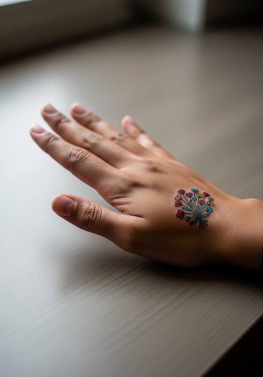
17. Shoulder Cap Illustration with Neon Highlights
Visual impact matters on the shoulder cap because the area catches movement and light. Sessions are moderate and can be completed in a single three-hour block for mid-sized pieces. Mistakes include packing neon tones right next to thin lines. Ask your artist for midtone buffers and a mix of traditional pigments with neon highlights to keep the piece readable as it ages. Expect only slight fading at two years with regular sunscreen use. For daytime showing, a wide-strap tank top keeps the shoulder cap visible while protecting the rest of the upper torso.
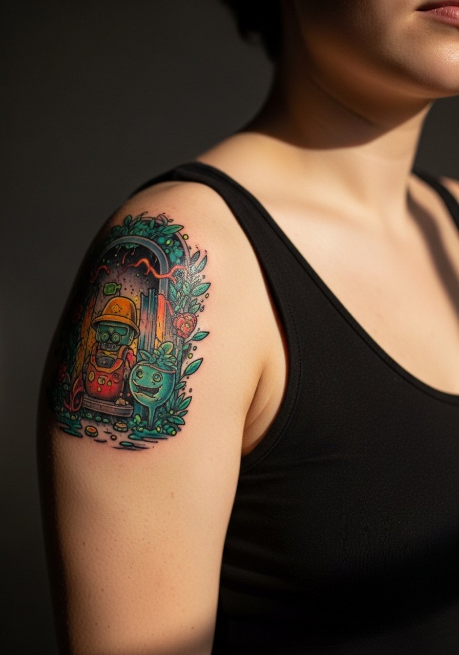
18. Small Rib-Adjacent Badge in Saturated Cyan
Controversy lead works here because rib-adjacent small badges split opinion. One group says smaller badges in saturated color near the ribs fade or blur quickly because of skin movement. The opposing group counters that when placed slightly off the rib bone with correct spacing, small badges maintain clarity. The safe route is to place the badge just lateral to the ribcage and ask for slightly bolder linework around the edges. Session pain is elevated and the tattoo will likely need a touch-up at two to three years. For the session, wear a cropped top you can lift without shifting the rest of your clothing.
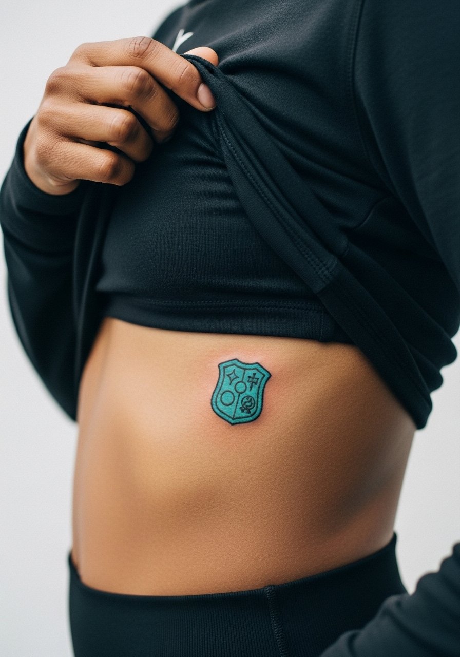
19. Collar Tattoo with Overlapping Color Panels
There is a practical risk when overlapping color panels meet at high-motion areas. The mistake is compressing too many color shifts into too small a space. For a collar tattoo that wraps the neck area, ask for clear panel lines and slightly reduced contrast between adjacent colors to avoid muddying. Sessions are short but may require a touch-up session for color balancing once healed. Expect the panels to read well at six months if protected from direct sun. For modest showing, a crew-neck tee with a loosened collar gives glimpses without exposing the neck.
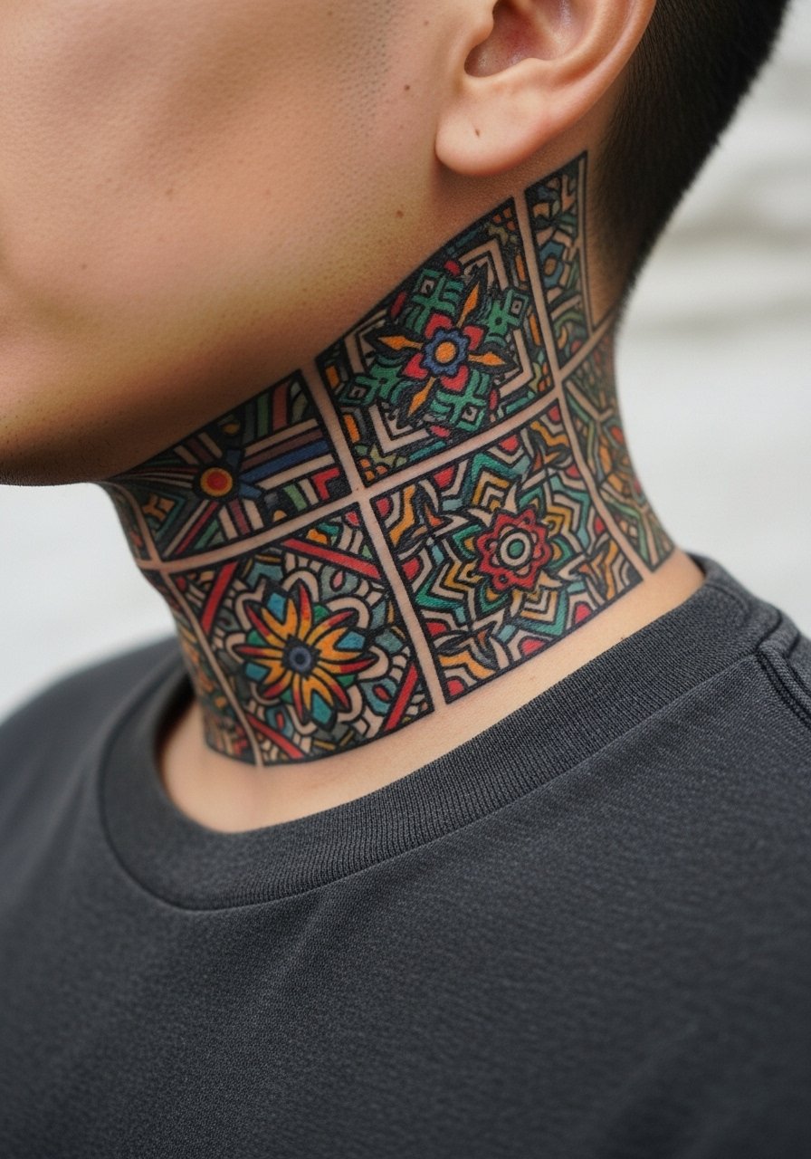
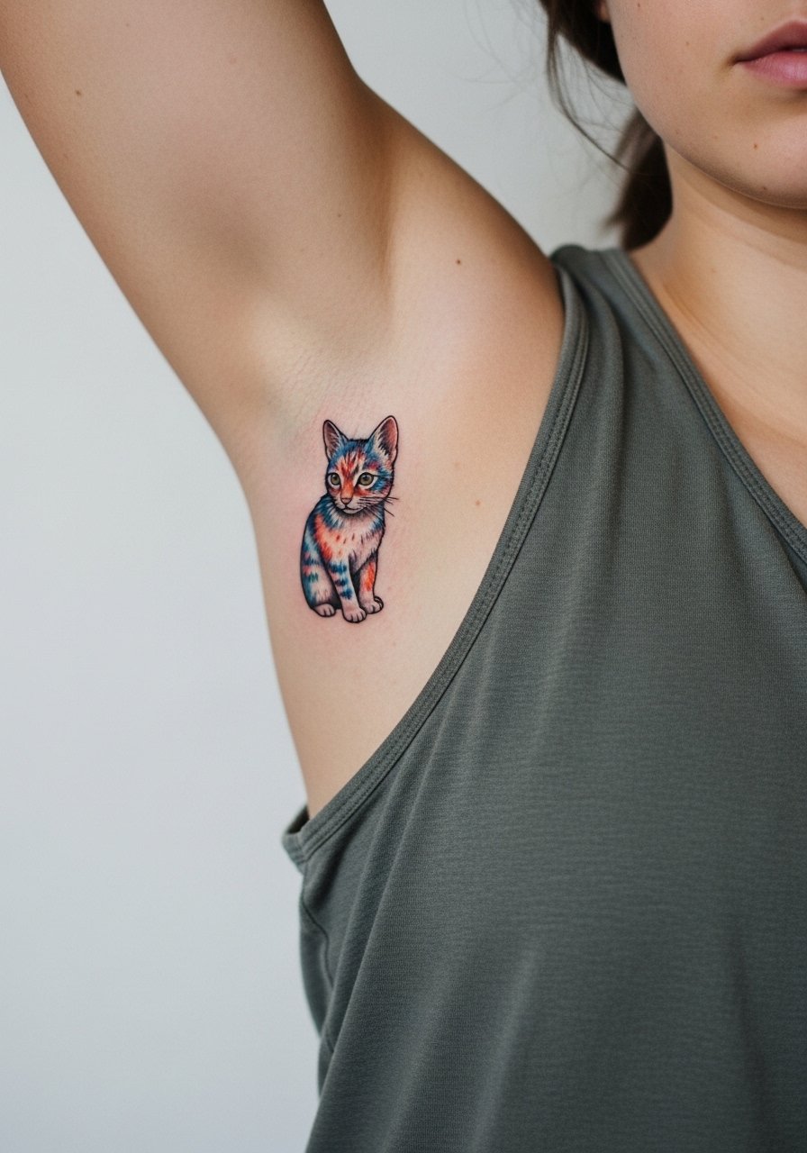
20. Micro-Realism Mini Animal on the Inner Bicep
When I talk to artists about inner bicep micro-realism, they stress spacing and pigment depth. The inner bicep heals nicely when lines are spaced and saturation is even. Pain is moderate and sessions are usually under two hours for a small animal face. A common mistake is adding too much tiny texture. For longevity, ask for broader strokes in key areas and a slight outline to protect contrast. Sensitive placement note, the inner bicep can be tender and sweat-prone, so schedule open days. For session wear, a loose tank top keeps access clean and comfortable.
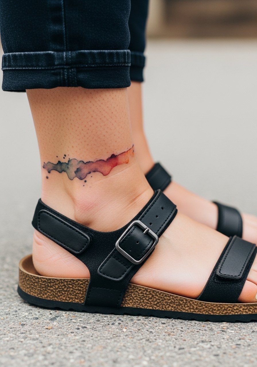
21. Ankle Band Watercolor Ring with Faded Edge
Most ankle band ideas that try to be too tight end up needing touch-ups. The visual impact lead applies because a watercolor ring looks intentional when the edge has a faded, airy finish. The ankle is a moderate pain area and sessions are usually under two hours for a narrow band. The biggest mistake is requesting a crisp, thin ring and expecting it to stay that way. Ask for slightly thicker color application at the base and softer feathering toward the skin. For footwear, pick sandals or low ankle boots in the first month to avoid constant rubbing. Wearing open sandals helps display the ring without unnecessary friction.
Frequently Asked Questions
Q: How long will a colorful inner forearm portrait last before needing a touch-up?
A: It depends on pigment saturation, sun exposure, and how much detail you cram into the piece. For a well-spaced inner forearm portrait with solid saturation, expect touch-ups around year three in many cases. Regular sunscreen and avoiding abrasive clothing help extend the interval.
Q: Are ribcage watercolor pieces more likely to blur than upper arm pieces?
A: The rib area moves and stretches more, so watercolor washes without anchors can soften faster. One camp says avoid fine details on ribs entirely. The other camp says anchors and proper spacing solve the issue. Choosing bold anchor lines and working with an artist who shows healed rib photos narrows the risk.
Q: What should I wear to a collarbone or sternum session?
A: Wear a wide-neck shirt or a sports bra that you can shift so the artist has clean access without exposing other areas. For a collarbone piece, a loose button-down works well. A wide-neck shirt is a practical session choice because it gives access while keeping you comfortable.
Q: Do colorful wrist and finger pieces need different aftercare than larger work?
A: They do not need different products but they do have higher friction and wash frequency. Keep them protected with thin film and expect earlier touch-ups. The Inline Product Block above lists a protective film and gentle wash that help these small placements heal better.
Q: How do I find an artist who can handle colorful micro-realism for a portrait?
A: Use discovery pathways like portfolio searches on studio websites, local convention portfolios, and community forums. Look for healed photos rather than just fresh work. Ask for healed shots showing similar placements and skin tones to yours.