
Fine line work and small script are fashionable right now, but longevity is the quiet test most people forget. A phrase on the collarbone or a tiny wrist script can look exquisite fresh and then soften unevenly if placement and line weight were not planned. These 17 feminine takes on One Life One Chance focus on designs and placements that balance visual grace with realistic aging, plus what to say in your consultation to get it right.
1. Fine Line Script Along the Collarbone
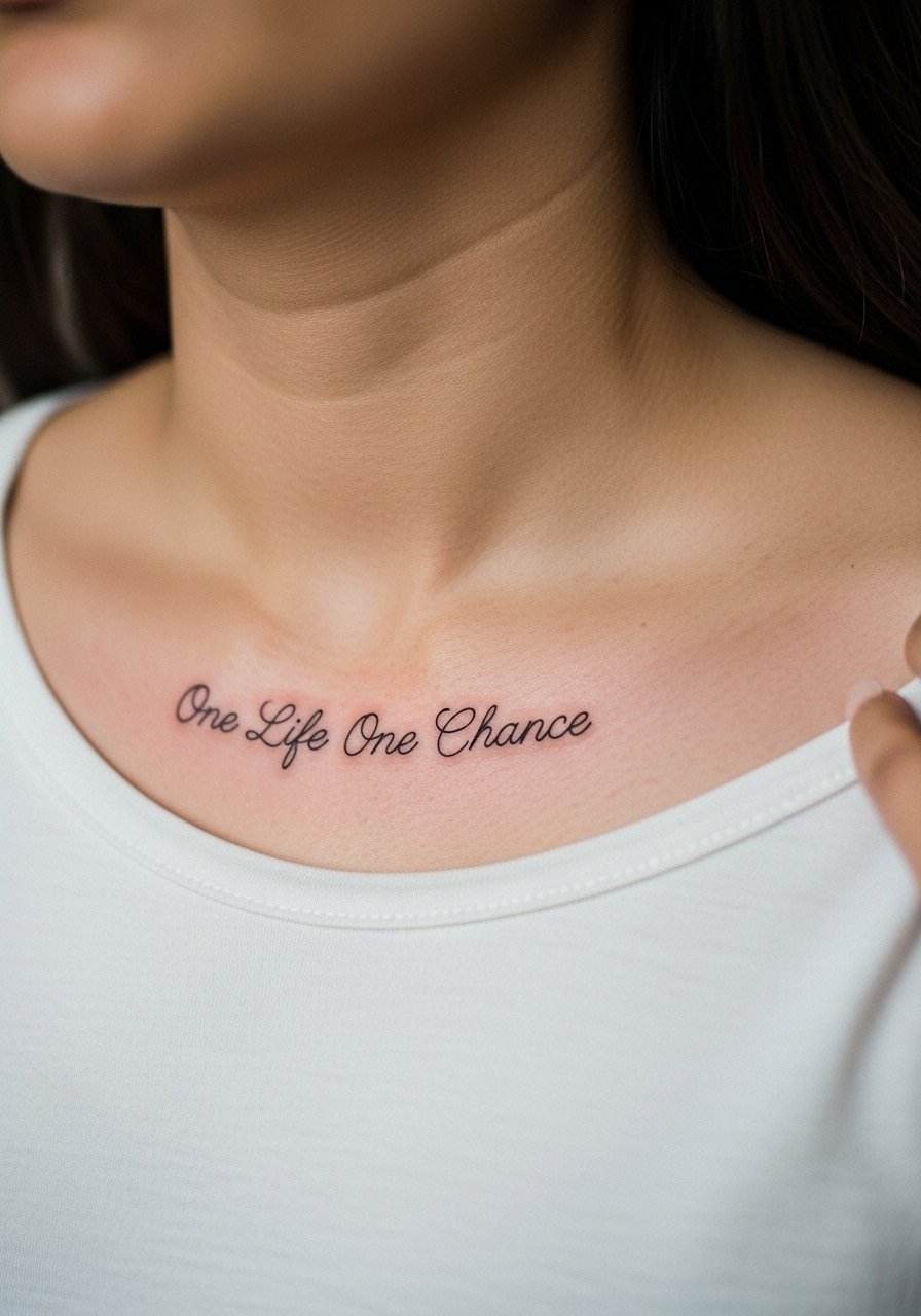
I recommend this placement when you want a visible, elegant script that reads with clothing choices. The collarbone skin holds thin script well if the artist spaces letters slightly wider than usual. Tell your artist you want classic cursive at slightly heavier line weight in the downstrokes, and ask how it will move when you turn your head. Fair warning about pain, it is tingly but brief. Most people find a single short session is enough. A common mistake is asking for hairline-thin lettering, which often blurs into each other over three to five years. For showing it off, wear a wide-neck shirt or a thin chain necklace that sits above the text so the script reads cleanly.
2. Tiny Script on the Side of a Finger
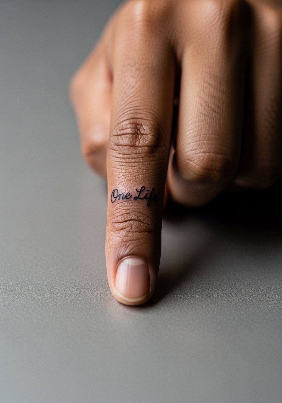
Finger tattoos are candid and intimate but they come with maintenance. Expect faster fading because of frequent washing and skin turnover on hands. Tell the artist you accept the likely need for touch-ups by year one or two, and request compact, slightly bolder letters rather than ultra-fine strokes. The session feels quick but the area is sensitive and vibration from the machine is more noticeable. A common mistake is asking for a long phrase across multiple fingers. Short, single-word or two-word placements age and hold up far better. Plan for annual touch-ups and avoid constant friction like rings resting over the text.
3. Floral Wreath Framing Script on the Inner Forearm
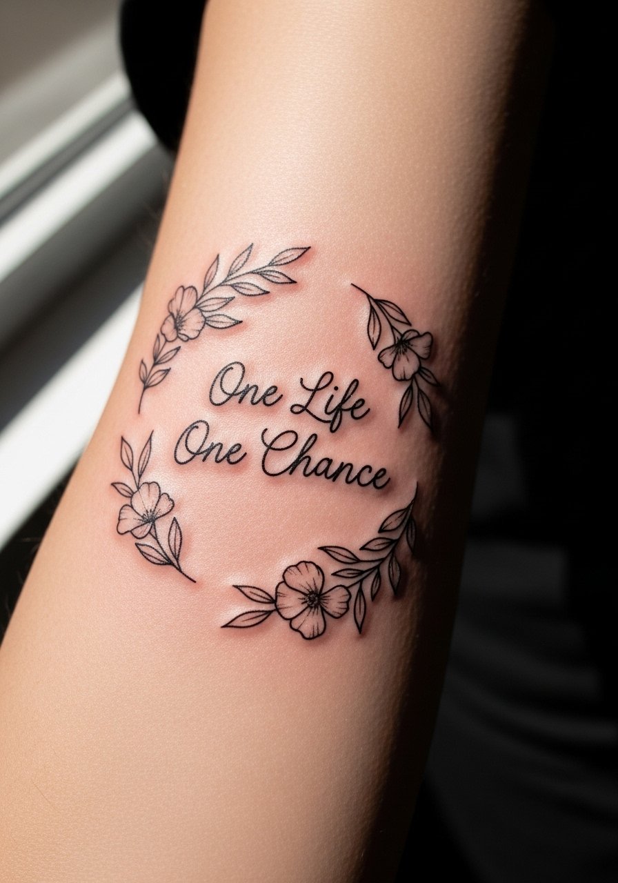
I've seen this layout work beautifully when the wreath gives breathing room around the phrase. The forearm has firm skin so delicate stipple shading and thin script survive longer there. Ask your artist to use stipple shading for petals and to keep the script slightly raised above the wreath so letters do not get swallowed by shading. The session is comfortable for most people and often fits into one two-hour slot. The usual mistake is crowding the script with dense shading. For outfits that highlight the forearm, a rolled-sleeve linen button-down frames the piece without competing.
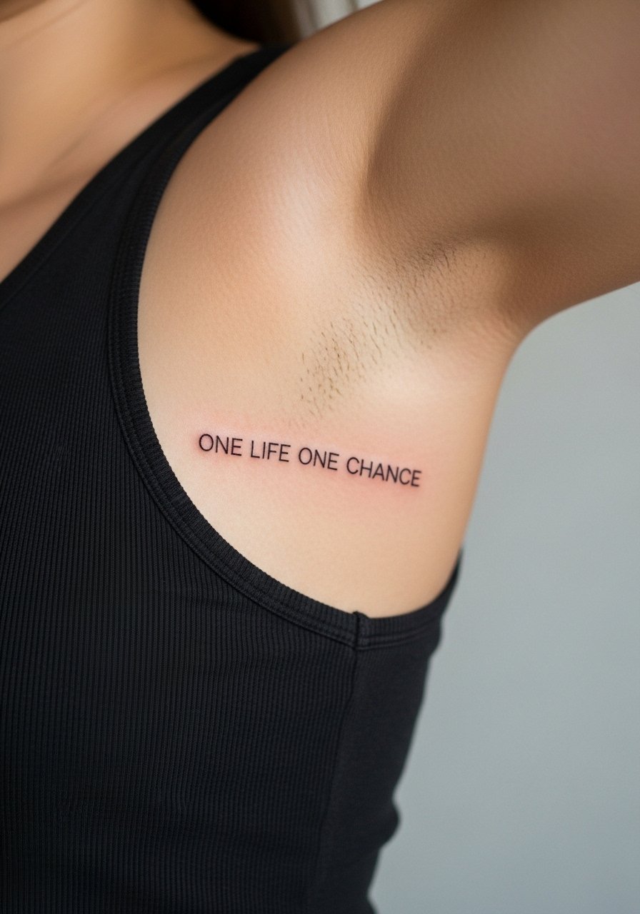
4. Watercolor Rose Over the Ribcage
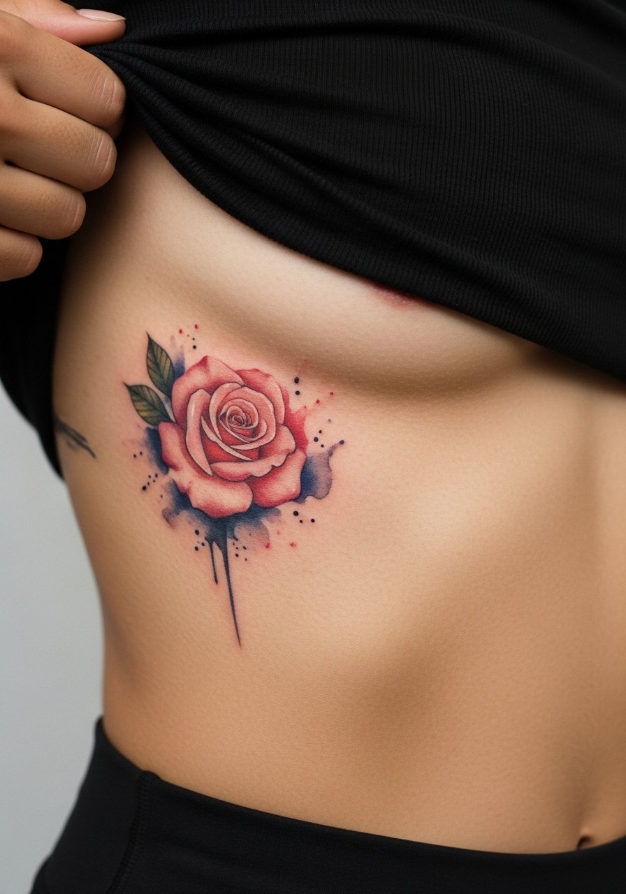
Fair warning, ribs are one of the more painful placements, but the canvas is generous so watercolor blending and script can breathe. Artists are split on placing fine line script on ribs. One camp says dense stretch and breathing blur thin lines within two years. The other camp argues that with the right needle depth and spacing, fine line settles fine on ribs. Ask your artist where they stand and request slightly larger letterforms if they favor longevity. The session can run long because of position changes and breathing. A common mistake is insisting on tiny lettering that gets lost in the wash of color.
5. Minimalist Arrow and Tiny Script on the Ankle
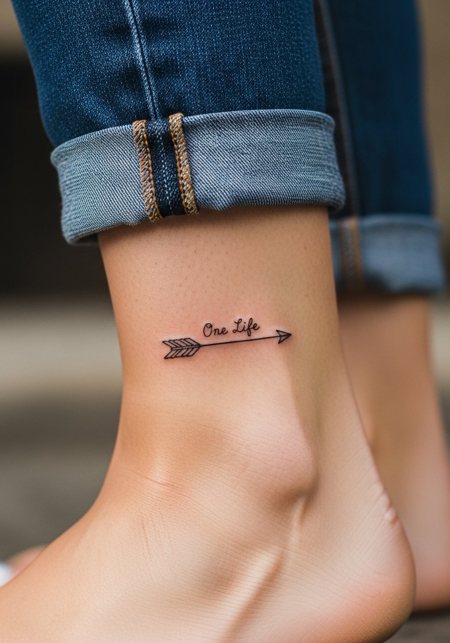
Ankle work looks delicate and reads as jewelry, but it sees friction from socks and shoes. I suggest asking for slightly thicker outlines on the arrow and to place the script where it will avoid direct shoe contact. Sessions are short and the pain is manageable, described often as sharp but brief. The typical mistake is placing script too close to the shoe line, which causes faster fading. When you want to show it off, pair the piece with rolled jeans and a pair of minimal sandals so the design stays visible without rubbing.
6. Micro-Realism Bee with Script on the Shoulder Blade
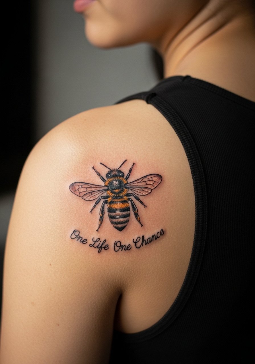
There's something about a small micro-realism bee that reads personal and tactile on the shoulder blade. The area tolerates fine detail and heals with less friction than the arm or ribs. Tell the artist you want the bee in micro-realism with stipple wings and the script directly under it, but ask for spacing so the text does not butt against the image. Sessions are comfortable because you lie on your stomach for part of the time and shifts are minimal. The common mistake is packing too much texture into a tiny bee which blurs into one mass after a few years. For session day, throw on a loose tank top so your artist can access the blade without you getting chilly.
Studio Day Picks
The collarbone, forearm, ankle, ribcage, and shoulder blade pieces above each ask for slightly different prep and first-week care.
-
Stencil transfer paper kit. Lets you preview how the phrase sits on curved areas like the collarbone and shoulder blade before committing to line weight.
-
Skin-safe barrier film roll. Useful for ankle and finger placements that experience friction from clothing during the first days.
-
Fragrance-free gentle body wash. Cleanses healing areas like forearms and collarbones without stripping or irritating the linework.
-
Thin cooling gel pads. Applied briefly after long ribcage or shoulder sessions this reduces surface swelling and soreness.
-
Aquaphor healing ointment. A thin layer in the first two to three days locks in moisture on delicate script and fine line work without clogging.
7. Geometric Mandala Centered on the Sternum
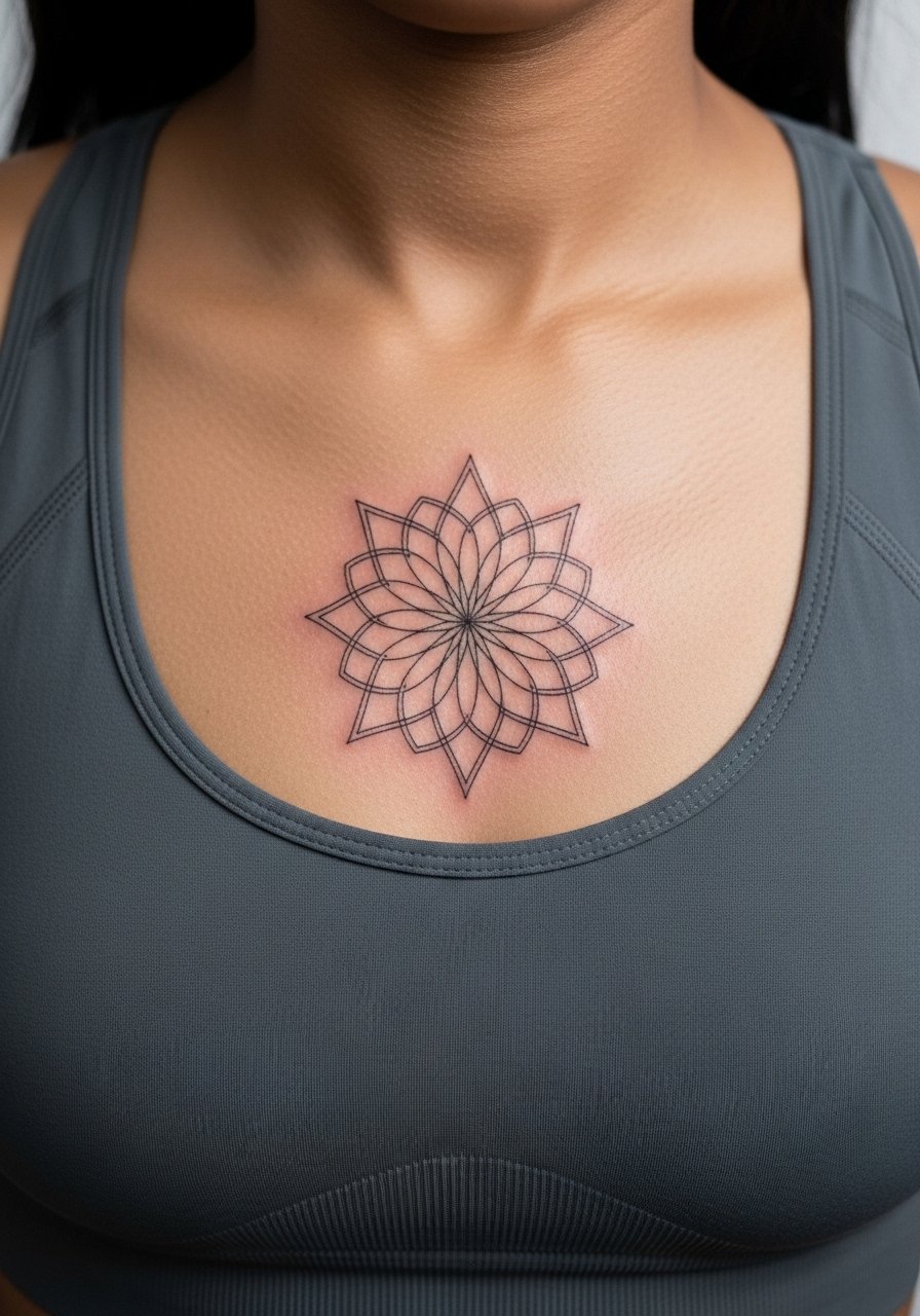
Sternum placements read dramatic and feminine but they are sensitive and require a thoughtfully staged session. The skin there moves with breath so mandala geometry needs deliberate spacing. Ask for slightly larger open sections in the dense areas so the pattern does not merge as it heals. Expect a high pain rating and shorter breaks at the artist's discretion. A common mistake is cramming a highly detailed mandala into a very small sternum area. Because of the sensitivity, some artists recommend multiple short sessions instead of one marathon sitting. Consider bringing a zip-up hoodie to stay warm while the area is exposed.
8. Bold Blackwork Heart with Phrase on the Upper Arm
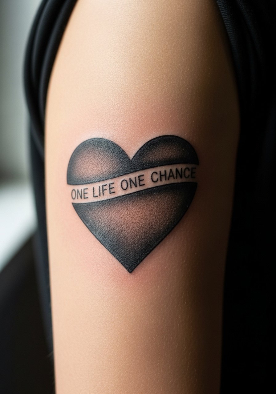
There is visual impact in pairing saturated blackwork with the phrase in negative space. The upper arm is forgiving for saturation and the bold fill ages predictably. Tell your artist you want strong saturation in the black and crisp negative lettering so the phrase reads even as the piece softens. The session can be slightly longer because of filling time, but pain is usually moderate. A typical mistake is underfilling the black so once it fades the negative script loses contrast. This option is great if you want a piece that reads from a distance and still holds detail up close.
9. Delicate Dotted Chain Bracelet with Tiny Script on the Wrist
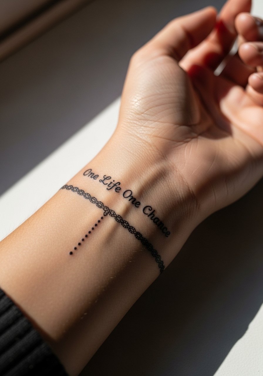
Wrist pieces are visible and behave like jewelry. The skin here is thin so stipple and dot work pair well with tiny lettering. Tell your artist you want dot spacing that reads like a chain rather than a solid line, and ask for a slightly heavier script so daily washing does not erase strokes. Expect sensitivity during the session but a short procedure time. The most common mistake is asking for hairline script that is impossible to maintain on the wrist over time. For showing it off, stack with a thin chain bracelet that sits below the ink rather than over it.
10. Botanical Thigh Panel with Script Nestled in Leaves
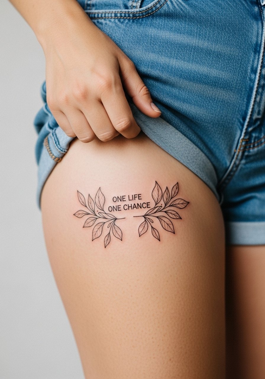
Upper-thigh placements suit larger, feminine botanical spreads that read private and sensual. The skin tolerates moderate shading so stipple leaves and script nested among branches look cohesive. During consultation ask for flow lines that follow muscle contours so the panel moves with your body. Pain for thigh sessions is generally lower than ribs but expect deeper needle pressure on inner thigh areas. A typical mistake is making the script too ornate where it becomes illegible among foliage. For session day wear loose shorts so the artist can access the area without irritation to the skin.
11. Roman Numeral Accent Next to a Side Rib Script
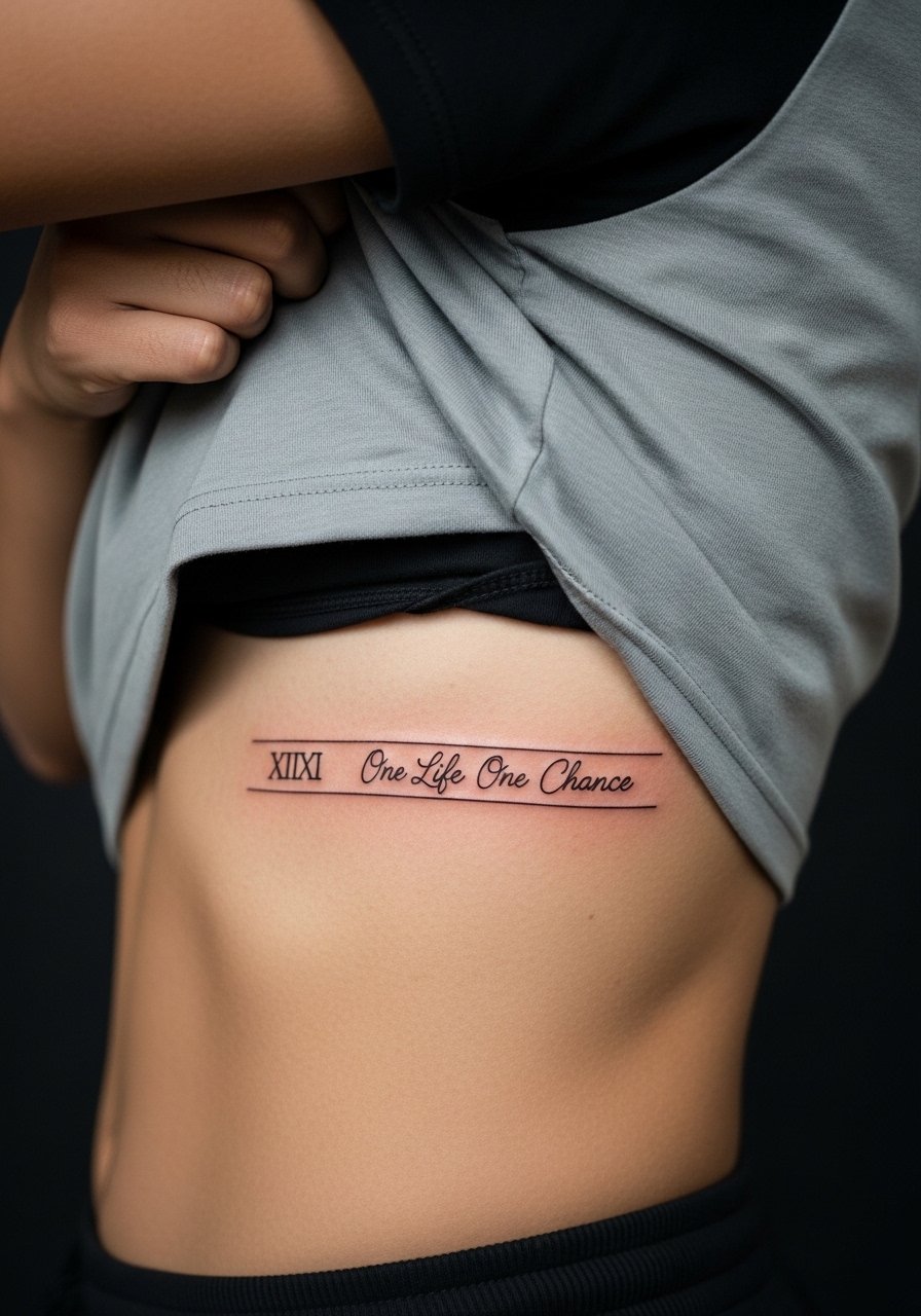
Side rib placements let you pair a short phrase with a small Roman numeral or date. The skin stretches with respiration so spacing is critical. My advice is to have your artist stencil the piece and check it while you breathe normally so placement reads as intended. Pain is higher here and sessions are often split. One mistake is centering the text where it will sit in a body fold when you sit, which shortens and distorts the line. Expect touch-ups sooner than on the forearm, and plan the script larger than you think to hedge against blurring.
12. Tiny Script Behind the Ear, Below the Hairline
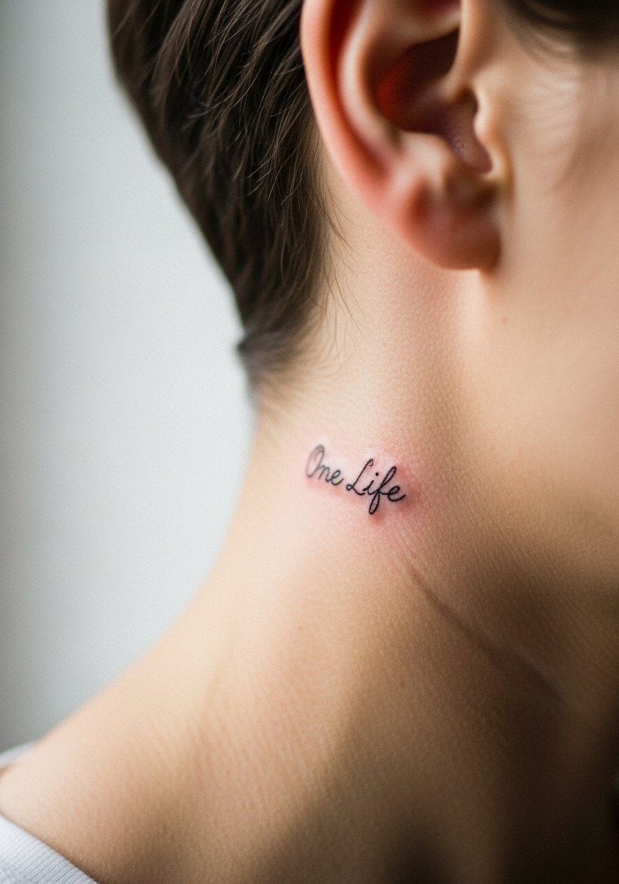
Behind-the-ear placements are discreet and read as a private reminder. Because of the small canvas and thin skin, keep lettering short. Ask your artist for single-word or two-word treatments and confirm they will place it slightly below the hairline rather than on the ear itself. The session is brief but can sting in that thin area. A common error is requesting a long cursive phrase that ends up wrapping onto the hairline and looking cramped. If you want to show it occasionally, a pulled-back ponytail or a low bun frames the spot without revealing too much.
13. Vertical Spine Script with Small Floral Accents
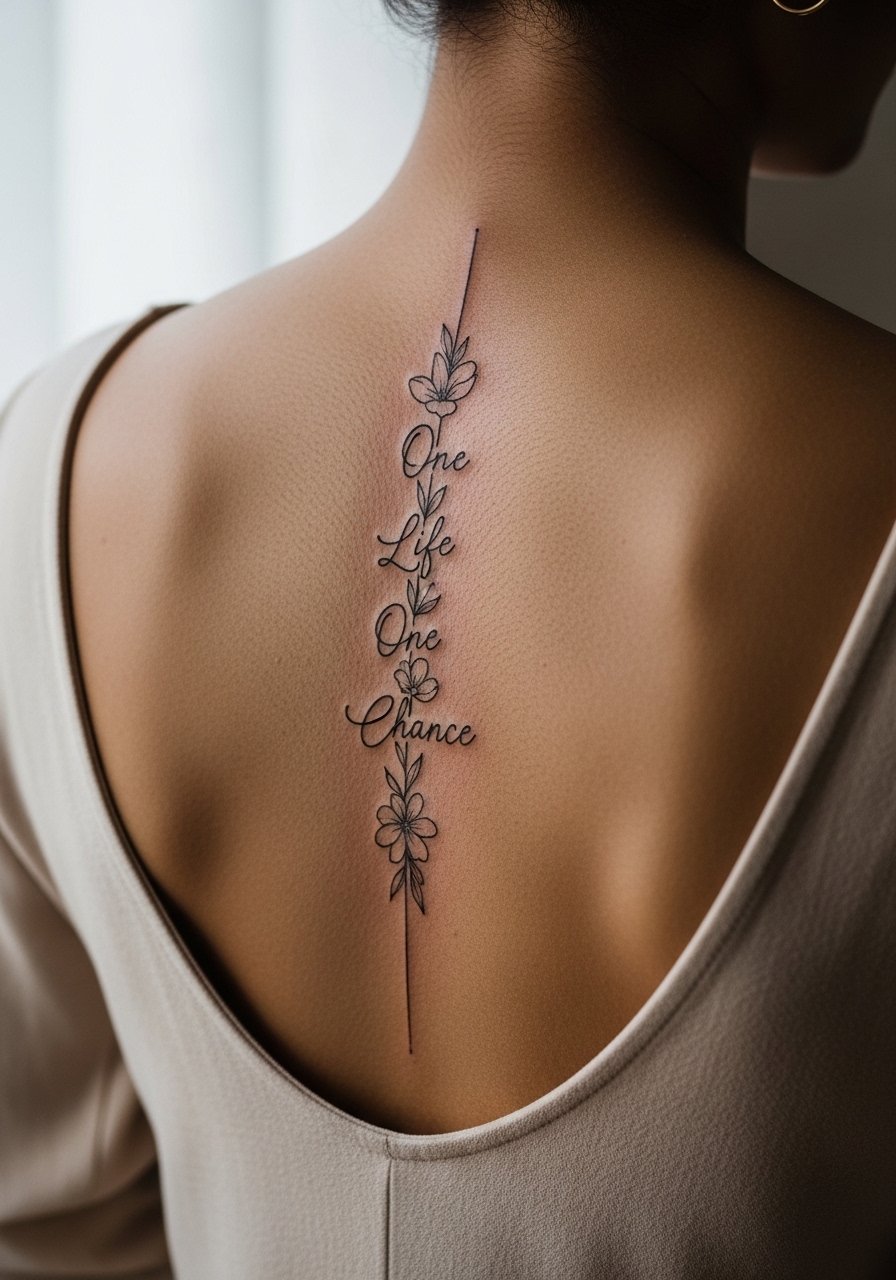
Spine scripts are elegant and wear well when the letters follow natural posture lines. The trick is to space script vertically so each word breathes and the small floral accents serve as separators. Tell your artist you want the script aligned to your vertebrae centers and to preview it while standing straight. Pain varies and can intensify near the spine. A frequent error is compressing phrases into one short block, which makes the spine read heavy. For an evening reveal pair with an open-back midi dress to let the vertical composition show.
14. Constellation with Script on the Calf
Calf placements give room for linear compositions and look modern with sparse dot-and-line constellations. The calf tolerates touch and larger spacing so small script beneath a constellation reads crisp for years. Ask for dot spacing that mimics star positions rather than a uniform chain of dots. Sessions are low to moderate in discomfort and often fit into a single appointment. A common mistake is packing too many tiny stars; keep negative space. When you want to showcase the calf, rolled jeans or midi skirts reveal just enough.
15. Hand Banner Script and Career Considerations
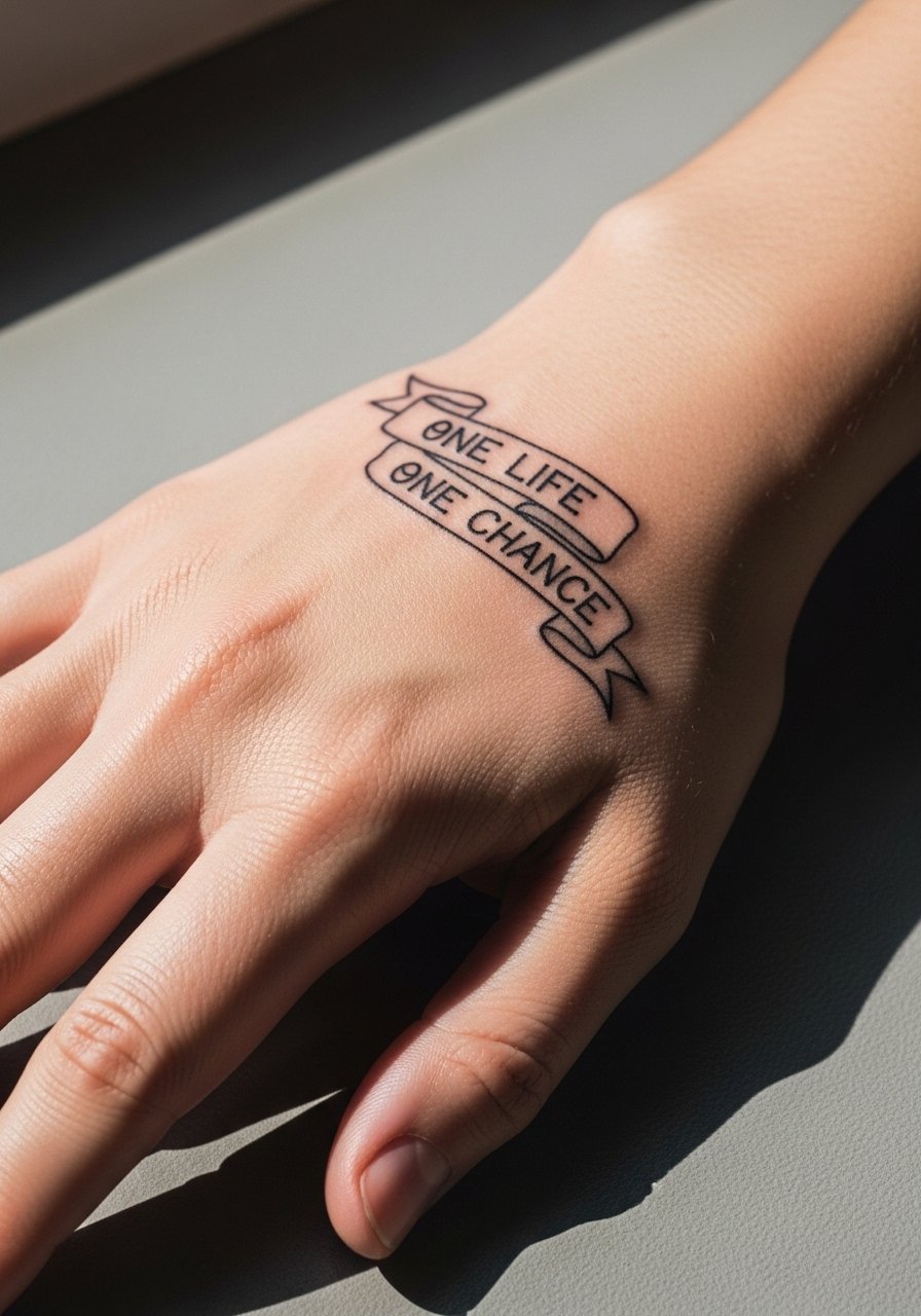
Hand tattoos are culturally visible and still a point of debate when it comes to professional settings. One camp argues hand tattoos are an honest form of expression and increasingly accepted in creative industries. The other camp warns they can affect hiring in conservative fields. Name both camps to be explicit. If you choose the hand, get bold letterforms because the area endures heavy friction and frequent washing. The session is bumpy and the ink often needs touch-ups in the first two years. The common mistake is asking for faint script that will disappear under daily wear.
16. Minimalist Wave and Short Script on the Ankle Outer Side
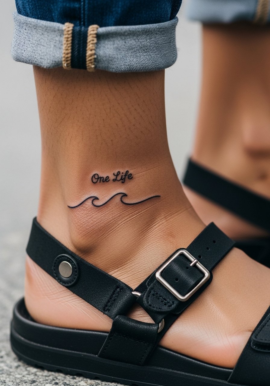
This coastal-inspired pairing reads subtle and wearable. The ankle outside is less prone to direct shoe rubbing than the inner ankle so script survives longer there. Ask for slightly heavier wave linework and modest script size to resist early fading. The session is short and the pain is described as sharp and quick. A common mistake is placing the script on the inner ankle next to shoe seams. To show the piece, wear minimal sandals or cropped pants so the curve of the design is visible.
17. Matching Inner Bicep Phrase for a Subtle Pairing
Inner bicep placements feel private and age well when the script is sized appropriately. The skin is softer here so lineweight should be a touch bolder than collarbone script to prevent blowout. During consultation say you want the piece centered on the muscle belly and preview it in both relaxed and flexed positions. Sessions are moderate in discomfort and often end with a clear stencil check before ink. A common mistake is making the text too long, which forces tiny letters that blur. For session comfort wear a loose drawstring linen pant if you need leg access or a tank for upper arm access.
Frequently Asked Questions
Q: Will fine line script on the collarbone require touch-ups more often than bolder pieces?
A: Fine line tends to need more frequent touch-ups because thin strokes can blur with time. If you want less maintenance, ask your artist for slightly heavier line weight in key strokes. Placement and sun exposure also matter, so protect the area when you can.
Q: How do hand and finger placements compare in longevity to forearm or thigh placements?
A: Hands and fingers face constant friction and frequent washing, so they fade faster and usually need touch-ups within a year or two. Forearms and thighs have firmer skin and lower daily abrasion, which helps them keep crisp detail longer.
Q: Is the controversy about fine line on ribs something to avoid entirely?
A: No, it is not black and white. One camp warns thin lines blur quickly on ribs, the other says careful depth and spacing will settle fine. The best approach is to ask your artist how they handle ribs and to size the linework slightly larger if longevity is a priority.
Q: What should I wear to the studio for a sternum or ribcage session?
A: Bring a fitted sports bra or a cropped top you can adjust so only the tattoo zone is exposed. Comfort and access are the priorities, and a zip-up hoodie is handy for aftercare warmth.
Q: Can a tattoo with heavy blackwork help the phrase remain legible longer?
A: Yes, high-contrast approaches like blackwork with negative lettering preserve legibility because the phrase sits against a strong background. That method trades subtlety for longevity and visual distance, so mention your preference during the consultation.
Q: How soon should I plan a touch-up for a tiny wrist script?
A: Plan for a touch-up within the first 12 to 24 months. The wrist sees a lot of use and exposure. If you want to minimize sessions, size the letters a bit larger at the start.
Q: Any quick rules for choosing between visible placements and private placements for this phrase?
A: Choose visible placements if you want the phrase to function like jewelry or a daily reminder. Pick private spots like the inner bicep or shoulder blade if you prefer a more intimate placement. Also consider your work environment and how often you want the tattoo visible.