Fine line Hunger Games motifs look delicate on a saved photo but act differently on skin. Trends push tiny Mockingjays and script lines, and the reality is that placement, skin type, and spacing decide whether a piece reads clean at year five. These 21 references pair story beats from the series with practical notes on aging, consultations, and what to wear to show them off so the design stays meaningful long after the hype.
1. Tiny Mockingjay on the Inner Wrist
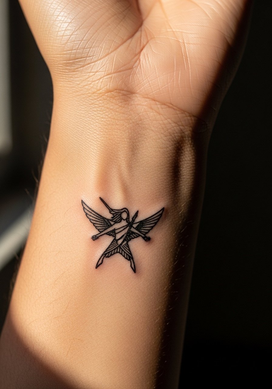
I recommend the tiny inner wrist Mockingjay when you want a quiet emblem that reads personal. Fair warning, the wrist is a medium pain spot, and linework too thin will blur into fuzz by year three. Tell your artist you want a bit more line weight than the reference and clear spacing around the wings. At six months this looks crisp, at two years faint softening appears, and at five years expect a subtle halo unless you get a touch-up. Pair it with a thin chain pendant necklace when you wear short sleeves to keep attention on the wrist. Common mistake is asking for hairline lines that are too small for the area.
2. Mockingjay with Arrow Stretching Down the Forearm
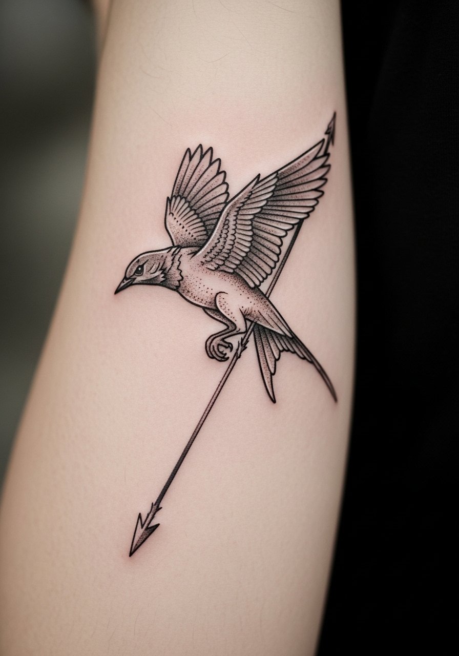
This forearm composition works if you want movement in your piece and visibility when you want it. The forearm tolerates longer sessions, so expect a single two-hour session or two shorter visits for color fill. Ask for slightly heavier contour lines where the wing meets the shaft so the silhouette holds up. A common mistake is over-detailing the feathers in a tiny space, which turns into blotchy shading later. For showing it off, roll up a loose button-down shirt sleeve or wear a racerback tank to keep the arm visible without crowding the design.
3. Roman Numerals or District Coordinates on the Collarbone
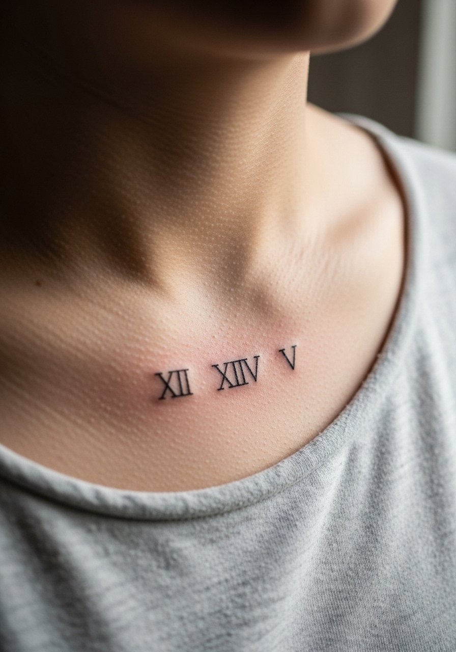
Collarbone text reads intimate and deliberate. Pain here is higher because the bone is shallow, so plan for short sessions. For longevity, keep the numerals slightly larger than you think and ask for crisp negative space between characters. A typical consulting tip is to bring examples of the exact font size and spacing. This placement pairs well with an open-back midi dress for evenings or a thin chain pendant necklace that sits above the script. Mistakes to avoid include tiny type that fills in after healing.
4. Minimal Mockingjay Behind the Ear
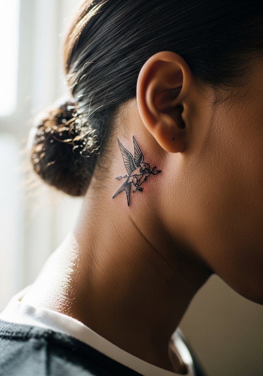
Behind-the-ear pieces read like a whispered reference. The area is sensitive but quick to tattoo, and touch-ups are common because the skin there is thin. If you want this spot, ask for a slightly bolder outline and avoid tiny interior details. This placement is discreet by design, so most people skip styling advice for public show-off looks. A common mistake is requesting micro-detail that the tiny canvas cannot hold, which results in muddled shading after six months.
5. Nightlock Berry Cluster on the Ankle
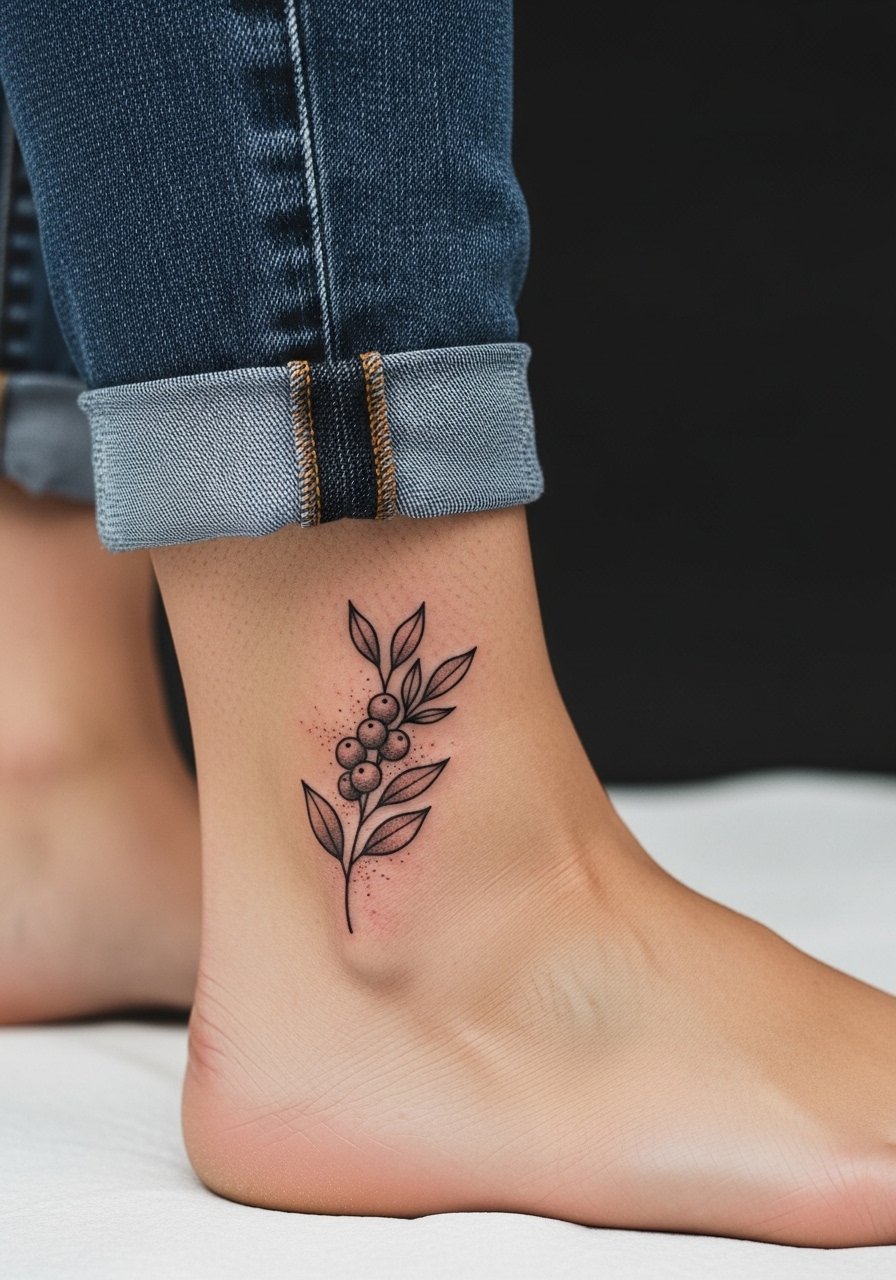
Ankle tattoos feel playful and seasonal. Expect a short but sharp session because bone and tendon sit close to surface. I suggest stipple shading on the berries rather than saturated color if you want longevity, because color on ankles fades faster from friction. For the session, wear jeans you can roll up easily and for showing it off pair with high-waisted denim shorts or sandals. Mistakes include asking for heavy color without accounting for shoe friction during the first two weeks.
6. Katniss Braid Silhouette on the Upper Arm
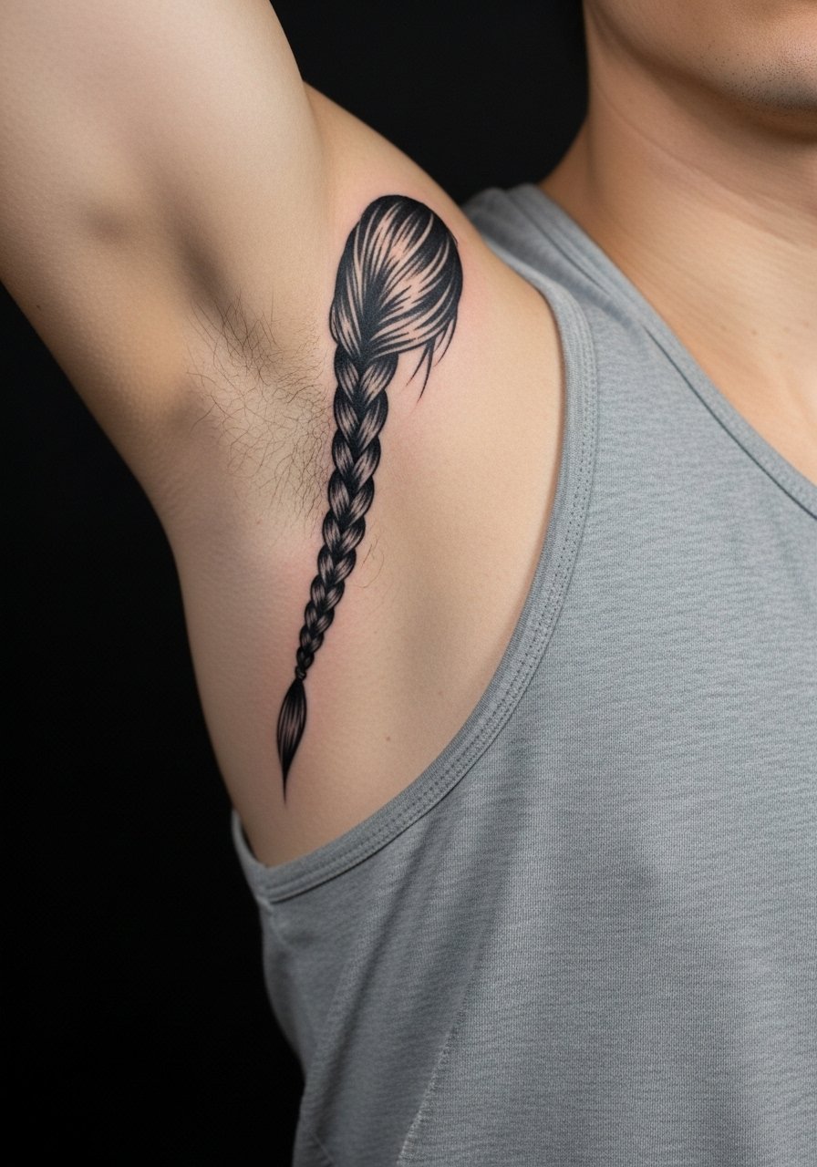
This silhouette makes a subtle reference while working well as an arm-centric statement. Upper arm pain is lower and sessions are forgiving, so you can build the piece in one medium-length appointment. Ask the artist to prioritize clean linework along the braid and to avoid tiny interior crosshatching that ages poorly. At two years the silhouette maintains contrast if the lines were saturated. Wear a loose button-down shirt pulled aside for the session, and later show it with rolled sleeves. The common error is overcrowding the braid with decorative detail that blurs into a dark patch.
Studio Day Picks
The wrist, ankle, and upper-arm pieces above need different prep and small tweaks to make the session and the first week easier.
-
Stencil transfer paper kit. Lets you preview the exact placement on skin, which matters for collarbone numerals and wrist Mockingjays.
-
Topical numbing cream. Useful for the collarbone and inner wrist sessions when sensitivity spikes in short appointments.
-
Thin protective film roll. Keeps ankle and finger work cleaner during early showers and prevents rubbing from socks and shoes.
-
Fragrance-free body wash. Gentle cleansing reduces irritation for delicate fine line pieces like the behind-ear and collarbone tattoos.
-
Aquaphor healing ointment. Thin initial layer helps lock in moisture on thin-skin areas without suffocating the ink channels.
7. Watercolor Fire Quote Along the Ribcage
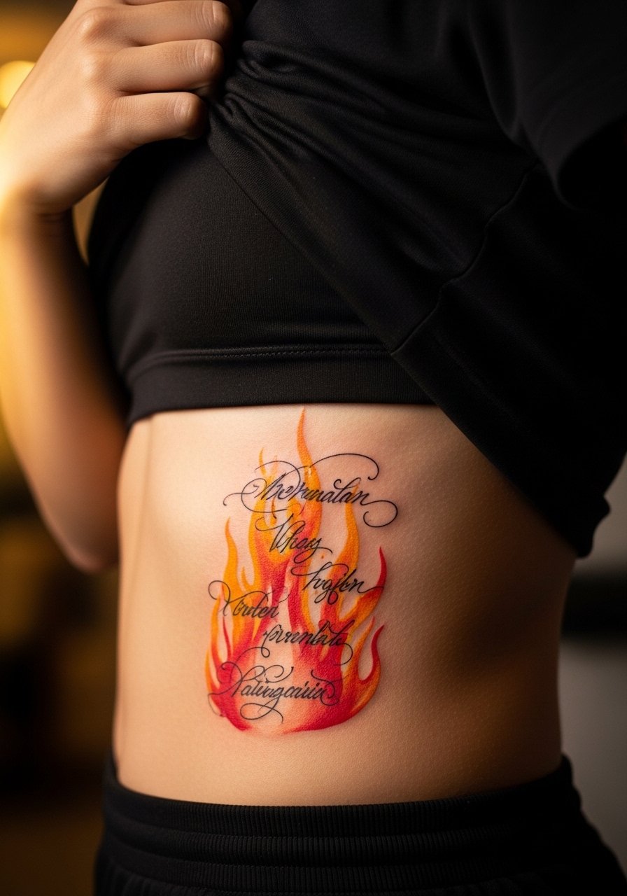
Ribcage pieces carry a strong aesthetic, but watercolor styles here spark a real debate. One camp says the watercolor bleed on ribs loses clarity quickly because the skin stretches and moves. The other camp argues that with proper spacing and muted pigments it can age elegantly. If you lean toward watercolor, ask your artist to plan for gentle saturation and larger negative space between strokes. Expect a higher pain rating for ribs and plan short sessions. The mistake is asking for tiny watercolor details that vanish at year two.
8. Sternum Mockingjay with Fine Line Filigree
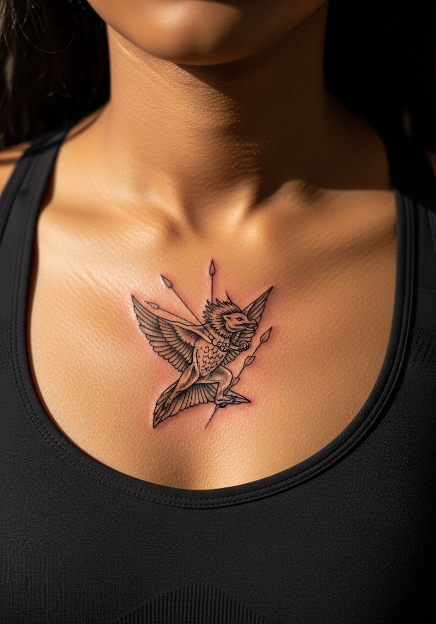
Sternum work reads dramatic and intimate, and it ages unpredictably on very thin skin. Pain is above average and session times vary with filigree detail. Artists split on whether very fine filigree holds on the sternum. One argument is that the thin skin and movement blur tiny lines, and another says disciplined depth and spacing keep the lines readable. Bring stencil examples and ask where they place needle depth. Professional preparation means a tight session plan and possibly booking a touch-up at year one. This spot is not ideal for micro-detail fans.
9. Tribute Number on the Side of a Finger
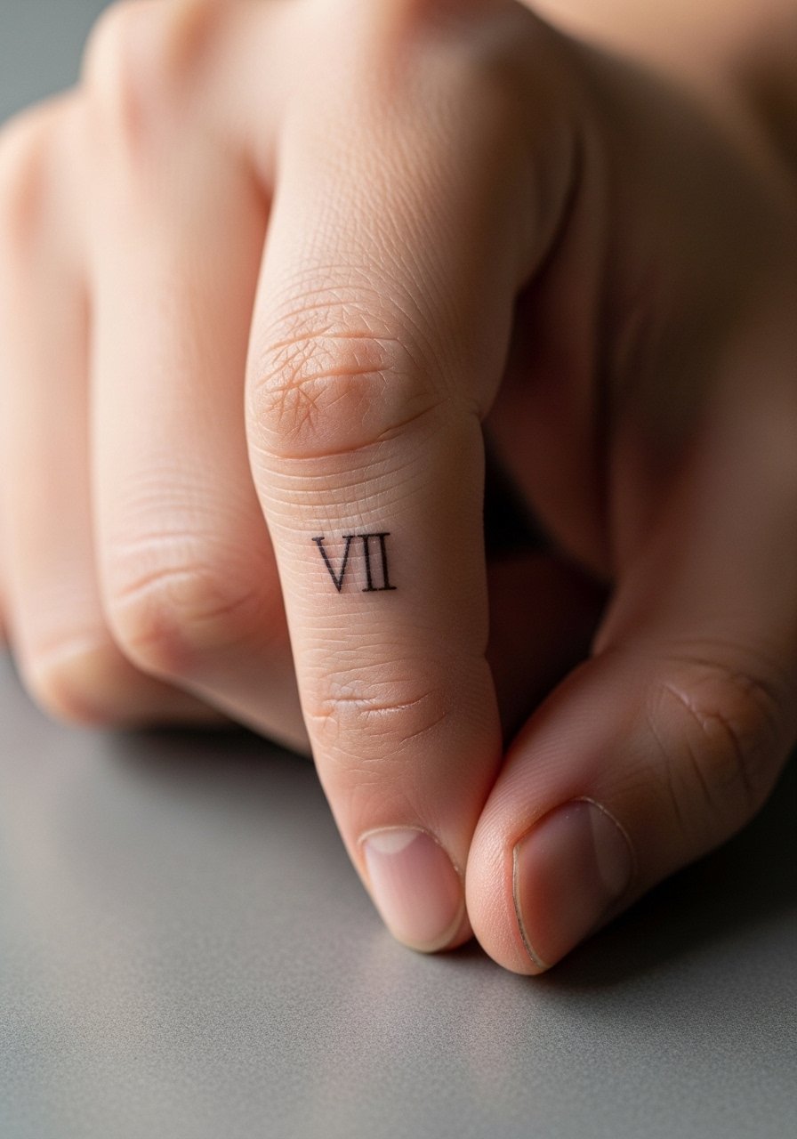
Finger work is high maintenance but very literal. Side-of-finger numerals are striking and symbolic, but expect heavy fading from hand washing and friction. Session time is short, and touch-ups are often required at year one. Tell your artist you want simple, bold numerals rather than hairline script. For showing it off, keep rings minimal and consider a thin chain pendant necklace to balance the hands in photos. The mistake is asking for delicate serifs that fill in quickly.
10. Micro-Realism Arena Map on the Back Panel
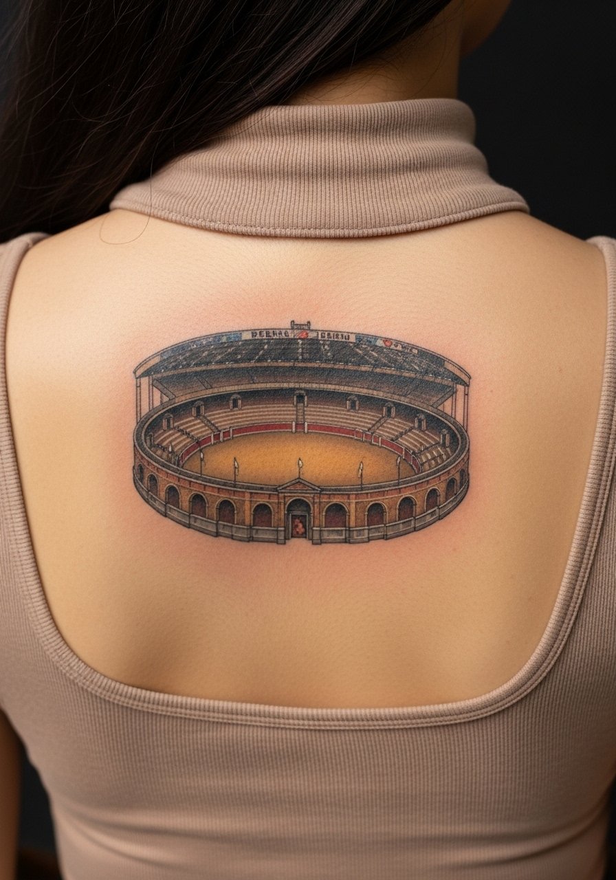
Back panel maps let you tell a scene-sized story and keep tattoo density manageable. This placement tolerates multi-hour sessions and detailed work because it heals evenly. Discuss scale in consultation and insist on slightly bolder contouring for tiny map lines so roads and markers remain legible at five years. A common misstep is packing too many micro elements into a small back panel. Show it off with an open-back top when you want the map visible without stretching the skin.
11. Quiver of Arrows on the Calf

Calf pieces are forgiving and ideal for vertical arrow motifs. Pain is moderate and sessions are straightforward. Ask for spacing between arrow fletching to prevent shading from merging after a few years. A common mistake is compressing too many tiny arrows into the span of a short calf, which crowds the piece. For the session wear choose loose drawstring linen pants you can roll up without pressure on the area. Calf work ages well if you avoid tight socks during early healing.
12. District Crest in Traditional Style on the Upper Back
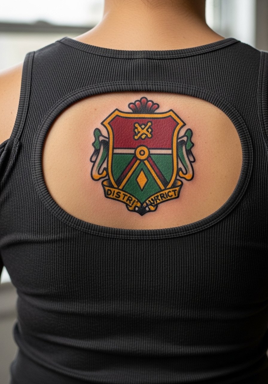
Traditional crests with heavy outlines and solid saturation last a long time, which suits district emblems. The upper back accepts saturation and has low blowout risk when the needle depth is correct. Tell your artist you prefer classic bold outlines and flat color fields rather than tiny stipple shading. The session may take longer if color packing is involved, but touch-ups are infrequent. Wear a loose button-down shirt you can pull off the shoulder for the appointment and later pair a simple tank to highlight the crest.
13. Minimalist Bow Tucked Along the Rib Line
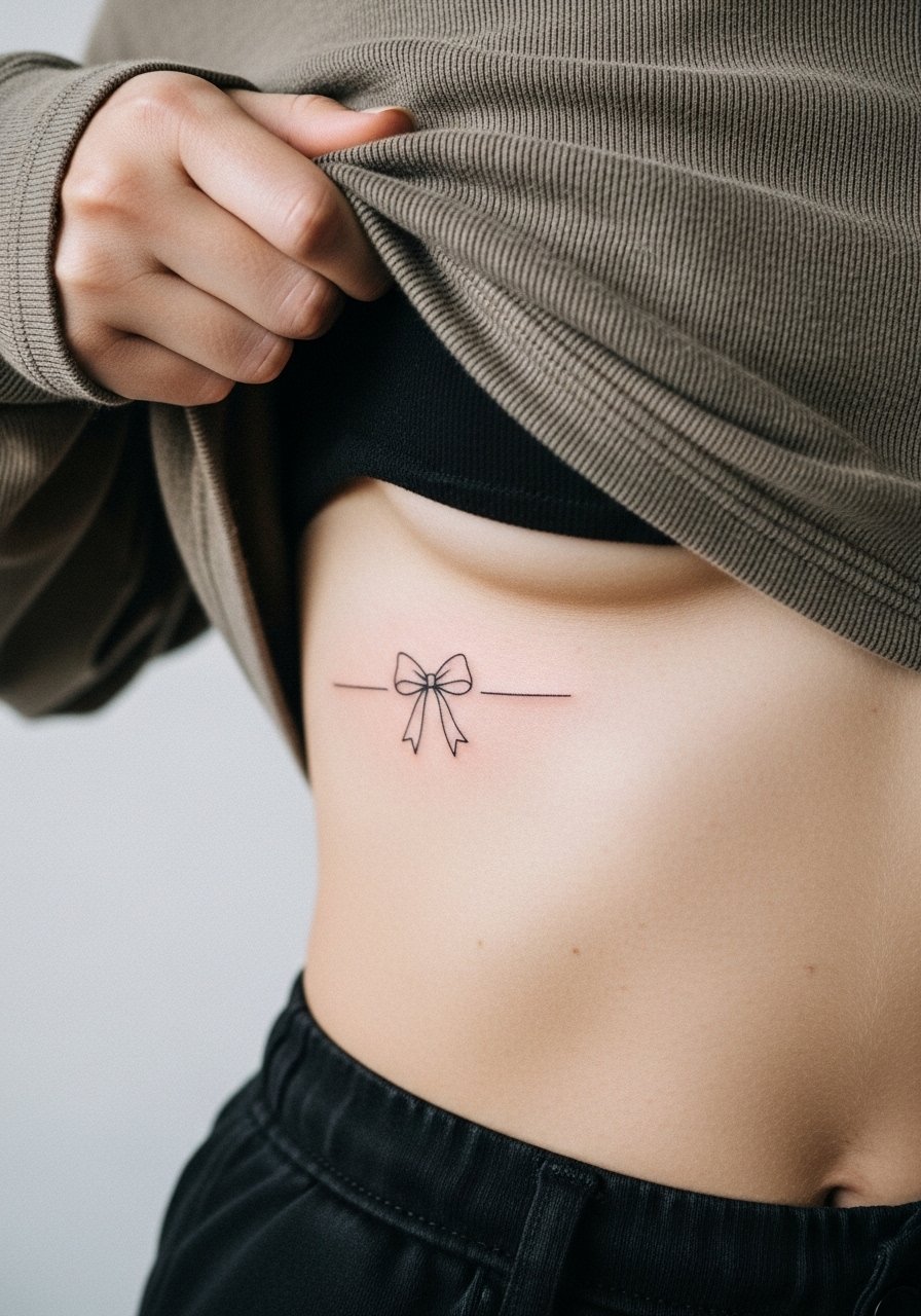
Minimal bows look delicate but ribs are an unforgiving canvas. If you want a tidy bow, ask for slightly heavier contours and more negative space around loops. Pain is high and sessions are short due to sensitivity. Expect touch-ups sooner than for arm pieces. The mistake is requesting needle-thin curves that dissolve into an indistinct gray patch after healing.
14. Fire Wrap on the Inner Wrist or Around the Arm
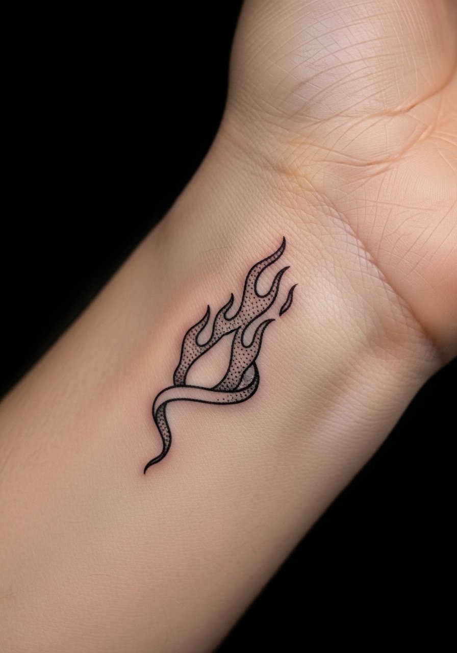
A flame wrap gives the Mockingjay reference a dynamic, wearable motif. Inner wrist flame wraps are visible and personal, with a medium pain level. For longevity, ask the artist for spaced flame tongues rather than densely packed lines. At six months the wrap reads lively, at two years the thin elements may soften unless the lines were intentionally built slightly bolder. Pair with a racerback tank if you want to photograph the wrist without jewelry crowding the shot. Avoid asking for hairline filigree that the wrist cannot retain.
15. Capitol Rose Blackwork on the Thigh
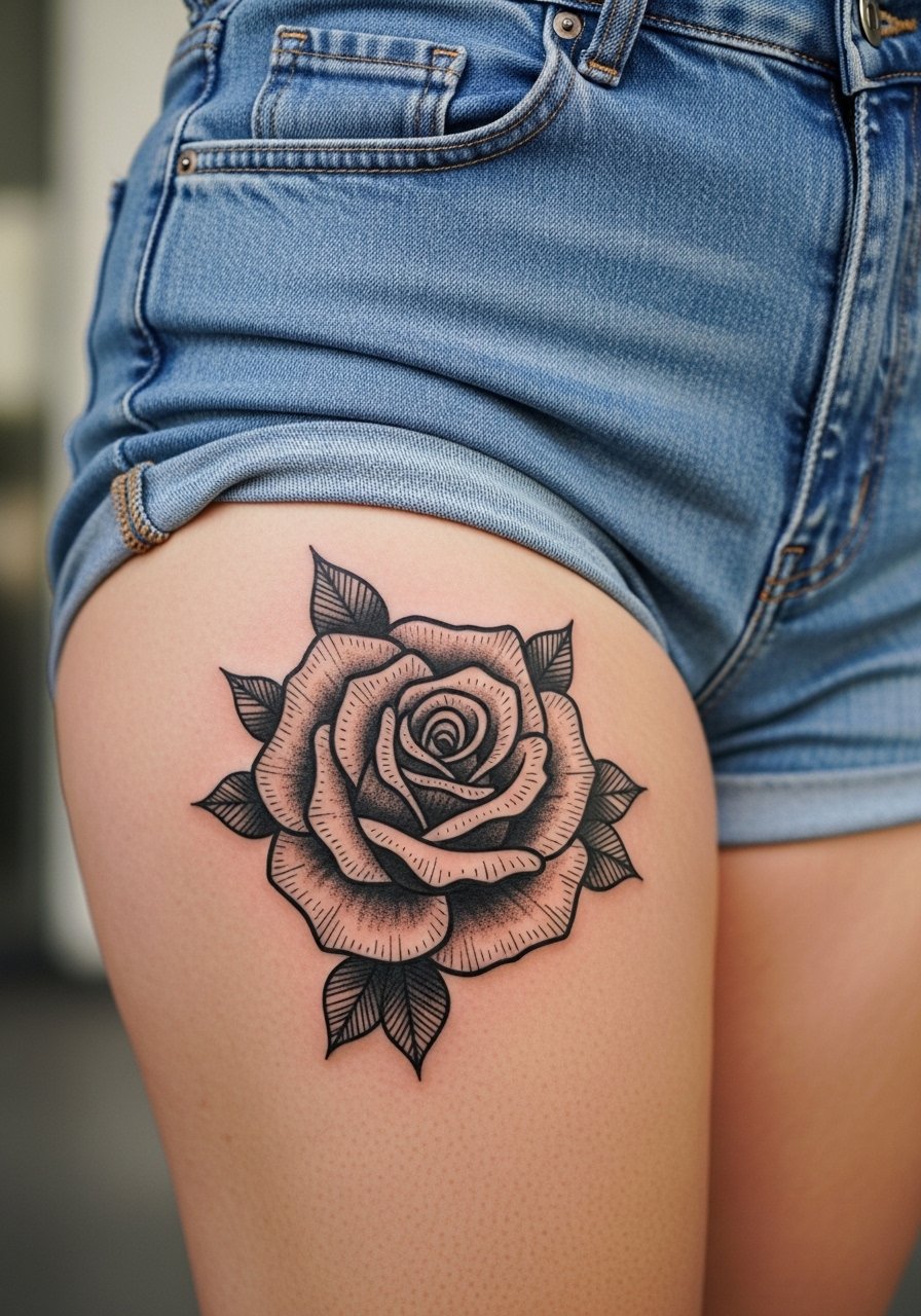
Thighs are forgiving for saturated blackwork and large motifs. The pain is often lower and sessions can accommodate heavy coverage. Ask for clear negative space in the petals to prevent a solid black blotch over time. If you plan on showing this piece selectively, pair it with high-waisted denim shorts or a swimsuit bottom for beach photos. Common mistakes include cramming fine dot work into big petal areas that looks muddy after healing.
16. Constellation of Stars Across the Shoulder Blade
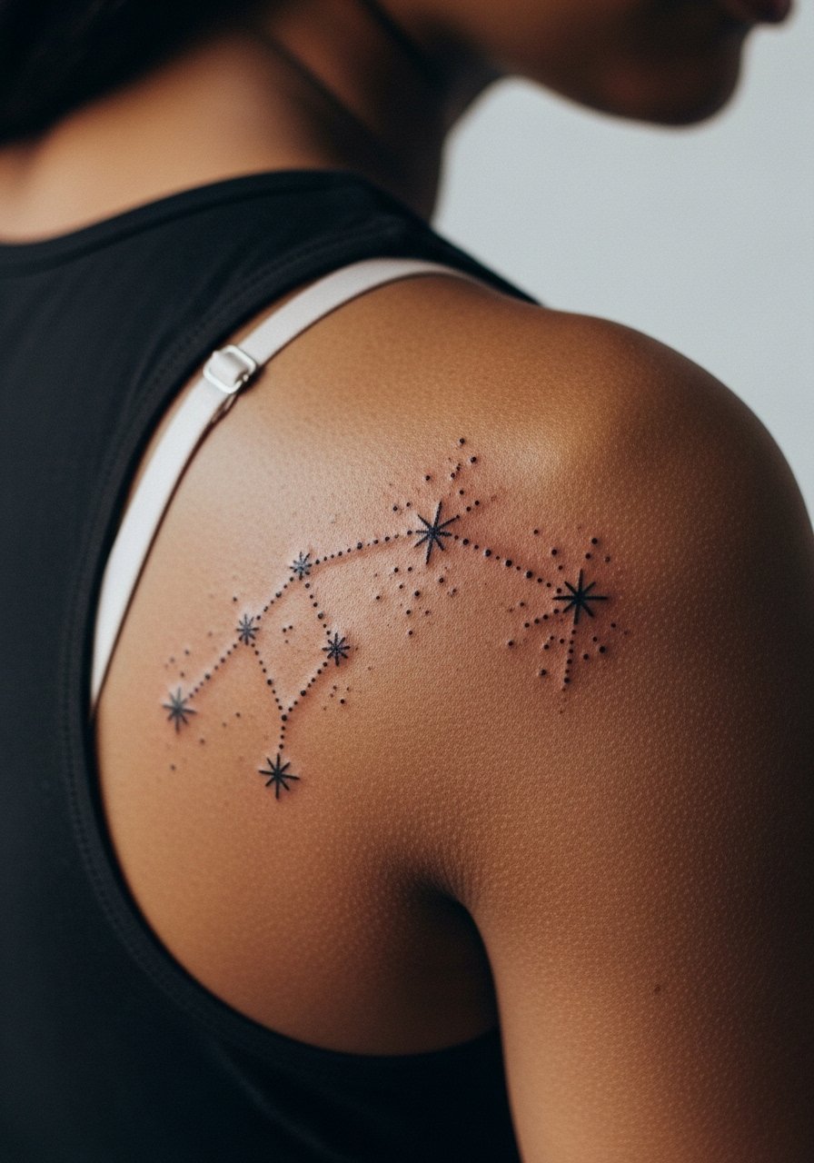
Shoulder blade constellations read ethereal and photograph well. This area tolerates tiny dots but spacing is critical. I advise asking for slightly increased dot spacing compared with the reference to prevent merging over time. Expect a short session and a likely touch-up at year two for dot consistency. For showing it off, an open-back dress frames the stars without stretching skin. The typical mistake is clustering dots too tightly in a small area.
17. Mockingjay Perched Behind the Shoulder Blade
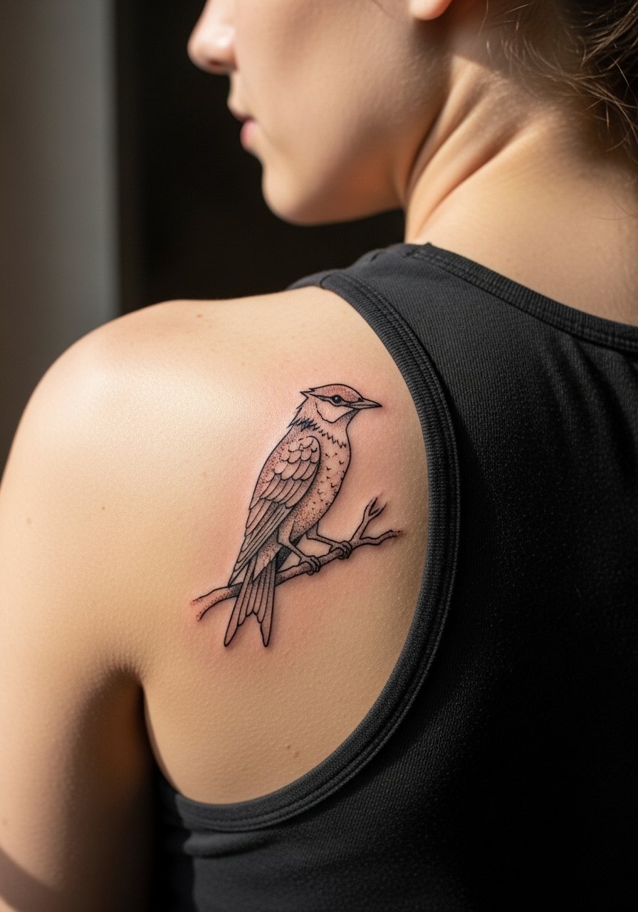
A perched Mockingjay behind the shoulder blade finds balance between visibility and privacy. The area heals cleanly, and blowout risk is low when the artist respects depth. During consultation request clear separation between wing feathers and branch to prevent future merging. Sessions are comfortable and you can plan for most of this in one appointment. Wear a loose button-down shirt you can shift for access. Mistakes include over-detailing feathers in a narrow silhouette.
18. Stitched Seam Scar Band on the Inner Bicep
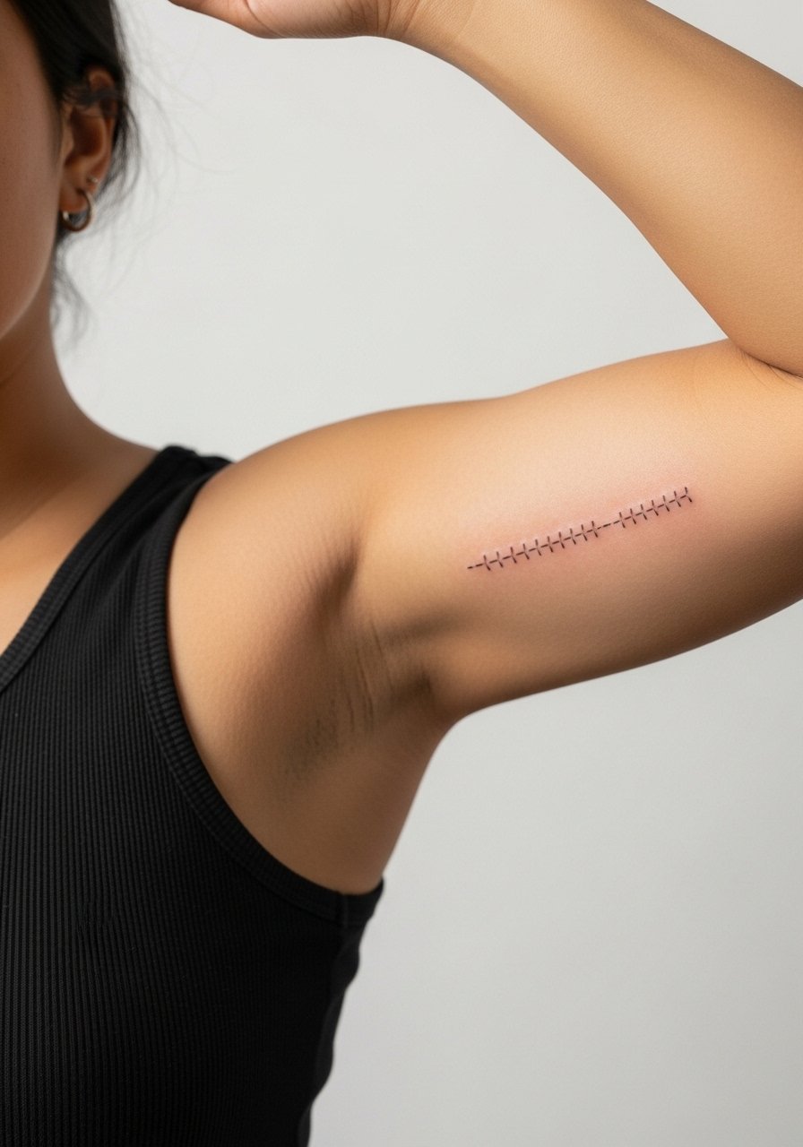
Inner bicep pieces are intimate and require skill because the skin stretches with movement. Pain can spike because the area is flexible. For a stitched seam motif keep linework slightly thicker than micro lines so stitches read as intentional after healing. This spot benefits from a staged session plan and possibly a touch-up at year two. The session wear tip is to bring a loose tank so the artist can access the inner arm without full disrobing. A common error is expecting hairline detail to hold in this moving canvas.
19. Script Quote Along the Outer Forearm: "May the odds be ever in your favor"
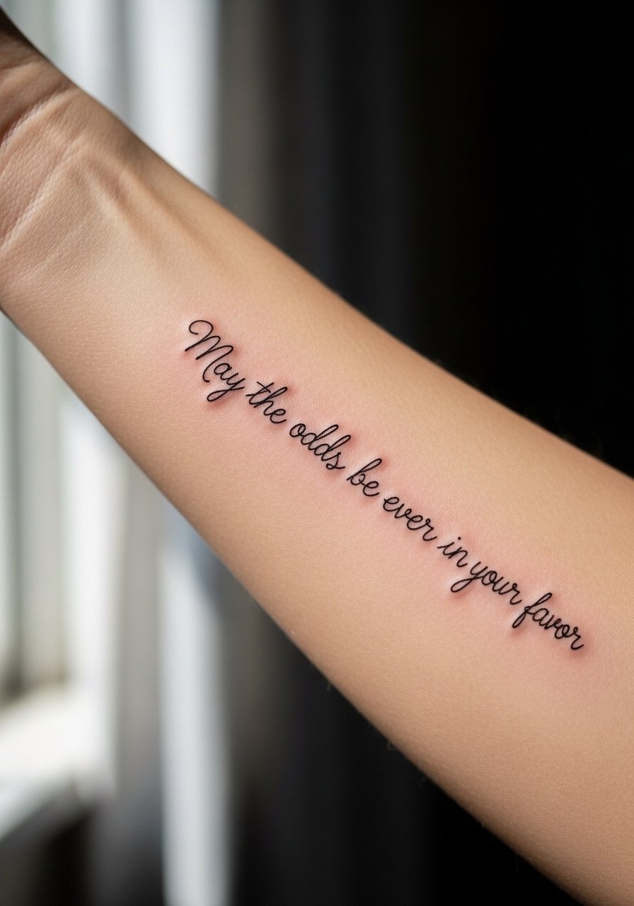
Text tattoos from the series are literal and carry emotional weight. The forearm handles script well, but tiny cursive fills in faster than block lettering. Bring the exact phrase and a font example to your consult so the artist can size letters for longevity. At six months the line looks precise, at two years thin cursive can soften unless spaced carefully. For photos wear a loose button-down shirt with rolled sleeves to frame the quote. A mistake is choosing an ornate script at very small scale.
20. Negative Space Mockingjay on the Hip

Hip placements sit at the intersection of intimacy and show-off potential. Negative-space Mockingjays rely on surrounding shading or color to read. Because the area is prone to shifting with weight and clothing, ask for a slightly larger silhouette to preserve the negative space over time. The session can be painless to moderate depending on your tolerance. Mistakes include choosing razor-thin gaps that close up after healing.
21. Arena Coordinates Wrapped Around the Ankle
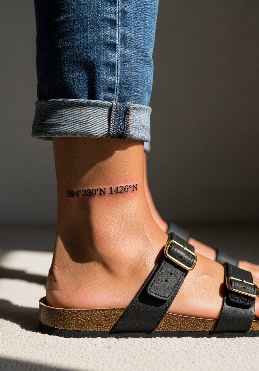
Coordinate tattoos feel precise and understated. Ankles frame coordinates well, but expect fading from shoe friction and boots. I recommend a monospace font with clear spacing and slightly larger numerals than your reference. Sessions are short and touch-ups are common by year two. For showing it off pick footwear that keeps the ankle visible, like sandals or cropped trousers. A mistake is cramming too many digits into a tight band without room to breathe.
Frequently Asked Questions
Q: Will a tiny Mockingjay on my wrist need touch-ups often?
A: Tiny wrist pieces usually need a touch-up sooner than larger saturated pieces. The wrist faces constant washing and sun exposure, so plan for a possible touch-up around year two to three depending on your lifestyle and how bold you wanted the original lines.
Q: Are watercolor flames on the ribcage a bad idea long term?
A: Watercolor on ribs divides artists. One side warns that the skin movement and thinness blur soft washes, while the other side says careful spacing and muted pigments can make it work. If you choose watercolor, agree on larger washes and a follow-up touch-up in the consult.
Q: How should I find an artist who can handle a micro-realism arena map?
A: Use discovery pathways like niche hashtag searches, local shop directories, and convention portfolios to spot artists who publish healed micro work. Look for examples of maps or small landscapes in their healed photos and ask about session breakdowns in your consultation.
Q: Do finger and ankle placements affect job prospects?
A: Hand and finger tattoos remain more visible in professional settings than ankle or thigh work. If your career or industry is conservative, place a personal emblem in a spot you can hide for interviews. For session comfort bring easy clothing like a loose button-down shirt so access is clean and discreet.
Q: How do I brief an artist for a Mockingjay that will still read at year five?
A: Be specific about line weight, spacing, and the scale you want. Bring multiple reference photos and ask the artist to show healed examples at similar sizes. Discuss a realistic touch-up timeline and get a clear plan for how the piece will age on your chosen placement.