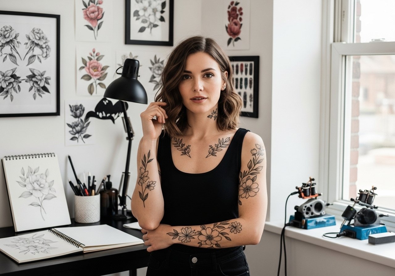
Fine line number tattoos are everywhere online right now, and the same trend that looks perfect on a bright photo often tells a different story after a year. I've seen delicate numerals blur, blackletter pieces hold, and typewriter digits age in their own quirky way. If you care about legibility on darker skin, how a wrist piece handles friction, or whether ribs will need touch-ups, start here for fonts that actually last.
1. Minimalist Monospaced Date on the Inner Wrist
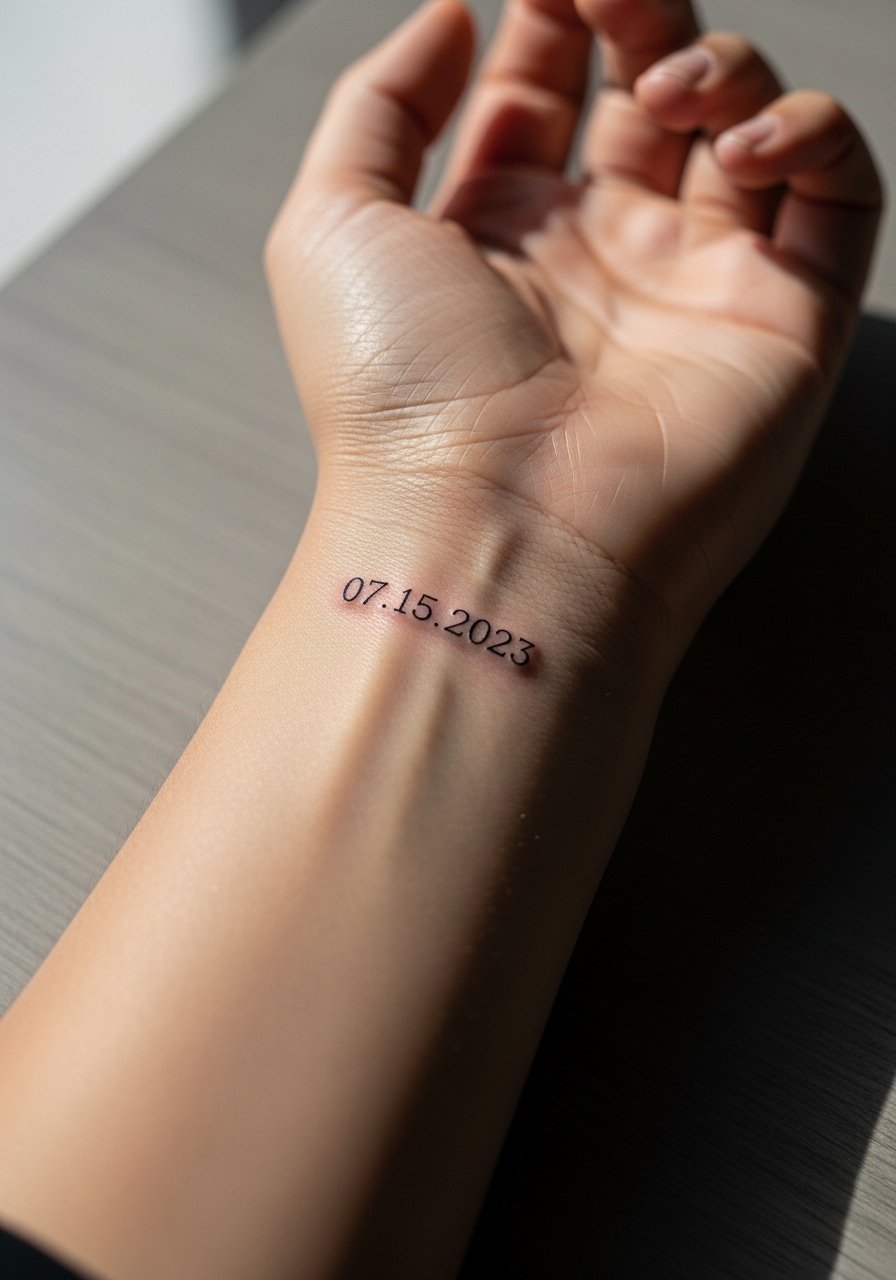
I open with monospaced numerals for inner wrists because they solve a practical problem. The equal spacing reads clearly at small sizes and stays legible longer than a thin script when you type and wash your hands a lot. Fair warning, the inner wrist is sensitive so expect a shorter session for a small block of numbers, not a marathon. Tell your artist you want the numerals spaced like a typewriter, with slightly heavier line weight than a micro script. A common mistake is asking for hairline strokes that the skin cannot hold, which leads to early softening and patchy gaps. For showing it off, roll up sleeves and wear a racerback tank or a simple bracelet so the numbers are visible without crowding the wrist.
2. Classic Typewriter Numbers Along the Collarbone
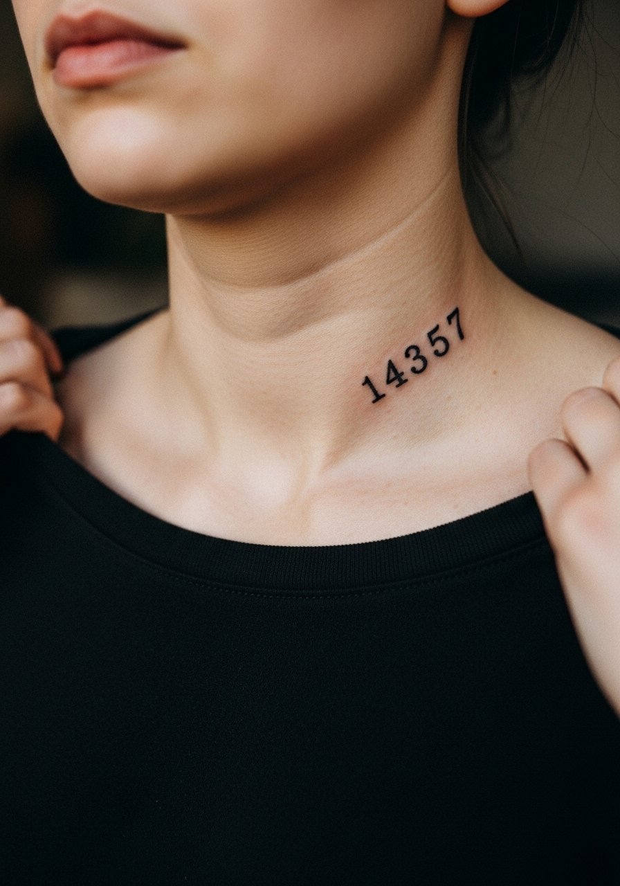
I've seen typewriter numerals age well on collarbones because the area avoids constant rubbing and sunlight exposure compared with hands. The session feels straightforward, usually under an hour for four to six digits, and the pain sits around a 4 out of 10 for most people. During consultation specify that you want slight plate-serif terminals and modest spacing so the numbers read like a stamped date rather than typographic art. A version that ages poorly is a thin, script-like typewriter imitation that looks feathery after a year. Pair this placement with a thin chain pendant that sits above the numerals to frame the area for going-out looks.
3. Blackletter Roman Numerals on the Outer Forearm
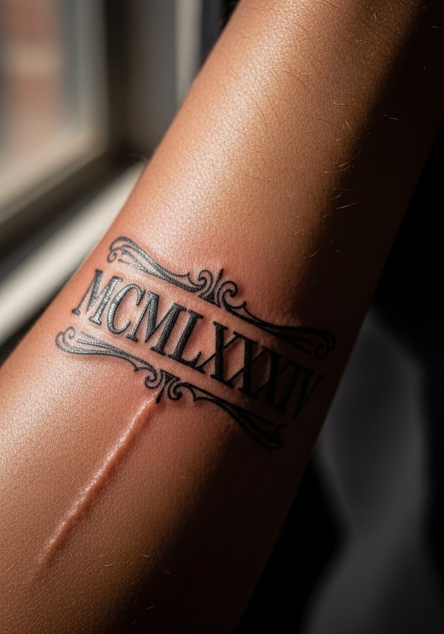
There is a reason blackletter remains popular for numerals on forearms. The heavy strokes and contrast withstand fading and give strong legibility at a distance. Expect a longer session than a micro piece because the artist lays down saturated black and thicker outlines to prevent future blowout issues. Tell the artist you want preserved counters and avoid tiny ornamental flourishes inside tight curves, because those fill in over time. A common mistake is shrinking blackletter for a wrist or finger scale where the counters close up. For casual outfits, rolled sleeves and a rolled linen shirt highlight the forearm without covering the numerals.
4. Geometric Digital-Clock Numbers Behind the Ankle
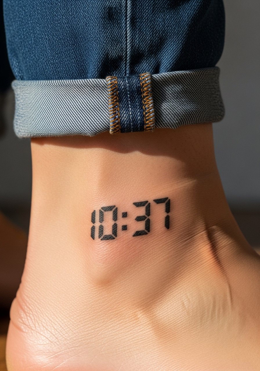
The pixelated seven-segment look reads playful and modern on low-visibility spots like the ankle. The ankle is a high-friction zone when you wear socks or tight shoes, so expect a touch-up at year two more often than a forearm piece. During your consult mention you prefer slightly bolder segments rather than hairline strokes to avoid early fading from shoe friction. The session can feel sharp around bone since the ankle sits close to bone, but a quick artist rhythm keeps it manageable. For showing it off casually, pair with sandals or a strappy sandal to let the geometry peek while keeping the design protected most of the time.
5. Stipple Shaded Numeral Cluster on the Upper Arm

Stipple shading gives number clusters texture without relying on solid fills that can age into blocks. I recommend this for people who want something decorative but low maintenance. The upper arm offers forgiving skin, so the stipple settles with less risk of blowout than thin-lined pieces on the hand. During consultation ask for dot density notes so the artist spaces dots to keep detail at five years. A mistake is compressing too many digits into a tight patch, which flattens the stipple into a gray smudge. If you plan to wear sleeveless tops, try a loose button-down shirt you can roll or pull aside during cooler nights to show the clustering without overexposing it.
6. Rounded Serif Numbers for a Chest Accent
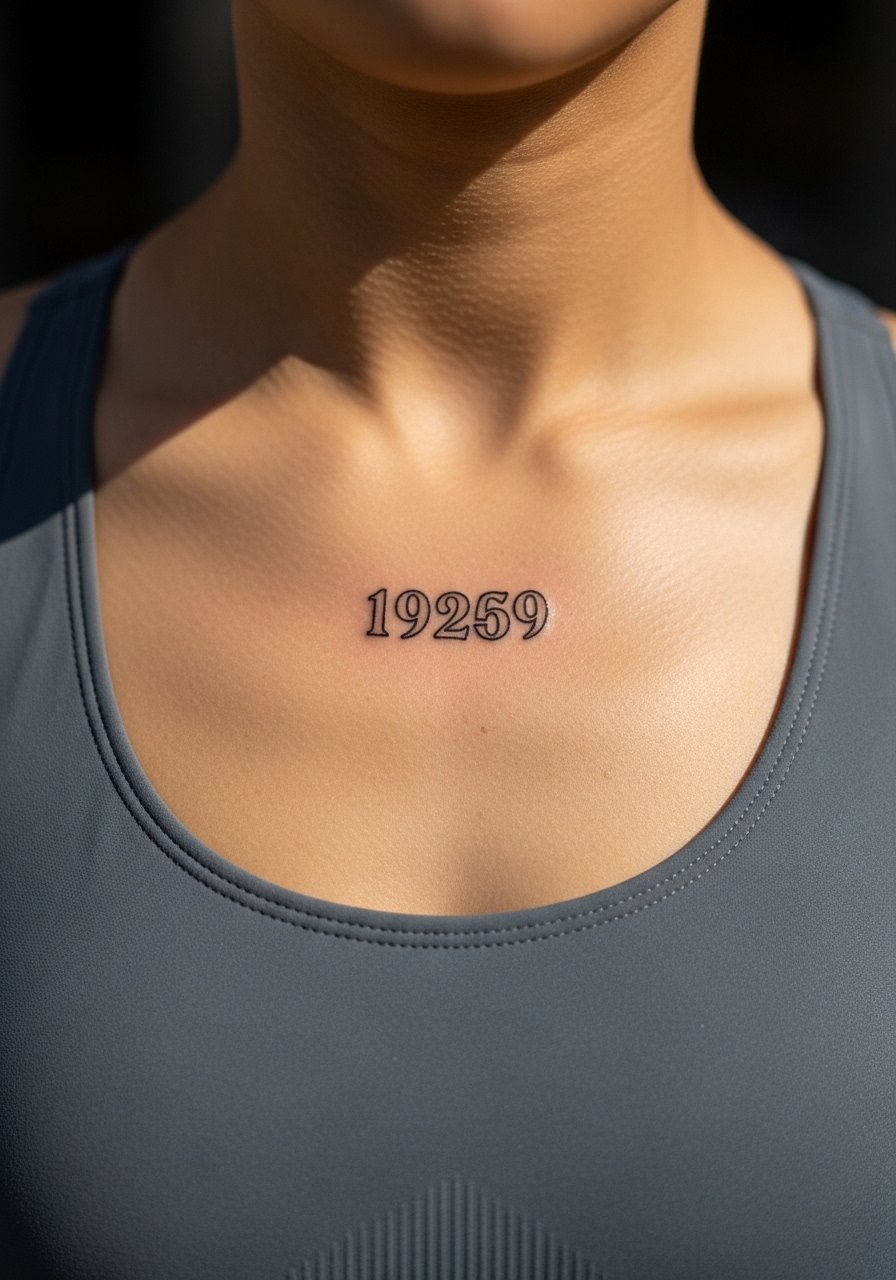
Rounded serif numerals on the upper chest marry ornament with legibility. Chest sessions can be more intense because the skin thins near the sternum and breath control matters, so plan for short breaks. Tell the artist you want slightly thicker serifs to keep counters open, and request preview stencils to check scale against the curve of your chest. Artists split on fine line here. One camp says fine line blurs quickly on chest skin, the other camp argues that careful depth and spacing hold. Name both camps directly and ask which approach your artist uses before booking. For wardrobe, an open-collar shirt that can be pulled slightly aside during the session keeps modesty in place and access clear.
Studio Day Picks
Those first six ideas include several zones that need different prep, from high-friction ankles to sensitive chests. A few simple items smooth the session and the first week of healing.
-
Stencil transfer paper kit. Lets you preview exact number spacing on skin before the needle starts, which is crucial for collarbone and chest placements.
-
Topical numbing cream. Applied as directed before the session helps take the edge off anklebone and sternum work without interfering with line clarity.
-
Thin protective film roll. Keeps wrist and finger numerals clean during the first days of heavy hand washing.
-
Fragrance-free gentle body wash. Gentle cleansing matters for stipple and fine line numerals that depend on intact needle channels.
-
Aquaphor healing ointment. Thin layers during the initial days lock in moisture for delicate number work without suffocating the skin.
7. Micro Roman Numerals Along the Finger Side
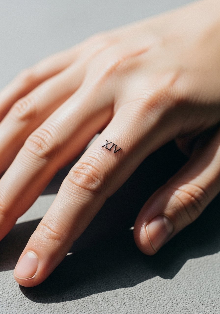
Finger numerals are intimate and visible, but they suffer from constant washing and contact. Expect a faster fade and likely touch-ups at year one or two, and understand the session feels sharp because of bone proximity. If you want longevity, ask the artist to increase line weight slightly and avoid placing ink directly over knuckles. The biggest mistake is requesting a hairline scale that looks fine in photos but softens into a ghost. For show-off styling pick slim rings or a stackable midi ring set that frames the numeral without rubbing the tattoo surface extensively.
8. Scripted Cursive Numerals on the Inner Bicep
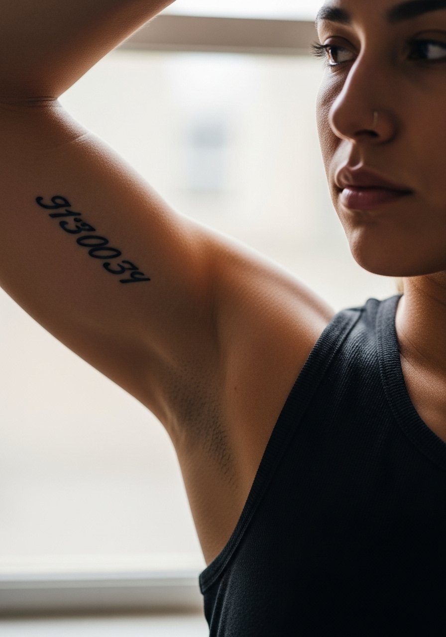
Inner bicep script feels personal and stays relatively protected from sunlight, which helps fine cursive numerals keep their shape longer. The session can be surprisingly tender because the inner arm is softer, but it is a good spot for a one-hour script tattoo. In consultation specify exact letter height and slope so the numerals do not compress when the arm relaxes. A common error is asking for ultra-thin connecting strokes that merge as the arm moves. For session wear bring a loose tank top so the artist can work with the arm raised comfortably.
9. Bold Geometric Numbers on the Calf
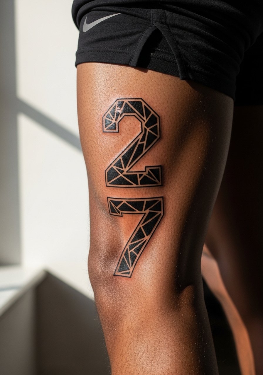
Calf placements accept bolder geometry and heavier saturation, which helps geometric numerals keep shape through years of movement and sun exposure. The session feels moderate because there is more muscle padding here, and artists can work at a confident pace. Tell the artist you want crisp corners and avoid super-fine interior details that compress when the calf moves. The mistake I see is trying to miniaturize blocky geometric fonts where the angles need space. For summer show-offs, wear loose drawstring shorts to reveal the calf without chafing the new ink.
10. Vintage Gutenberg-Style Numbers on the Thigh
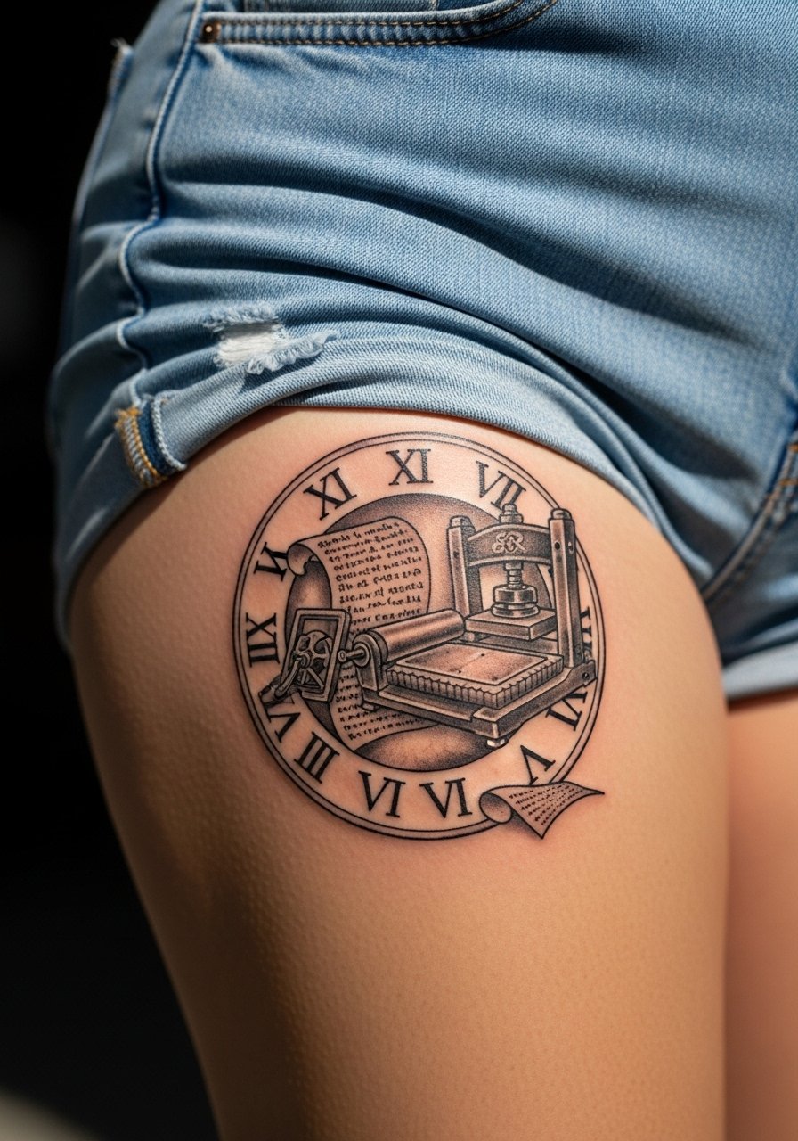
Thighs are generous canvases for antique serif numbers that borrow from Gutenberg era fonts. This placement ages favorably because it is mostly protected from daily abrasion and UV. Sessions can be longer for larger typographic treatment, so expect a multi-hour booking for a dense layout. I advise asking for generous counters and moderate kerning so numerals breathe on curved flesh. A common misstep is cramming ornate numerals too close together. For the appointment wear high-waisted shorts or a skirt you can shift so the artist has clean access without exposing more skin than needed.
11. Thin Stencil Script Dates Across the Sternum
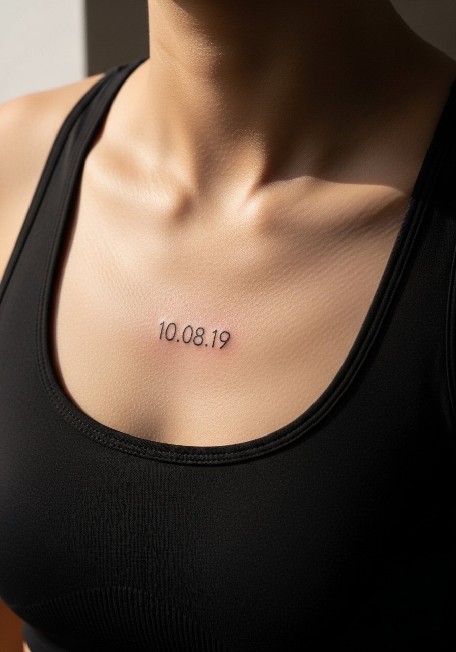
Sternum numerals are striking but sensitive, and healing here depends on clothing choice during the week after. Sessions feel intense because breathing and core tension affect the needle path. One camp of artists cautions against ultra-fine script across the sternum because skin stretch can blur lines, the other camp claims precise depth control holds fine work. Name both camps and ask where your artist stands. For the session wear a fitted sports bra or bandeau that gives access while protecting the area during travel home.
12. Minimalist Boxed Numeral on the Back of Neck

Numbers at the nape read like a secret code when you wear hair up. The back of neck is a place where professional considerations come into play for some workplaces, so think about visibility before booking. Sessions are quick but can sting because the area is thin skinned. Ask for a preview stencil that mirrors your hairline and movement. A mistake is requesting a too-small box that loses crispness as hair and collar rub. For showing it off put hair in a high bun or wear a wide-neck shirt that reveals just the nape without overexposing it.
13. Serifed Block Numbers for a Ribcage Statement
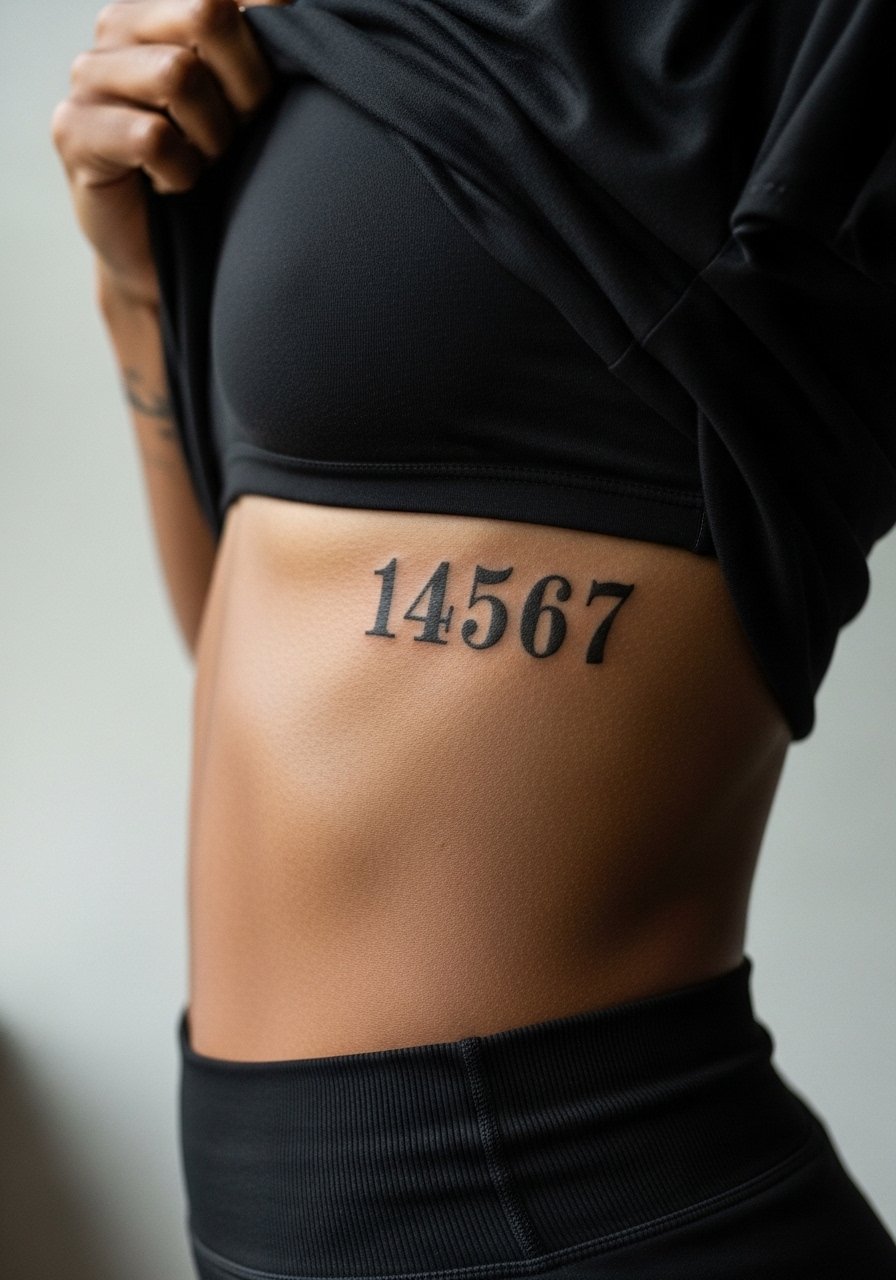
Ribcage numerals make a statement but carry higher pain. The skin there moves with breath and shifts with weight changes, and fine line on ribs divides artists into two camps. One group warns that lines blur quickly from constant movement, the other believes careful depth and spacing keep serifs crisp. Say both camps aloud during booking and ask which technique your artist uses. Ask for slightly stronger line weight than you would on the forearm to preserve detail. During the session wear a cropped top you can lift so the artist only exposes the work area.
14. Dot Work Zodiac Number on the Side of the Hand

Side-of-hand numerals are visible and vulnerable. Expect the fastest fading rate of anything in this list and plan on touch-ups. The session feels stinging due to minimal padding, and the area gets lots of soap and sun exposure. For longevity, ask for dense dot work or thicker line work rather than hairlines. A frequent mistake is assuming a tiny outline will hold like an upper arm piece. If you want to accessorize without covering the tattoo, choose thin bracelets or a minimalist watch that does not rub the ink directly.
15. Vintage Ticket-Style Numbers Along the Spine
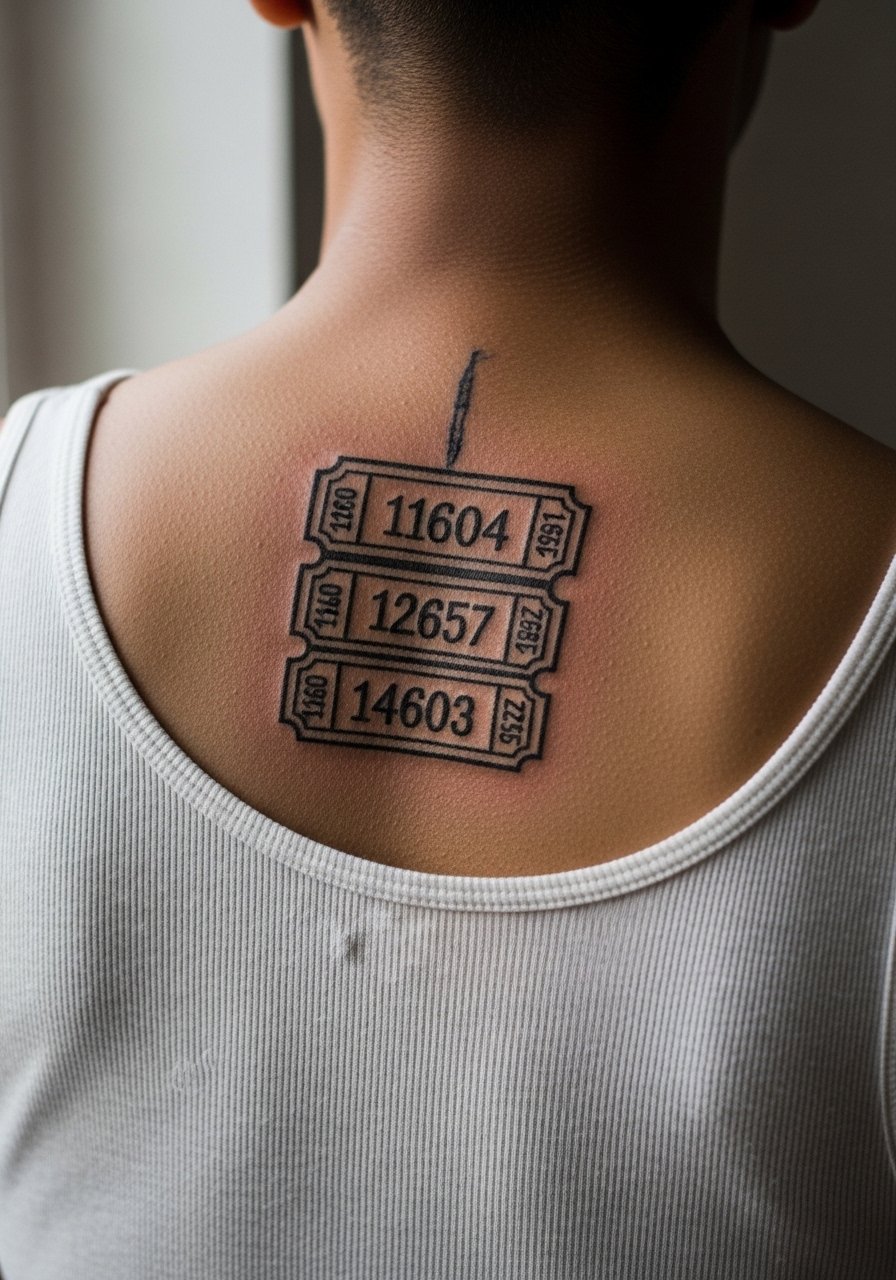
Spine numerals draw the eye in open-back garments and age dependably when spaced properly. The area tolerates vertical layouts naturally, and shading is less necessary when the font carries weight. The session can be longer because of the tight spacing; expect to take breaks. During consult ask for line weight that reads at arm's length rather than hairline detail. A common misstep is compressing tiny numerals too close along the vertebrae. For showing it off pair with open-back dresses or halter tops.
16. Brush Script Numerals on the Outer Thigh
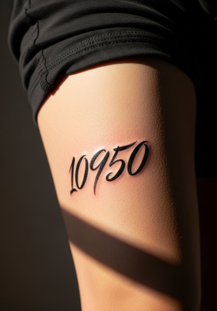
Outer thigh pieces take heavy brush scripts well because the area is protected from constant abrasion and sun. Sessions can be more relaxed because there is room to move and the artist can step back for composition checks. Tell the artist you want the brush strokes to maintain visible texture rather than smoothing into solid fills. The mistake is making strokes too thin so they look faded after a few years. For the appointment wear loose shorts so the artist can work without pressure on the area and so the thigh stays comfortable while healing.
17. Minimalist Numeric Barcode on the Side Waist
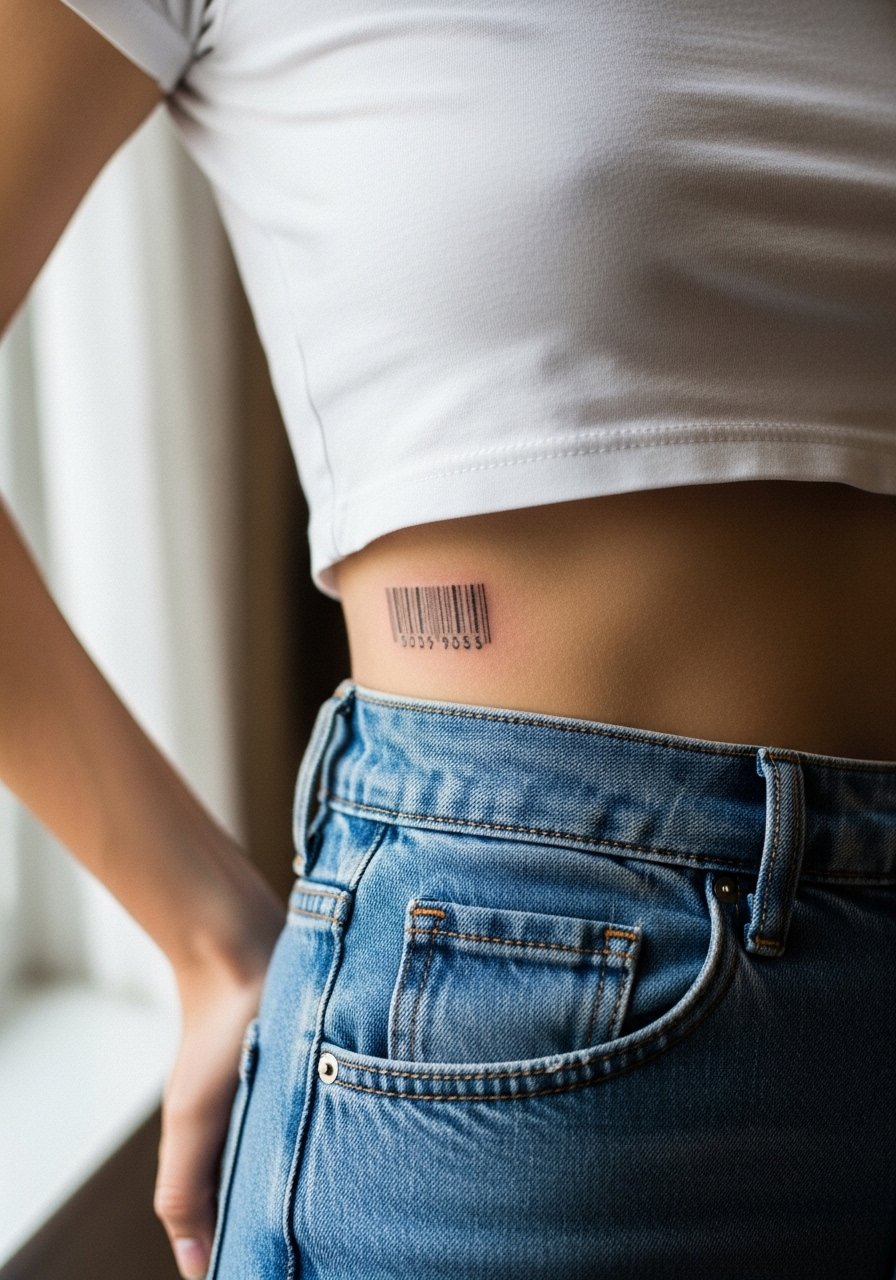
A barcode-inspired numeric piece reads modern and graphic on the side waist, and the placement keeps it mostly private which reduces UV exposure. The session is typically quick and sits at a low to moderate pain level depending on your torso sensitivity. During consult request even bar widths and clear spacing to avoid merging within a year. A mistake is asking for an ultra-fine barcode that blurs; pick a slightly bolder line weight for longer life. For showing it off wear high-waisted jeans and a cropped tee that reveals just enough of the strip.
Frequently Asked Questions
Q: Will fine line numerals hold up on darker skin tones as well as on lighter tones?
A: From what I've seen, contrast and line weight matter more than skin tone alone. Slightly bolder strokes and open counters give numerals clearer reading on darker skin, while hairline strokes risk fading into a softer gray. Bring clear reference photos to your consult and ask the artist to test scale on a preview stencil.
Q: How often should I expect touch-ups for finger or hand numbers?
A: Plan for touch-ups sooner than for arm or chest work. Fingers and hands take more washing and abrasion, so a one- to three-year touch-up schedule is common depending on lifestyle. If you want the least maintenance choose heavier line weight and avoid placing ink over knuckles.
Q: Are Roman numerals better than Arabic numerals for longevity?
A: Roman numerals can age well when rendered in bold serif or blackletter styles because the thick strokes resist early softening. Arabic digits in heavy serif or blackwork also last. The issue is not the numeral system but the line weight, spacing, and placement.
Q: Is there a major debate about fine line numerals on ribs and sternum?
A: Yes. One camp argues that skin stretch and movement blur fine line work on ribs and sternum quickly. The other camp says careful needle depth and spacing let fine line survive in those spots. Ask your artist to explain which side they take and why before booking.
Q: What should I wear to the appointment for a thigh or rib-number session?
A: For thigh work bring loose shorts you can shift, and for ribs wear a cropped top or a sports bra you can lift slightly. Comfort keeps the session steady and reduces readjustments, which in turn helps line consistency.
Q: How do I balance showing a number tattoo while protecting it from sun and friction afterward?
A: Plan outfits that reveal the tattoo selectively, such as open-back tops or rolled sleeves, and use sun protection once healed. For high-friction spots like ankles or hands choose slightly bolder line weight to reduce the visual effect of wear over time.