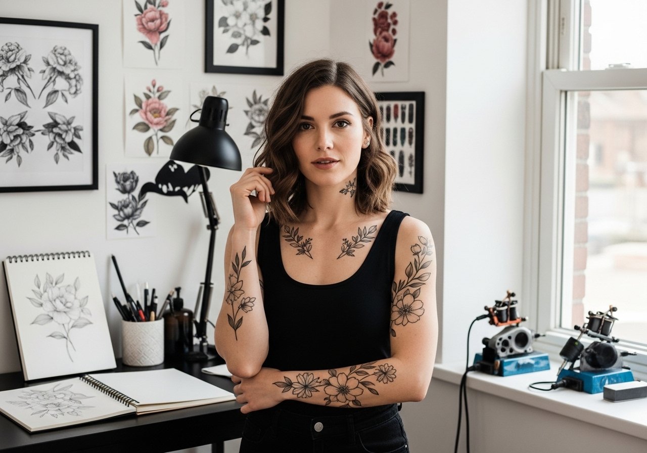
Fine line tattoos dominate saved boards and short-form feeds, but the reality is that finger work plays by different rules. Tiny scripts and micro symbols show off quickly, then face friction, frequent washing, and thinner skin that changes how ink settles. These twenty-one compact ideas focus on what actually lasts on fingers, what to ask in consultation, and how to style them so they read like jewelry for years.
1. Tiny Script Lettering on the Side of a Finger
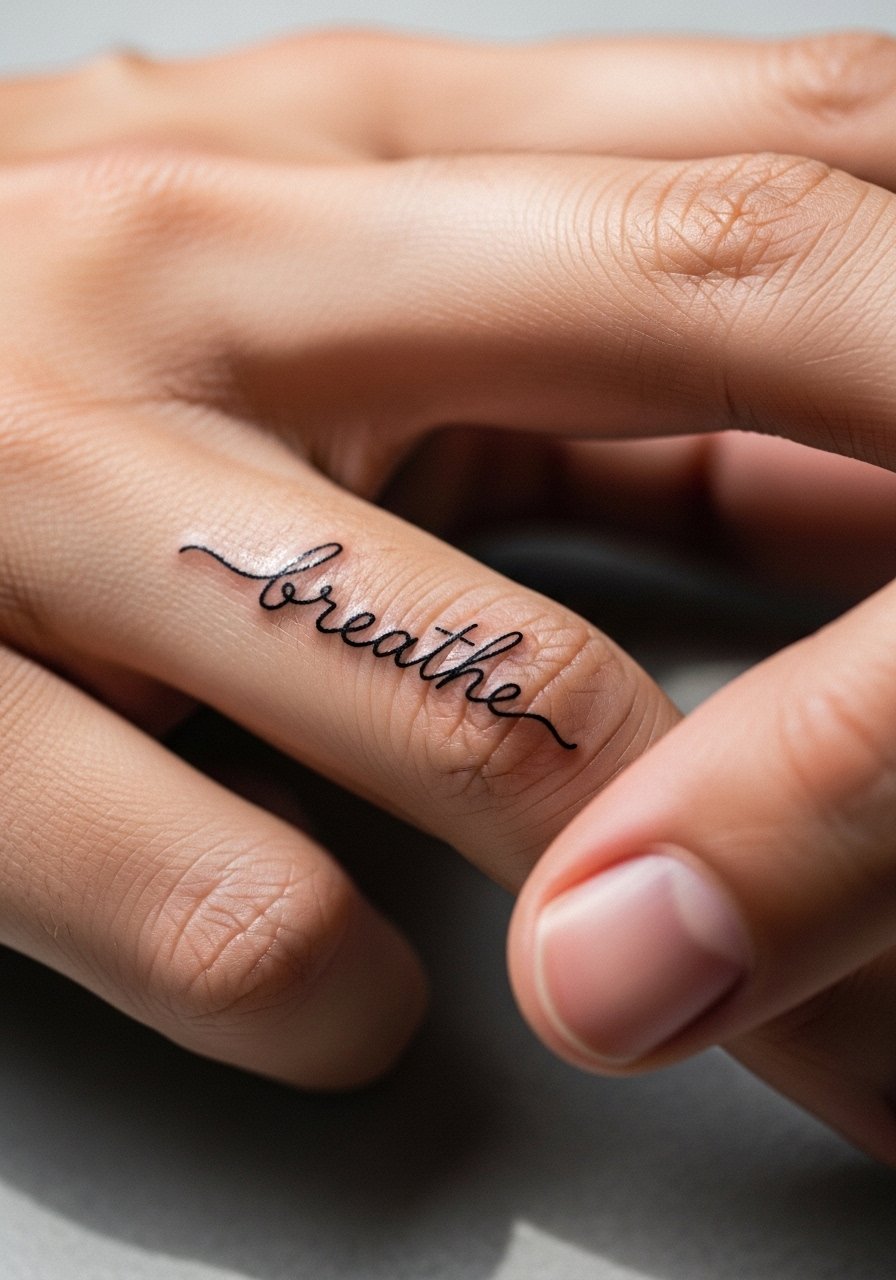
I've seen tiny script on side fingers look very intentional when the letters sit vertically and the linework is spaced. Recommend this when you want a discreet reminder that reads like a ring. Tell your artist you want slightly heavier single-needle linework with tiny gaps between letters so the word does not merge after a year. Fingers are high blowout risk because of thin skin and movement. Expect a touch-up window at year one to two. For showing it off, stack it with dainty stacking rings that mirror the script's width so nothing competes visually.
2. Minimalist Heart Outline on the Knuckle
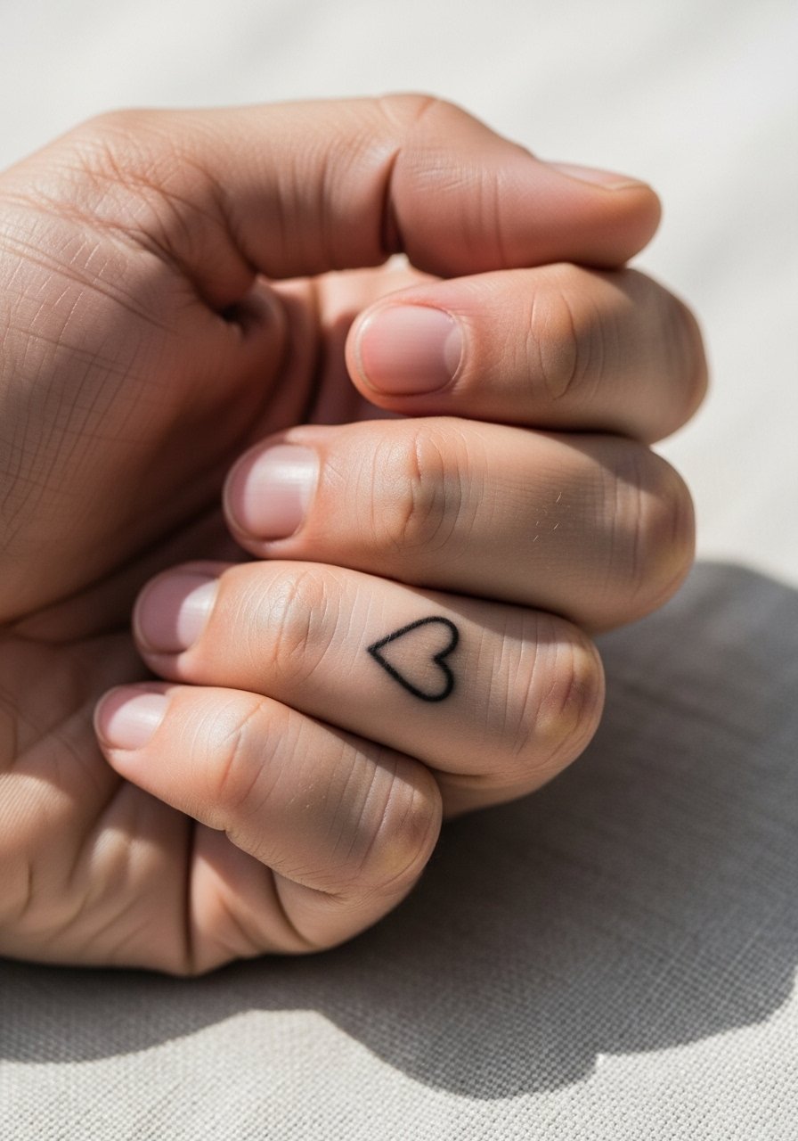
When someone wants a small symbol that reads from close range, a knuckle heart is quick and low session time. In consultation, ask the artist to map the design over your knuckle crease so the heart sits where the skin flexes least. The common mistake is placing it directly over a joint, which makes lines warp as you bend your finger. Pain is brief but sharp for the knuckle. Expect the first six months to show crisp linework then to soften. Pair it with a thin midi ring set to frame the area without covering the ink.
3. Morse Code Dots and Dashes Along the Finger
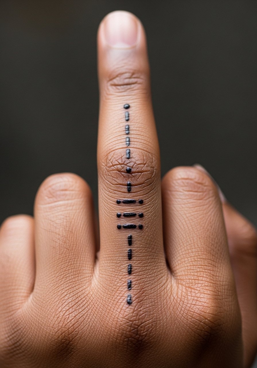
Morse code is great when you want privacy without visible letters. Recommend this for names or dates that you want encoded. Tell the artist exact spacing and have them test-transfer the dots and dashes so proportions scale to the finger. A real mistake is making the dots too close. Over time, small dots can merge if placed too densely. For session feel, it is a short, prickly process that rarely needs more than one brief sitting. Touch-ups are common at year one. If you want it to last, ask for slightly larger dots than you think you need.
4. Micro-Realism Tiny Rose at the Finger Base
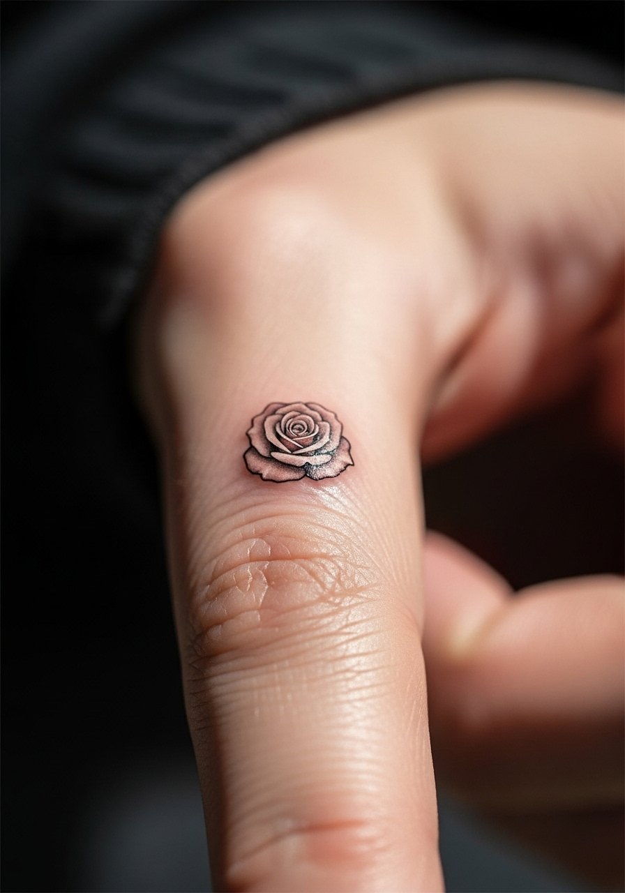
A micro-realism rose gives classic imagery in a compact form, and it reads differently from line-only work. I recommend this when you want a tiny focal point that still has texture. Tell your artist to use soft stipple shading and to avoid packed gray washes that blur in tight spaces. The common aging issue is over-saturation in a small area, which can turn petals into a gray blob by year three. For the appointment, wear a loose button-down shirt you can pull aside so the artist has clear access to your hand and wrist. Keep in mind hand skin moves a lot, so expect a touch-up at one year.
5. Mini Geometric Triangle Stack Along the Finger
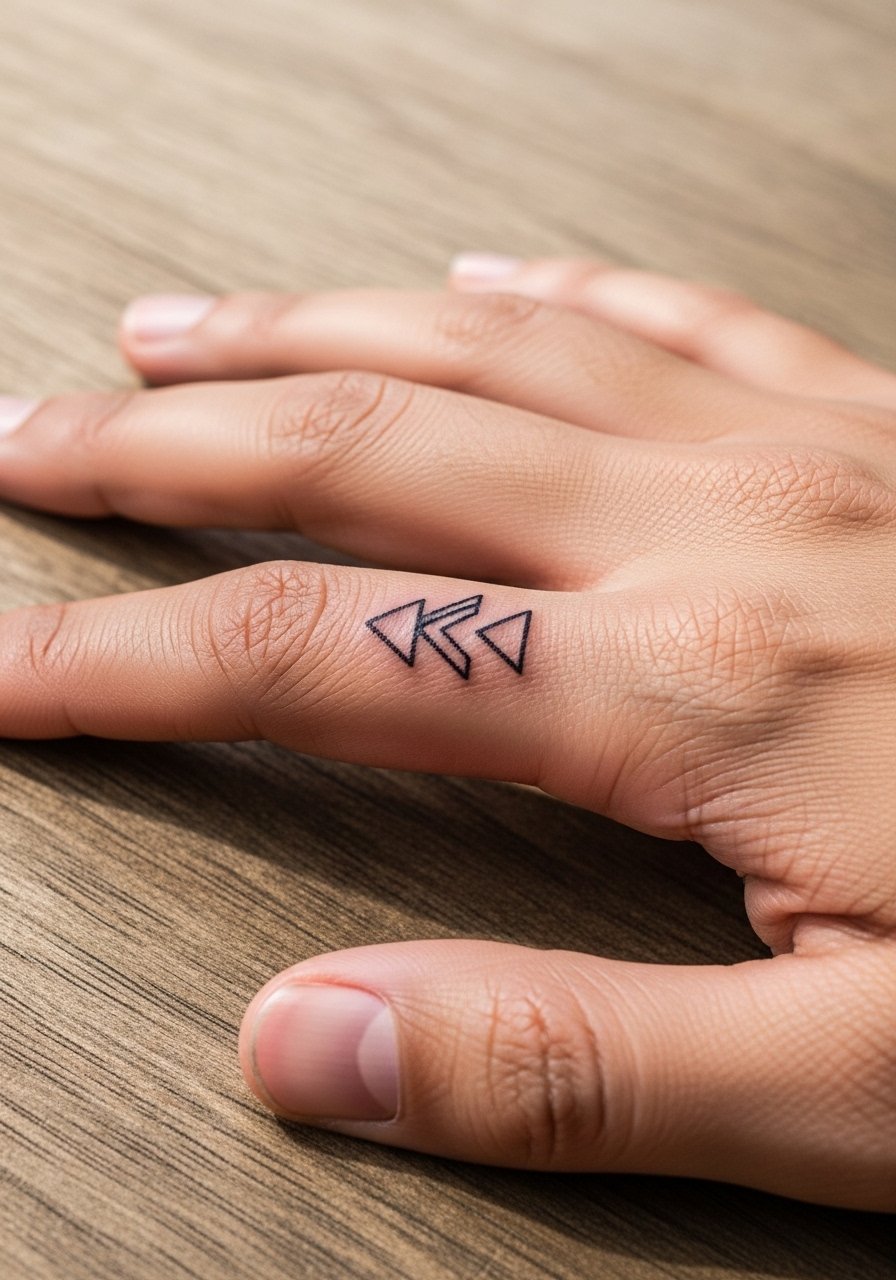
Geometric stacks work when you want clean shapes that follow finger anatomy. I suggest this over more ornate patterns because simple geometry keeps the negative space intact as skin shifts. Tell your artist to maintain even spacing and consistent linework. The mistake is scaling the triangles too small, which invites line merging. At six months the contrast will be clear, then gradual softening occurs with daily friction. Pain is brief and sharp. For a casual show-off look, cuff rolled sleeves so the hand is visible, or pair the design with a minimalist chain bracelet on the same wrist to balance the visual weight.
6. Single Tiny Diamond Symbol on the Index Finger
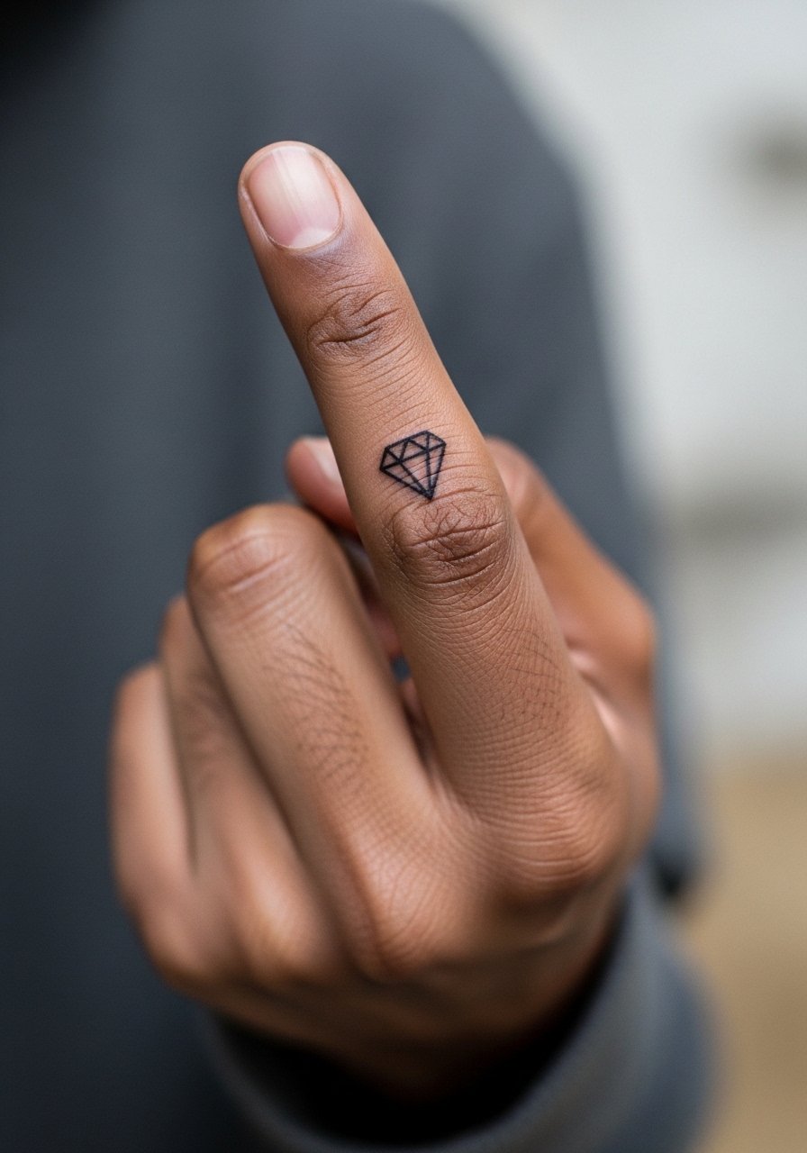
A single diamond glyph reads like a talisman. I recommend it when you want a modern, simple mark that sits like jewelry. During consultation, confirm exact diamond proportions and whether the interior will be filled or left open. Filled interiors tend to hold better than ultra-thin outline only, but too much fill increases blowout risk on fingers. Expect a short session and possible touch-up at year one. One real mistake is replicating a complex facet pattern at micro scale. Keep it graphic and simple so the lines age gracefully.
Studio Day Picks
The finger and knuckle ideas above face more washing and friction than forearm or chest work, so a few targeted items help the session and early healing.
-
Stencil transfer paper kit. Lets you preview placement on small finger areas so you can confirm spacing before the needles touch skin.
-
Topical numbing cream. Applied per instructions about 45 minutes before can ease the sharp sensation over knuckles and finger joints.
-
Thin protective film roll. Useful for tiny finger pieces to shield the area during the first days of frequent hand washing.
-
Fragrance-free gentle body wash. Cleans fingers without fragranced irritants that can sting fresh linework.
-
Aquaphor healing ointment. A thin layer in the first 48 hours helps keep tiny needle channels moisturized without clogging them.
7. Fine Line Wave That Wraps Around a Finger
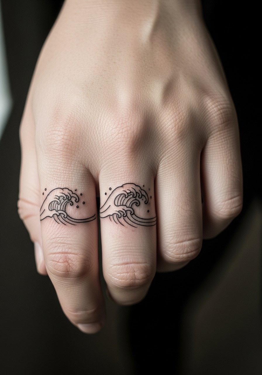
This wrap feels like a subtle ring and suits anyone who wants a continuous motif. In the chair, ask for slightly deeper single-needle placement so the line maintains crispness but not so deep it causes blowout. One camp of artists says fine line on fingers blurs fast and should be avoided. The other camp argues careful depth and spacing let it settle well. Name your artist's preference and be ready for a touch-up depending on how your skin reacts. For styling, wear thin stacking rings on other fingers to create a layered jewelry effect that complements this wrap.
8. Tiny Constellation Spanning Two Fingers
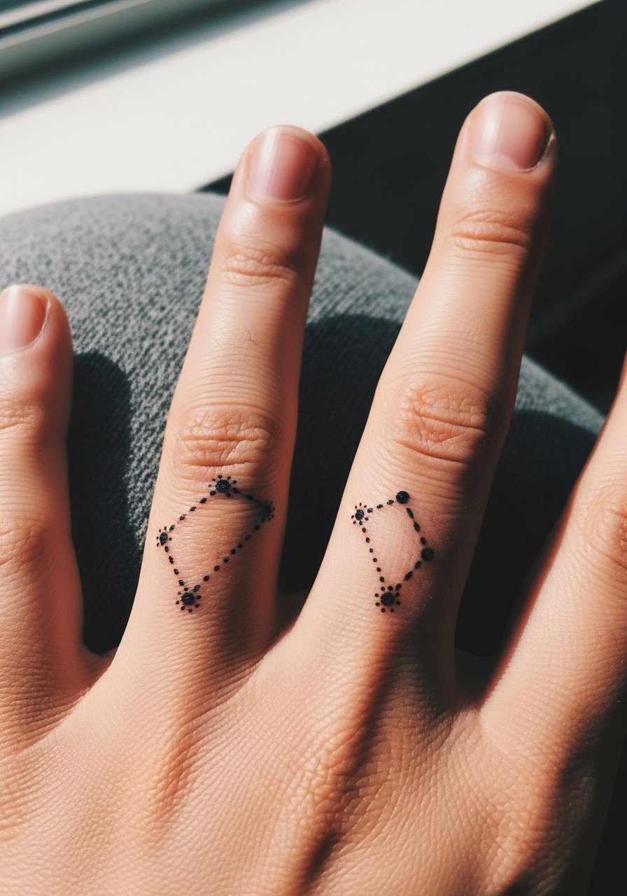
A constellation that spans two fingers reads like a linked piece, which looks deliberate when the spacing is tested while the hand moves. Tell your artist the exact finger gap you prefer and have them test the transfer with your fingers in natural positions. The common mistake is not accounting for finger spread, which can distort constellation alignment when relaxed. For showing it off, a delicate chain bracelet helps tie wrist-level attention into the design without stealing focus. Expect touch-ups at year one as tiny dots soften under daily use.
9. Micro Script Word Along the Finger Side
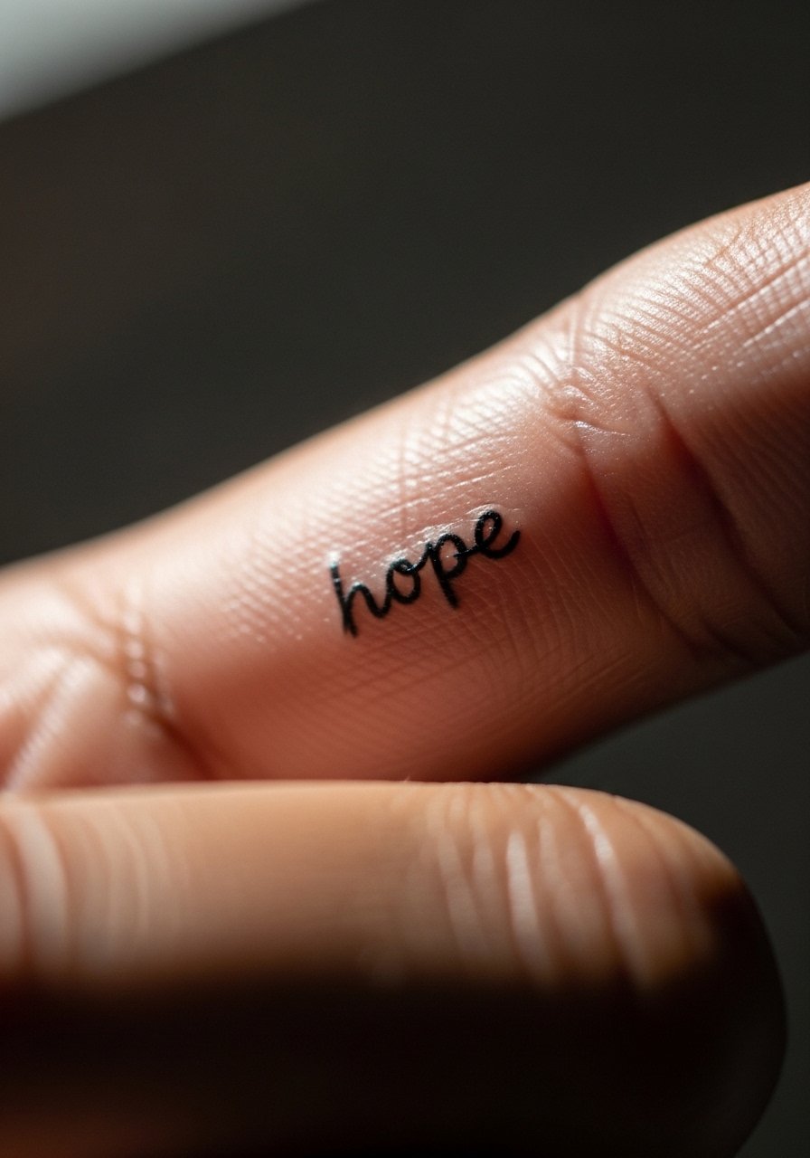
Micro script works best when the word is short and the type is open rather than cramped. I recommend one-syllable words or initials so characters have room. Ask the artist to scale letter spacing and test the transfer on your finger's curve. A mistake is requesting ornate cursive that compresses into blur. In practice, six months in you will see the crispness fade slightly and fine edges will soften. Plan for a light touch-up if you want the script to remain precise. For session wear, keep nails trimmed to let the artist cleanly access the area.
10. Minimalist Anchor on the Ring Finger
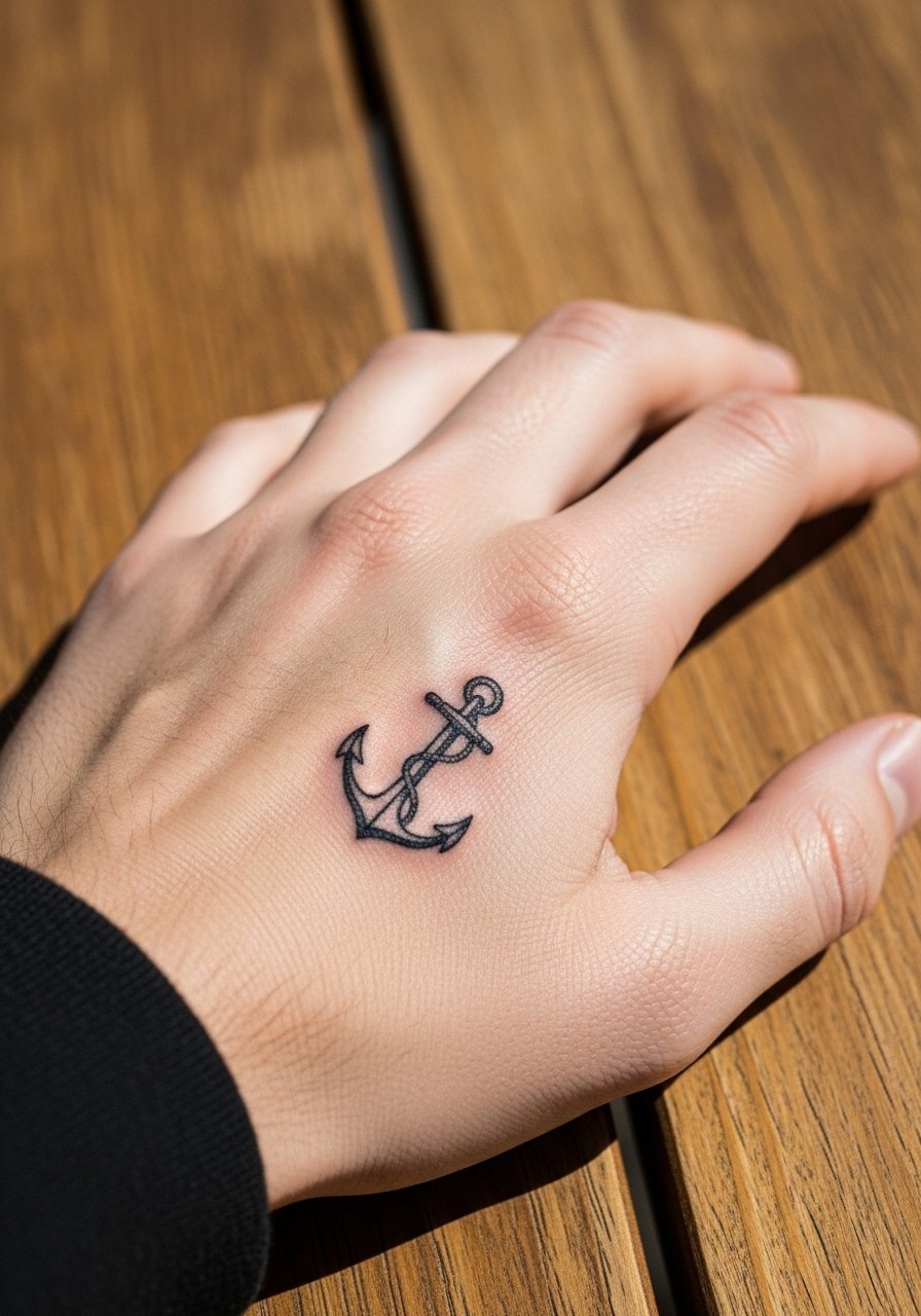
An anchor reads like a token and sits naturally near the ring finger. Recommend this for someone who wants nautical symbolism without large commitment. In the consult, specify whether the anchor should be solid or just an outline. Solid fills may blur slightly faster on fingers, so a thin but confident outline often holds up better. Pain is brief and concentrated. For show-offs, pair with a complementary stackable ring set rather than a single bulky band so the tattoo remains visible and framed.
11. Tiny Symbol with Stipple Dot Work on the Thumb
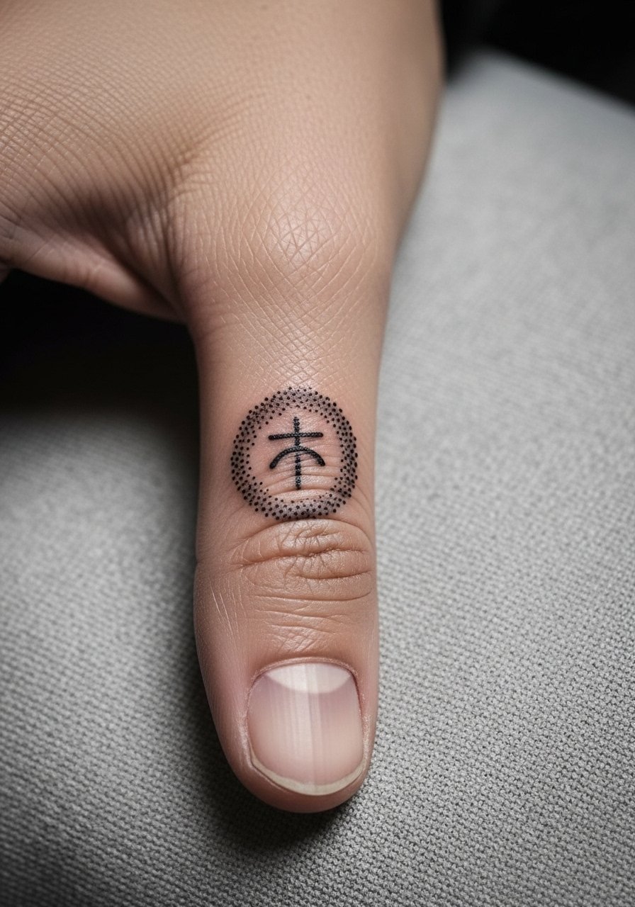
Thumb tattoos feel bold because the area is so visible in daily gestures. I recommend stipple shading when you want texture without heavy fill. During consultation, request controlled stippling and ask for a sample density on a similar area. A common mistake is packing too many dots into a tiny zone which increases merging risk. Thumb skin tends to need touch-ups sooner because it experiences more abrasion. For the session, wear a short-sleeve button-down so the artist can move your arm freely and you stay comfortable.
12. Mini Floral Ring That Encircles the Finger
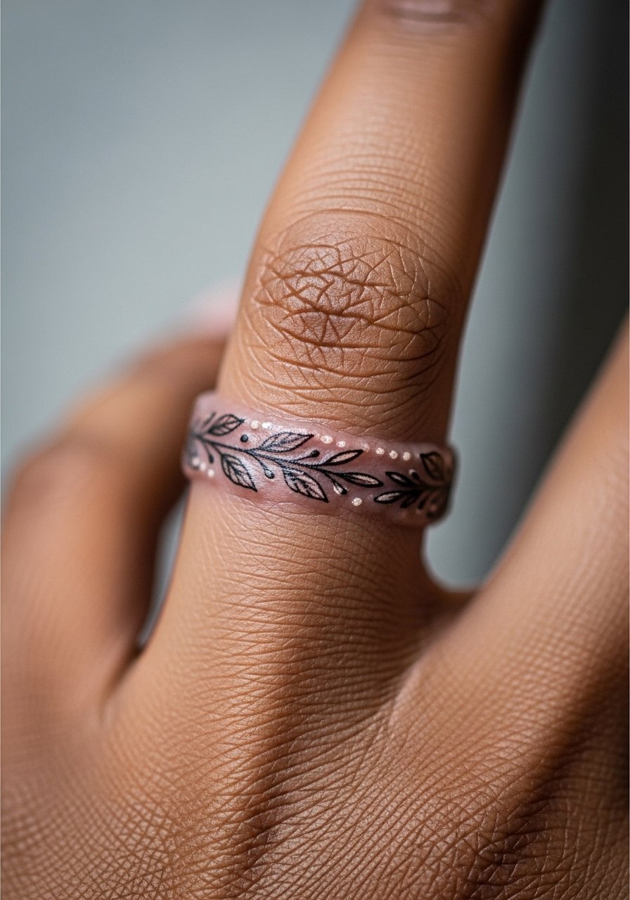
A floral ring is literal jewelry that ages like one. I recommend this when you prefer ink to metal rings. Ask your artist to keep motifs spaced and avoid tiny connected shading that could merge. The mistake is over-detailing the band so it becomes a solid band over time. Expect the first year to keep good contrast then gradual softening around edges. For marriage-minded clients, note that ring placement may conflict with real rings in long-term wear. If you want the look without finger abrasion, consider a slightly higher placement near the proximal phalanx.
13. Tiny Paw Print at the Side of a Finger
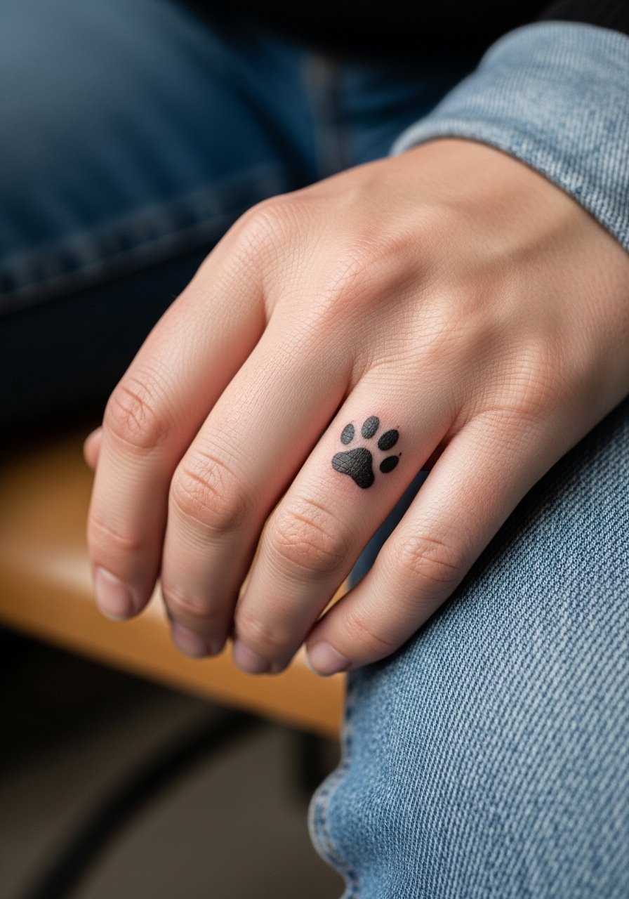
Pet memorials read clearly in compact paw prints when the pads are spaced and simple. In consult, bring a photo to translate scale accurately. A real mistake is insisting on a detailed paw pad texture that cannot hold at micro size. For the session, put on a rolled-up linen shirt so your forearm is free and the artist can position your hand without restriction. Paw prints on fingers are a sweet, low-commitment way to carry a pet signifier, but expect small touch-ups over time.
14. Tiny Coordinates Along the Finger Bone
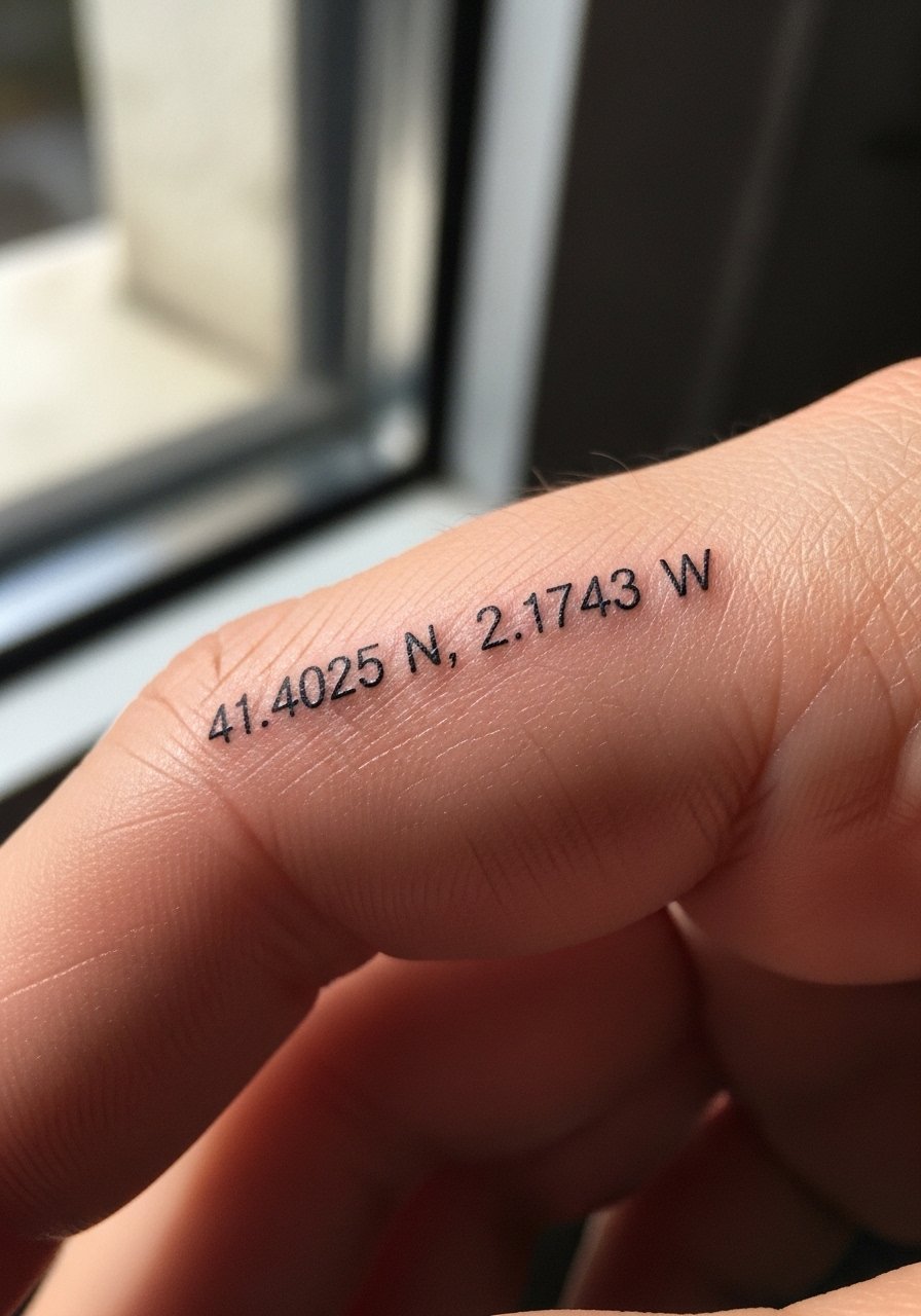
Coordinates translate to meaningful places without overt imagery. Precision matters, so provide the exact format you want and ask for a transfer with readable type. A mistake is asking for long decimal places that compress into illegibility. For longevity, space numerals slightly wider than normal and consider using Roman numerals for visual breathing room if you prefer. Fingers can be unforgiving with tiny numerals, so expect a touch-up at one to two years if you want them razor sharp. This style pairs with minimalist jewelry, but avoid wide bands that cover the coordinates.
15. Minimalist Arrow Running Along the Finger
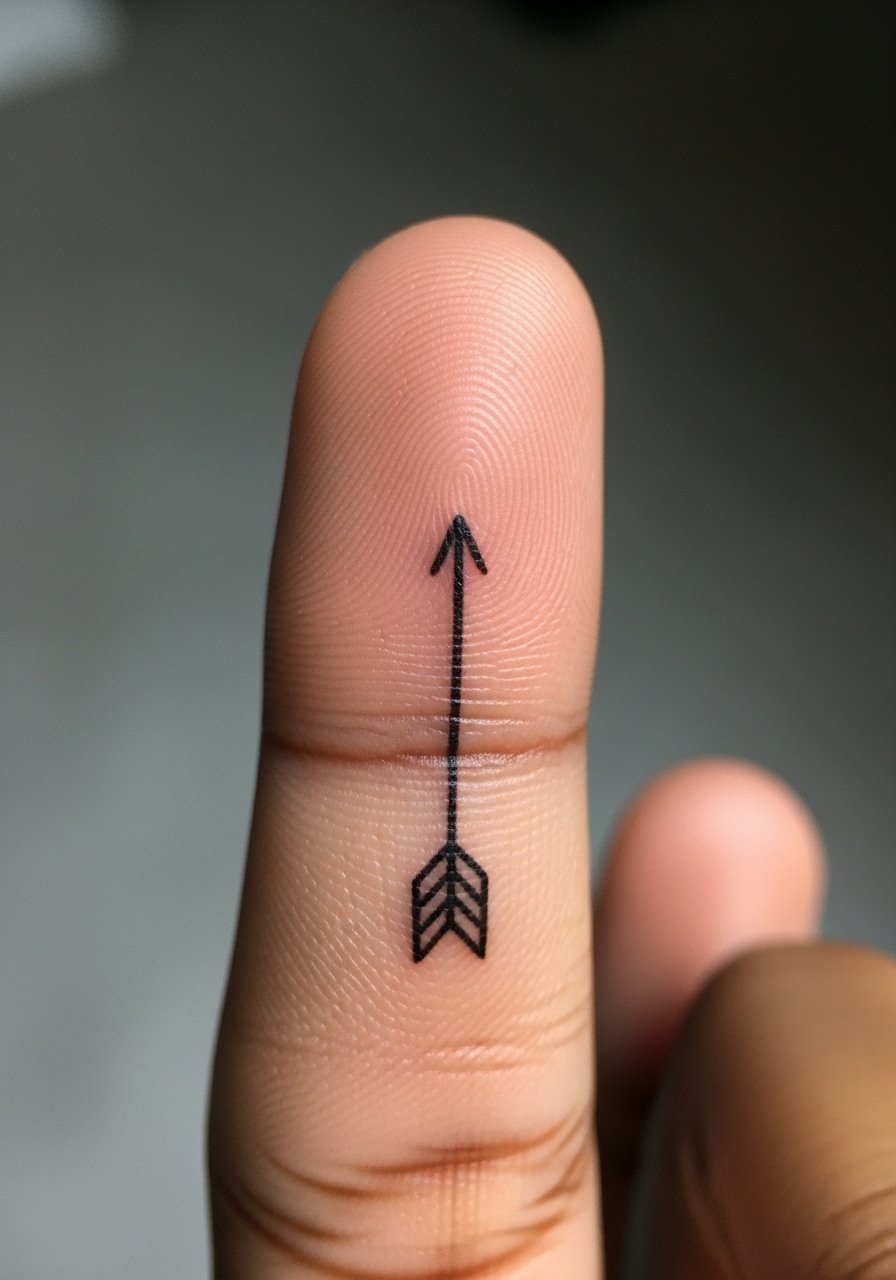
An arrow reads like motion when placed along the finger. Recommend it if you want directional symbolism that still reads small. Ask the artist to keep the arrowhead simplified and the shaft slightly thicker than you might choose for forearm linework to resist spreading. A common mistake is placing the arrow too near the fingertip where washing and use wear it fastest. Expect short session time and a likely touch-up at year one. For wear, avoid rings that slide over the arrow's placement.
16. Tiny Moon Phases Spanning Three Fingers
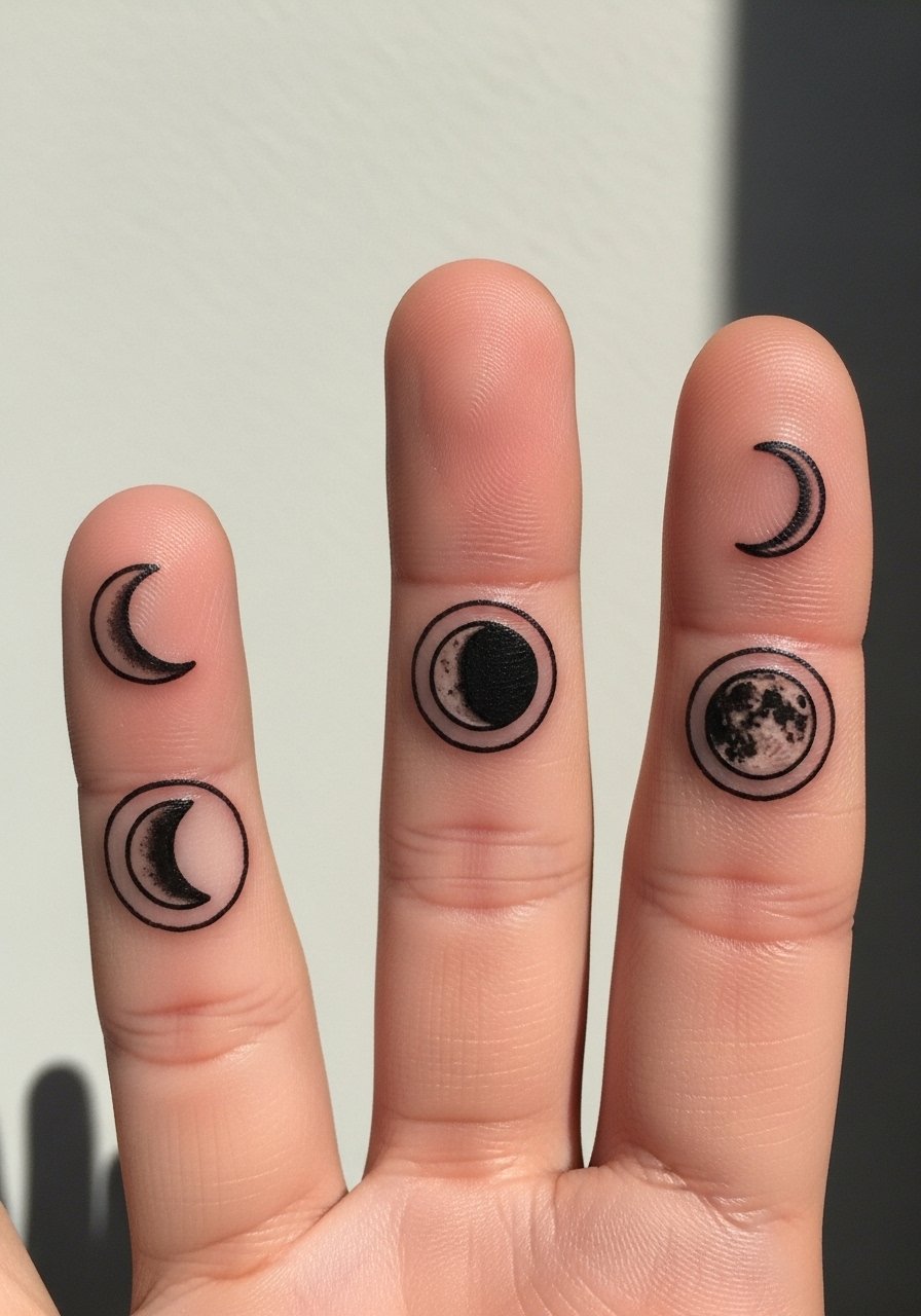
Moon phases across fingers look deliberate when alignment is checked with relaxed and flexed hands. When booking, request the artist test the placement with your natural finger spacing so moons do not separate when you make a fist. The mistake is not accounting for how knuckles shift during everyday motion. Because this sits on multiple fingers, touch-ups are more likely than a single-finger piece. For a cohesive look, wear thin coordinating stacking rings on adjacent fingers rather than one heavy band.
17. Single Tiny Star Near the Knuckle
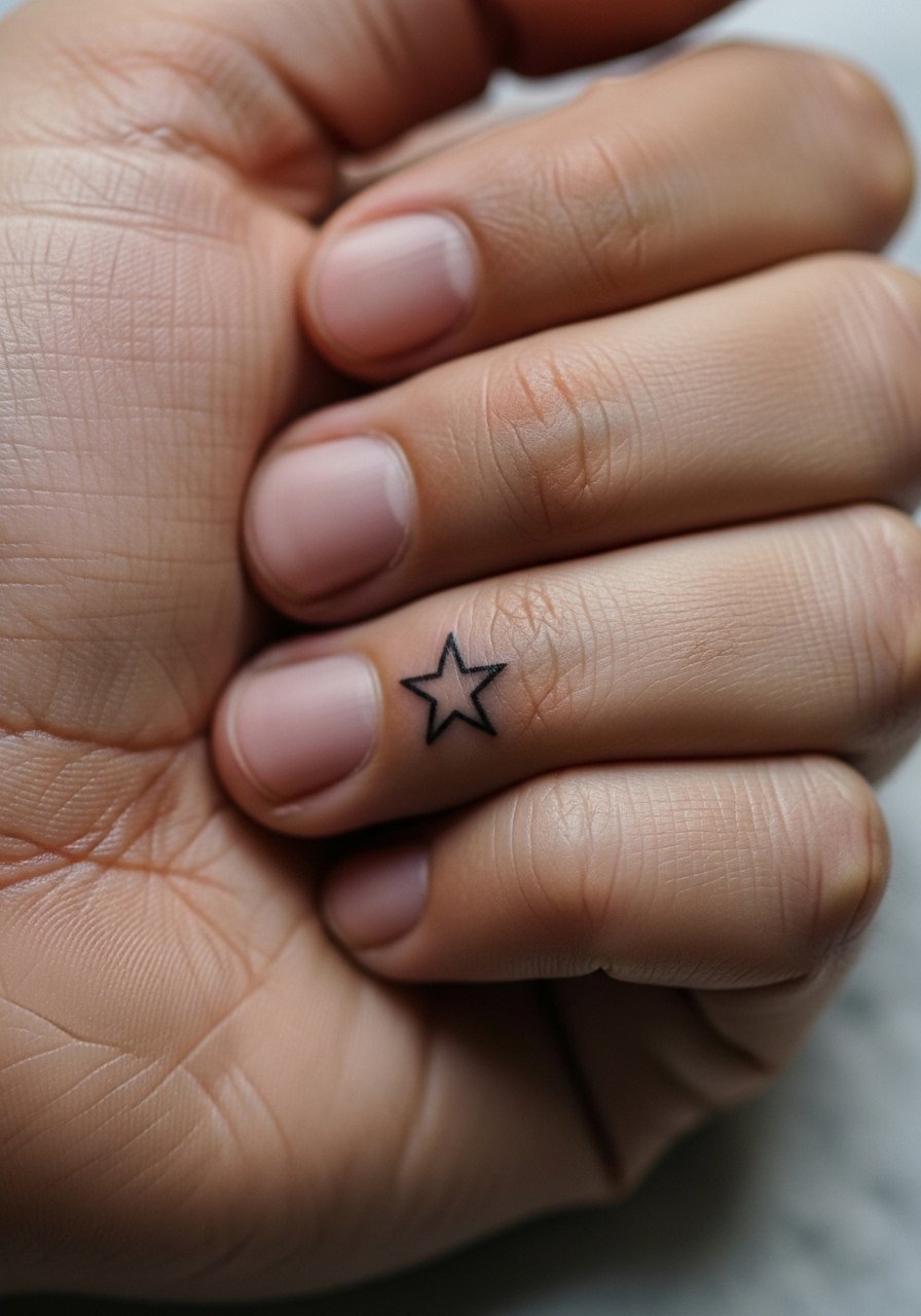
A knuckle star is quick and iconic. I recommend this when you want a tiny symbol with clear edges. In consultation, ask the artist to keep points blunt rather than razor sharp so lines last cleaner with skin movement. The common mistake is requesting an extreme micro star that loses its shape after the first year. Pain is brief. Expect a touch-up if you want crisp, sharp points after a period of regular use and hand friction.
18. Micro Roman Numerals Along the Finger Side
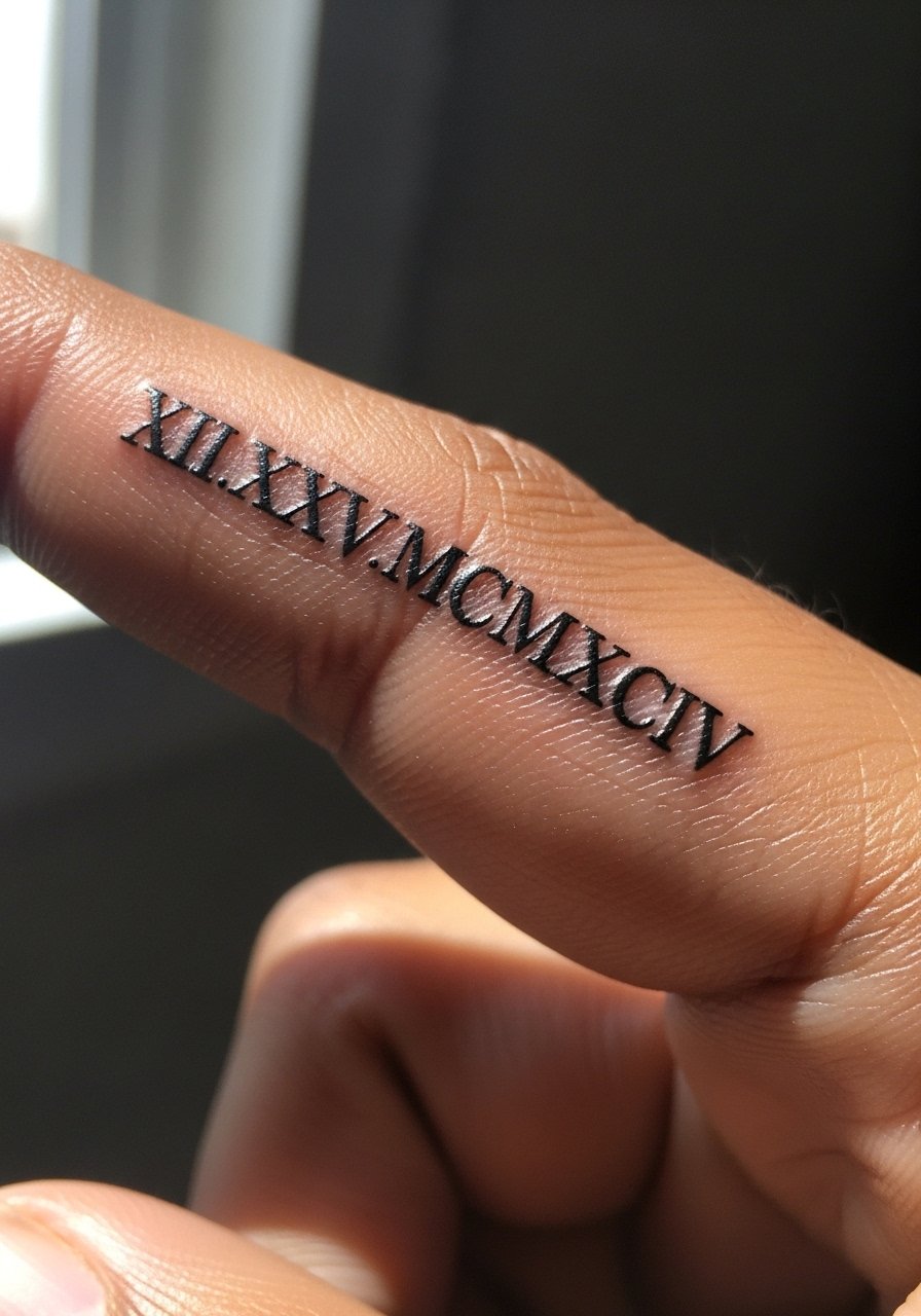
Roman numerals compress elegantly and can keep meaning with minimal ink. Key consultation advice is to ask for slightly wider spacing and a modest serif so numerals do not blur into each other. People often ask for very long dates which become unreadable on fingers. For longevity, opt for simplified separators or fewer characters. A practical styling tip is to go light on bulky rings that sit over the numerals. For show-off pairing, a thin chain pendant necklace keeps attention near the hand and neck area without covering finger ink.
19. Tiny Leaf Sprig Along the Side of a Finger
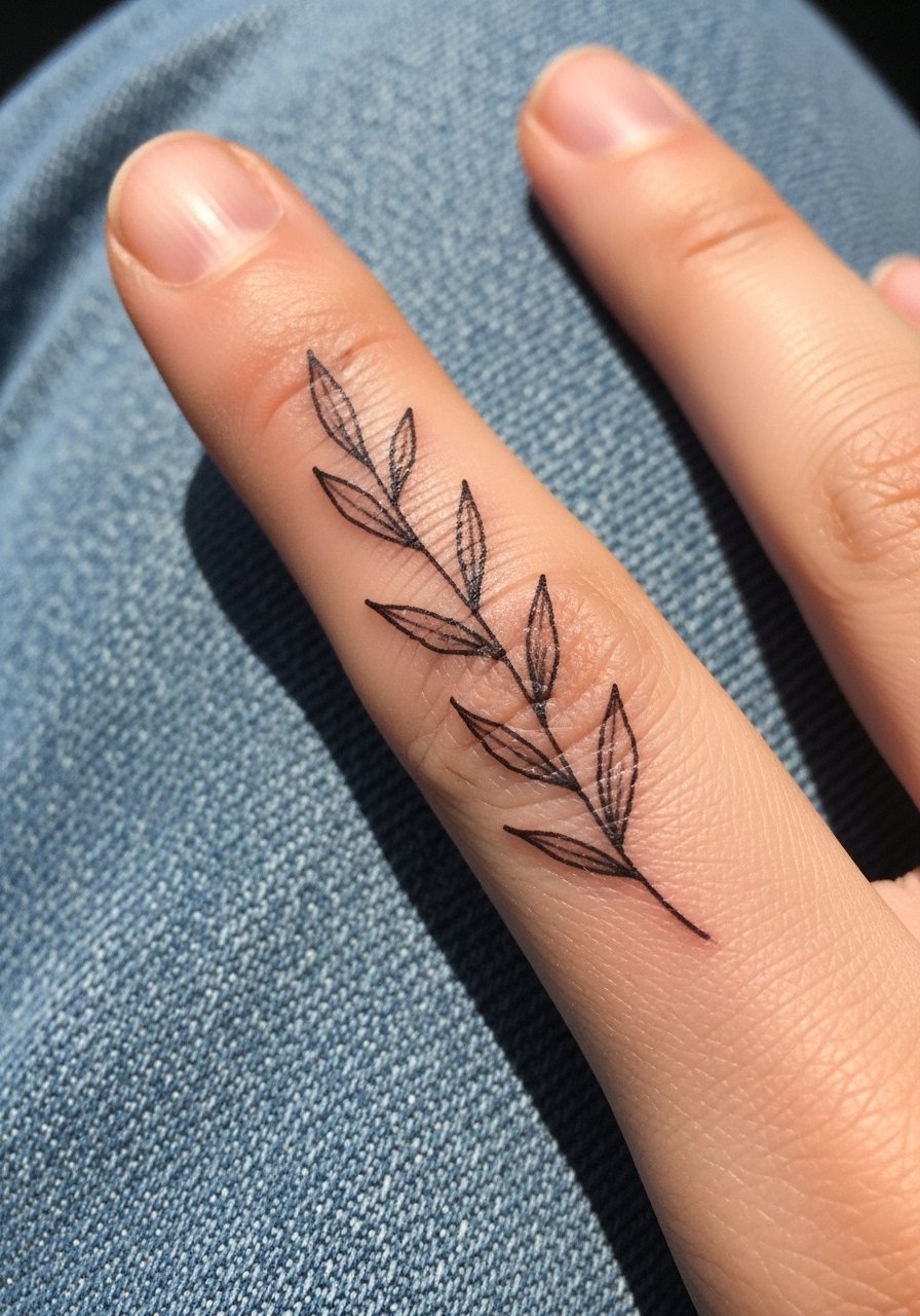
A leaf sprig reads organic and pairs well with casual wardrobes. Suggest this when you want a soft, elongated motif that follows finger contours. Tell the artist to space leaves with negative space and avoid packed stippling. The mistake is over-detailing the veins, which cannot hold well at micro scale. For showing it off, roll sleeves and consider a rolled-up linen shirt or short sleeves that keep hands visible. Expect a touch-up window around year one as edges soften.
20. Small Split Lock and Key Across Two Fingers
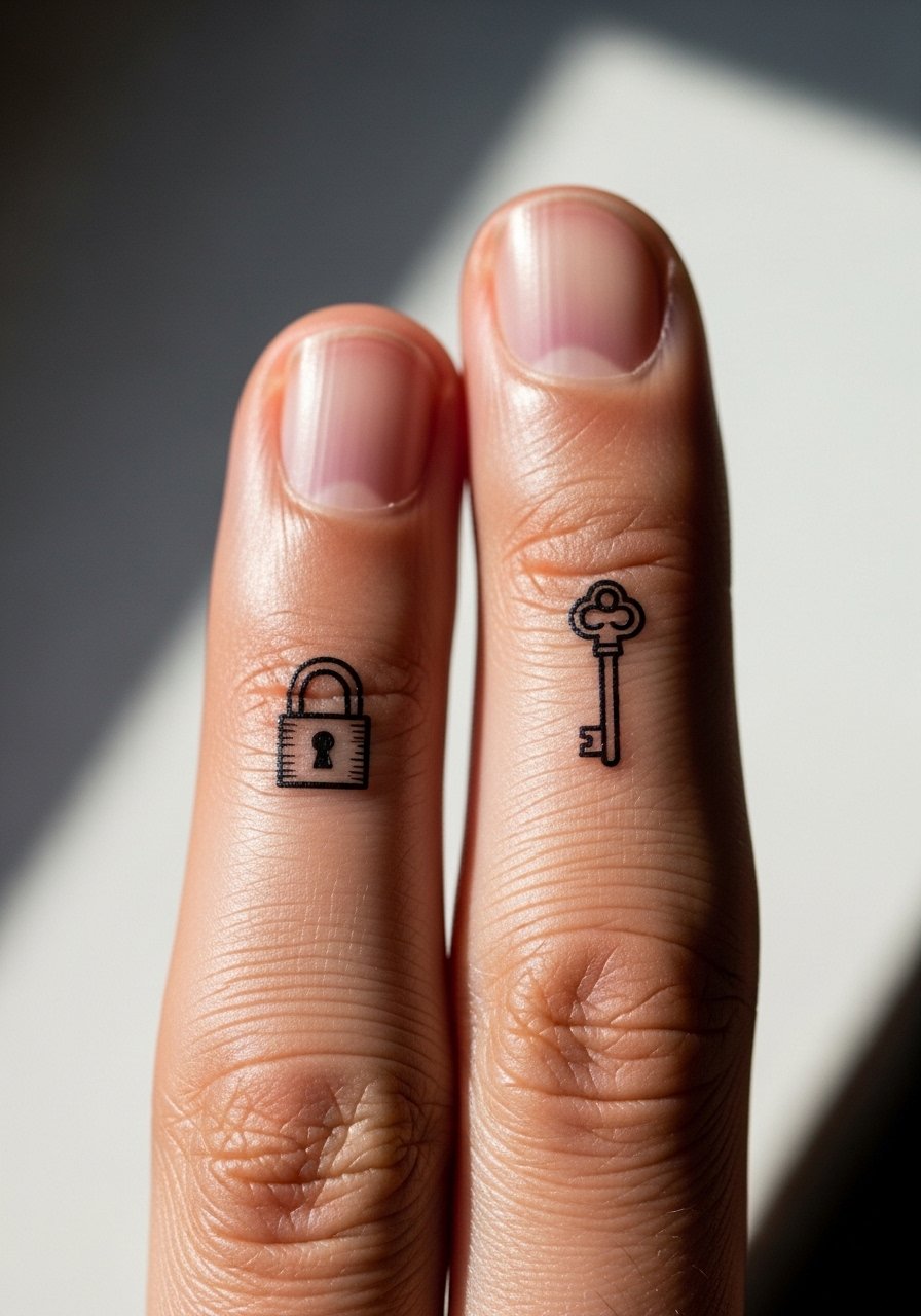
Split designs that complete when fingers meet are playful and highly visual. I recommend this for couples or symbolic pairs, but confirm alignment in the transfer stage. A common mistake is misaligning the lock and key shapes so they do not match when fingers close. Because two separate areas are involved, plan for two small touch-ups rather than one. For styling, coordinate with interlaced midi ring sets that do not obstruct the designs.
21. Tiny Minimalist Barcode or Abstract Line Symbol on Outer Finger
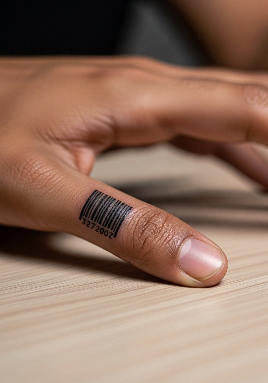
A mini barcode or abstract glyph has a modern, graphic feel that reads like a stamp. Use this when you want an element that reads technical rather than ornamental. For consults, insist on clear negative spacing and ask the artist to test the smallest readable bar width for your skin type. A real mistake is pushing the bars too thin, which causes merging into a gray block. For session wear, make sure rings are removed and the artist can position your hand flat. Expect a touch-up at year one if you want the barcode to remain crisp.
Frequently Asked Questions
Q: Do finger tattoos fade faster than forearm tattoos, and why?
A: Yes, I have noticed finger tattoos generally soften faster. Fingers see constant washing, rubbing, and UV exposure, and the skin there is thinner and moves more. That combination makes tiny linework blur sooner than forearm work. Planning for at least one touch-up within one to three years is realistic.
Q: Will micro-realism roses or packed shading hold up on fingers?
A: Micro-realism can look great initially but packed shading in a tiny area often loses detail as the ink spreads. Ask for stipple shading or simplified petal shapes during consultation so the piece keeps definition longer. If you want more texture, consider placing the micro-realism slightly higher toward the hand where skin is steadier.
Q: How should I dress to the appointment for a finger or thumb piece?
A: Wear clothing that gives the artist access to your arm and wrist without discomfort. A short-sleeve button-down or tank top that lets the artist position your hand easily works well. Comfortwise, bring layers since studios can be cool.
Q: Are there professional risks to hand or finger tattoos I should consider?
A: Hand and finger tattoos remain visible in many interactions, and some workplaces still frown on exposed ink. If career flexibility matters, think about placement on less visible fingers, or small symbols that can be covered with a ring or band during formal situations.
Q: How do I choose between a single-needle fine line and a slightly bolder outline for a finger design?
A: It depends on your priorities. Single-needle fine line looks delicate at first but can blur sooner. Slightly bolder outlines ask for less maintenance and keep shapes readable longer. Discuss your skin type and desired longevity with the artist and pick line weight based on their recommendation. Trust your artist where they show past healed photos of similar finger work.