
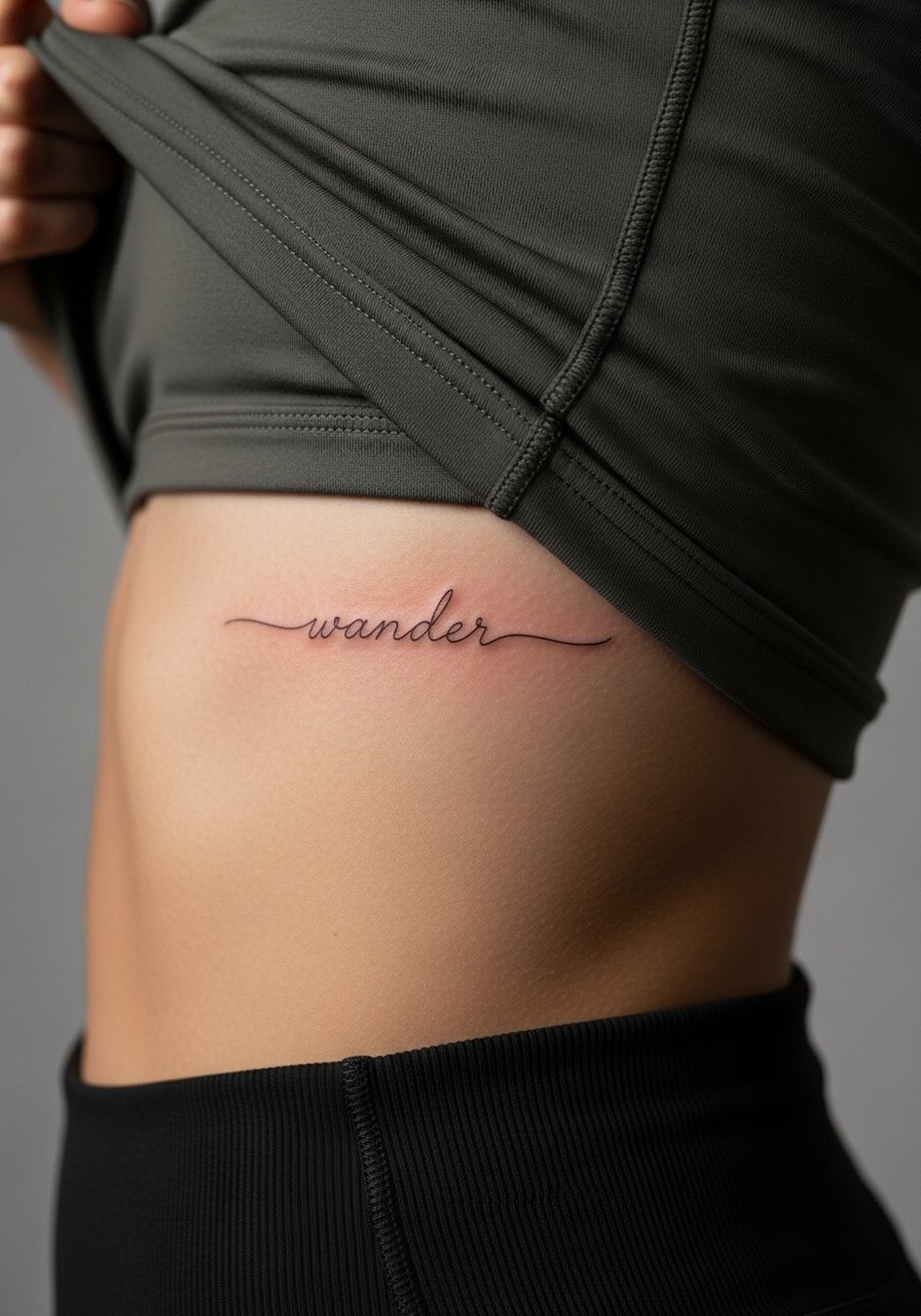
Fine line script is everywhere online right now, and the reality is that what trends on day one often needs a touch-up by year two unless placement and line weight are planned with care. I like to think of these tiny scripts as letterform plans, not fashion snaps. Below are 17 small script ideas with notes on longevity, what to ask your artist, and how to wear the piece before and after the session.
1. Tiny Script Quote on Inner Wrist
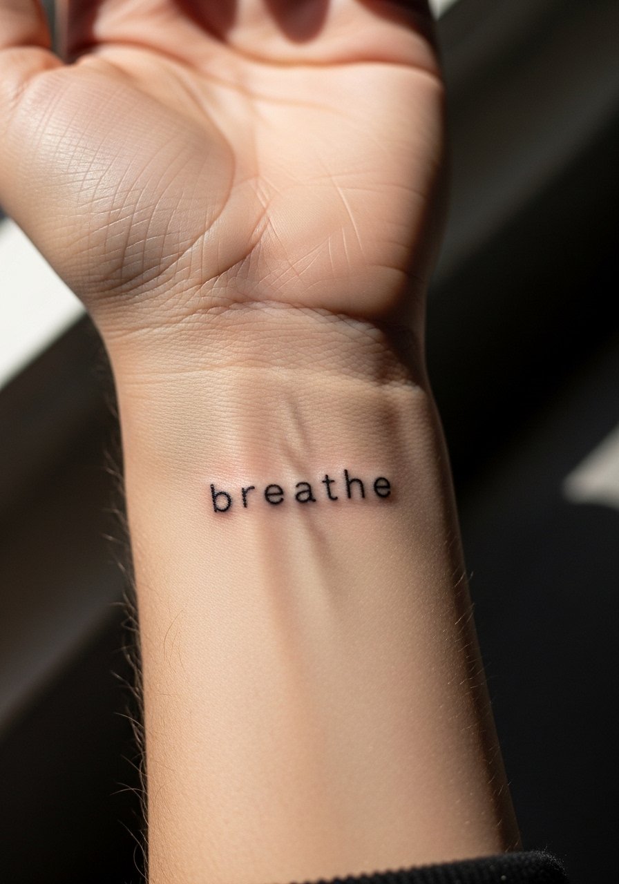
A one- to two-word quote on the inner wrist reads every time you check your phone. I recommend 1.5 to 2 inch total length so the letters do not merge as the skin ages. Tell your artist you want consistent thin linework with slightly increased line weight in places that naturally fade, like the baseline of letters. Common mistakes are choosing an overly ornate cursive that looks great fresh and blurs after healing. Expect a quick session under 30 minutes and mild discomfort. For the appointment wear a rolled cuff blouse so the artist can access the inner wrist easily and you can show it off later.
2. Delicate Script Floral with Lettering on Ankle
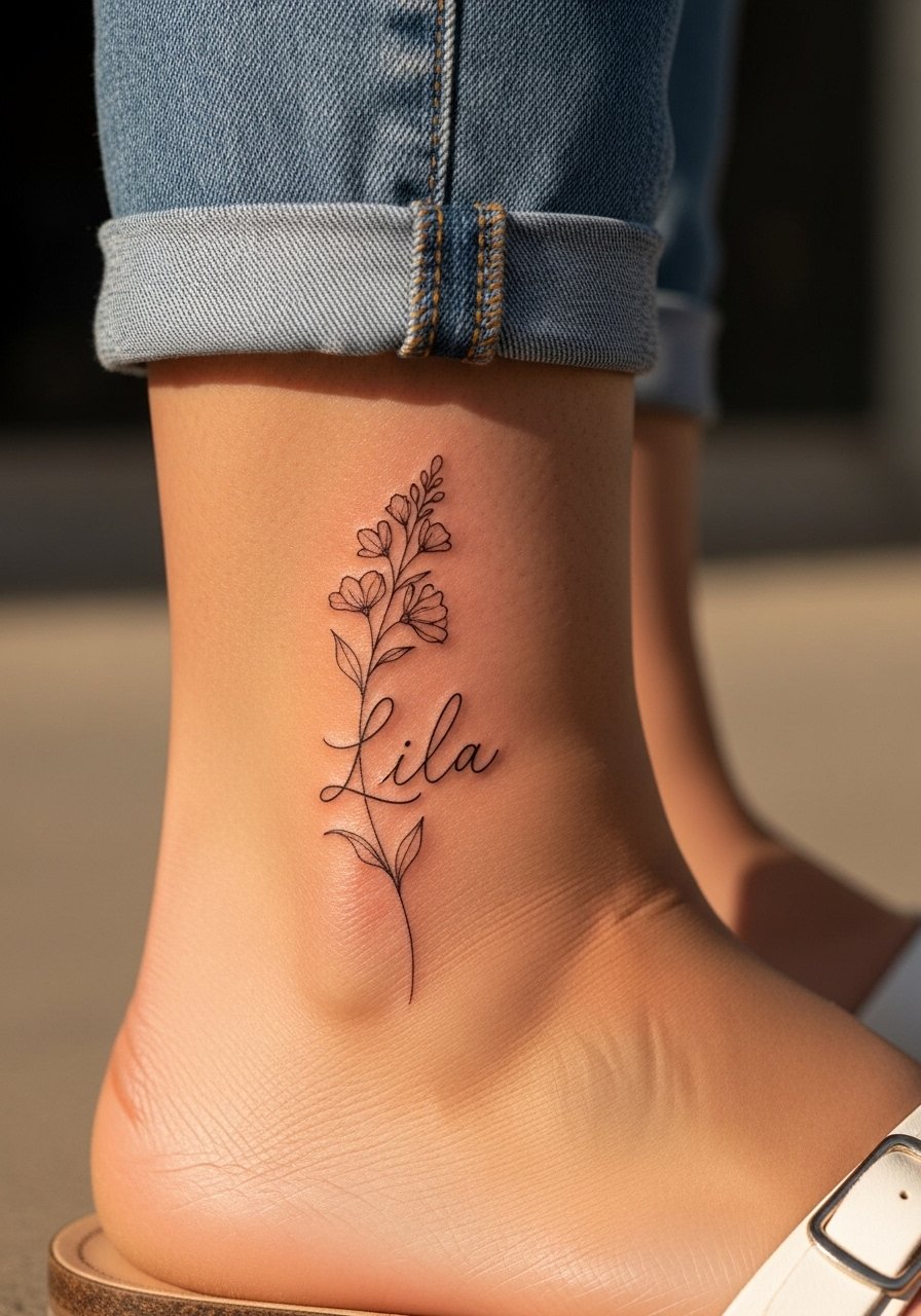
A small name tucked into a floral stem on the ankle turns a simple script into a story. Keep the script around 1.5 inches and use black ink only for clearer aging. The ankle sees a lot of friction from socks and shoes, so ask the artist to space letters slightly wider than you think you need. Sessions take around 30 to 45 minutes and the pain is low to moderate. When showing it off, strappy sandals and cropped pants are ideal. Try pairing the piece with strappy flat sandals so the tattoo has room to breathe in summer outfits.
3. Micro Initials on the Upper Collarbone
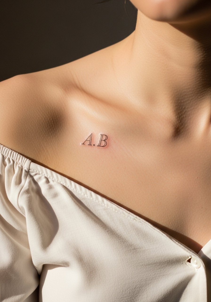
Initials under the collarbone sit elegantly and hide easily under shirts. Go under one inch in height to preserve the micro feel. The main consultation note is to specify letter spacing and ask for a serif or simple block style rather than ornate cursive that crowds at small sizes. Pain is low on the collarbone but the area can feel sensitive for thin skin. For session day, a off shoulder blouse or a button-front shirt will let the artist access the area without you being cold.
4. Constellation Name Along the Inner Forearm
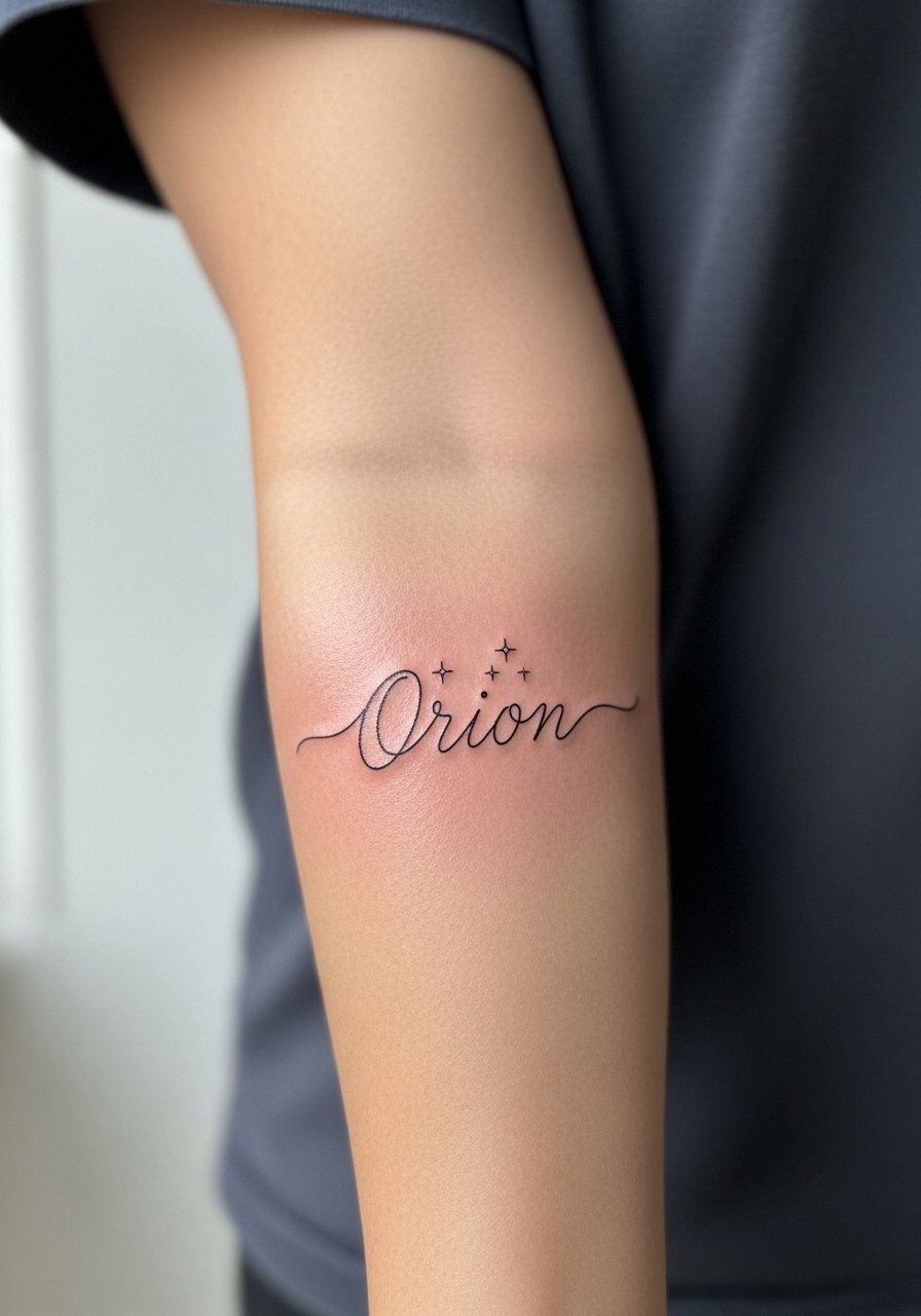
A name with tiny celestial accents plays well on the inner forearm where there is space for 2 to 3 inches of lettering. Request slightly heavier downstrokes in the script so the word keeps contrast after a couple of years. A common mistake is forcing ultra-thin hairlines into a long word, which can turn into soft gray smudges over time. Sessions often run 45 to 75 minutes depending on the stars and spacing. For a casual reveal style with rolled sleeves, consider a chambray button down that frames the forearm without covering it.
5. Tiny Word Behind the Ear
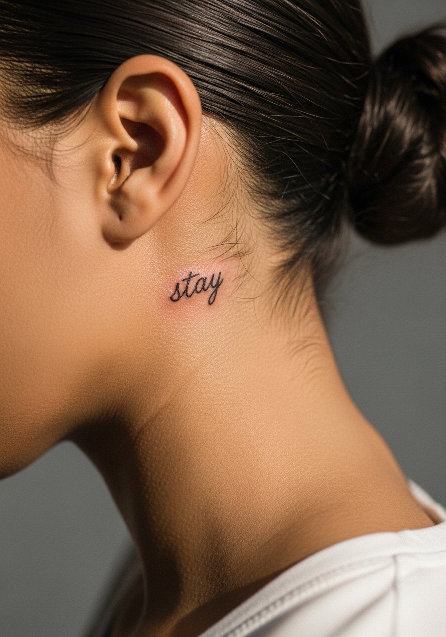
Behind-ear scripts are discreet and feel intimate when hidden under hair. Keep the lettering under one inch tall and use simple, legible type. The skin here is thin so the artist may advise slightly heavier line weight to prevent premature fading. Sessions are short and the pain is low but proximity to the skull makes the sensation unique. For showing the piece, sleek updos or half-up styles work best and a pair of minimal stud earrings keeps attention on the tattoo without competing.
6. Fine Line Arrow with a Short Quote on the Shoulder Blade
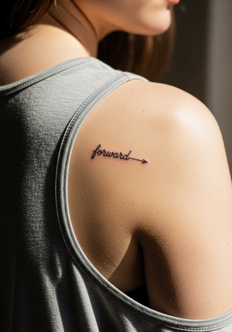
A short directional quote paired with an arrow works well on the shoulder blade because the area offers room for a 2 inch motif without distortion. The biggest mistake is shrinking the lettering too much inside the arrow. Ask for spacing that lets the arrow breathe. Pain is low on the shoulder blade and session time is usually 30 to 50 minutes. This placement ages gracefully compared with hands and fingers because it avoids constant sun and washing. For the session wear a loose tank top so the artist can shift fabric aside with minimal fuss.
Studio Day Picks
The wrist, ankle, and collarbone pieces above benefit from light prep and small items that cut friction during the first week.
- Stencil transfer paper kit. Lets you preview the exact line placement on the skin, which is useful for tiny scripts on the wrist and collarbone.
- Topical numbing cream. Applied before the session it softens sensitivity around the ankle and inner wrist without changing the linework when used as directed.
- Thin protective film roll. Keeps delicate wrist and finger scripts cleaner during the first days of healing when friction is highest.
- Fragrance free gentle body wash. Use this on ankle and forearm showers to avoid irritating newly inked thin lines.
- Aquaphor healing ointment. A thin layer for the first few days helps lock in moisture for fine line pieces while allowing the needle channels to breathe.
7. Fine Line Animal Name Outline on Inner Wrist
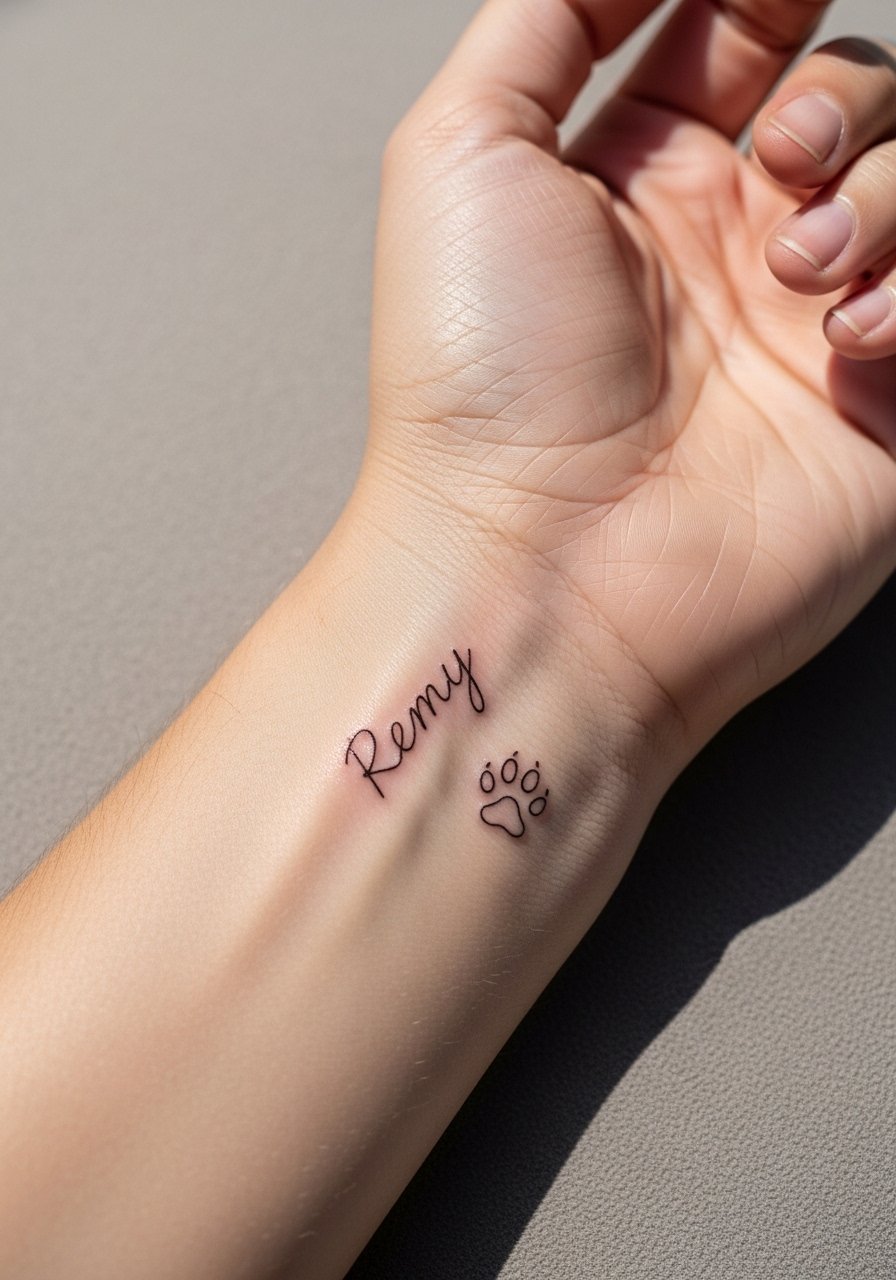
Pet tribute scripts work beautifully on the inner wrist where they peek out during gestures. Keep the name to roughly 1.5 inches and request a small icon rather than heavy shading so the piece ages as script rather than illustration. People often pick a cursive that is too tight at small sizes. Ask for slightly open counterspaces so the letters survive touch-ups. Session time is brief and pain is mild. For showing it off, a thin silver chain on the opposite wrist balances the look. I like pairing this with a thin silver chain bracelet.
8. Micro Moon Phase with Date on Outer Forearm
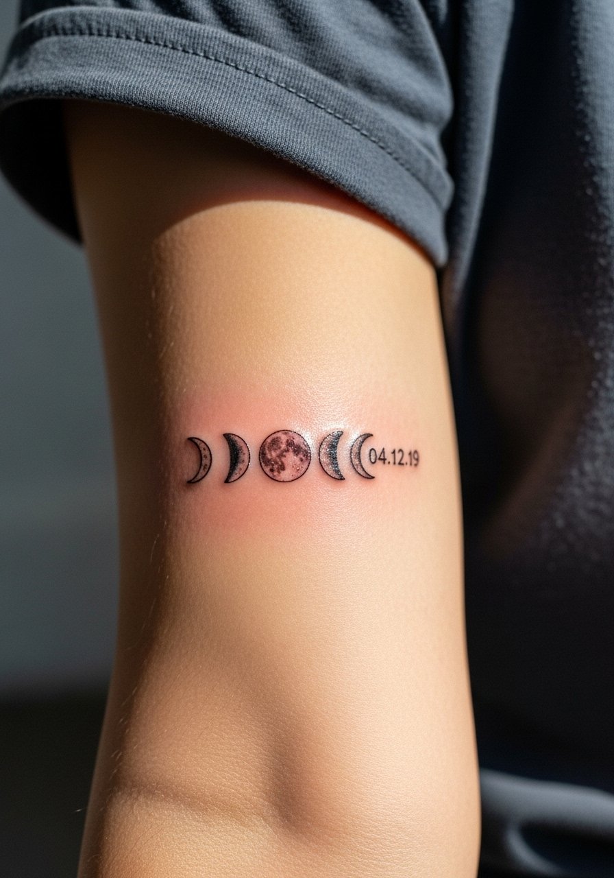
A set of moon phases next to a small date reads like a miniature timeline on the outer forearm. Keep the total block under 2 by 2 inches to preserve legibility. The main consultation note is to confirm text size for the date so numbers do not pool into a gray line as they age. Expect one session of 45 to 75 minutes. Forearm skin holds fine line well if you avoid the very thin hairlines. Roll your sleeves to show this one and consider a rolled sleeve shirt that frames the band.
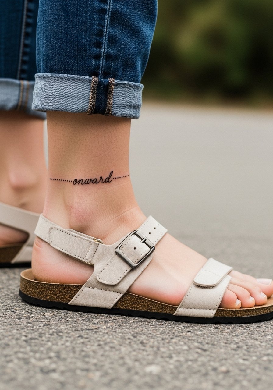
9. Small Geometric Script Symbol at the Ankle
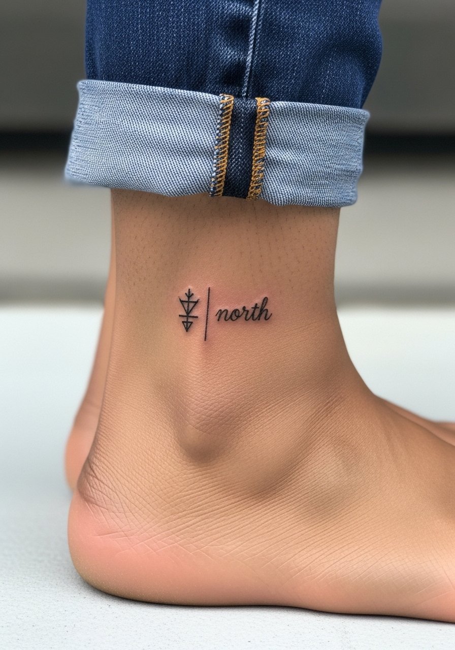
Combining small script with a geometric glyph gives a masculine edge to ankle pieces without bulk. Keep the word short and the glyph simple so neither element overwhelms the other. A common error is cramming detailed geometry next to thin letters. Ask for space between the symbol and text during consultation. Sessions are relatively quick but expect a bit more sensitivity near bone. Strappy shoes or cropped pants let the tattoo breathe for summer. Try showing it off with cropped linen pants.
10. Tiny Heart and Name on Upper Collarbone
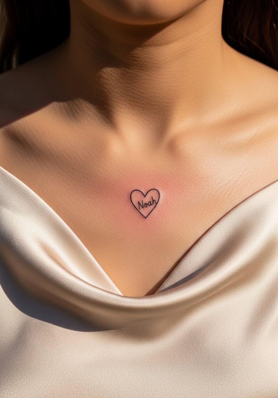
Romantic scripts on the collarbone feel classic because the area is low movement and low sun exposure. Keep the piece under 1.5 inches and go for simple letters. The biggest mistake is overlapping the heart with the name at such a small scale that the letters bleed into the icon after healing. Pain is low and session time is short. For evenings out pair the tattoo with a silk slip top or an off-shoulder blouse so the piece sits just above the neckline.
11. Nature Word Arcing on the Upper Shoulder
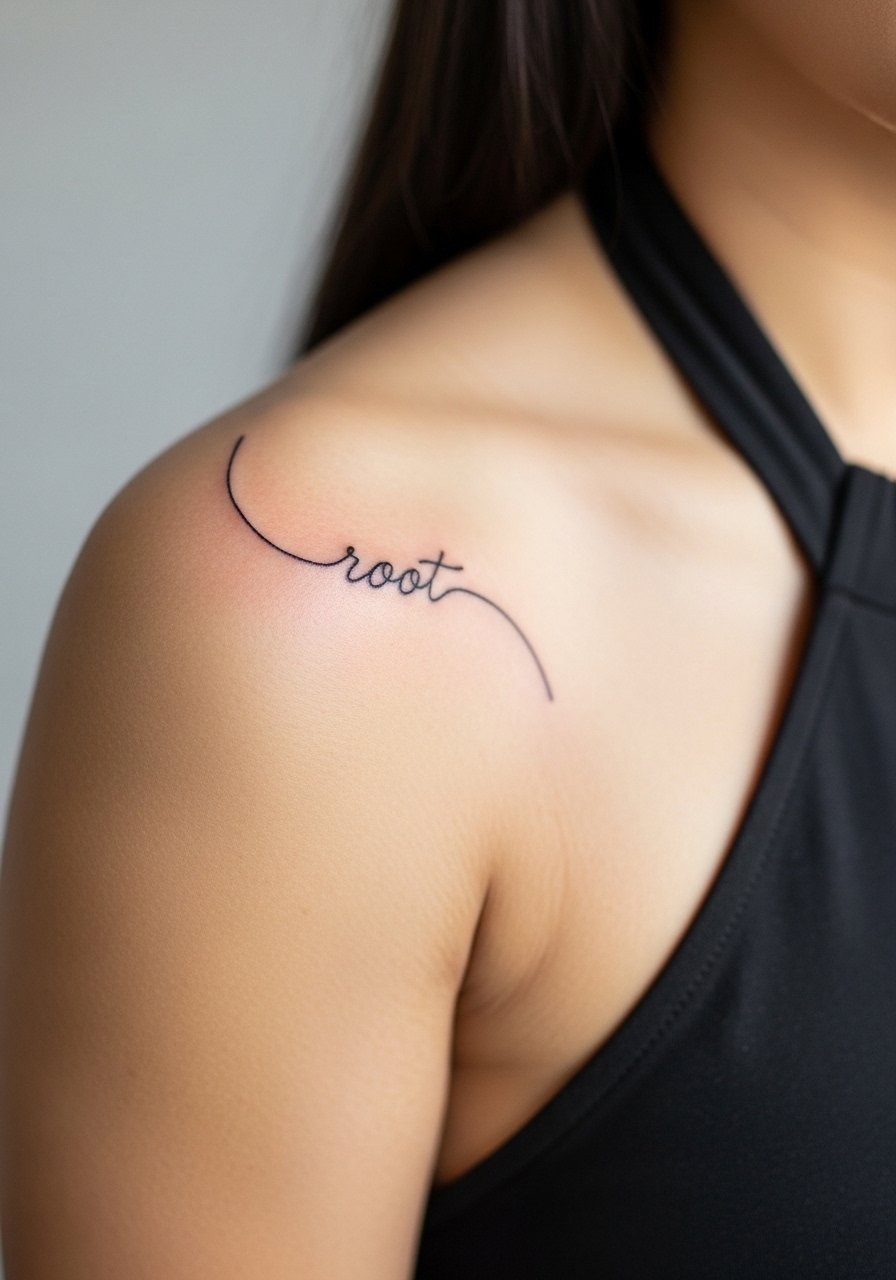
A single word tied to nature on the upper shoulder follows the muscle curve and looks intentional as movement changes. Use a 2 inch arc and request slight boldening at anchor points so the script maintains presence over time. A frequent error is putting the arc too tight which shortens letterforms. Expect low to moderate pain and a session around 30 minutes. This placement pairs well with sleeveless sundresses and halters, so bring a sleeveless linen dress for showing the piece off.
12. Micro Coordinates on Inner Wrist
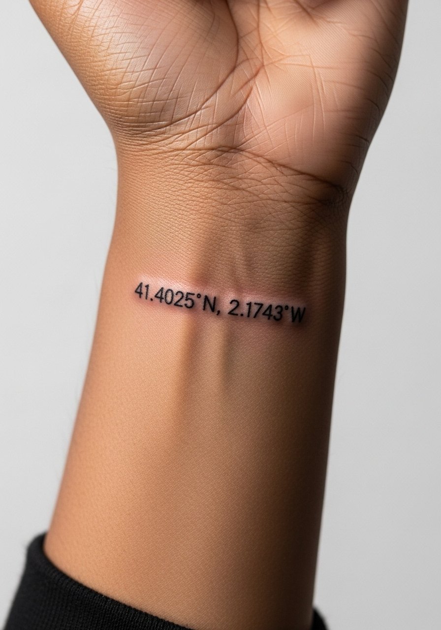
Coordinates on the inner wrist are precise and quiet. Keep the line length to about 1 to 2 inches and use a mono or small serif font so numbers stay readable after a couple of years. The usual mistake is compressing the numbers to fit a shorter space which makes them mushy. This one heals quickly and is one of the least painful wrist placements. For session comfort wear a loose short sleeve tee and show off later with a thin chain pendant necklace that sits above the script.
13. Minimal Script Tag Along the Side Ribcage
Ribcage scripts split artists into two camps. One group says thin linework on ribs blurs within a couple of years because of skin stretch and movement. The other group says with correct needle depth and spacing it settles fine. My advice is to ask the artist how they space letters on curving ribs and whether they recommend slightly thicker strokes for durability. Pain here is higher than on the arm and sessions are usually longer. Wear a cropped top you can lift, and expect to discuss a touch-up plan during booking.
14. Micro Script on the Inner Bicep
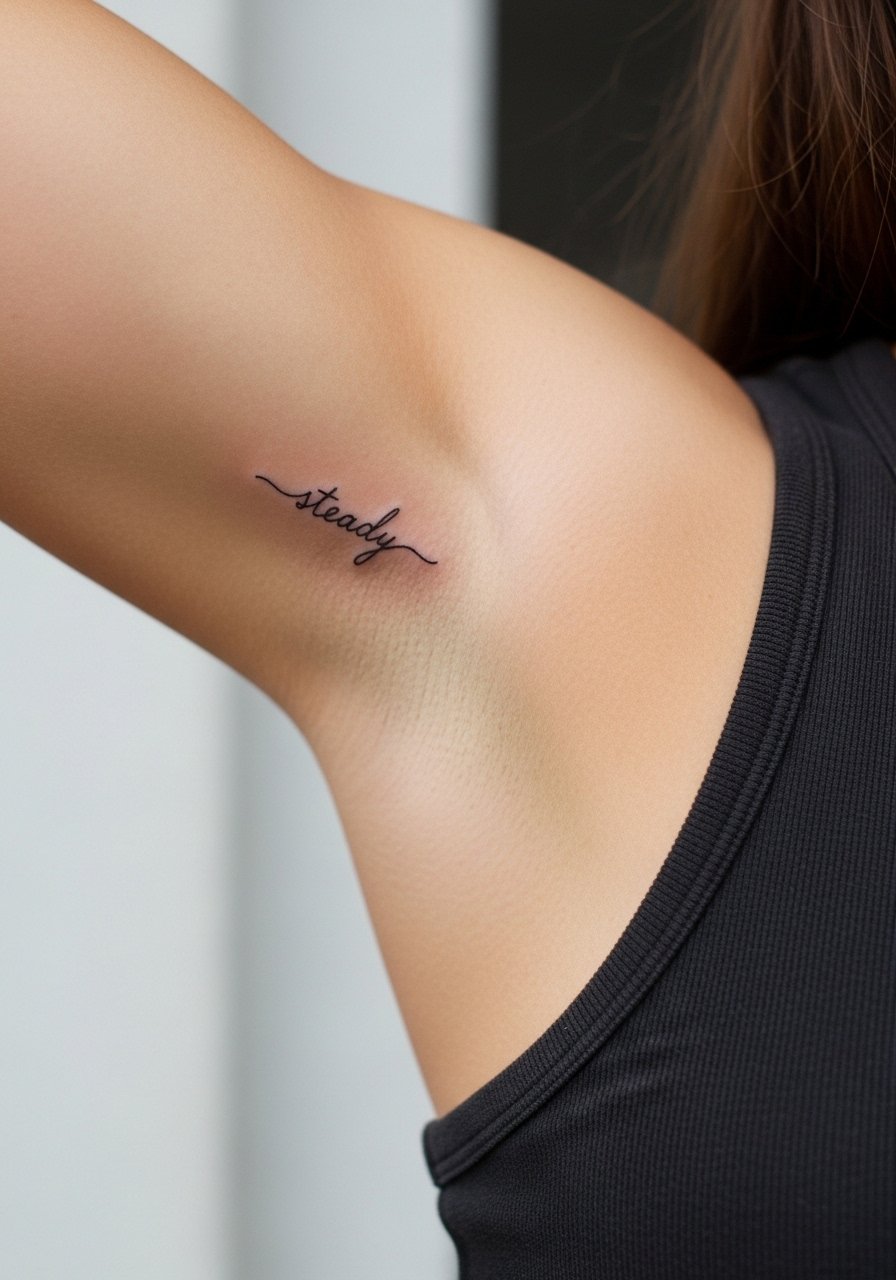
Inner bicep scripts sit on a softer surface that tends to keep lines crisp if the artist adjusts for stretch. Size the word around 1.5 inches and ask for a little extra thickness on verticals so letters do not soften against the skin. A mistake is choosing extremely airy lettering which disappears under healed shadow. This area rates moderate on the pain scale and sessions are brief. For the appointment wear a loose tank top with enough room to raise the arm without tugging the fabric.
15. Script Wrapped Around the Ankle with Tiny Dots
A wraparound ankle script reads differently with each step, and dot accents give breathing room to the letters. Keep the total wrap under 2 inches in height and ask your artist to map the spacing standing and seated. The ankle can be sensitive near bone and friction from shoes can affect healing. A common mistake is too tight a wrap which crowds the type. For summer reveals choose neutral ankle strap sandals that avoid rubbing the fresh ink.
16. Tiny Script Behind the Neck on the Side
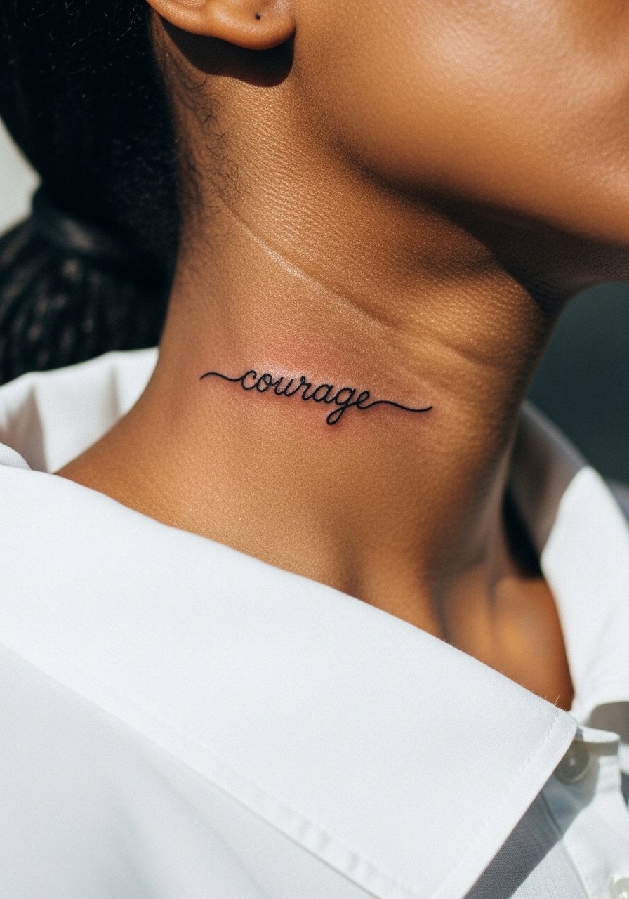
A side neck script sits where the hairline and collars meet. Given the visibility, many people ask about career impact and cover options. Keep the word under two inches and choose a clean, legible font. The skin here holds thin lines reasonably well but swelling can make initial lines look thicker. Pain is moderate to high depending on proximity to bone. For the session plan a wide-neck shirt you can tug aside. Ask your artist about touch-up expectations for neck placement before you book.
17. Tiny Script Along the Collar of an Upper Chest Sternum Edge
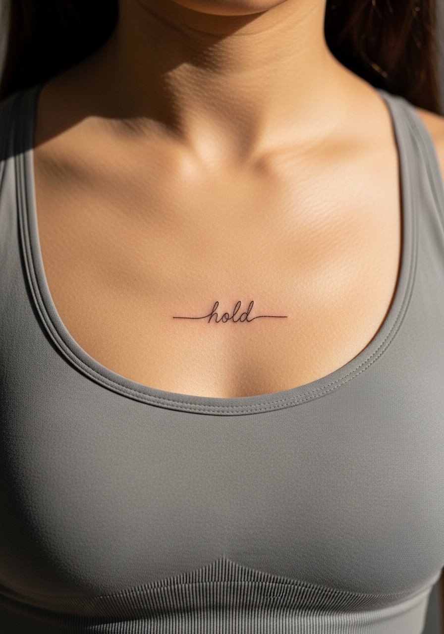
Sternum and upper chest scripts need careful framing because they sit near a high-movement zone. Use a short word under one inch of height and ask the artist to position it just above the fabric line so it reads with clothing. One common error is centering a long word across the sternum which stretches as you move. Pain is higher on the sternum and sessions may be broken into short passes. Wear a fitted sports bra or bandeau for easy access and to protect modesty during the session.
Frequently Asked Questions
Q: Will tiny fine line script tattoos on the wrist need touch-ups more often than on the collarbone?
A: Yes, wrist scripts usually need touch-ups sooner because the area sees constant washing and sun exposure which lightens thin lines. Collarbone skin moves less and avoids daily friction, so those scripts typically hold edge longer. Plan for a possible touch-up around year two for wrist pieces and talk with your artist about slightly stronger line weight if you want fewer revisions.
Q: Are fine line scripts safe for darker skin tones, and what should I ask the artist?
A: Fine line can work on darker skin tones but some lines may appear softer after healing. Ask to see healed photos on similar skin and request test placements if the artist offers them. A small tweak in line weight or spacing during the consultation often makes the difference for long term clarity.
Q: How should I dress on session day for a behind-ear or collarbone script appointment?
A: For behind-ear consider tying your hair up and wearing a shirt with a loose neckline. For collarbone wear an off shoulder blouse or a button-front top so you can reveal the area without getting cold. Comfortable layers help during longer sessions.
Q: Do tiny script tattoos blur into a solid shape over time if they are too small?
A: They can. The most common cause is picking a typeface that is too intricate at micro size. Ask your artist to scale the letters so counters and gaps remain visible after the first year. Slightly increasing letter spacing and avoiding ultra-fine hairlines prevents the script from softening into a gray shape.
Q: Should I get a single session for a tiny script or book extra time for touch-ups?
A: Most tiny scripts fit into a single session, but booking a brief follow-up save slot is smart for finelines. Some artists prefer to finish then check healed shots later. Ask during booking how they handle touch-ups so you are clear on timing and expectations.