
Fine line and tiny number tattoos are trending, but what holds up is not always what looks best in the studio photo. Fresh micro script can disappear inside a year on high-friction spots, while compact bold numerals can read clean for a decade if placed and spaced correctly. Below are 21 tiny number tattoo fonts with notes on longevity, what to ask your artist, and how to wear them so the design actually gets seen.
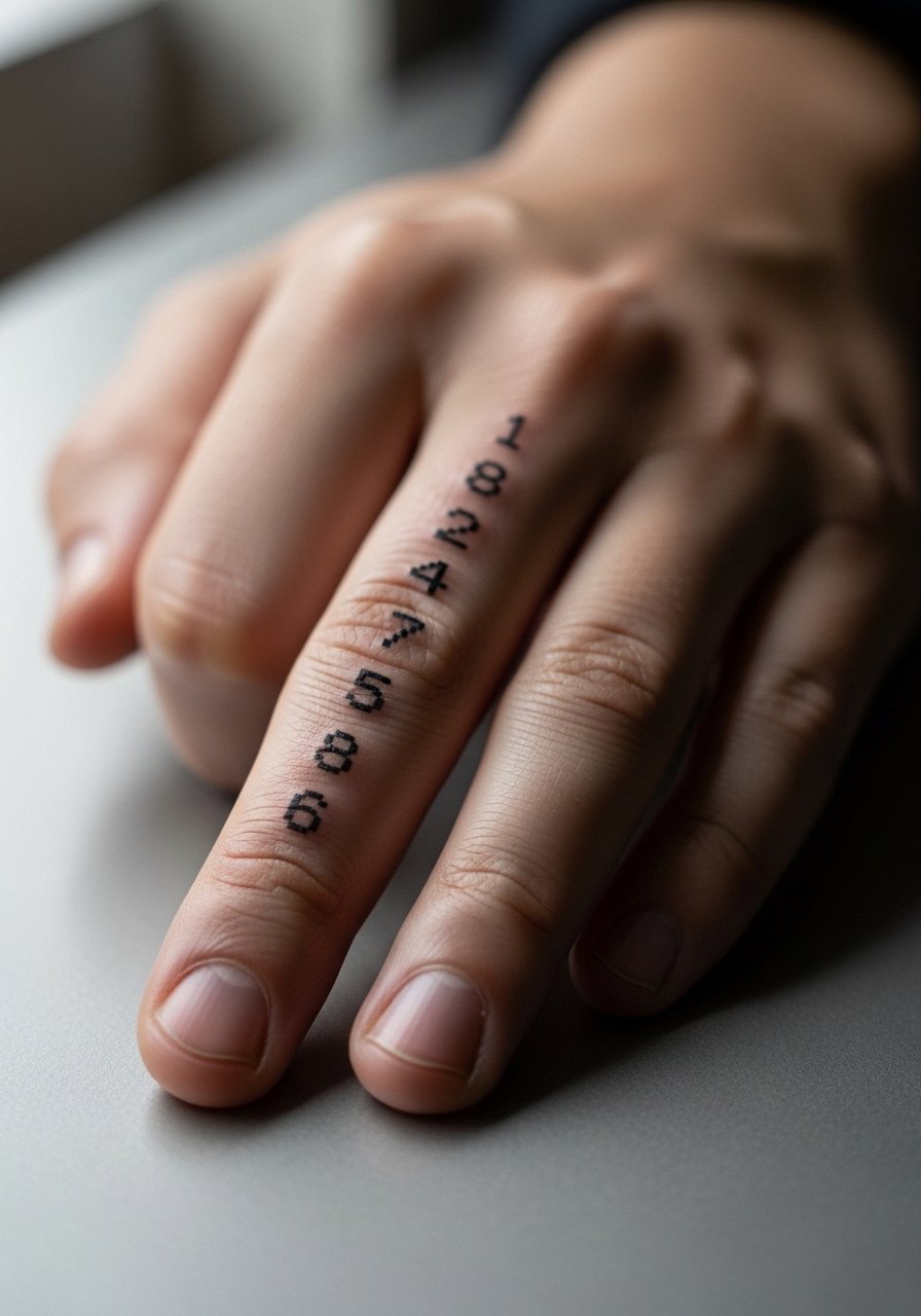
1. Alevantre Bold Sans on the Finger
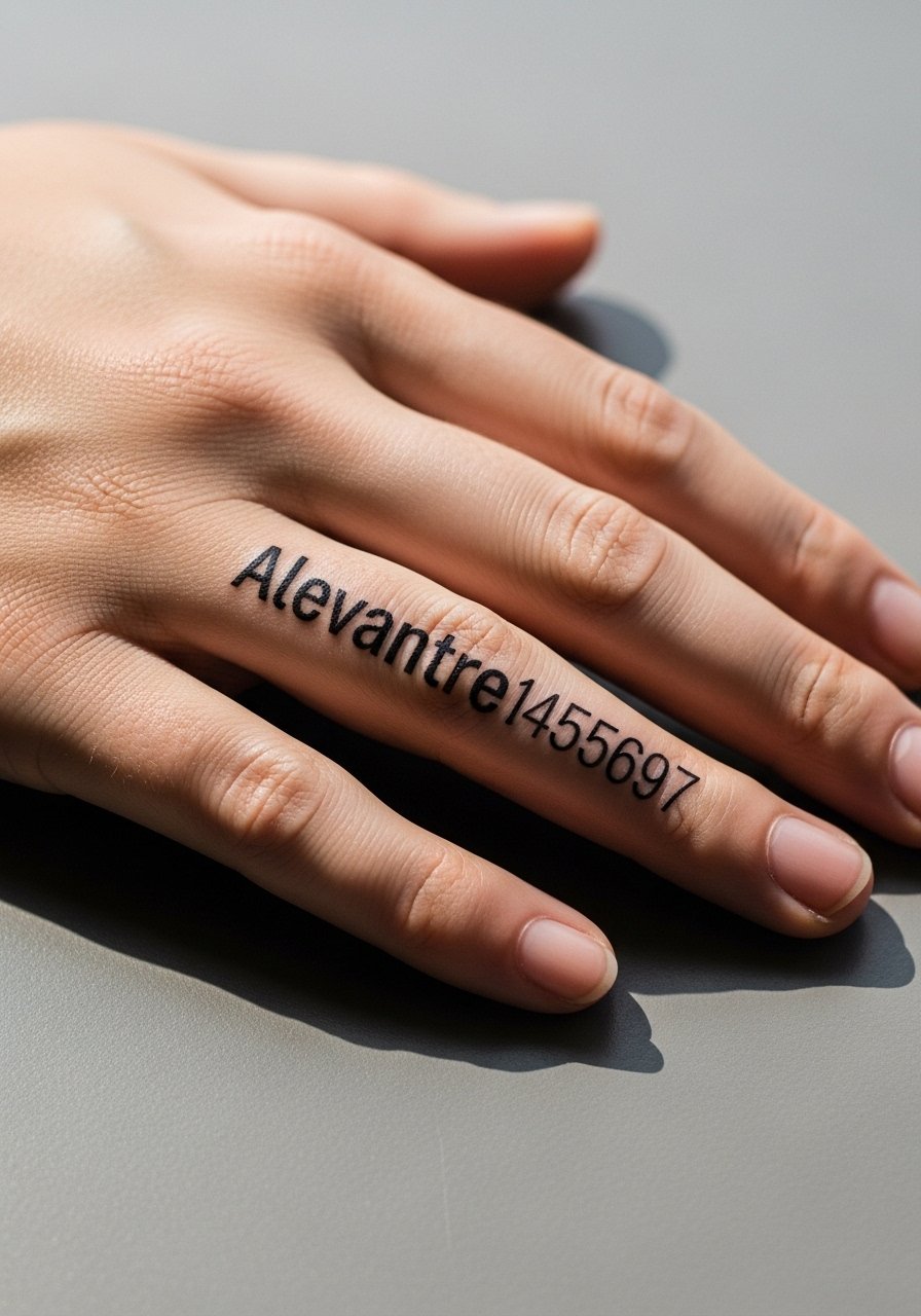
I've seen this font hold up better than thin scripts on fingers because the characters use compact but stout strokes. Expect a short session, more rubbing in the first week, and a likely touch-up around year two if you type a lot. During consultation, ask the artist to thicken the thinnest strokes slightly so the counters do not fill in as the skin moves. The common mistake is asking for a micro size that robs the numbers of spacing. For showing it off, go bare-handed or add a thin gold ring set on a non-tattooed finger, and pack soft gloves for the ride home.
2. Mordova Angular Numerals on the Inner Forearm
The inner forearm is forgiving for bold angular fonts because the skin stretches less than the fingers. Pain is moderate and most sessions finish quickly. Tell your artist you want heavier line weight in narrow strokes so the angles stay crisp after healing. A mistake people make is shrinking the digits to fit a wrist reference, which ruins the mordova geometry. For easy access at the appointment wear a loose button-down shirt you can pull aside. A rolled sleeve in a linen shirt frames this piece nicely when you want to show it off.
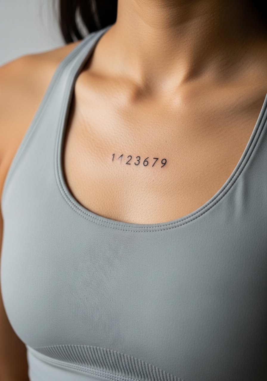
3. Stopher Graphic Numbers on the Collarbone
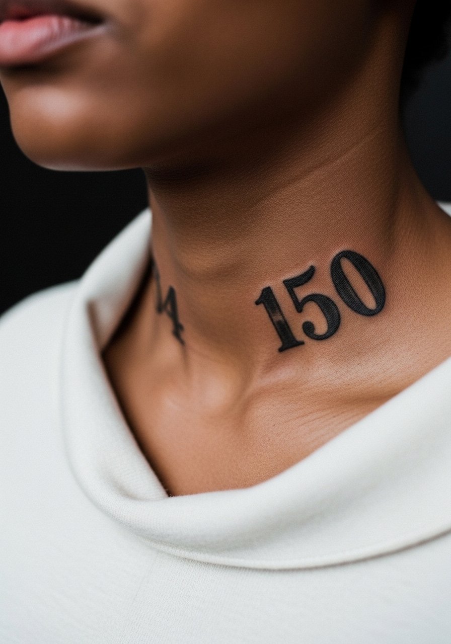
Collarbone tattoos read differently when they are micro. Stopher’s customizable weight helps here because you can keep the shape without crowding the bone. Fair warning, collarbones can be painful because of the shallow skin. Ask for a slightly larger cap height and to avoid tiny serifs that will merge. One common aging problem is placing too close to the bone where motion causes early softening. Pair this with an off shoulder blouse for evenings out so the numbers sit clean against the neckline.
4. Rebel Nation Sans Italic on the Side of the Neck
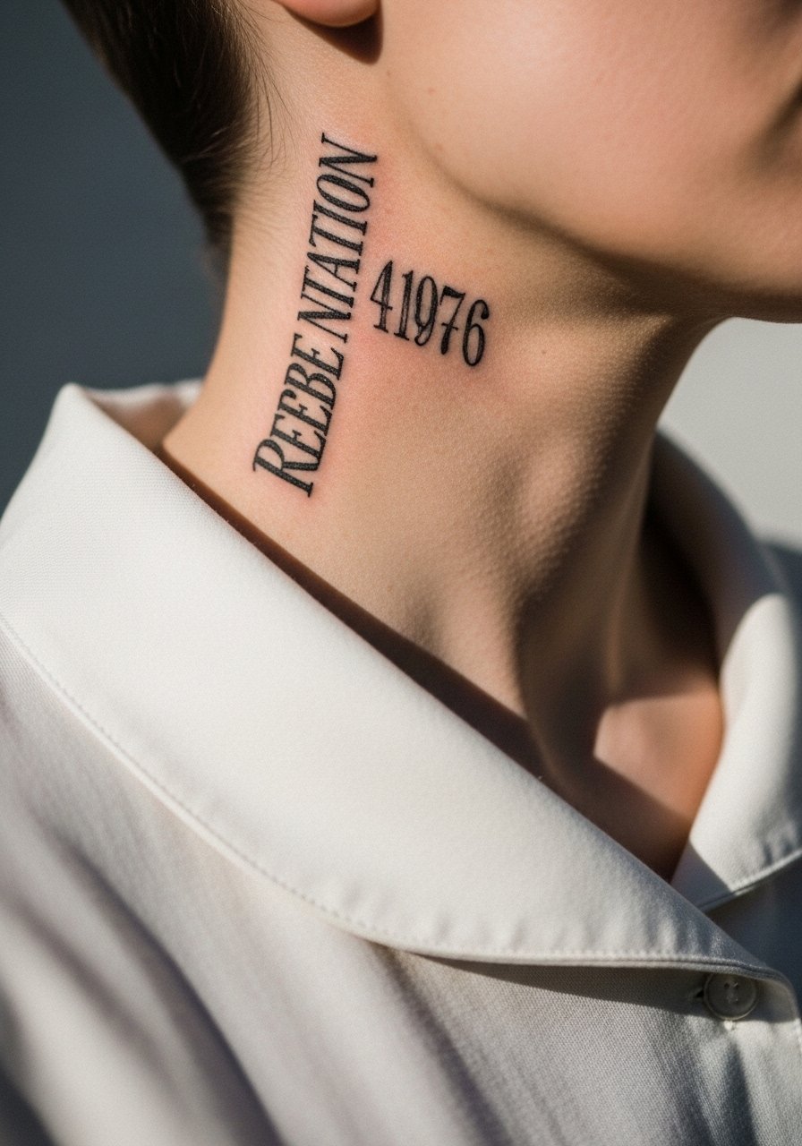
Neck placements split artists into camps about longevity. One camp says the neck moves and blurs fine detail quickly. The other camp argues that with measured depth and spacing italics can settle well. Ask your artist which camp they follow and to show healed examples. The session feels brisk and sensitive. A real mistake is asking for ultra-fine italics that look delicate fresh but soften noticeably by two years. For a subtle reveal, layer a long pendant necklace that sits above the numerals without covering them.
5. Black Angela Edgy Compact on the Shoulder Blade
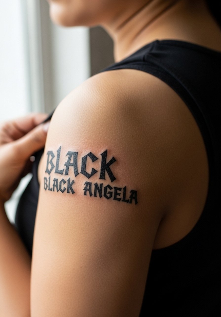
The shoulder blade tolerates aggressive geometry because of thicker skin and less surface friction. Sessions can be one-off and the pain is usually mild. Tell the artist you want the angles to keep a little breathing room between strokes. A common mistake is cramming ornate details into a tiny block, which leads to early blur. For the studio wear go with a loose button-down shirt you can pull aside. At show time a sleeveless top keeps attention on the numerals.
6. Traveling Typewriter Micro Date on the Wrist
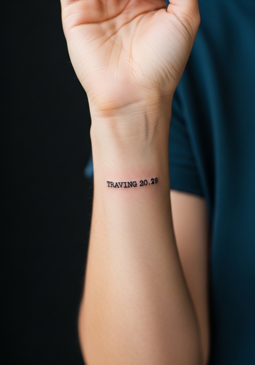
Typewriter numbers age well on wrists because the irregular edges read as character rather than noise as the ink softens. The wrist is a high-motion zone so expect a minor touch-up window at year two. During consultation ask for slightly increased letterspacing so the monospaced look remains legible after settling. A common error is requesting a distressed typewriter texture scaled down too far. For showing it off, stack a thin chain bracelet stack on the opposite wrist and wear a minimalist silver watch to balance the look.
Studio Day Picks
The wrist and finger pieces above heal differently from larger work, so a few small items smooth out the session and the first week.
-
Stencil transfer paper kit. Lets you preview the linework on skin before committing, which helps on finger and wrist number placements that need exact spacing.
-
Topical numbing cream. Applied about 45 minutes before takes the edge off sensitive neck and wrist spots without changing how the ink settles.
-
Thin protective film roll. Keeps finger and ankle tattoos clean during the first week when friction from shoes and daily washing is highest.
-
Fragrance-free body wash. Gentle cleansing during showers avoids irritating tiny linework on wrists and forearms.
-
Aquaphor healing ointment. A thin layer in the first days locks in moisture for fine line work without clogging delicate channels.
7. Underwood Champion Classic on the Outer Calf
Calf pieces show detail for years because the skin there is resilient and movement is less constant. Pain is low and sessions wrap quickly. For this font ask for consistent saturation across all digits so the visual weight matches from afar. Many people make the mistake of shrinking the numerals to fit a different placement reference, so bring a calf-sized mock. Styling pairs well with cropped ankle pants or strappy sandals when you want the number visible. During the session wear loose bottoms you can roll up without pressure on the area.
8. Mirage Gothic Mini on the Collarbone
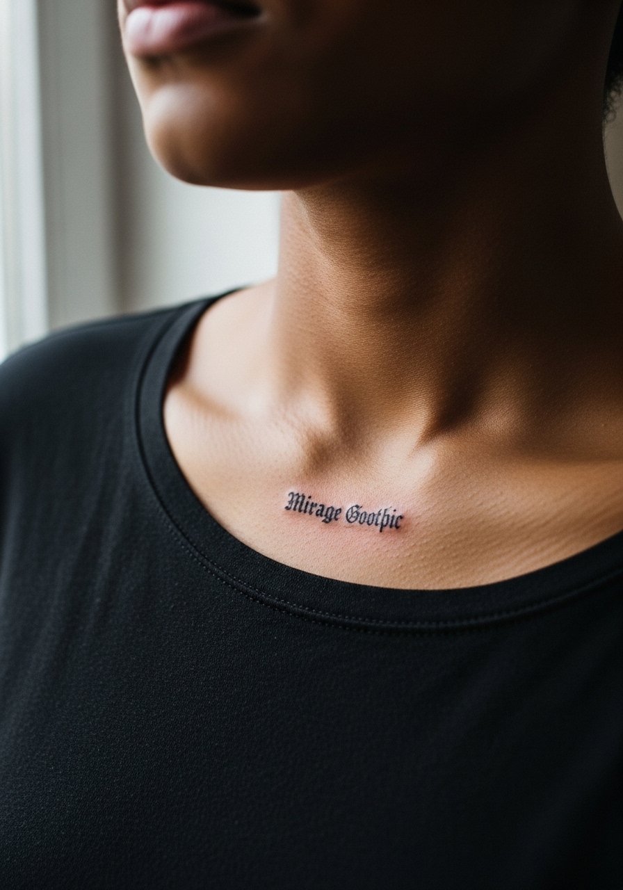
Gothic details compress quickly if placed too small. The collarbone accepts moderate detail, but keep flourishes minimal. Expect a sensitive session and ask the artist to test one numeral at a slightly larger scale to see how negative space breathes. A common fail is insisting on full gothic ornament on micro digits. This design carries weight best when the strokes are simplified. Pair with an off shoulder blouse for nights out, and ask for a casual touch-up plan if you want the ornamentation to stay crisp.
9. PF Ronda Seven Pixel Retro on the Pinky
Pixel fonts are playful and work surprisingly well at micro sizes because the blocky forms survive minor blur. Fingers are a high-wear zone though, so expect touch-ups earlier than for arm pieces. Tell your artist you want squared edges rather than rounded pixels so the iconography reads like a tiny digital display after healing. A frequent mistake is asking for pixel spacing that is too tight, which then merges. For a low-key pairing, wear a minimalist finger rings set and keep nail polish neutral.
10. Wes Minimalist Script on the Side of a Thumb
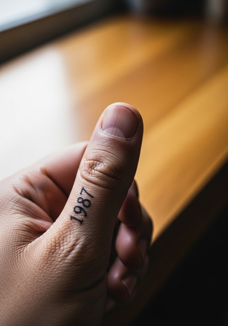
Thumbs bear constant friction from pockets and zippers so script-like numerals need thicker strokes than they would on the wrist. Pain is moderate and sessions are quick. Ask your artist to reinforce stroke terminals and avoid exaggerated flourishes. The most common mistake is requesting ultra-delicate terminals that disappear within months. For the appointment, take off rings and wear a loose short sleeve shirt so hands are fully accessible.
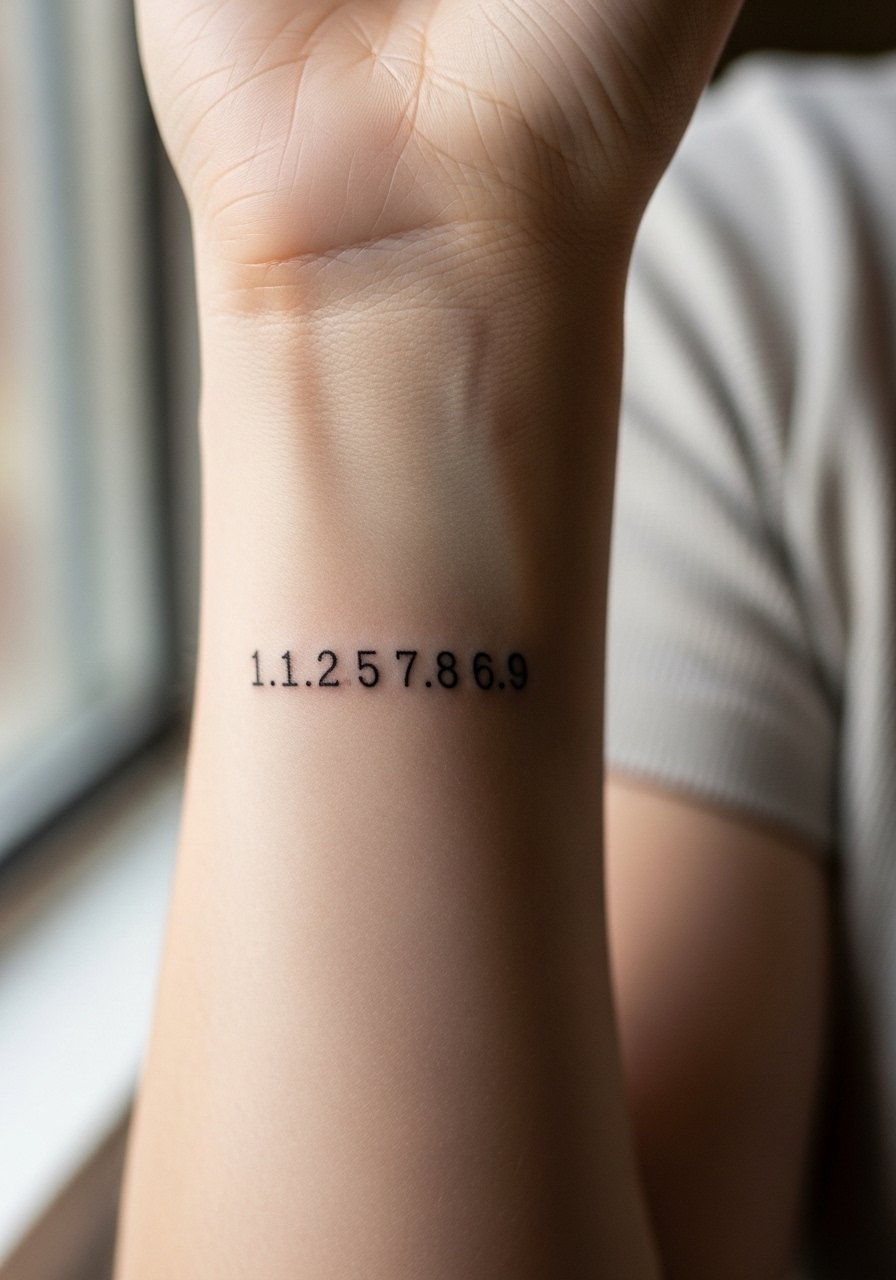
11. Scriptina Single-Needle Cursive on the Inner Wrist
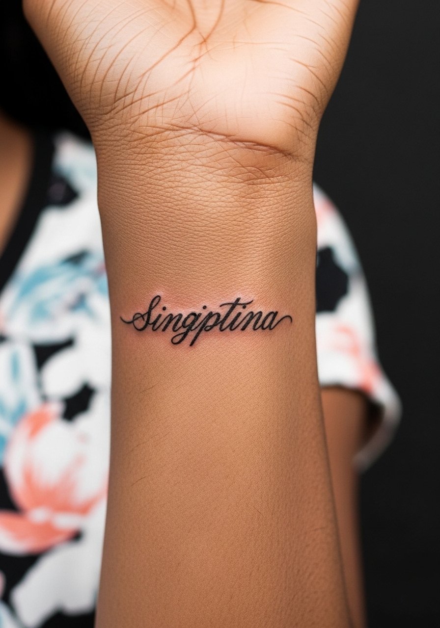
Fine single-needle cursive looks intimate and handwritten, but the inner wrist is a place where motion and washing accelerate blur. Expect a light sting and a small touch-up window at around two years. Ask the artist to slightly widen the thinnest strokes and to place the digits where skin creasing is minimal. A common mistake is using decorative loops that collapse when the wrist is flexed. For showing it off consider a thin chain bracelet stack on the opposite wrist to balance the composition.
12. Neo Serif Tiny on the Upper Ribcage
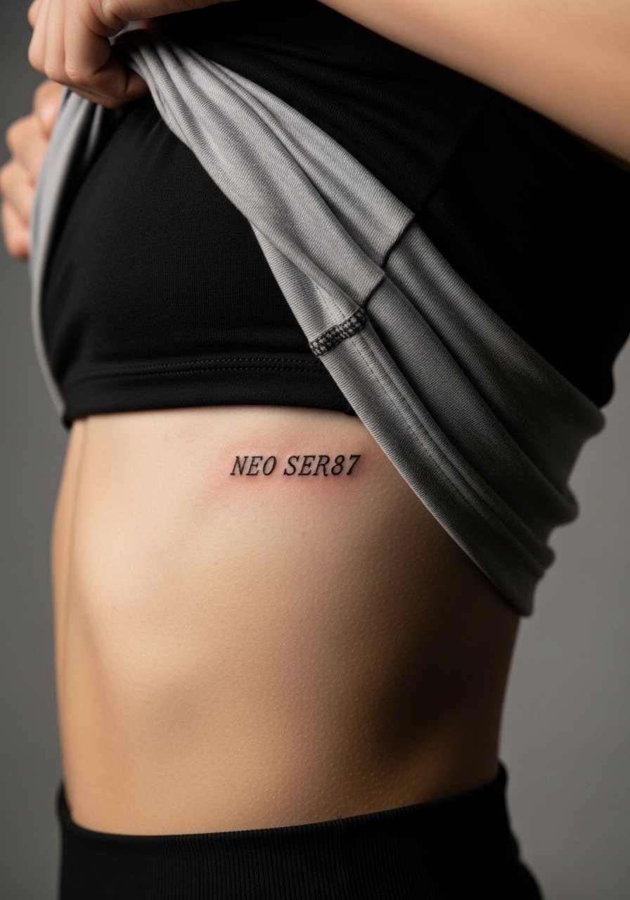
Ribcage pieces split opinion in the community about fine detail. One camp warns that skin curvature and breathing blur thin work after a short time. The opposing camp says measured depth and spacing can make fine serif numerals last. Name both when you consult so you know where your artist stands. The session is breathable but painful at times. Avoid tiny serifs and ask for slightly increased spacing so the numerals do not merge as the body moves. Plan loose clothing for the trip home.
13. MonoDot Micro Monospace on the Inner Bicep
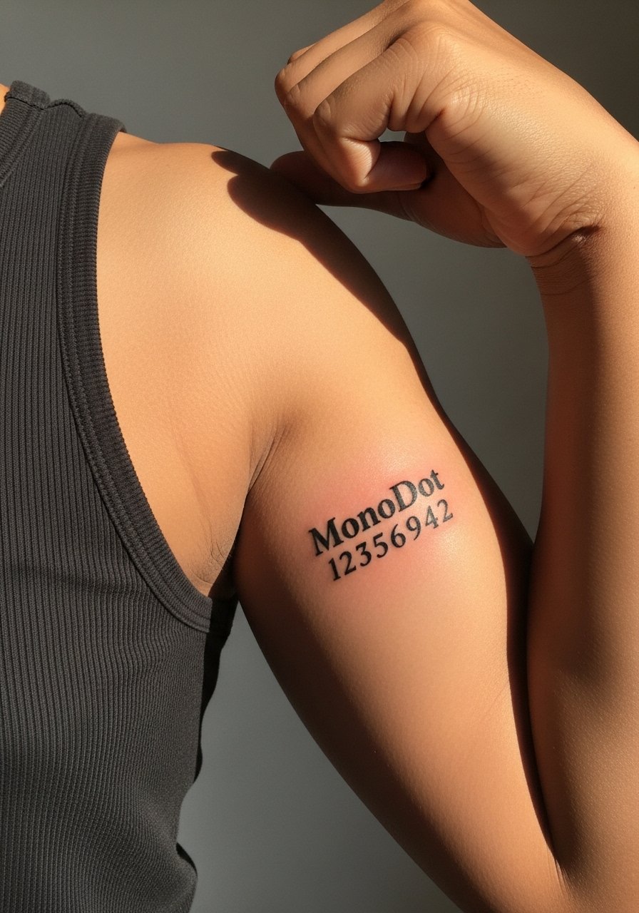
The inner bicep accepts micro typography well because of its relatively calm surface. Pain is variable so expect short breaks. Ask for consistent dot spacing if using stipple elements and request a small mock-up on the skin first. A common mistake is assuming inner arm detail will behave like forearm detail. For the session wear a loose tank top so the artist can access the spot cleanly. After healing, rolled sleeves show off this placement nicely.
14. Slim Sans Compact on the Side Rib
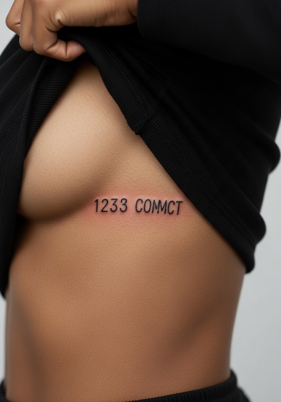
Side rib placements are high on the pain chart but they photograph well. Slim sans fonts need spacing to avoid merging across breathing cycles. Tell your artist you want slightly expanded counters so the numerals age into steady shapes instead of puddles. The common error is shrinking slim sans into a tiny block. For the session choose a strapless bra or fitted sports bra so the artist can work without fabric interference.
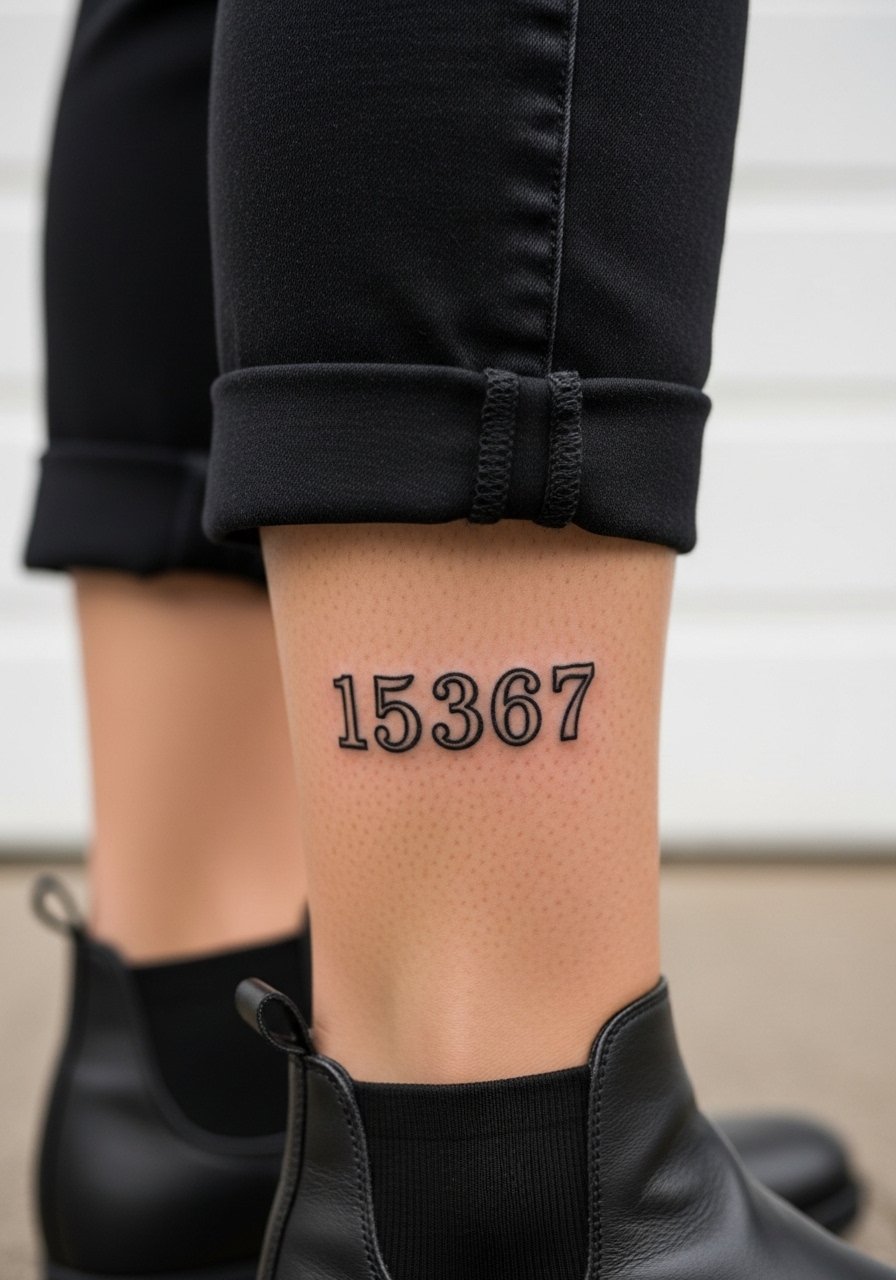
15. Tiny Serif Classic on the Ankle
Ankle placements are exposed to shoe friction and socks, which can blur ultra-fine serifs. Expect a short and sensitive session. Ask your artist to raise the serif terminals slightly and to place the numerals on the flatter part of the bone to reduce rubbing. Many people forget to factor shoe friction into size decisions. When showing this off, wear strappy flat sandals or canvas cropped pants so the ankle is visible without rubbing.
16. Stencil Ticker Micro on the Side of the Foot

Foot tattoos have a rough healing path because of constant pressure and moisture. Stencil-style numerals need to be bolder than they look on the reference. During consultation say you want slightly heavier saturation and a plan for a touch-up after the first healing cycle. The common mistake is treating foot micro work like forearm work and expecting the same longevity. For session day wear easy slip-on shoes and bring sandals so the area is not compressed.
17. Calendar Drop Narrow on the Inner Thigh
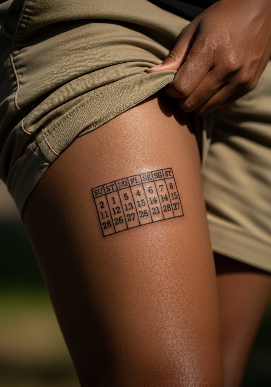
Inner thigh pieces are private and the skin there can be forgiving for fine serif numerals. Pain is moderate and healing is sheltered from sunlight. Tell the artist you prefer slightly more space between rows if doing multiple numbers to prevent merging. A mistake is choosing tiny spacing that looks tidy on paper but smears over time. For the session wear loose shorts that can be shifted without friction. Consider coverage choices if you want to reveal the piece rarely.
18. Neo Retro Seven on the Collar of a Shirt
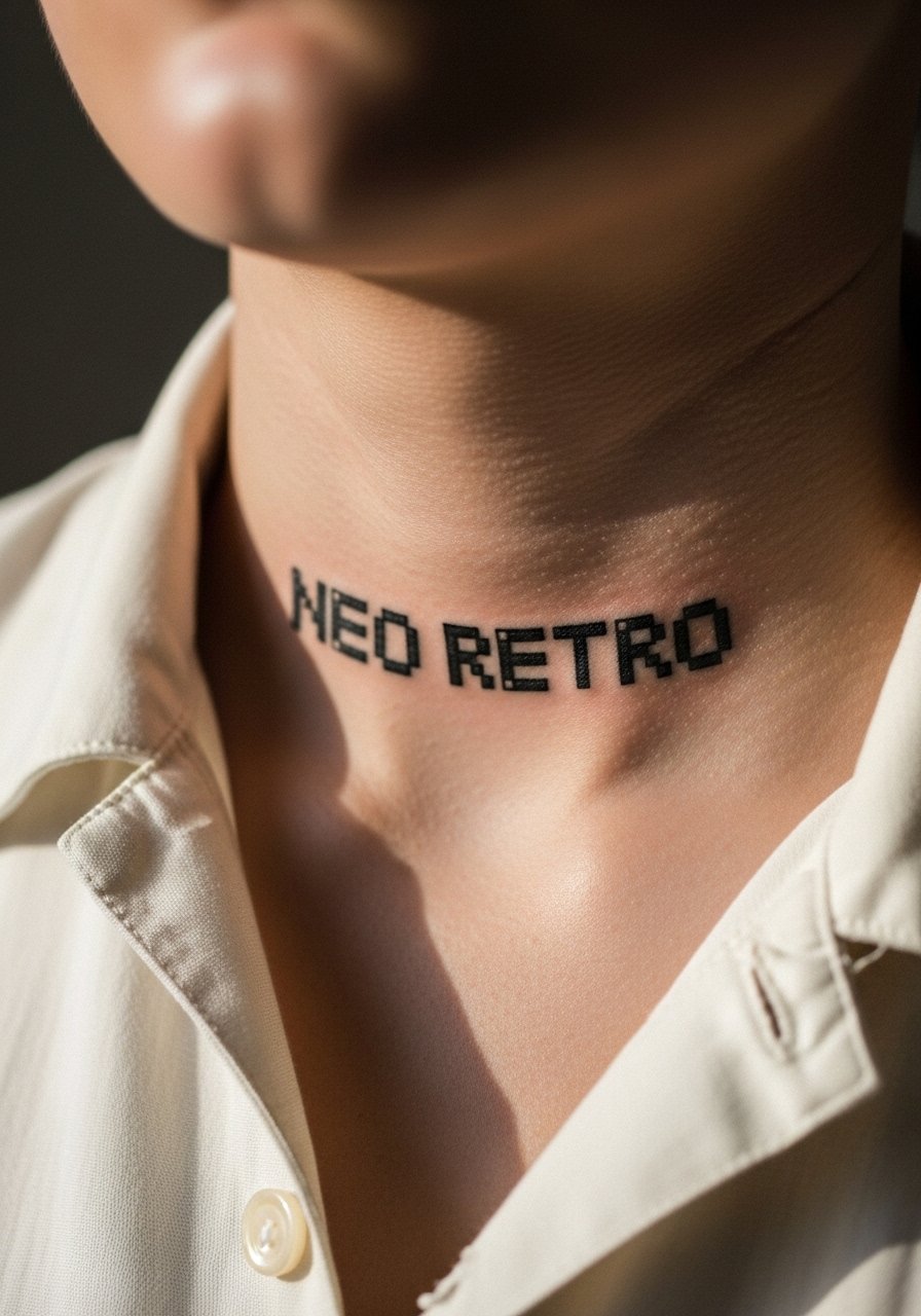
Numbers at the nape or upper neck are subject to sun exposure and friction from collars. Pixelated or retro seven styles work because the block forms withstand minor blur. Expect a sensitive but fast session. Ask for a slightly larger pixel grid than the original reference and a plan for sunscreen after healing. The common mistake is going too small and losing the pixel effect. Layer a thin chain pendant necklace above the digits to create separation and frame the piece.
19. Minimalist Ticker on the Sternum
Sternum placements are intimate and require experience. The skin near the sternum moves with breathing so thin lines must be spaced to avoid early blur. Artists disagree about fine detail here. One group says avoid single-needle work. The other group says careful spacing and depth make it viable. Ask your artist which approach they prefer and to show healed examples. For the session wear a fitted sports bra and consider a calm breath plan to minimize motion.
20. Tiny Stencil Stencil on the Lower Back

Low back skin tolerates small text well because movement is moderate and coverage is easy while healing. Sessions are low on pain for many people. Ask for balanced spacing across the row and avoid borderline micro sizes. A mistake is placing text across a curvature that reads fragmented when clothed. Wear a tank top you can lift slightly without removing so the artist has clear access without exposing other areas.
21. Minimalist Ticker Typeface on the Inner Wrist
The inner wrist is a classic spot for tiny numerals because it is visible and personal. Expect a small sting and a chance you will want a touch-up in a couple of years if you wash hands often. Ask your artist to anchor the terminals and to favor boldness over filigree. Avoid the mistake of tiny script that looks delicate in the chair and disappears after daily life. Pair this with a minimalist silver watch on the opposite arm and a thin chain bracelet stack to balance the wrist composition.
Frequently Asked Questions
Q: How do tiny number fonts fare differently on fingers versus forearms?
A: Fingers see more friction and soap exposure so thin strokes blur faster. Forearms are calmer and tolerate finer detail longer. If you want digits on fingers ask for stronger stroke weight and slightly larger spacing, and expect touch-ups sooner than on the forearm.
Q: Will a typewriter or pixel font hold up better for a date on the wrist?
A: Typewriter and pixel styles both age well on wrists because irregular edges disguise mild softening. Pixels keep a blocky identity as they blur, while typewriter charm can actually increase with small surface noise. Tell your artist the exact numeric text you want and request subtle spacing increases for longevity.
Q: Should I be concerned about careers or hiring when placing numbers on hands?
A: Hand and finger placements remain visible and can still influence first impressions in some fields. If your workplace matters, consider wrist or inner forearm placements that you can cover easier, or choose a placement that stays private until you decide to show it.
Q: How often do tiny number tattoos need touch-ups?
A: It depends on placement and lifestyle. Fingers and feet often need touch-ups within one to three years. Forearms and calves can go longer. Plan a realistic touch-up timeline with your artist before booking, and factor light sun exposure into your expectations.
Q: What should I wear to a session for a collarbone or chest number?
A: For collarbone or upper chest, wear a wide-neck shirt or a sports bra you can shift so the artist only exposes the work area. A strapless tank top or an open button-down that you can pull aside works well and keeps the rest of you covered.