
Fine line number tattoos look fragile at first glance, but the way they hold up tells a different story. Trends push tiny roman numerals and micro-digits, and those choices force trade-offs between readability, longevity, and placement. Pick a font that works with your skin, the area you want, and how often you wash or wear rings. The list below starts with clear, wearable options and moves into more decorative numbers that still read well after a few years.
1. Fine Roman Numeral '1' on Inner Forearm
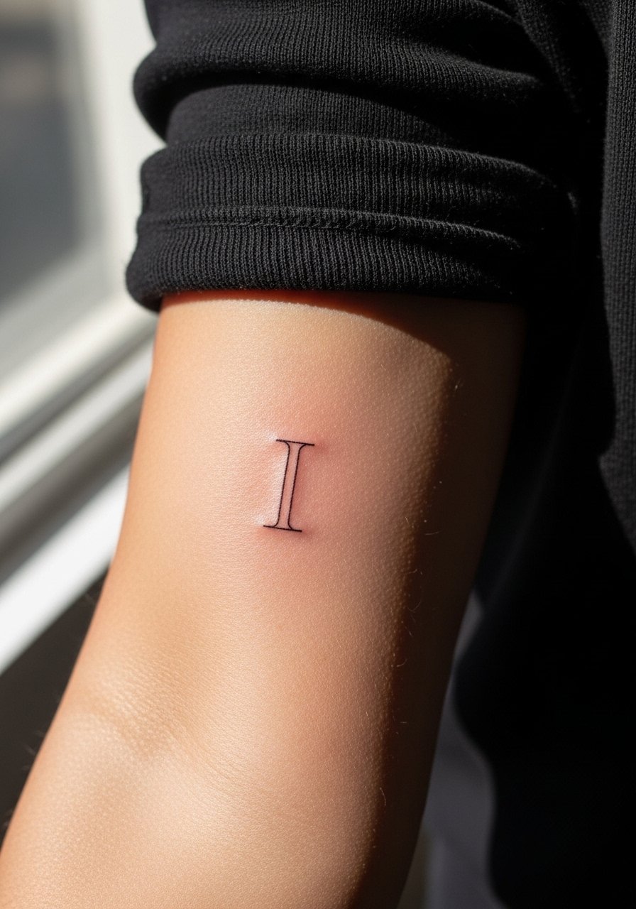
I recommend a narrow, single-stroke roman numeral for inner forearm placement when you want discreet significance without heavy saturation. I've seen this hold well at year two when the artist used slightly heavier linework than ultra-micro lettering. Tell your artist to avoid hairline strokes that sit too high in the dermis, and ask for a touch-up plan at year two. Pain is mild. Session time is short. For showing it off, roll sleeves and wear a loose button-down shirt so the forearm reads clean against fabric.
2. Bold Block '2' on Outer Wrist
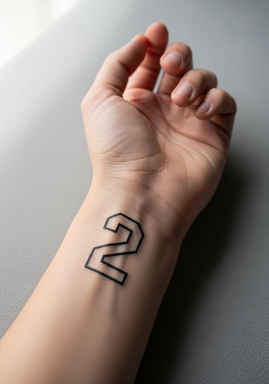
The outer wrist is great for a bold, high-contrast number that reads at a distance. Fair warning: wrist skin takes a beating from washing and bracelets, so choose a slightly thicker stroke than you might want. The biggest mistake is requesting ultra-thin script on the wrist. That look blurs fast and demands frequent touch-ups. Session is quick but the healing week is fussy. For showing it off, stack a minimalist leather bracelet so the number sits between bands without being crowded.
3. Serif '3' Framed on Collarbone
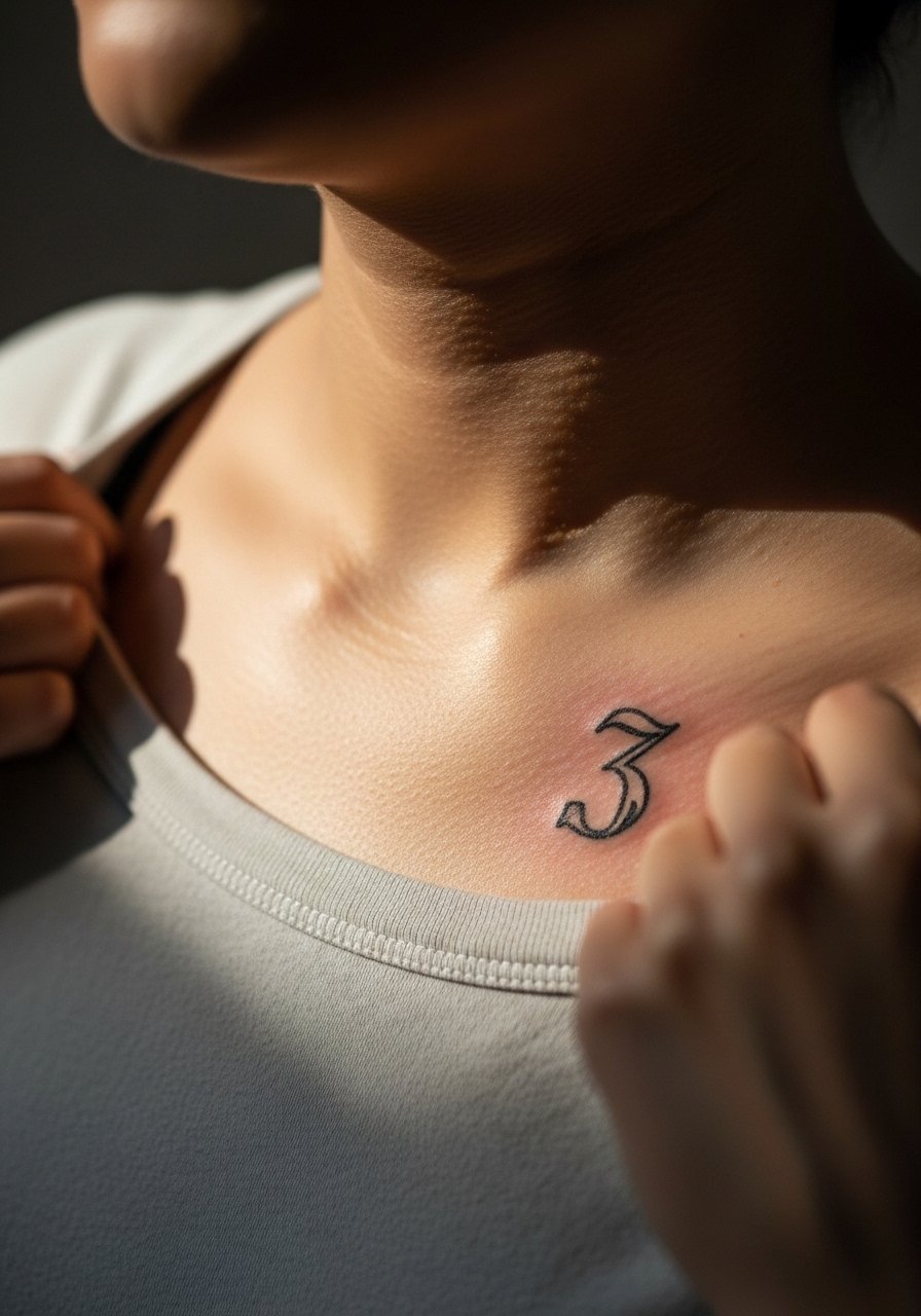
A small, classic serif number on the collarbone reads as both jewelry and statement. The area moves with breathing and clothing. Tell your artist to keep the numeral slightly bolder than a hairline and to center it with the clavicle. Expect a moderate sting during the session. Most people see crispness at six months and slight softening by year three. For outfits, a thin chain pendant necklace sits above the glyph and keeps attention on the numeral without crowding it.
4. Script '4' on the Side Ribcage
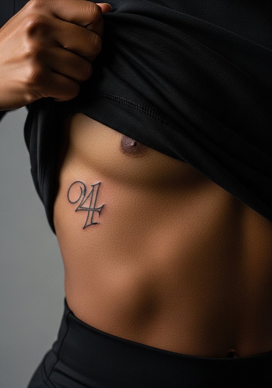
Rib placements are painful but they deliver intimacy. Artists split on small script here. One camp says ribs blur because the skin stretches. The other camp insists careful depth and spacing keep script readable. I recommend slightly larger script with open counters to age better. Expect a session that takes longer than a wrist piece and plan for a slower healing window. For the appointment, wear a cropped athletic top you can lift so the area is exposed without moving a lot.
5. Dot-Work '5' on Upper Arm
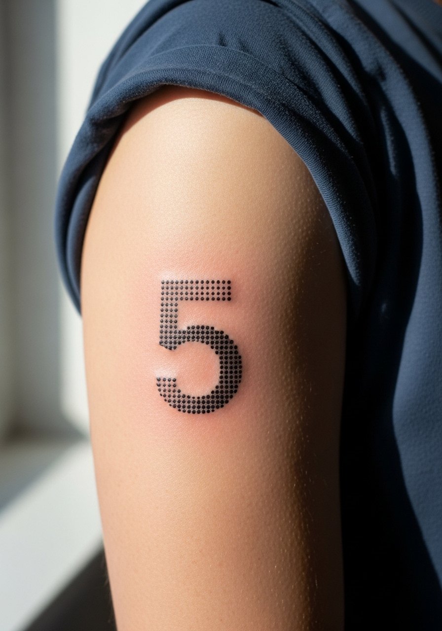
Dot work gives number tattoos texture without heavy outlines. This suits the upper arm where blowout risk is lower. Tell the artist you want stipple shading behind a small numeral to preserve readability across time. A common mistake is packing dots too densely around fine digits, which turns to gray in a few years. Session time is moderate. Pair with a short sleeve linen shirt to show the piece in casual settings.
6. Traditional '6' on Ankle

Ankle numbers are classic and photograph well. The heel-to-ankle friction zone increases fade risk so thicker outlines and full saturation help. Expect a sensitive session with intermittent pressure points. For the appointment, wear shoes you can slip off and jeans you can roll up easily so the artist can access the area without tugging. A thin outline here keeps the number readable from year one to year five with minimal softening.
Pack Smart
The ankle and rib pieces above need different prep and healing gear than simple wrist tattoos, so pack items that address access, rubbing, and moisture control.
-
Stencil transfer paper kit. Lets you preview exact placement on the ankle and ribcage before the needle hits skin.
-
Topical numbing cream. Useful for rib sessions that tend to run longer and feel sharp.
-
Thin protective film roll. Helps ankle numbers that rub against socks and shoes during the first week.
-
Fragrance-free body wash. Cleans healing areas without stripping pigment from fine numerals.
-
Aquaphor healing ointment. A thin layer protects fresh linework while keeping the skin supple in the early days.
7. Blackletter '7' on Hand Knuckle

Knuckle numerals are bold and age fast. Fair warning: hand skin moves and fades quickly, and the community debates whether any style lasts more than a couple of years. Expect frequent touch-ups. Tell your artist you want heavy linework and deeper saturation to extend longevity. The session is short but painful because of the thin skin. Consider the career and social effects. Hand work is a long-term commitment more than a one-time aesthetic.
8. Stencil-Style '8' on Calf
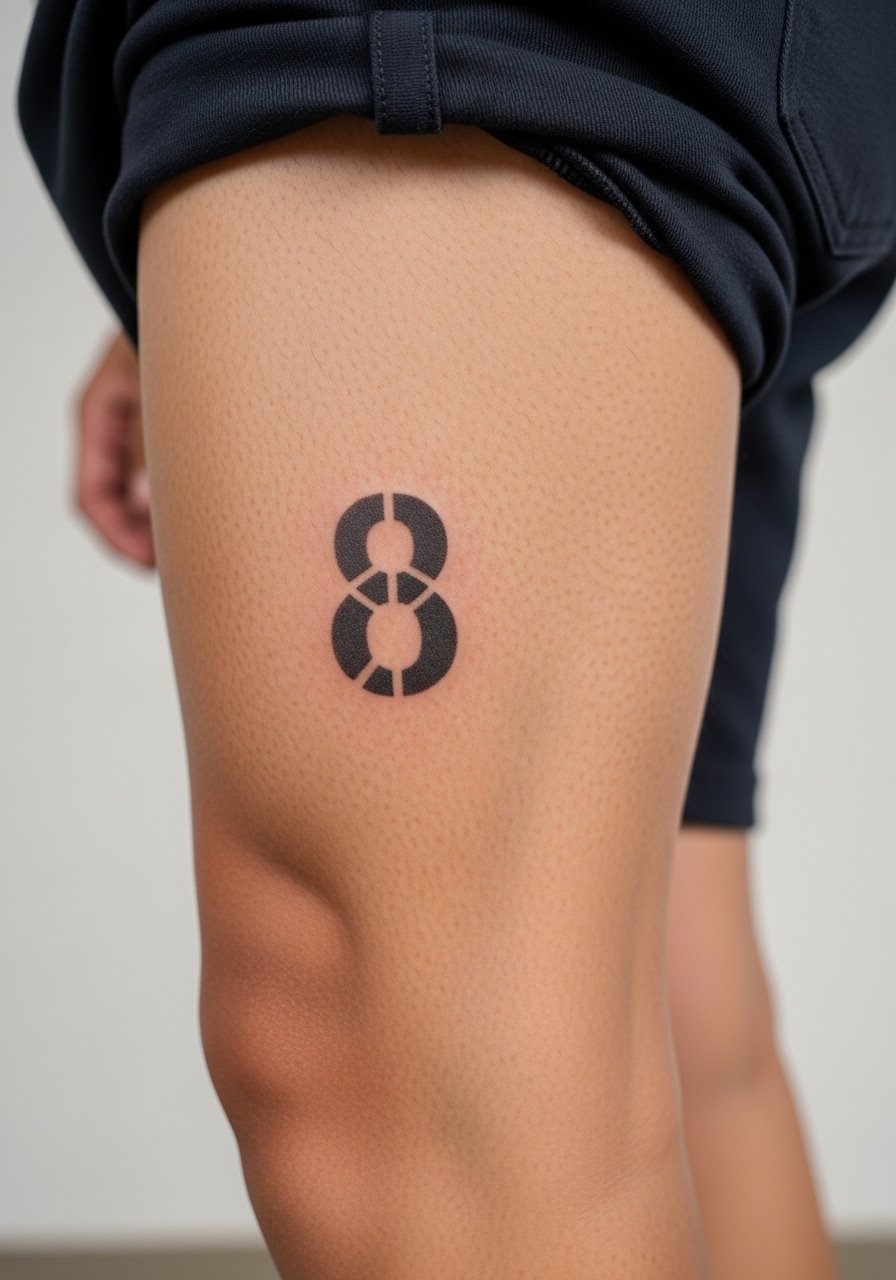
Calf pieces take ink well and show detail. For numerals with stencil or stencil-like geometric fills, ask for a mid-weight outline and open interior so the pattern breathes. The biggest mistake is cramming small patterning into a narrow numeral. Sessions are comfortable and the area heals predictably. If you want to show it in warm months, wear high-waisted shorts that stop above the calf and let the piece be visible.
9. Minimal '9' on Side of Finger
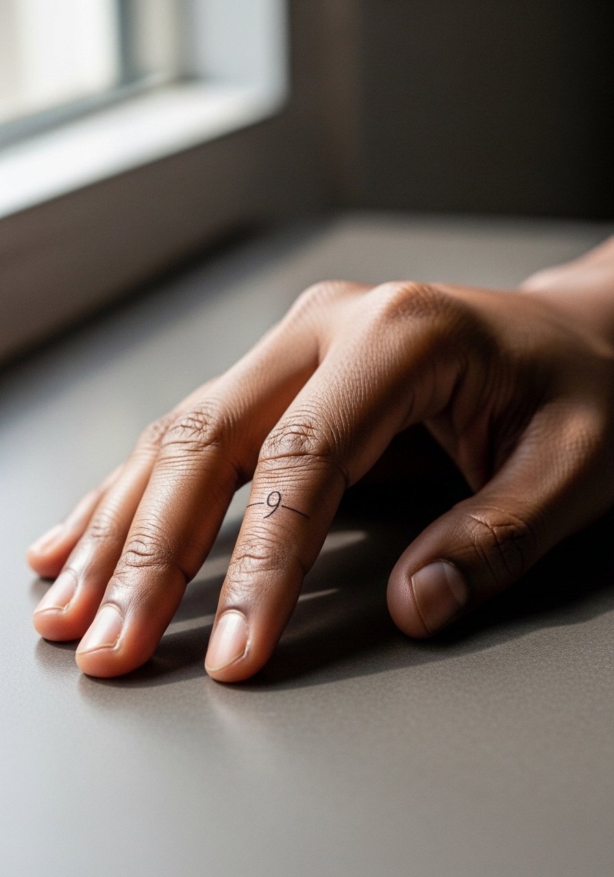
Finger side numerals are intimate but prone to early fading because of constant washing and friction. A common mistake is picking a script with open terminals that soften into blobs. Choose a slightly bold single-stroke figure and schedule a touch-up at year one. The session is quick and the pain is sharp. For showing it off, a thin stacking ring sits near the number and frames it without covering the ink.
10. Serif '10' as Chest Anchor

Chest anchors read as both statement and anchor for larger pieces. Sternum and upper chest vary in skin texture. Many clients pick serif numerals because they balance between decorative and readable. During consultation, ask for slightly more spacing inside the numerals to avoid merging in shaded areas. Sessions can be tetchy on the chest. For evenings out, a v-neck shirt frames the numeral without exposing more than you intend.
11. Cuban-Style '11' on Shoulder Cap

Shoulder cap numbers age well thanks to lower friction and thicker skin. The visual impact lead applies here because a bold '11' reads from across a room. Tell your artist you want strong linework with consistent saturation. The session is moderate in length and tolerable. For showing off, a loose tank top or a sleeveless blouse displays the shoulder cleanly.
12. Scripted '12' Along the Spine
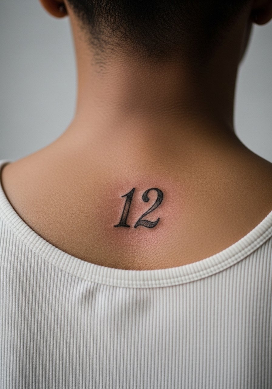
Spine numerals make a vertical statement and require an artist experienced with centered composition. Most people notice a difference in healing between the upper and lower spine. The common mistake is letting the design shift off-center during stencil placement. Sessions on the spine can be uncomfortable for longer runs. If you want to reveal this piece rarely, choose a shirt with a low back or an open-back dress for evenings.
13. Monoline '13' on Inner Bicep

The inner bicep accepts monoline numerals well but sees stretching when you move the arm. I've noticed monoline pieces keep their clarity when the lines are not hairline thin. The pain is moderate and often surprising. Ask for slightly bolder lineweight and a touch-up window at year two. For the session, wear a loose sleeveless shirt you can lift or pull aside without tugging the skin.
14. Roman Numeral '14' on Thigh

Thigh numerals handle larger sizes and subtle ornamentation. I recommend a roman configuration with spacing that prevents the vertical bars from merging in heavier thighs. The session is comfortable and the area is forgiving for fullness and movement. A mistake is choosing too-small numerals for this canvas. For the appointment, wear high-waisted shorts so the artist can access the outer thigh without stretching the skin too much.
15. Minimalist '15' Behind the Ear
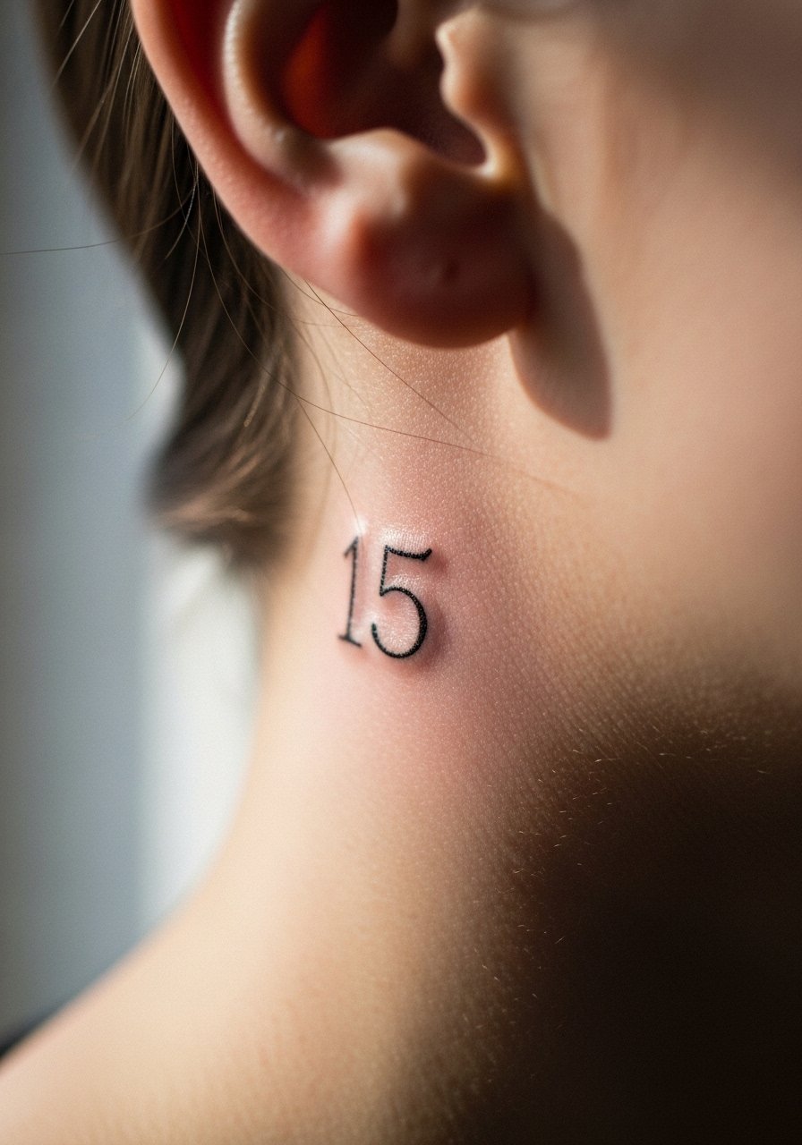
Behind-the-ear numerals read like a secret charm. This placement requires a close crop in the image and careful framing at the session. The skin here is thin so the truth is small strokes can blur. One camp prefers tiny marks and accepts touch-ups. The other camp suggests slightly larger dots or miniature roman forms to preserve clarity. If you get it, plan for touch-ups and know the artist's stance. For the session, wear your hair up so the area is accessible and away from product residue.
16. Geometric '16' on Lower Back

Lower back numerals can anchor a more decorative piece. The area is sensitive to stretching from movement and from clothing pressure. Ask for a balanced outline and avoid tiny interior patterns that fill in over time. Sessions here are manageable but watch for fabric friction while healing. A common mistake is placing the numeral too low where belts and waistbands rub constantly. For show-off looks, a crop top and high-waisted jeans reveal the tattoo without too much exposure.
17. Script '17' on Hip
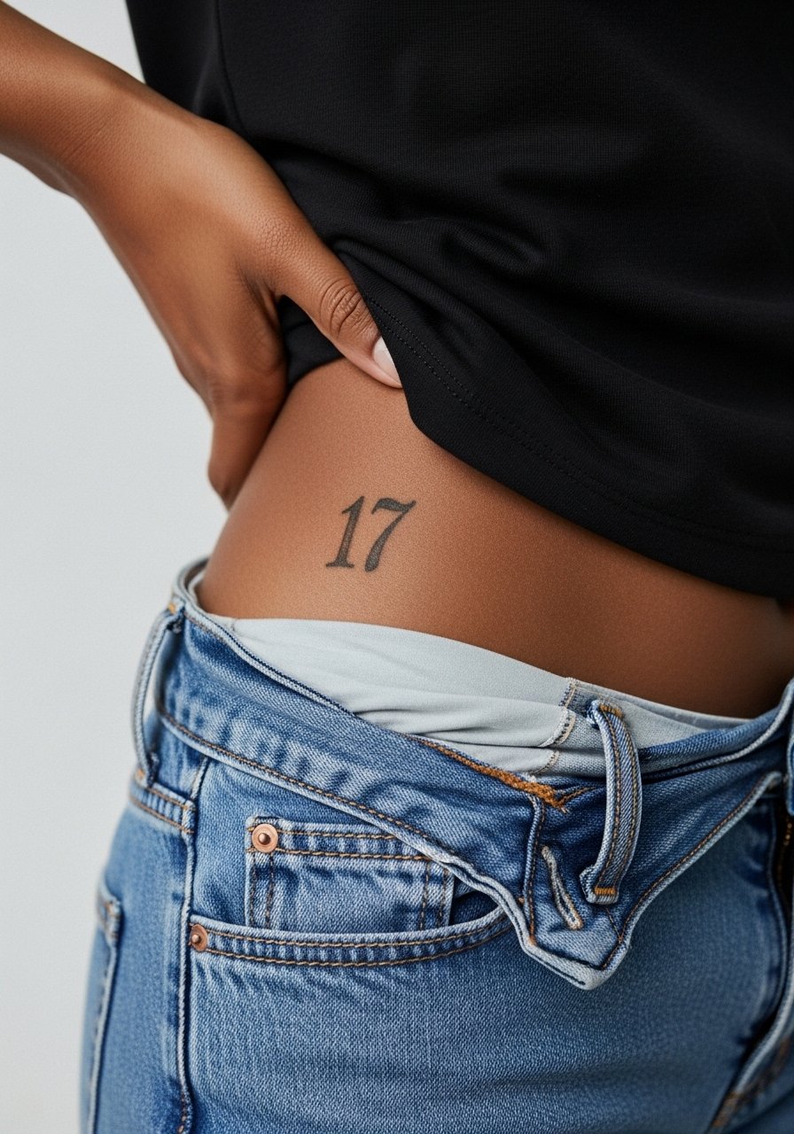
Hip numerals are private and sensual. The session can be awkward for first-timers but the canvas is friendly. Keep script open and slightly larger than you think. A common mistake is choosing ultra-fine loops that break up when skin shifts. For the appointment, wear high-waisted bottoms you can adjust without cold fabric tugging. To show it selectively, pair with a swimsuit bottom or a high-cut brief when appropriate.
18. Blackwork '18' on Forearm Sleeve Accent

Numbers as accents in sleeves need strong contrast. The visual impact here is about reading the digit amid surrounding pattern. Tell your artist you want clear negative space around the numeral and consistent saturation to avoid the number disappearing into background shading. Sessions vary in length depending on the sleeve. For a casual reveal, roll your sleeves and wear a short sleeve tee.
19. Ornamental '19' on Collarbone Cluster

Clusters let you pair a number with small motifs. The risk is overcrowding the numeral, which reduces clarity. My consultation tip is to reserve a full centimeter of clear skin on at least two sides of the number so the ornamentation frames but does not swallow it. Sessions are short for small numbers but take longer when adding flourishes. A delicate pendant or thin chain necklace complements rather than competes.
20. Stipple '20' on Inner Wrist

Inner wrist stipple numbers look soft and photo-ready but the skin there is exposed to sun and washing. The aging reality is inevitable unless you protect the area. Choose slightly denser stippling and expect lightening by year three. The session is quick and the pain is low. For showing it off, a minimalist watch band can frame the numeral while keeping it visible between straps.
21. Typewriter '21' on Bicep Wrap
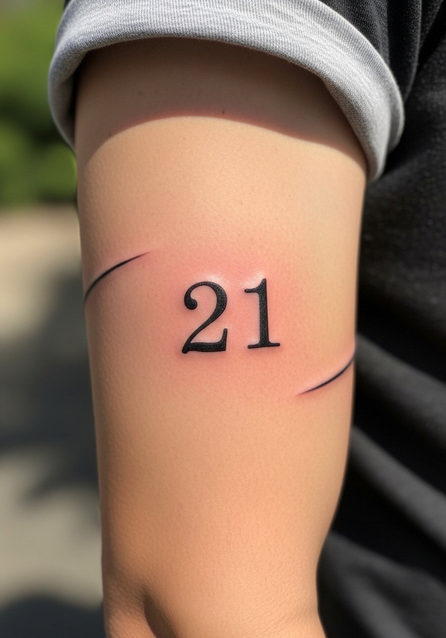
Typewriter digits carry an archival feel and age gracefully when sized properly. The common mistake is making the glyph too small on a curved area. Ask for a slightly larger x-height so the counters remain legible after healing. Sessions are pleasant and the area handles saturation well. For shows, roll sleeves or wear a fitted tee to keep the number visible.
22. Thin Serif '22' on Sternum

Sternum numerals require thoughtful spacing because the skin there moves and is sensitive. One camp warns that thin serifs on the sternum blur within a few years. The other camp says with proper depth and slightly increased letterforms, they can last. I recommend a modest serif weight and a touch-up plan. Sessions are intense and the area needs care while healing. For the appointment, choose a fitted sports bra that you can remove without touching the fresh ink.
23. Inline '23' on Neck Side

Neck numerals are visible and social-risk aware. The skin has texture that can cause thin lines to break up. The consultation lead applies: ask to see healed neck examples from the artist. Sessions are quick but intense. Keep in mind visibility if your job requires discretion. For a styling touch, pair with a wide-neck sweater that can hide or reveal the number as needed.
24. Art Deco '24' on Outer Thigh
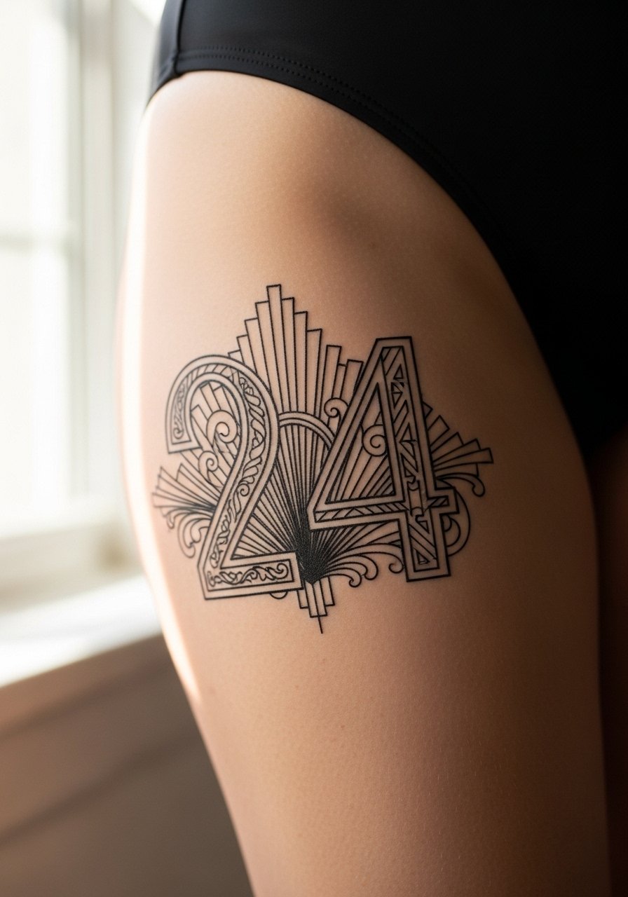
Art Deco numerals let you add geometry while keeping a number readable. Thigh skin is forgiving so you can play with negative space. Avoid packing too many tiny ornaments inside the glyph. Sessions are comfortable and the area heals well. When dressing, a swimsuit with a mid-cut leg reveals the piece without awkward exposure.
25. Minimal '25' on Side Rib (Hidden)
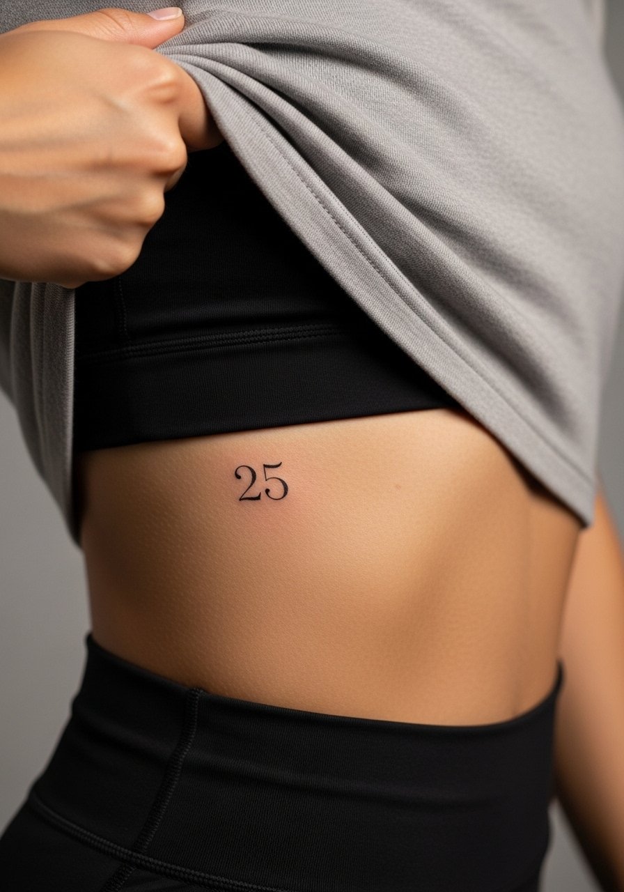
Side-rib numerals are intimate and often hidden. The aging/healing lead matters here because thin minimal forms can blur if placed too small. I advise slightly larger strokes and open counters. The session is more painful than an arm piece and the healing is slower. For the appointment, wear a cropped athletic top so the artist has access without fabric rubbing the area.
26. Vintage Rounded '26' at Ankle Bone

Numbers placed at the ankle bone need extra saturation to resist shoe and sock friction. The mistake is choosing hairline strokes that disappear after a year. Request consistent linework and a protective bandage strategy for the first few days. Sessions are quick but the area is sensitive. For showing it off, wear open sandals and rolled cuffs so the digit reads clean.
27. Decorative '27' on Lower Rib Near Hip

A lower rib numeral near the hip is decorative and private. The area moves with your torso so keep flourishes minimal around the numeral. My consultation tip is to preview the stencil in a few body positions to find a stable spot. Sessions can be painful and the healing window is longer. For the appointment, pick bottoms that you can adjust easily like high-waisted denim so the artist can access the exact area without stretching.
Frequently Asked Questions
Q: Which number font holds up best on the wrist long term?
A: Bold block or slightly weighted serif numerals tend to hold up best on wrists. Thin scripts and ultra-micro figures blur faster because the wrist sees constant washing and friction. In practice, choose a mid-weight line and plan a touch-up around year two if you want the original crispness to remain.
Q: Are roman numerals or Arabic digits more legible over time?
A: Both work if sized and spaced properly. Roman numerals can become harder to read when stacked tightly. Arabic digits with clear counters and modest stroke weight often read longer without touch-ups. Ask your artist to show healed examples of each on similar skin to yours.
Q: How should I dress for a rib or sternum numbering session?
A: Wear clothing that lets the artist expose only the targeted area without being fully undressed. For ribs, a cropped athletic top or a shirt you can lift is practical. For sternum work, a fitted sports bra that unhooks or a bandeau works best so you avoid rubbing fresh ink.
Q: Do decorative fills or stippling affect longevity for numbers?
A: Decorative fills add character but they also increase the surface area that can soften with time. Stipple shading ages more gracefully than dense micro-patterns. If longevity is your priority, keep fills subtle and maintain negative space around the numeral.
Q: How often should I expect touch-ups for small finger or hand numerals?
A: Expect earlier touch-ups for fingers and hands, often within 12 to 24 months, because those areas undergo the most friction. Planning for at least one touch-up in the first two years makes that commitment realistic.