
Fine line neck work dominates saved boards, but what looks delicate on a phone can age into an indecipherable smear if the placement, spacing, and ink depth are wrong. Side neck tattoos sit in a high-visibility, high-movement zone, so choices that read crisp at year five start with a few specific decisions in the chair. The first idea below shows how to do script on the side neck in a way that lasts.
1. Slim Script Along the Side Neck
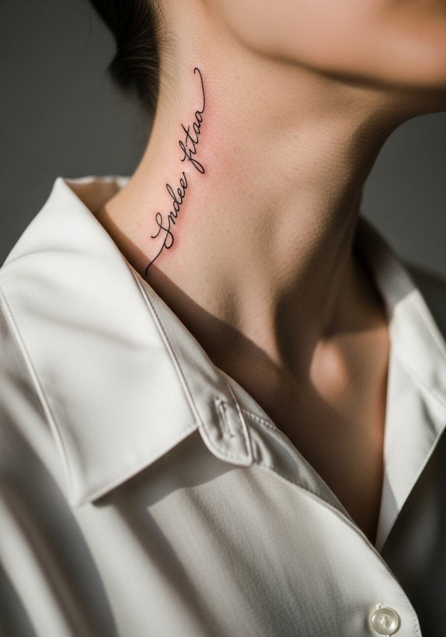
A thin, vertical script on the side neck reads intimate and personal when done with airy spacing. Fair warning, small letters on neck skin tend to blur faster than on flatter areas. I recommend asking the artist to space letters generous and to use slightly bolder single-needle strokes than what you see on tiny wrist scripts. Expect a noticeable shift at six months and another subtle softening by two years. Pain is moderate. For showing it off, a wide-neck tee lets the lettering peek without looking staged. Think about career visibility before committing.
2. Micro-Realism Portrait Fragment
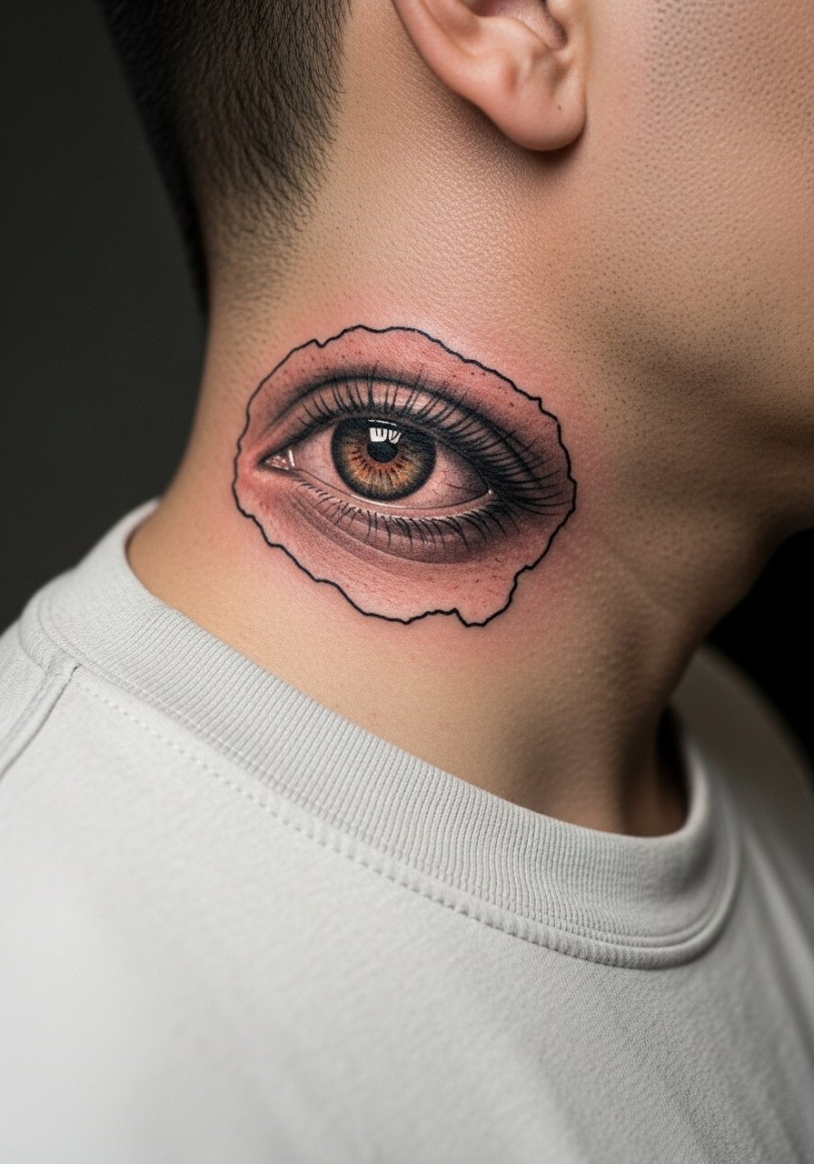
A tiny realistic eye or fragment reads like a private symbol when tucked on the side neck. It works for someone who wants figurative detail without a full chest commitment. Tell your artist to plan one focal point only and avoid packing background dots too close. Blowout risk on neck skin is real so ask about needle spacing and touch-up expectations. Session time is one to two hours depending on shading. For the appointment, wear a loose button-down shirt you can pull aside easily. Sensitive placement note: visible neck work can change first impressions in some workplaces.
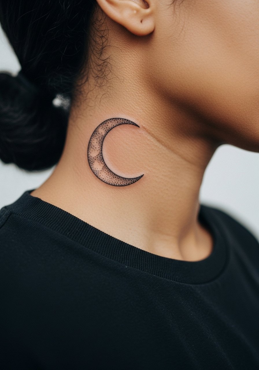
3. Blackwork Crescent and Dots
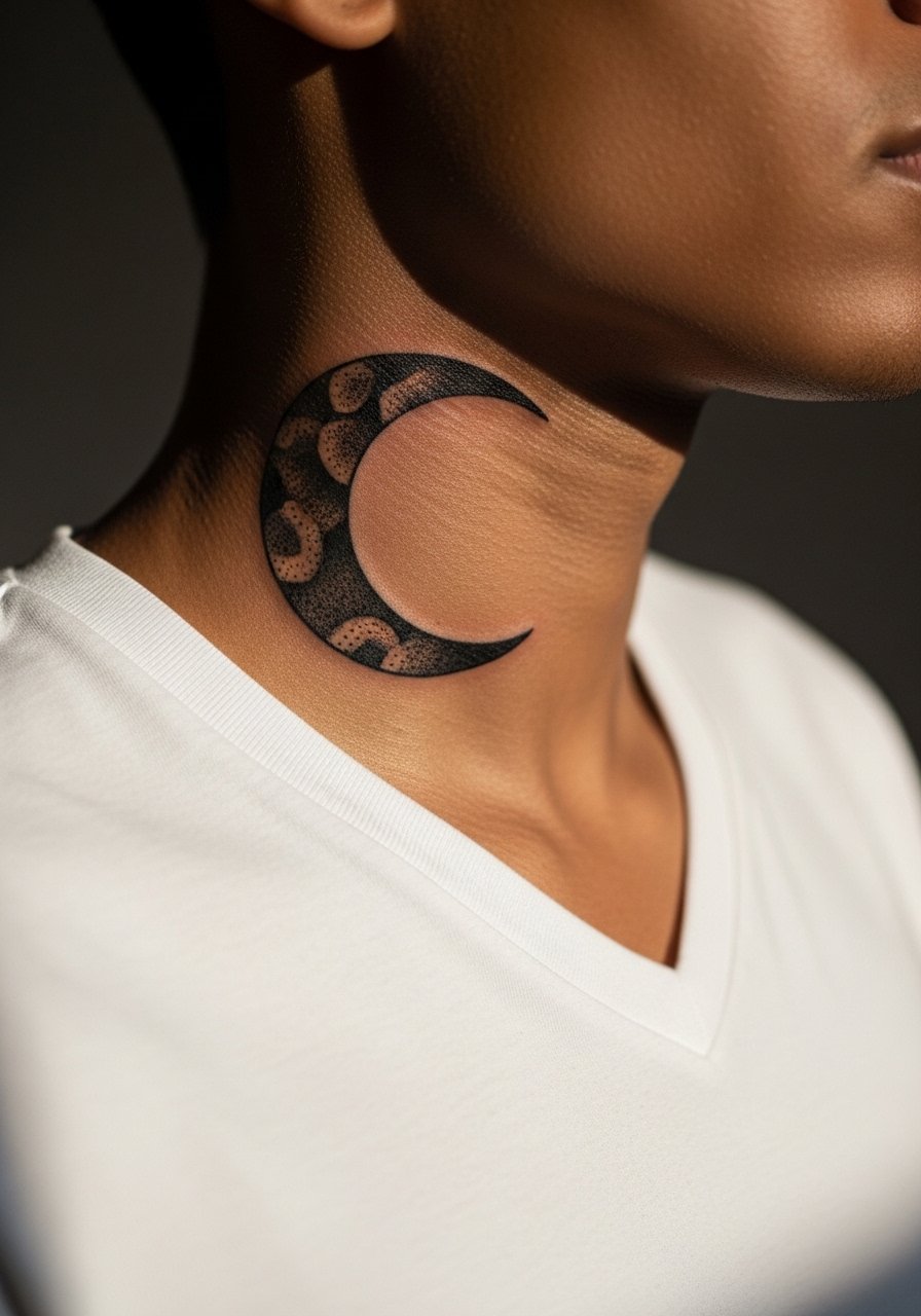
Bold black crescents anchored by stipple shading hold up well because saturation ages into stable contrast. This is a good choice for guys who want a statement that stays readable. The neck moves a lot so expect the artist to prioritize deeper saturation at session time. Pain is moderate to high near the nape. One common mistake is asking for too many tiny dots packed into a tight field. Ask for stepped spacing in the stipple so the texture separates over time. Pair this with a low-slung chain necklace to frame the shape without hiding it.
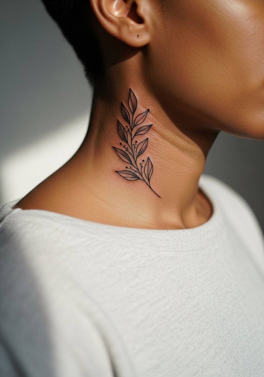
4. Single-Line Botanical Stem
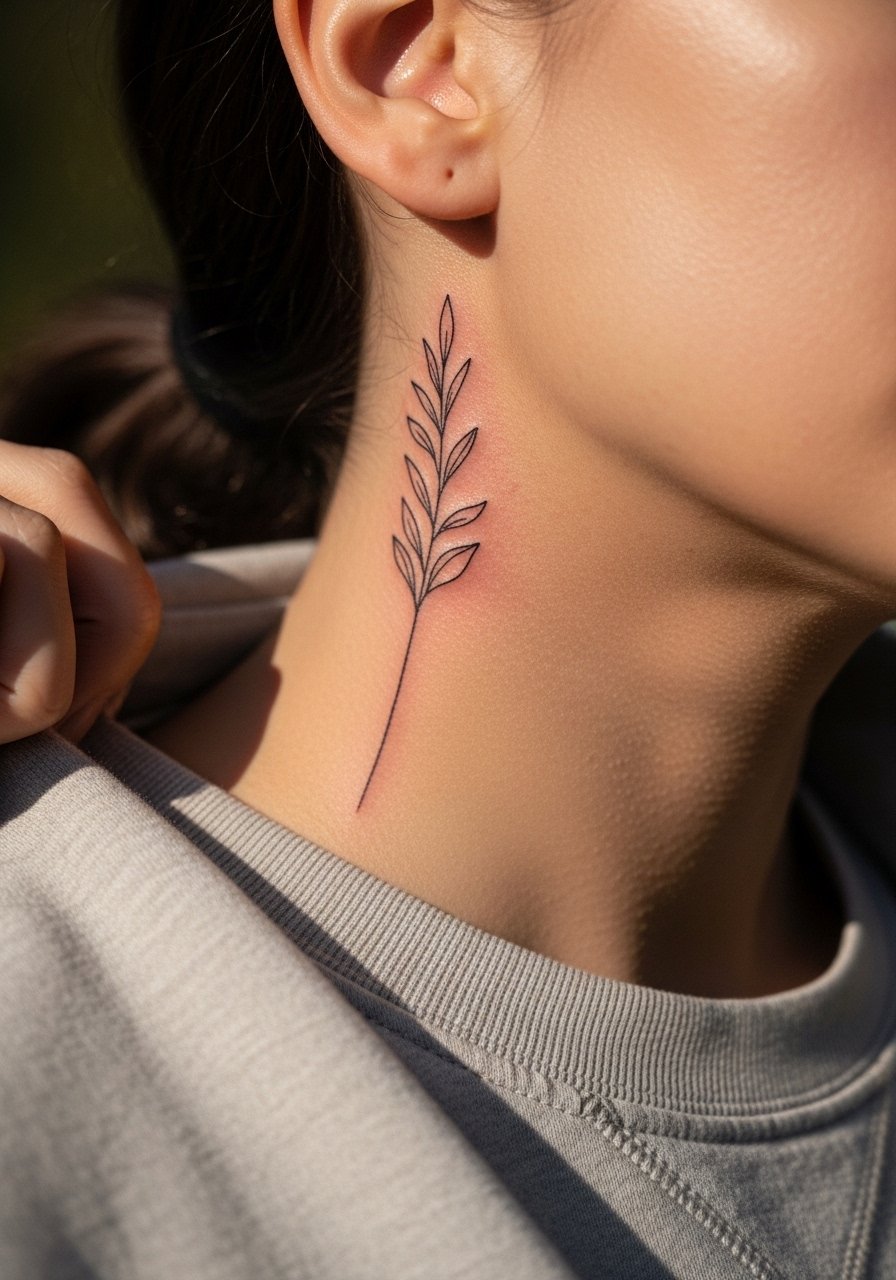
A single continuous line forming a stem and leaf feels organic on the side neck. The visual impact is in the negative space. The neck skin is thin and mobile so tiny loops will merge if placed too close. Tell your artist to keep leaf shapes open and to avoid ultra-fine internal detail. Expect touch-up around year two for the thinnest segments. For the session, a racerback tank or loose tee helps the artist access the area without tugging. This placement looks subtle under a collared shirt or visible with an open neck.
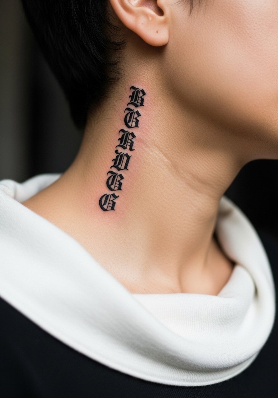
5. Gothic Glyph Cluster
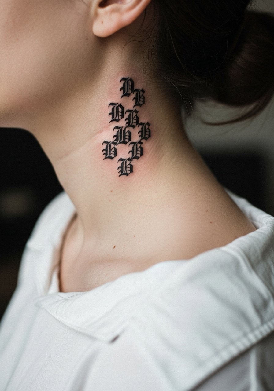
Small gothic letters or glyphs stacked vertically make a bold narrow column on the side neck. Because of the high-contrast blackwork, aging tends to be kinder than with ultra-fine scripts. A split in the community exists over tight gothic lettering on necks. One camp says the dense strokes blur within a few years. The other camp says bold, properly spaced blackwork endures. Ask your artist which approach they use and how they plan for future touch-ups. For showing it off, a loose linen button-down frames vertical text well. Session time is typically under two hours.
6. Minimal Geometric Band
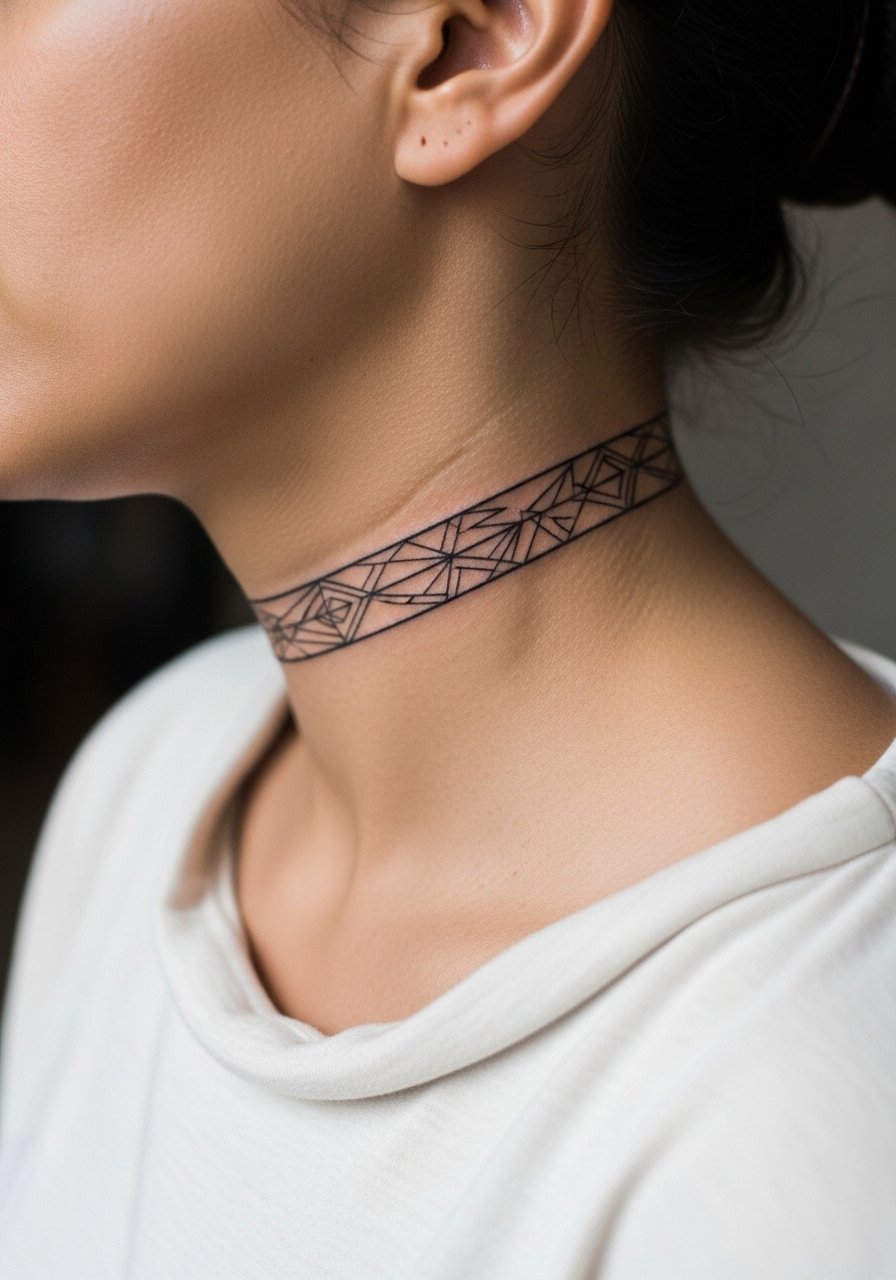
A thin geometric band that follows the jawline reads modern when proportions are right. The biggest mistake is asking for a band that is too tight. Skin movement causes parallel lines to merge over time if spacing is minimal. During consultation, show the artist exactly where you want the band relative to the jaw and ear. Expect moderate pain and a session under an hour for a simple band. For evenings out, pair the band with an open-collar shirt so it sits in the natural negative space created by the neckline.
Studio Day Picks
The side neck scripts and blackwork pieces above need careful prep and different first-week care than collarbone or forearm work.
-
Stencil transfer paper kit. Lets you preview the placement on neck skin before the machine touches you, which is crucial for vertical scripts and glyph clusters.
-
Topical numbing cream. Applied 45 minutes before can ease neck sensitivity for longer shading sessions without changing how the ink settles.
-
Thin protective film roll. Keeps side neck tattoos protected from friction with collars and backpacks during the first few days.
-
Fragrance-free body wash. Gentle cleansers avoid stripping the thin neck skin while it heals, preserving fine line clarity.
-
Aquaphor healing ointment. A thin layer in the first 48 hours locks in moisture for delicate neck linework without clogging pores.
7. Small Traditional Rose
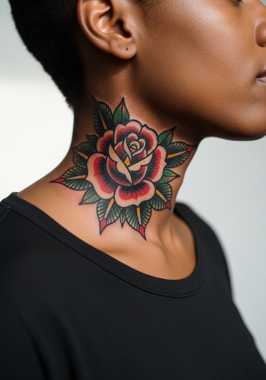
A small traditional rose uses bold outlines and solid fills that age predictably on the neck. The advantage is durability. The downside is that thick outlines can feel heavy in such a visible spot. Ask for slightly reduced scale so the petals keep negative space as they settle. The session feels quicker than shaded realism. For showing the tattoo, a button-down shirt left unbuttoned a couple of steps frames the motif without overexposing it. Consider career implications since bold neck pieces are still noticed.
8. Tiny Constellation Path
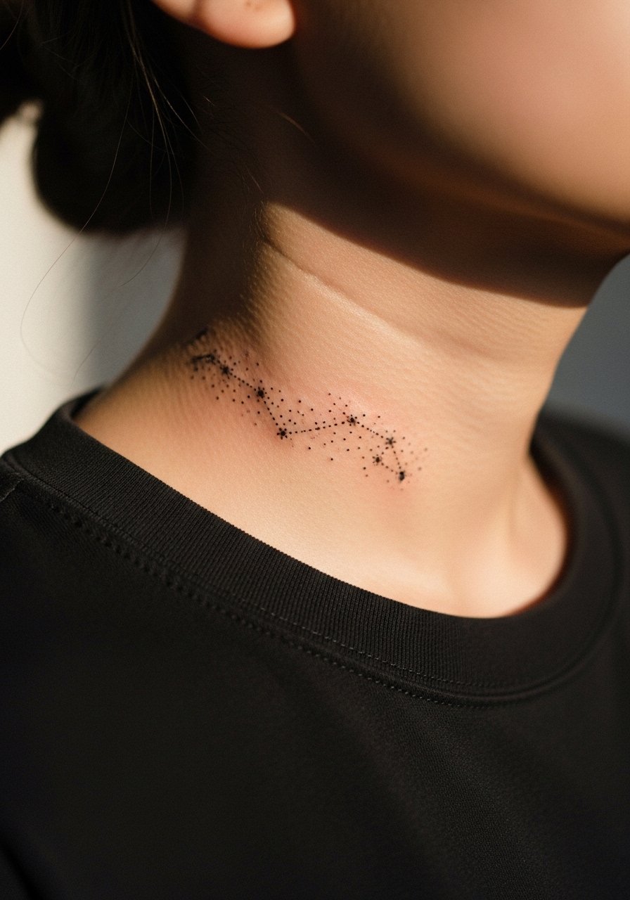
A dotted constellation that follows the jawline feels like a quiet personal map. Dots and micro-strokes here require spacing because the neck’s motion can pull dots into lines. Tell the artist you want airy spacing and single-dot anchors rather than clusters. Touch-ups are common around year two. Pain is mild to moderate. For the session, bring a shirt you can shift without tugging. This design pairs with a slim pendant chain that sits just below the dots.
9. Blackletter Single Word
A single blackletter word reads like a crest when spaced correctly. The controversy here centers on legibility versus aesthetic. One camp says blackletter is classic and holds up because of heavy strokes. The other camp warns that tight flourishes on neck skin blur. Ask the artist to simplify flourishes and increase spacing. Expect a two-year touch-up window if you want crisp serifs. For show-off wear, a neat open-collar shirt or a low-cut sweater frames the word.
10. Small Botanical Cluster
A clustered arrangement of leaves gives a sculptural, organic look that suits the neck curve. The typical mistake is asking for intricate interior veins at a micro scale. Those details collapse over time. Ask for open leaf shapes with subtle stipple shading so the composition breathes as it heals. Pain is moderate. For the session, wear a loose neckline shirt that does not rub the area. Pair with a lightweight scarf in colder months so the tattoo peeks without friction.
11. Micro Skull Accent
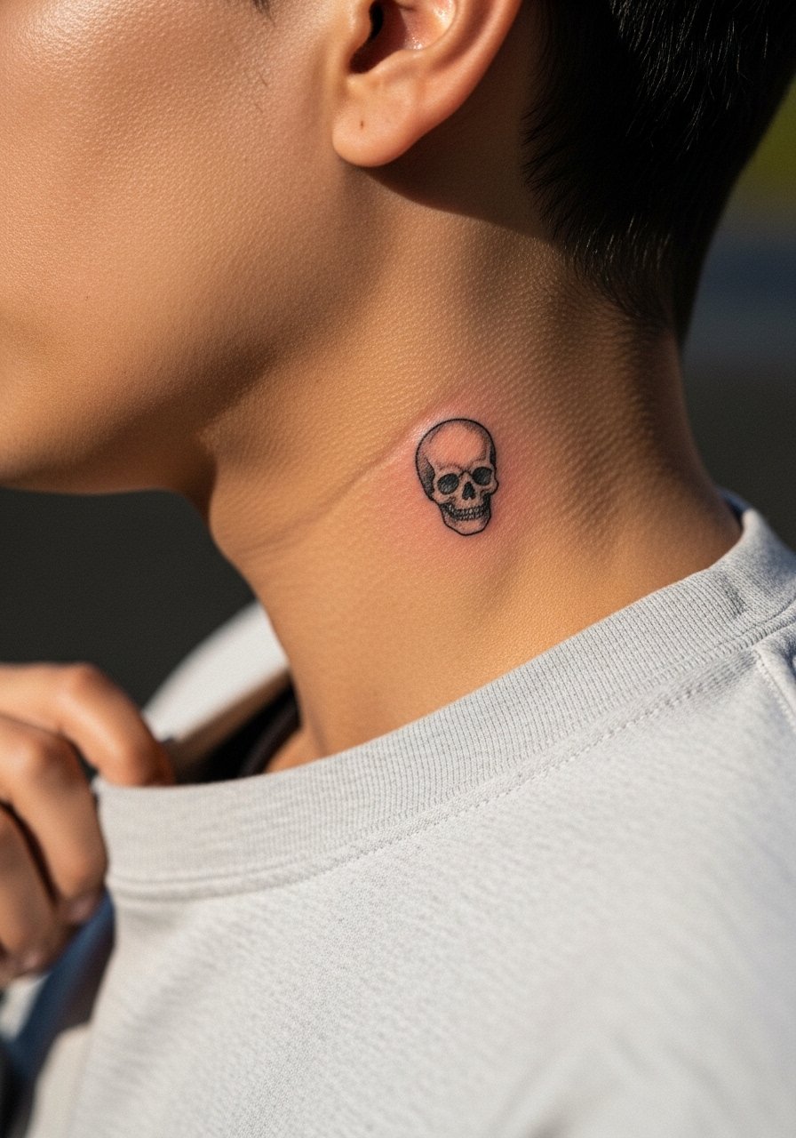
A micro skull is a compact statement that reads bold by contrast. The trick is not to load too much shading into a very small piece. Keep the skull simple and avoid heavy background. Since the neck moves, rank small dark fills for later touch-up if saturation softens. The session is short and sharp. One practical tip is to feel the fit of your collar before booking. Tight collars can rub during healing and scuff edges.
12. Single Needle Script Ribbon
A ribbon-like script that curls subtly along the neck looks refined. Single-needle work on neck skin fades faster than thicker lines. During consultation ask for slightly bolder single-needle strokes and more spacing between curves. Expect a touch-up around year three. Pain is moderate. For the appointment wear a loose tank or open button shirt so the artist can access the jaw and neck without tugging. This placement ages best with sun protection.
13. Abstract Brushstroke Mark
A single brushstroke gives an expressive, modern energy. The shape should read at a glance so avoid adding fine texture that will vanish. Tell your artist to plan the stroke width to accommodate the neck’s curvature. One real mistake is overdrawing small serrated edges that blur into a blob. Expect the bold black to remain readable long-term. Pain varies with coverage. For show-off wear, a plain crew neck pulled slightly aside keeps attention on the brushstroke.
14. Tiny Anchor or Nautical Mark
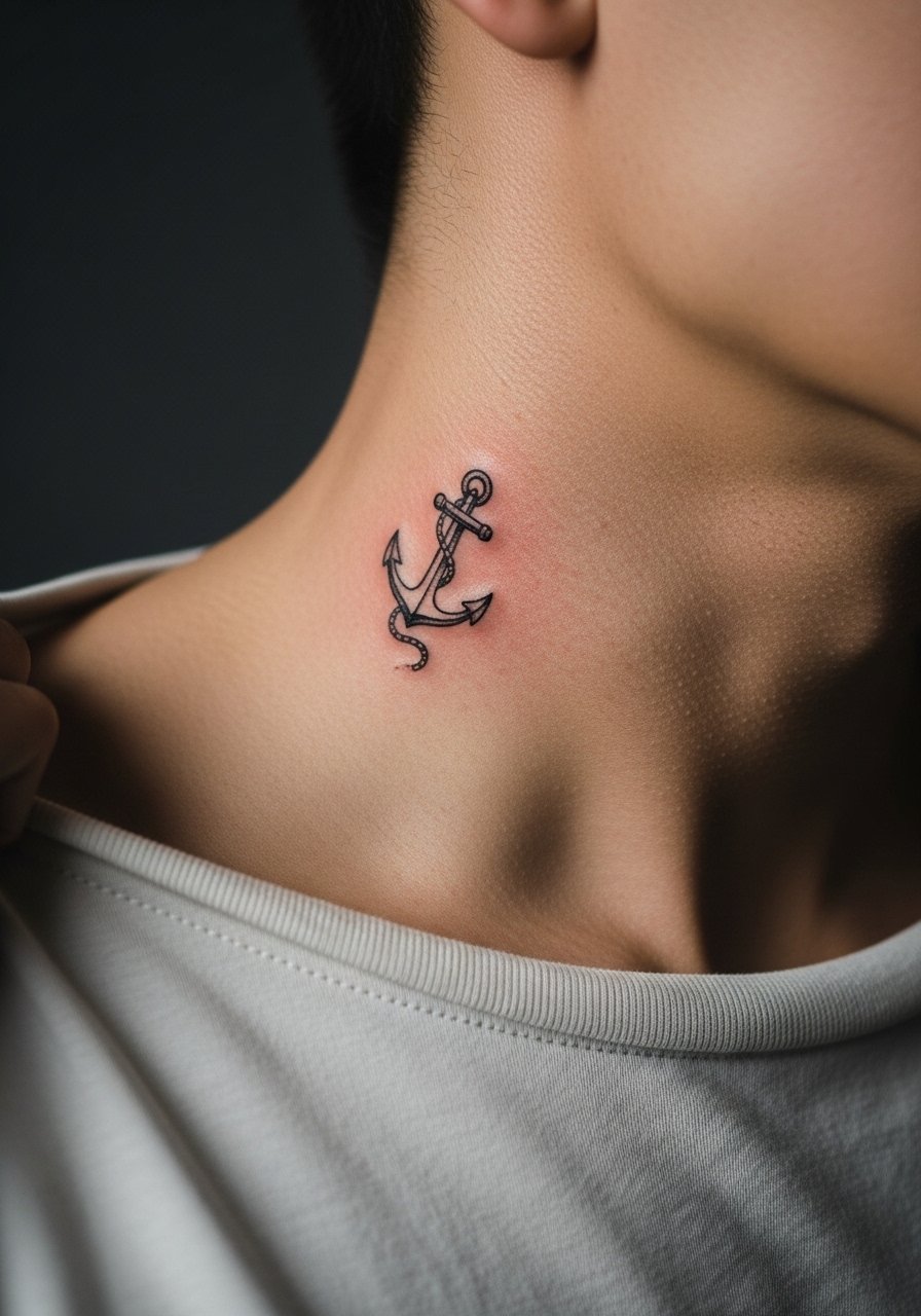
A compact anchor reads classic and literal when small. The common error is adding tiny rope details that do not survive movement. Ask for a simplified silhouette and solid anchor base. Session time is short and pain is mild to moderate. Pair this with a casual boat-neck tee when you want the symbol visible. Consider the meaning you attach since tattoos on the neck are rarely private.
15. Thin Wave Motif
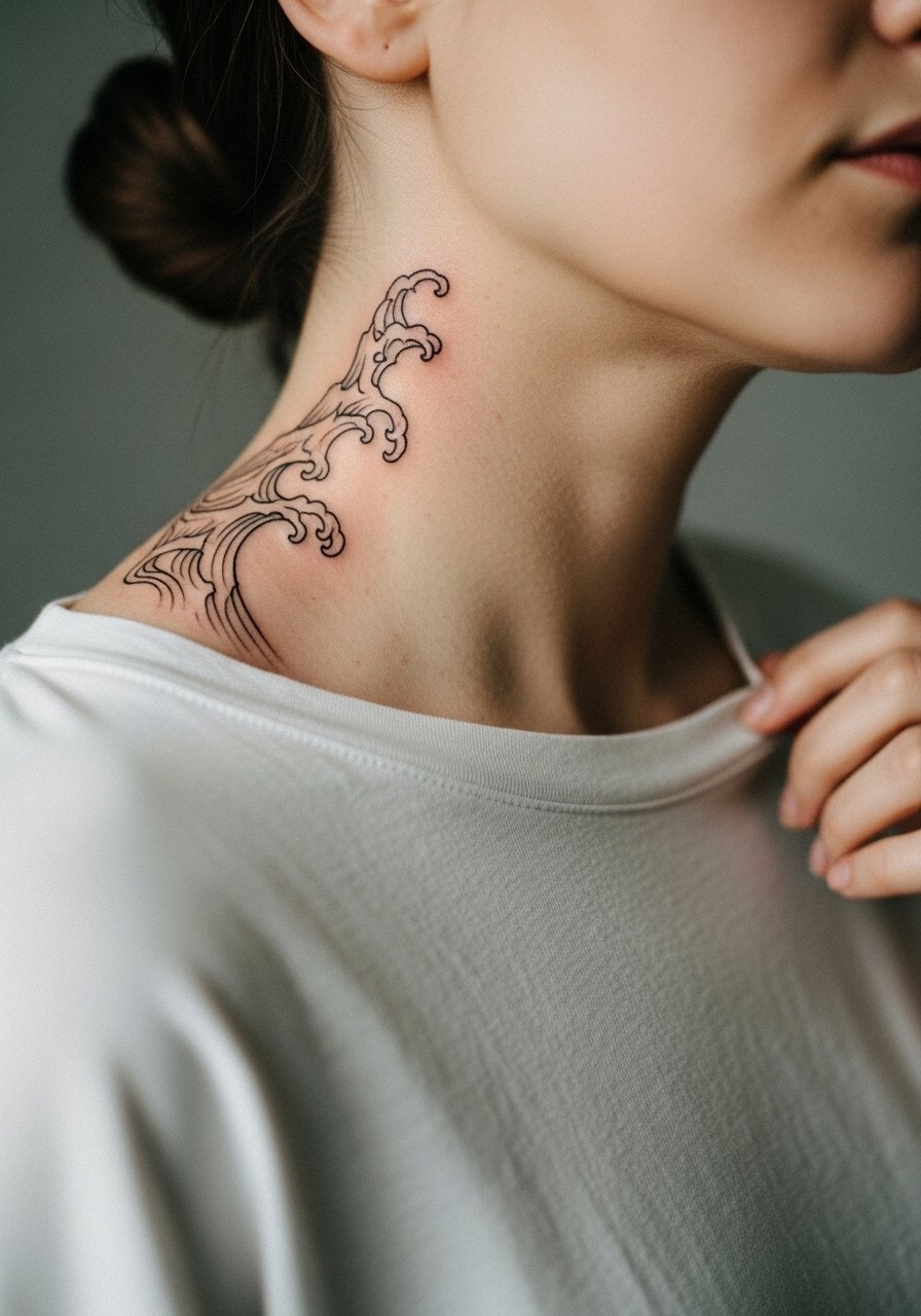
A delicate, flowing wave suits the side neck curve and plays well with vertical movement. Keep line repetition minimal so the waves do not crowd. The main aging issue is line merging where curves cross. Tell your artist to allow breathing room between peaks. Pain is moderate. No accessory is needed but a low-cut tee frames the motif if you want it visible. For the session, a button-down you can shift aside works best.
16. Tiny Anchor Tattoo with Script Tag
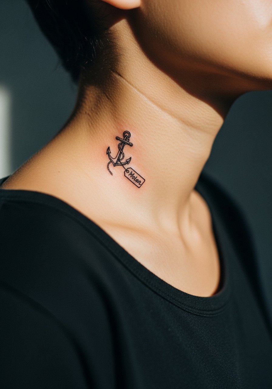
Combining a small icon with a one-word script creates narrative balance on the side neck. The mistake people make is shrinking the script to illegibility. Have the artist write the word at a slightly larger scale with open counters. Expect touch-ups in the finer script after a couple of years. Pain is moderate. For showing it off, a simple pendant necklace can sit just below the icon to complete the look.
17. Stippling Crescent Moon
A stippled crescent uses dot work to imply volume without heavy fills. The neck is forgiving for dot gradients if spaced properly. Ask your artist for graduated dot density that leaves room at the edges. Common mistakes include packing dots too close which blends into a patch. Touch-ups may be needed around year three to restore crisp dot edges. Pain is moderate. Pair the moon with nighttime outfits or a low collar.
18. Tiny Arrow with Tail
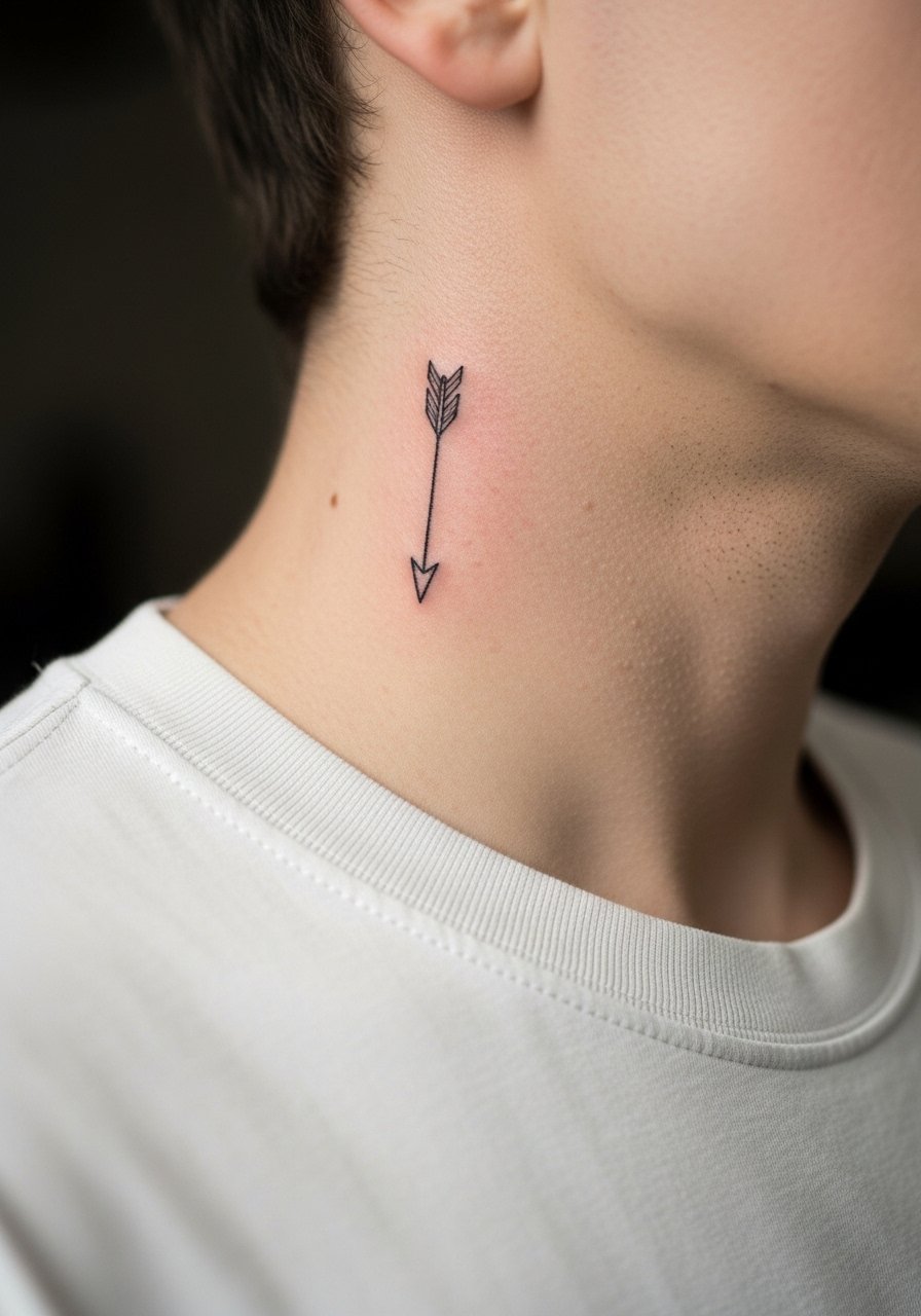
A tiny arrow reads sharp and directional. The biggest mistake is making the shaft too fine. Ask the artist for a balanced shaft thickness and a small but defined arrowhead. This placement can be more painful near the jawline. Expect a touch-up if the shaft thins with time. For the appointment wear clothing that exposes the neck without rubbing. An open collared shirt helps the arrow sit naturally in negative space and shows off the direction.
19. Minimal Shield Emblem
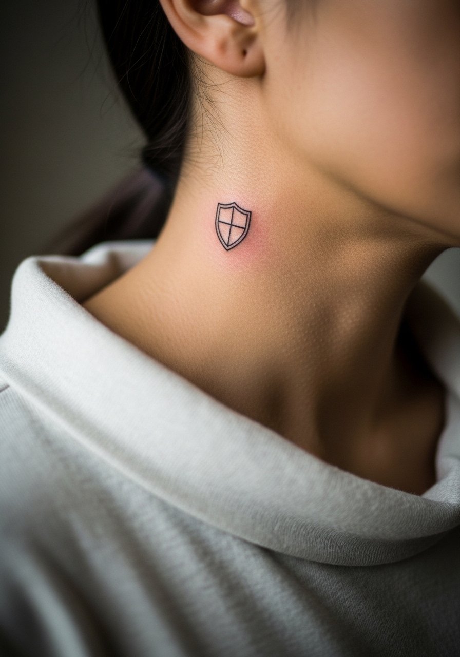
A compact shield emblem reads architectural and masculine without heavy color. The key is to avoid internal micro-decoration. Keep interior shapes large and simple so lines age separately. The neck’s movement makes tight corners prone to softening. Ask for slightly rounded corners to avoid early blurring. Session time is short. For show-off styling, a casual henley shirt frames the shield when unbuttoned.
20. Small Compass Needle
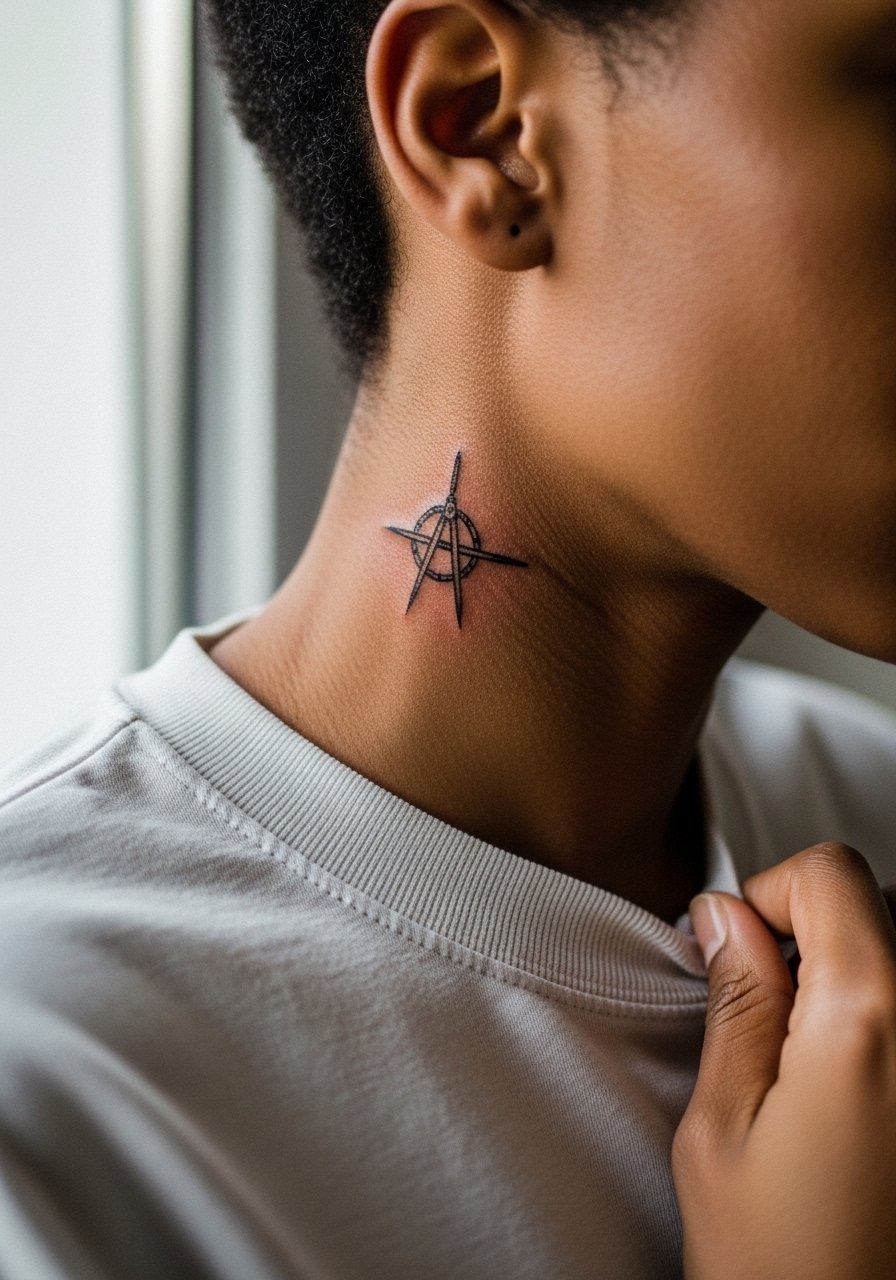
A fine compass needle is a concise directional statement that fits the neck’s vertical plane. The frequent error is adding too many cardinal points that clutter the tiny space. Keep only the needle and a hint of housing. Ask your artist about a subtle anchor dot to hold the design visually. Expect touch-ups in the smallest points over the years. The piece pairs well with a low neckline and a slim pendant chain.
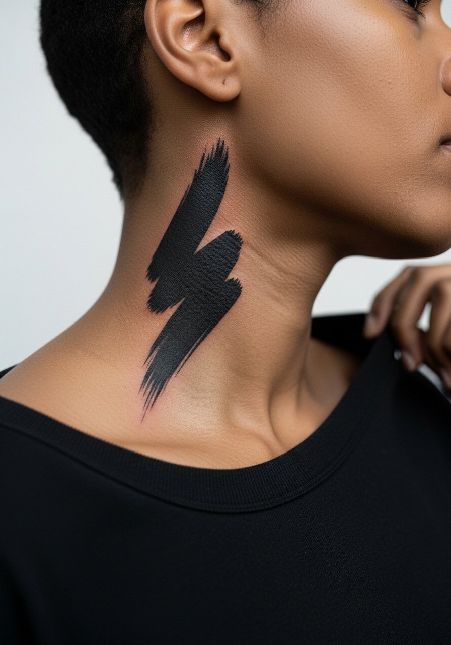
21. Simple Lightning Flash
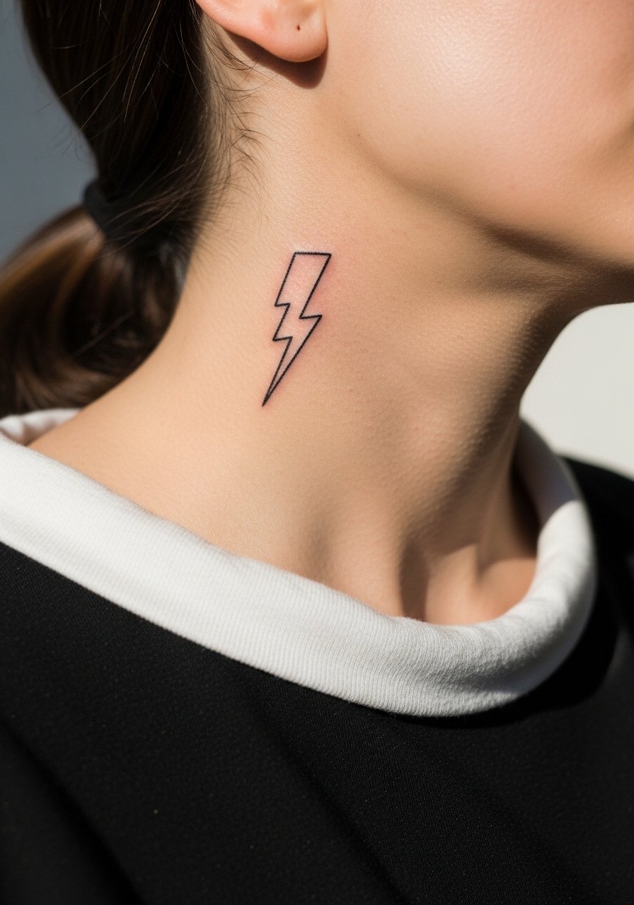
A single lightning bolt reads strong and instantaneous. The risk is requesting an ultra-thin bolt that fades into the skin. Opt for a bolt with a bit of weight so it keeps contrast. Pain is moderate. Plan for a brief session and expect a potential touch-up if edges softens. For showing it off, the bolt sits well with a plain tee. Keep the buffer between bolt and jawline to reduce movement-related softening.
22. Scripted Coordinates
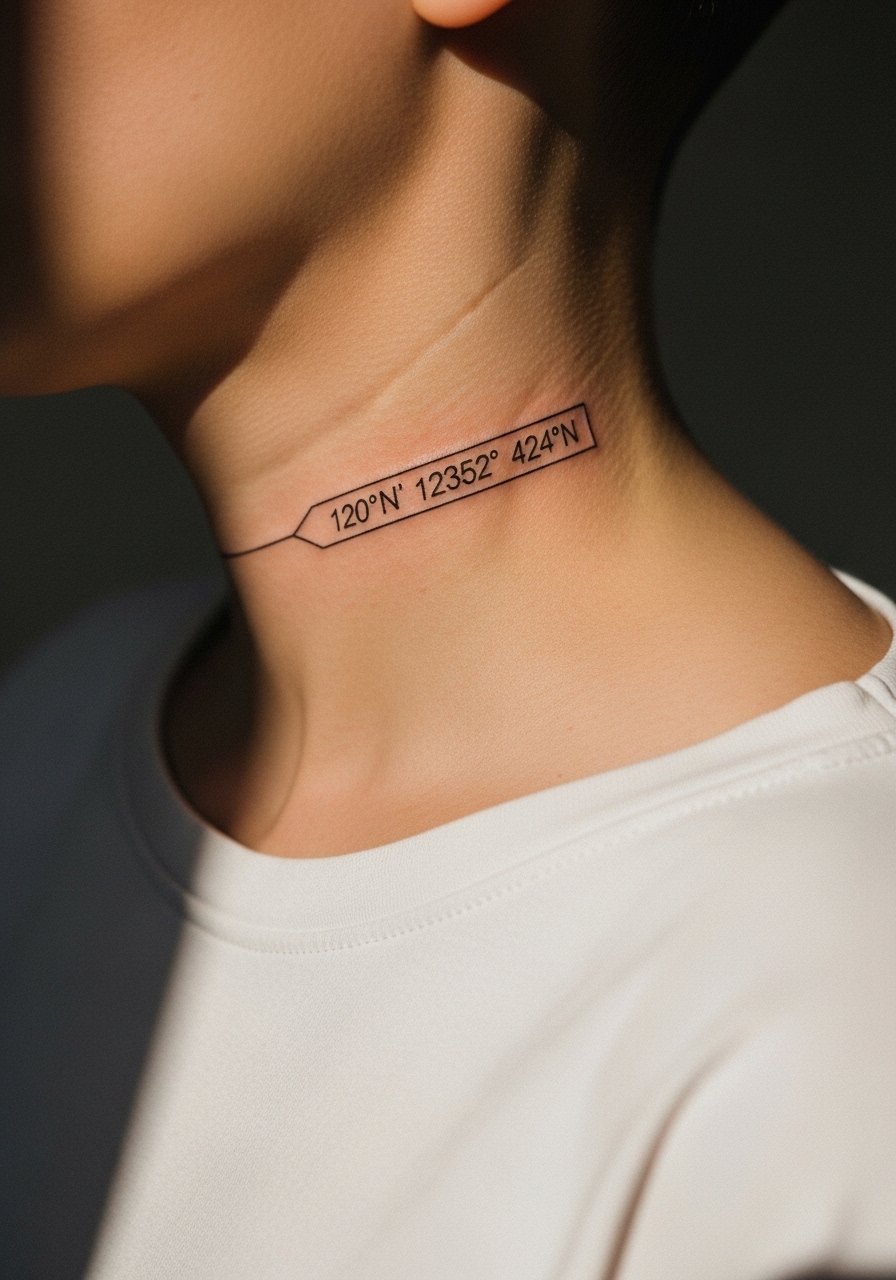
Coordinates read like a private map and fit the side neck naturally. Because numbers sit close together, the common mistake is compacting them too tightly. Ask the artist to space digits and to consider small serifs or trace spacing to aid legibility as it ages. Expect a touch-up in two to three years for clarity. For the session, wear a shirt that gives easy access. Pair with minimal accessories so the coordinates remain the focus.
23. Small Anchor with Rope Detail
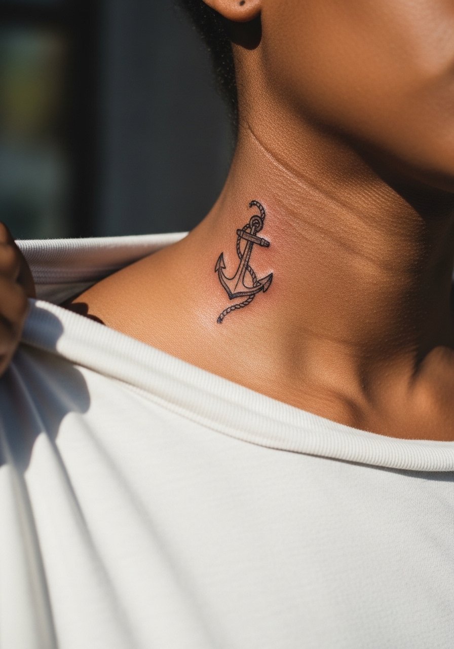
A small anchor with a simplified rope loop adds texture without overloading detail. Keep the rope suggestion broad instead of many tiny curls. The rope is where detail often melts, so ask for slightly bolder rope lines. Pain is moderate. For showing it off, a simple open collar or a boat-neck tee complements the nautical theme.
24. Micro Floral Motif
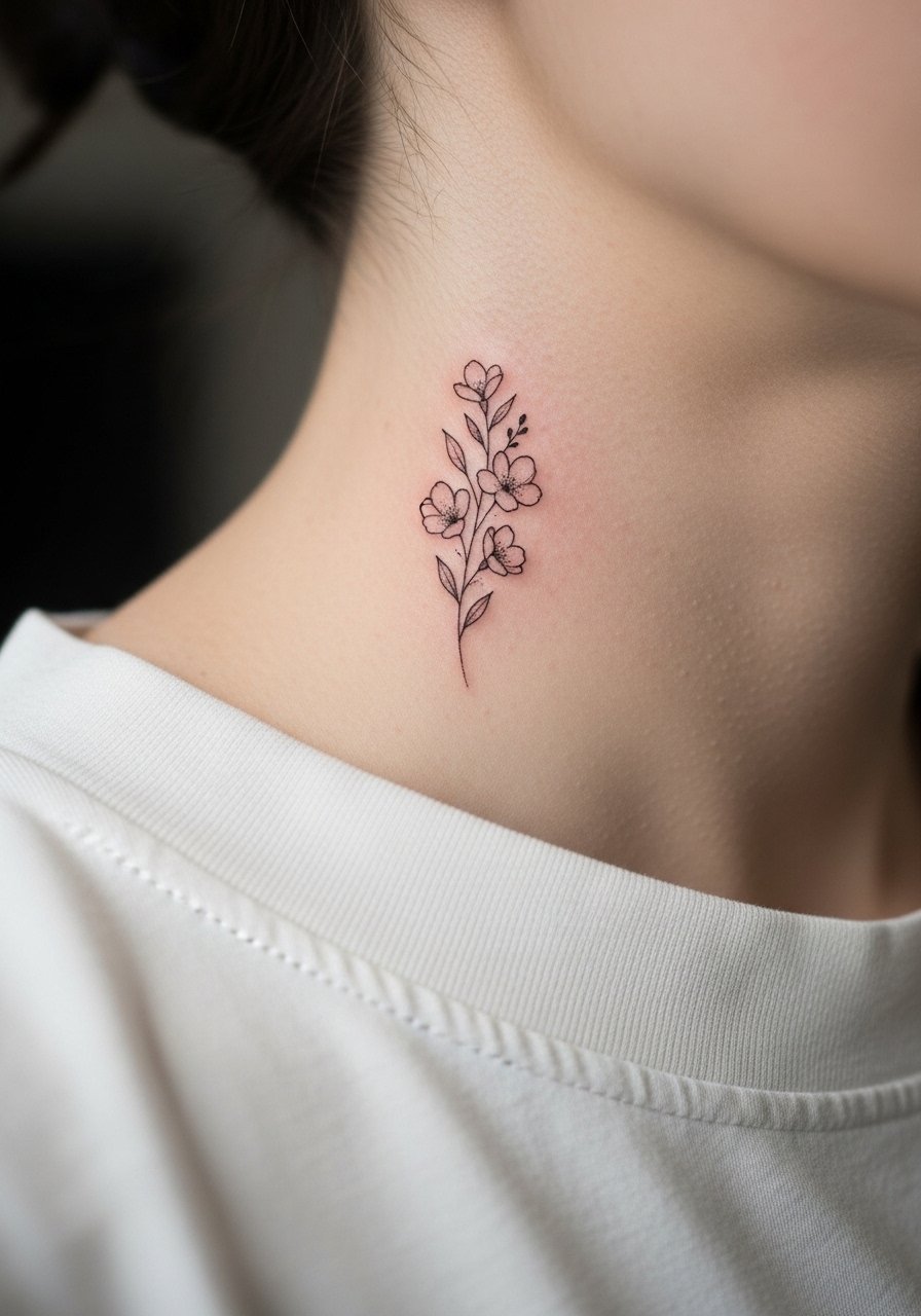
A micro floral motif can feel almost like a freckle when sized right. The pitfall is overwriting with veins and filigree that won’t hold. Ask for open petals and light stipple rather than dense shading. Expect touch-ups to refresh the faint stippling over time. Pain is moderate. For the appointment, a loose tank top or wide-neck tee is easiest for access.
25. Tiny Zodiac Glyph
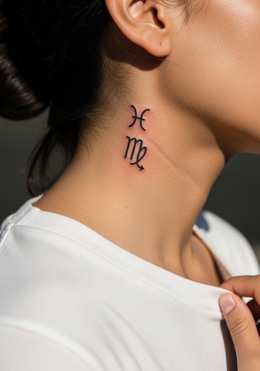
A zodiac glyph is symbolic and minimal. Because glyphs are simple shapes, the main consideration is scale and placement relative to jawline curvature. Tiny glyphs that lean too close to the ear can distort. Ask to preview multiple stencil positions in the mirror before ink. Pain is moderate. This design pairs well with a plain crew neck for understated exposure.
26. Micro Geometric Triangle Stack
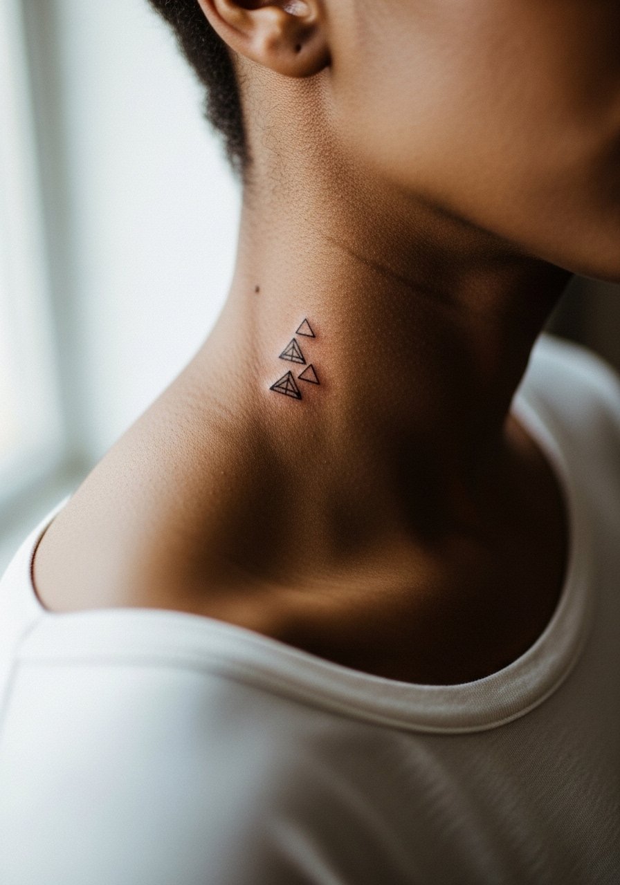
Stacked micro triangles read architectural and repetitive in a way that suits the neck’s verticality. The primary mistake is packing the triangles too tightly so points merge. Request small gaps between shapes and slightly heavier outer lines. Expect a touch-up around year three if the inner lines soften. For show-off styling, a simple open-collar shirt frames the stack without distraction.
27. Tiny Keyhole Accent
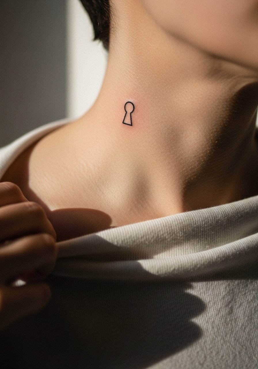
A keyhole is a discreet emblem that suggests privacy without words. The keyhole must be sized to keep the opening visible as lines soften. The frequent error is making the interior too narrow. Ask the artist to slightly widen the opening and to keep outer lines crisp. Pain is moderate. For the session, wear a shirt you can shift without rubbing. Consider discovery pathways like local shop portfolios, tattoo directories, and convention guest lists to find artists who specialize in micro neck work.
Frequently Asked Questions
Q: How long do side neck fine line scripts usually stay legible?
A: It depends on scale and spacing. Very thin single-needle scripts often need touch-ups earlier than bolder scripts. From what I have seen, expect some softening by year two and plan a touch-up around year three if you want crisp edges.
Q: Are there neck designs that are safer for jobs that frown on visible tattoos?
A: Tiny symbols tucked just below the jawline can be hidden by collars more easily than bold neck columns. Consider placement slightly lower and discuss how clothes will cover the area. If discretion matters, test visibility with shirts you already own.
Q: Should I choose bold blackwork or fine line for longevity on the side neck?
A: Artists are split. One camp favors bold blackwork for its lasting contrast. The other camp says well-spaced fine line can age gracefully with the right ink depth. Ask your artist which approach they use and what they recommend for your skin type.
Q: What should I wear to the studio for a side neck session?
A: Wear something with a wide or open neck so the artist can work without tugging at fabric. A loose button-down shirt or wide-neck tee is usually best. Comfort and access make the session smoother.
Q: How do I find an artist who understands micro neck work without naming specific shops?
A: Use discovery pathways like curated tattoo directories, convention guest lists, and focused hashtags to find portfolios. Look for healed photos of neck placements that show settled linework and ask about touch-up policy during consultation.