
The stencil sat crooked on the shoulder cap, the client breathing shallow, and the artist nudged it a hair to the left before inking. That tiny reposition saved the composition and kept the negative space balanced with the existing sleeve. If you have a half-finished shoulder or odd gaps where larger pieces meet, these filler ideas solve scale, flow, and aging problems without stealing the spotlight. The first one addresses odd negative space at the top of the deltoid.
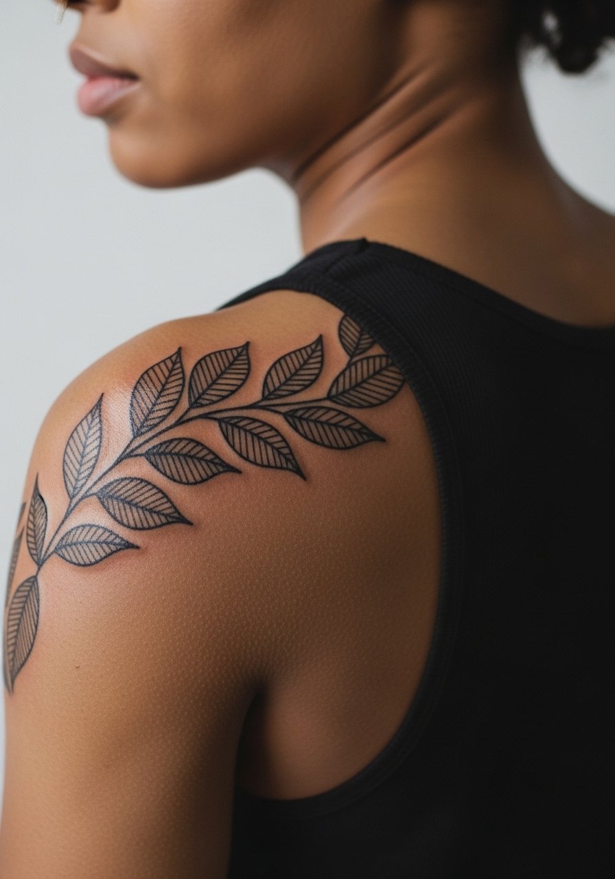
1. Micro-Geometry Cluster on the Shoulder Cap
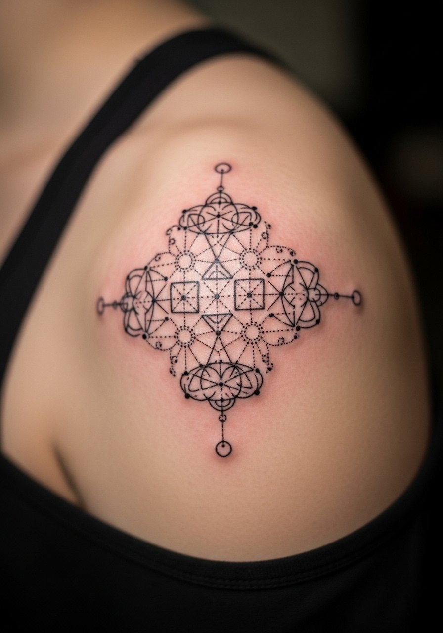
Small geometric clusters fit into irregular gaps around larger shoulder pieces and read coherent with a sleeve. I recommend this when the surrounding work is bold but irregular, because tiny geometry brings scale down without competing. Tell your artist you want single-needle linework with positive spacing so dots and triangles do not merge over time. The shoulder has moderate pain and usually takes one short session. Common mistakes are going too tight and packing elements where the shoulder moves a lot. Expect crispness at six months, slight softening by year two, and a likely touch-up by year five if you want razor-sharp edges. For showing it off, an off-shoulder blouse frames the cap without hiding the piece.
2. Stippled Floral Sprig Nestled Near the Deltoid
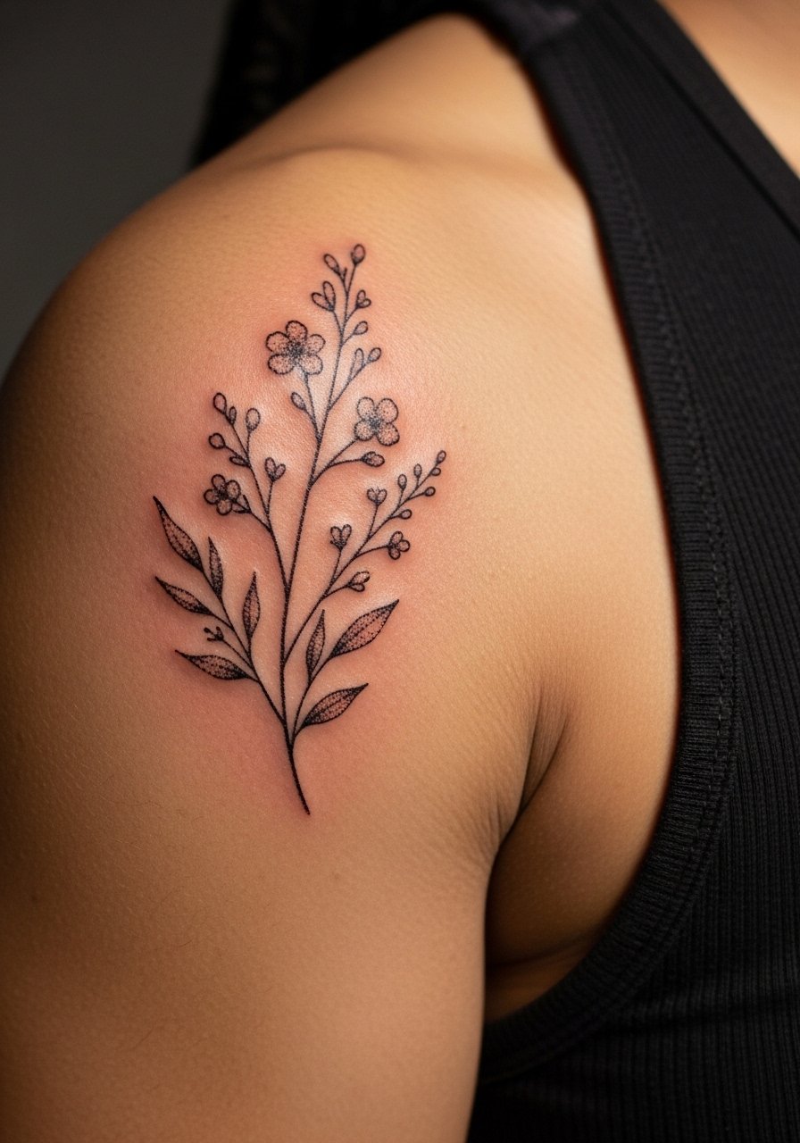
Stipple shading fills awkward oval gaps with organic texture that ages into soft contrast instead of blotchy patches. Request a low-saturation black gray palette and ask for spaced stippling rather than solid fills to avoid saturation pooling on the rounded shoulder. Pain is moderate and session time is often under two hours for a medium sprig. A frequent error is asking for heavy black fills that sit on shoulder curves and create sharp edges as flesh moves. At six months the stippling settles, at two years it reads softer, and many people book a touch-up at three to five years depending on sun exposure. Pair this with a racerback tank to let the sprig peek out without covering seams.
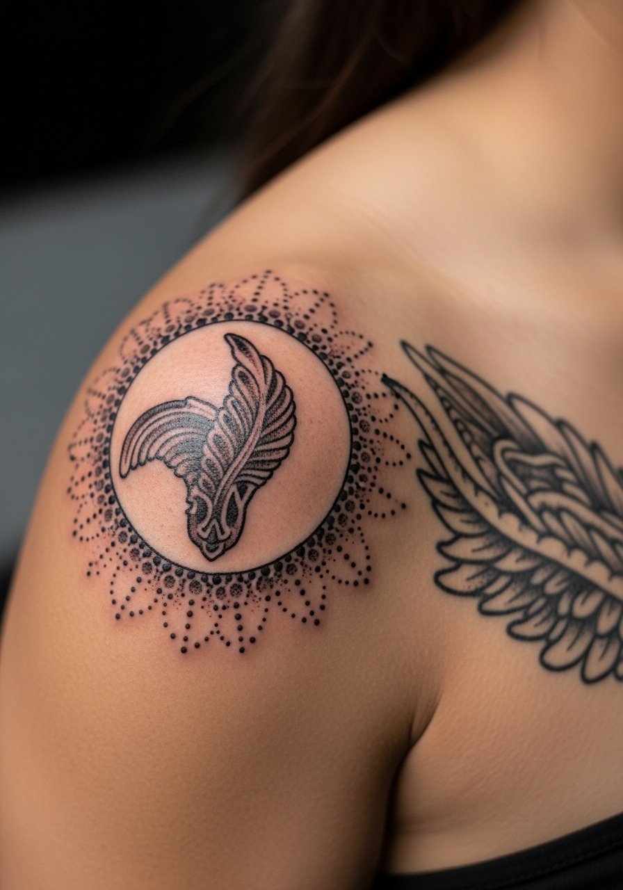
3. Small Blackwork Mandala Fragment at the Shoulder Blade
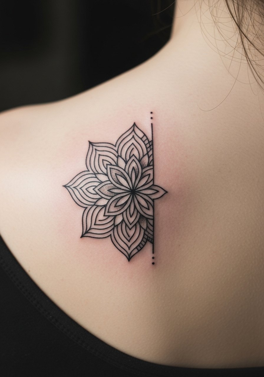
A mandala fragment fills crescent-shaped voids near the shoulder blade without demanding a full circle. Artists often split on how dense to make these on curved skin. One camp says dense mandala detail on the shoulder blurs quickly. The other camp argues that with adequate spacing and slightly bolder line weight it holds. Ask for a mix of open negative space and thicker outer linework to keep the contrast as the piece ages. Sessions are comfortable and usually under two hours. The biggest mistake is over-detailing at a scale that the shoulder cannot hold over time. For casual showing, a wide-neck sweater pulled to one side frames the shoulder blade art.
4. Tiny Script Curve Along the Acromion
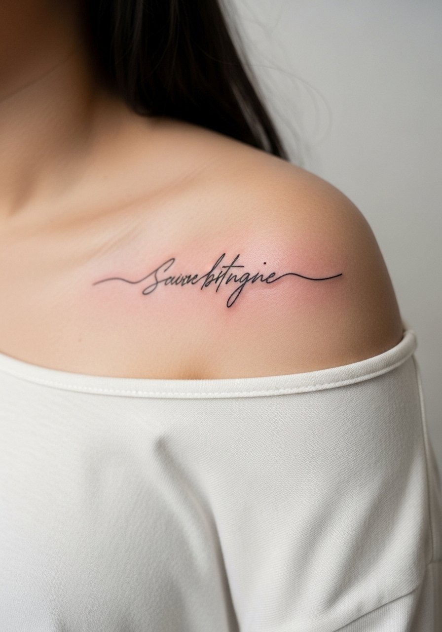
Curved script fits the shoulder's contour well and helps bridge a gap between upper-arm and chest pieces. Choose a compact, slightly bolder script so letters do not blur into each other on the rounded surface. Tell your artist the exact phrase and preferred slant, and show how it should sit in relation to the neighboring pieces. Pain is low to moderate and a micro-session is common. The common mistake is picking ultra-fine lettering that looks crisp fresh then melts into a thin smudge. Expect legible script at six months, with possible softening by year three and a touch-up if you want the original contrast back. For evenings out, an off-shoulder midi dress gives the script space to show.
5. Waveband Ribbon That Bridges Shoulder and Upper Arm
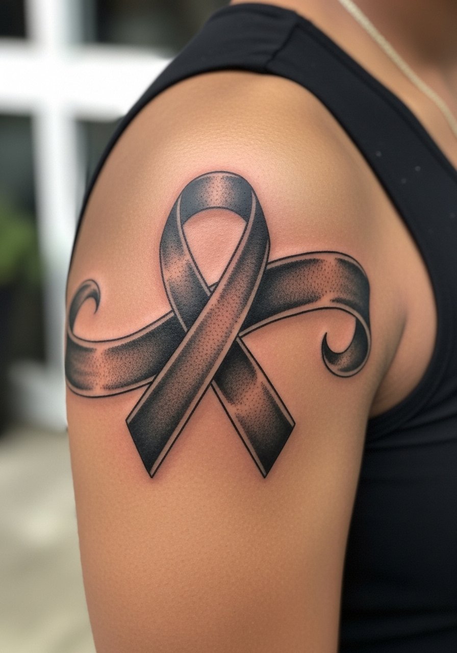
A waveband ribbon smooths jagged transitions between larger pieces and creates intentional negative space. This style is best when existing work has heavy saturation and you need a unifying graphic. Ask for a slightly beveled edge and consistent saturation so the ribbon reads as a solid element over time. Pain is moderate and session time varies by length. A common error is making it too thin where the shoulder's curvature causes edge breakup. Bold blackwork like this tends to age well, needing fewer touch-ups than micro detail. For session day, wear a loose button-down shirt you can slide off one shoulder for clear access.
6. Little Botanical Vine Drifting Toward the Clavicle
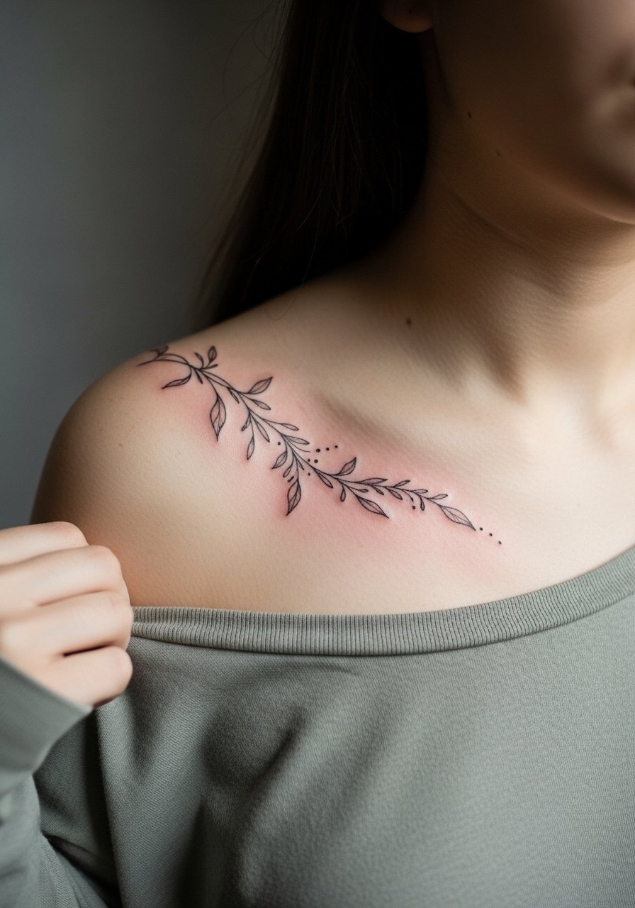
A thin vine works where the shoulder gap tapers into the clavicle, adding flow without heavy contrast. Ask for spaced leaves and staggered dots to keep the vine airy. The clavicle area moves and the skin is thinner, so expect a bit more sting during the session. A typical session for a small vine is under ninety minutes. Mistakes include over-detailing leaves or packing shading too close to the clavicle, which can blur as the skin moves. At two years the vine keeps its shape if UV exposure is managed. Pair with a thin chain pendant necklace that sits above the vine without competing.
Studio Day Picks
The first six ideas focus on the shoulder cap, clavicle junction, and upper arm transitions, so a few items make those sessions and the first healing week easier.
-
Stencil transfer paper kit. Lets you preview line placement on the curved shoulder so the artist and you can confirm negative space balance before the first pass.
-
Topical numbing cream. Applied as the artist recommends, it eases the sharper tugs near the clavicle and acromion without changing how the ink sets.
-
Thin protective film roll. Useful for shoulder work that can rub under straps during the first few days, preserving fine line and stipple details.
-
Fragrance-free body wash. Gentle cleansing protects delicate shoulder linework while avoiding irritation that can blur tiny geometry.
-
Aquaphor healing ointment. A thin layer keeps moisture up in the first 48 hours for small shoulder fills without clogging puncture channels.
7. Minimalist Sunburst Near the Anterior Deltoid
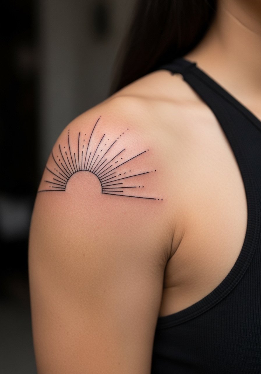
A sunburst motif fills a triangular gap between chest and upper arm pieces and directs eye movement across the shoulder. Request slightly bolder rays at the outer edge so the piece retains structure as it softens. The deltoid stings moderately and a short session usually suffices. Newcomers often pick rays that are too narrow, causing the tips to blend over time. Expect crisp contrast at six months, some softening at two years, and likely a touch-up at three to five years for razor detail. For casual wear, roll up a linen short-sleeve shirt sleeve so the burst sits in a clean frame.
8. Micro-Realism Feather Tucking Into a Gap
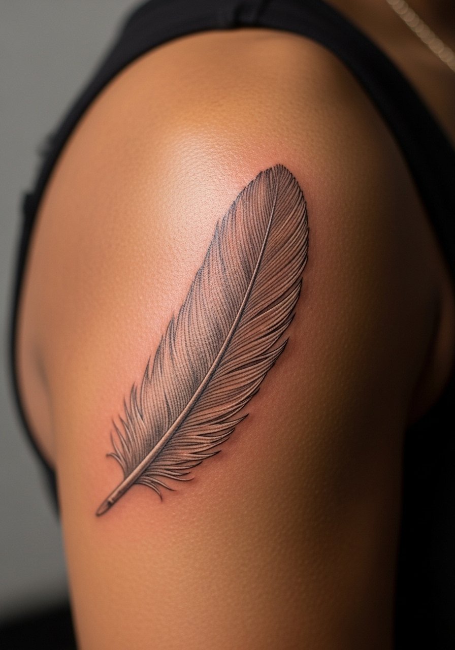
Feathers can bridge uneven negative spaces if kept narrow with soft shading. Tell your artist you want feather barbs that read as texture not solid blocks. On the shoulder the needle depth and shading style determine longevity. The controversy here is subtle. One camp says micro-realism on the shoulder blurs quick because the skin sees more friction. The other camp says with careful saturation and spacing it settles well. Ask the artist which method they prefer and why. Sessions are gentle but can take longer for realistic shading. A common mistake is asking for heavy contrast in a feather that belongs airy. For showing it off, a scoop-back tank keeps the feather visible.
9. Tiny Nautical Star Cluster at the Shoulder Joint
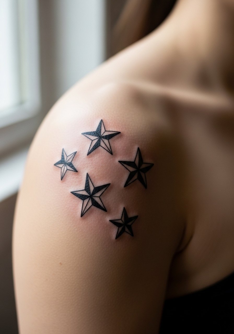
Star clusters make pleasing filler shapes when gaps sit at joint intersections. Request slightly varied star sizes and spaced negative area to reduce merging as the shoulder moves. Pain is low and sessions are quick. A frequent error is requesting all stars the same micro scale. Uniform tiny stars can blend into a speckled blur over years. Expect a tidy look at six months with potential softening by year three. For beachwear or show-off styling, an halter swimsuit top lets the shoulder piece breathe without straps crossing it.
10. Lace-Inspired Filigree Along the Shoulder Seam
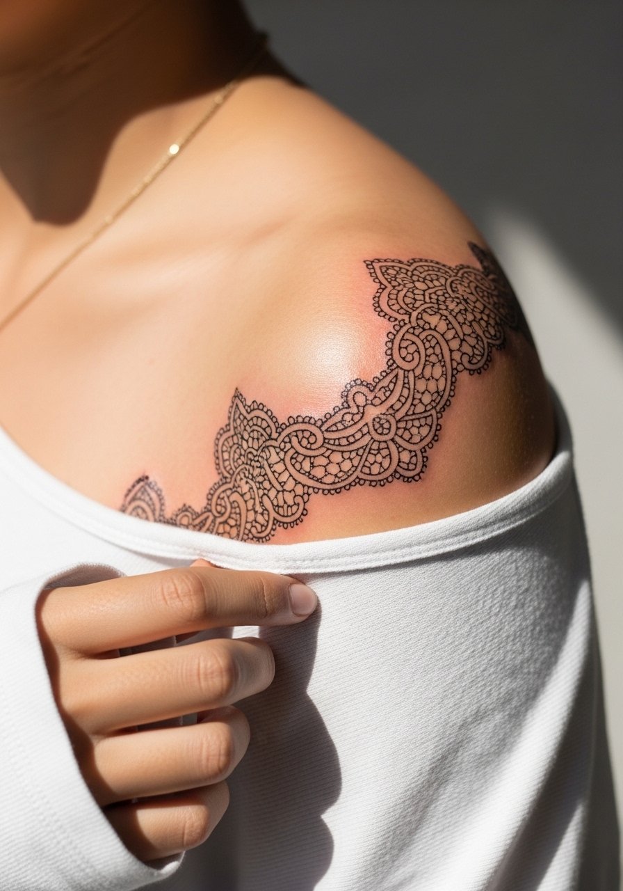
Filigree patterns act like a visual gasket between dense patches, softening transitions with ornate negative shapes. Ask for slightly increased spacing between filigree loops so the pattern does not fill in as it ages. Session time depends on intricacy but small lace bands are usually under two hours. A common mistake is packing too many micro-loops into a small shoulder gap. That approach looks delicate fresh then turns muddy. In two years a well-spaced filigree keeps a lace-like legibility. Pair with an off-the-shoulder top to echo the pattern.
11. Negative Space Crescent to Echo a Larger Piece
Sometimes the answer is not adding pigment but shaping the absence of pigment. A crescent of negative space carved into a darker surround stabilizes flow and reads intentional. Explain to your artist exactly where the dark fields will stop and the skin will remain untouched. Pain is low and the session is short since the work is mostly about edges. Mistakes include unclear edges that the surrounding ink overtakes. Over time the edge contrast softens, so consider a slightly stronger outer border if you prefer lasting clarity. For show-off outfits, a one-shoulder dress highlights the crescent.
12. Tiny Compass Rose Nestled by the Shoulder Tendon
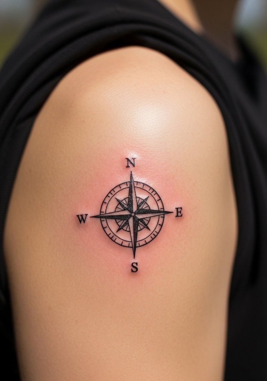
A compact compass rose anchors awkward gaps where directional lines meet at the shoulder. Request a simplified compass with clear cardinal points so the fine points do not bleed into each other. Expect a twinge of pain near tendonous areas but a short session duration. The usual mistake is over-detailing inner ornamentation that the tiny scale cannot keep. At two years the rose reads softer but remains legible if UV is limited. For a low-key look, wear a cap sleeve tee that sits just below the compass.
13. Dotwork Halo That Frames an Existing Motif
Dotwork halos bridge contrast clusters by creating a graded edge that fades into skin. Tell your artist you want graduated dot density moving away from the central motif. The shoulder tolerates dotwork well but dense stipple too close to edges can compact. Sessions can be brief for halos depending on size. A common mistake is wanting a fully packed ring at small scale which ends up looking like a band rather than an airy halo. Over time the halo holds as soft texture. Pair with a sleeveless linen top so the halo reads against neutral fabric.
14. Short Script Accent That Connects Two Pieces
A single word or short phrase can visually link two separate pieces across a shoulder gap when positioned along muscle lines. Pick slightly thicker letterforms to avoid thin strokes merging. Pain is moderate but session time is short. The mistake people make is choosing long text at a scale the shoulder cannot hold. At six months the letters look stable, with small softening by year three. If the phrase crosses sensitive areas, confirm with the artist about needle depth. For showing it off, a boatneck top creates a clean neckline that complements the script.
15. Tiny Animal Silhouette Tucked by the Shoulder Joint
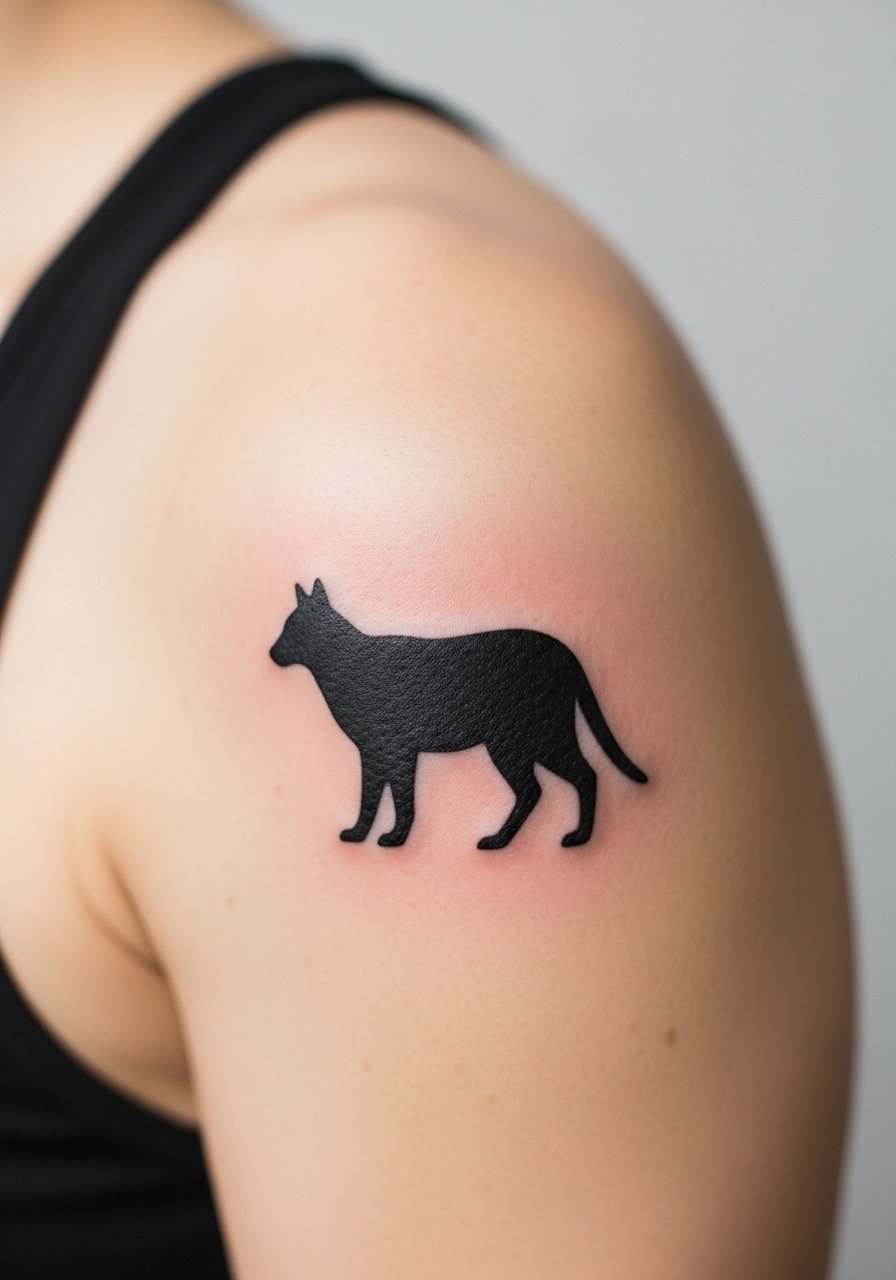
Small silhouettes add personality and fill irregular voids without distracting from bigger work. Simple bold shapes age predictably and need fewer touch-ups than fine detail. Tell the artist you want solid fill with no internal linework for durability. Sessions are brief and pain is low. A common mistake is asking for micro detail inside a silhouette, which vanishes quickly. Expect steady appearance at two years, and touch-ups only if edges soften noticeably. For casual display, a tank dress keeps the shoulder area visible and comfortable.
16. Chevron Ladder That Bridges Sleeve Edges
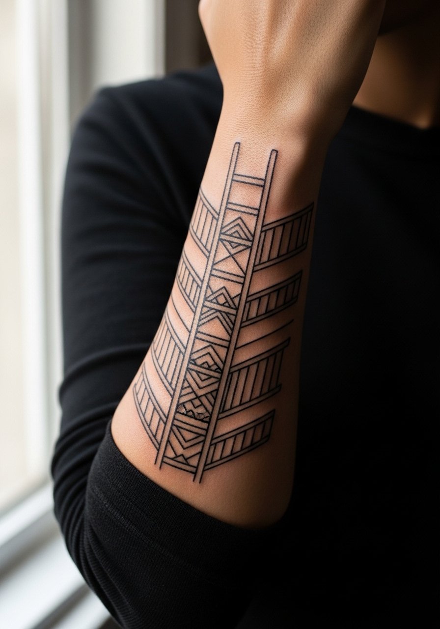
Repeating chevrons make tidy mechanical transitions between dense sleeve endings and sparse shoulder fields. Ask for consistent negative spacing to prevent the ladder from collapsing into stripes. The shoulder tolerates this pattern well, but too many chevrons at tiny scale merge. Sessions vary by length but are generally straightforward. People sometimes request ultra-thin lines that vanish; instead, opt for modest line weight. At five years the pattern keeps its cadence with occasional touch-ups. For session comfort, wear a button-front shirt so you can expose the shoulder cleanly.
17. Geometric Leaf Cluster Flowing Toward the Back
Geometric leaves soften transitions into the upper back and shoulder blade without overwhelming the back piece. Specify mixed line weights so leaf veins remain visible as the skin ages. The upper back side of the shoulder has lower sensitivity but more movement from shoulder blades, so spacing is key. Mistakes include tiny internal vein lines that blur into shadow. Expect the piece to read well at six months and soften modestly by two years. For showing it off, an open-back dress highlights the flow without full exposure.
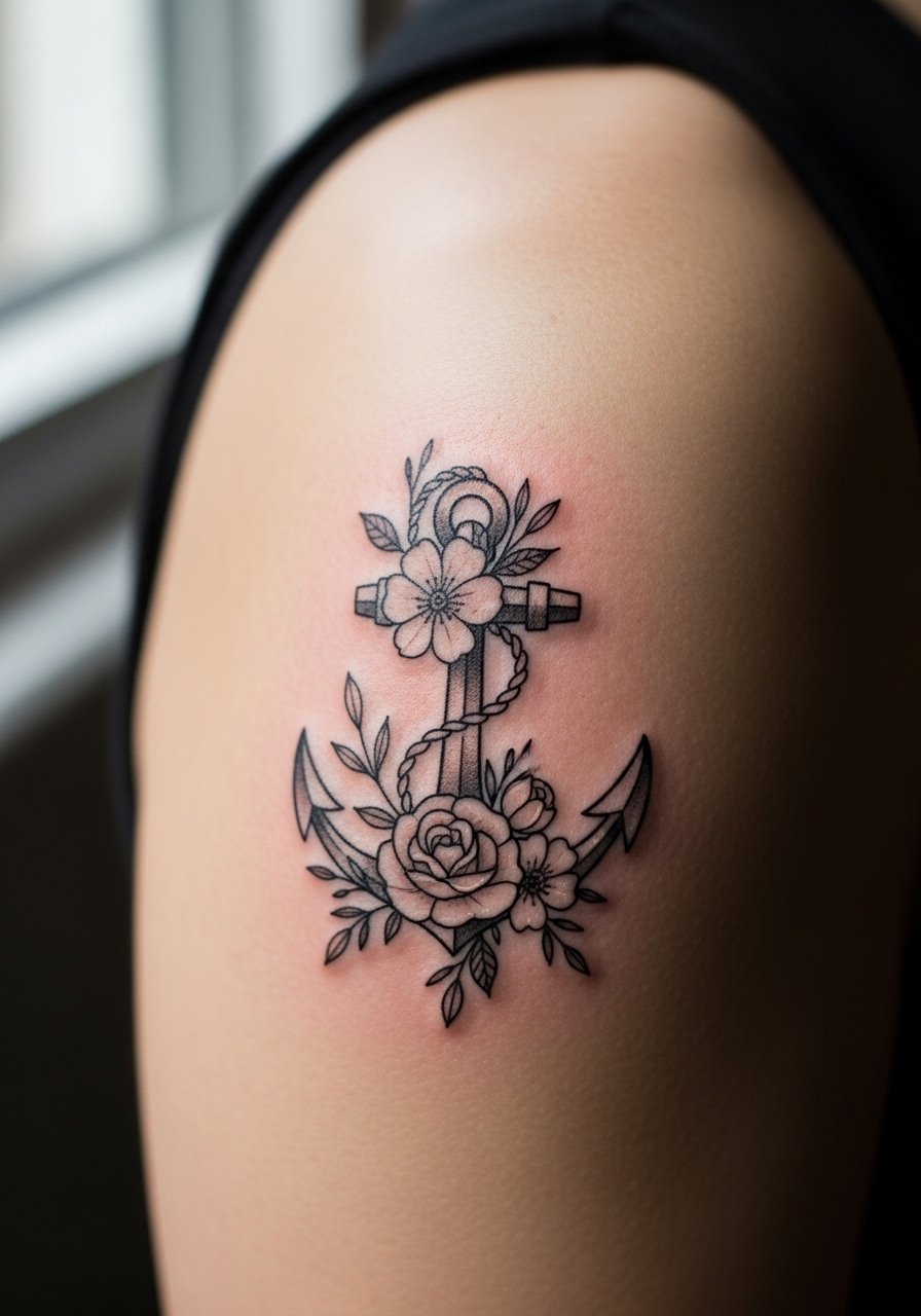
18. Tiny Anchor or Symbol Close to the Acromion
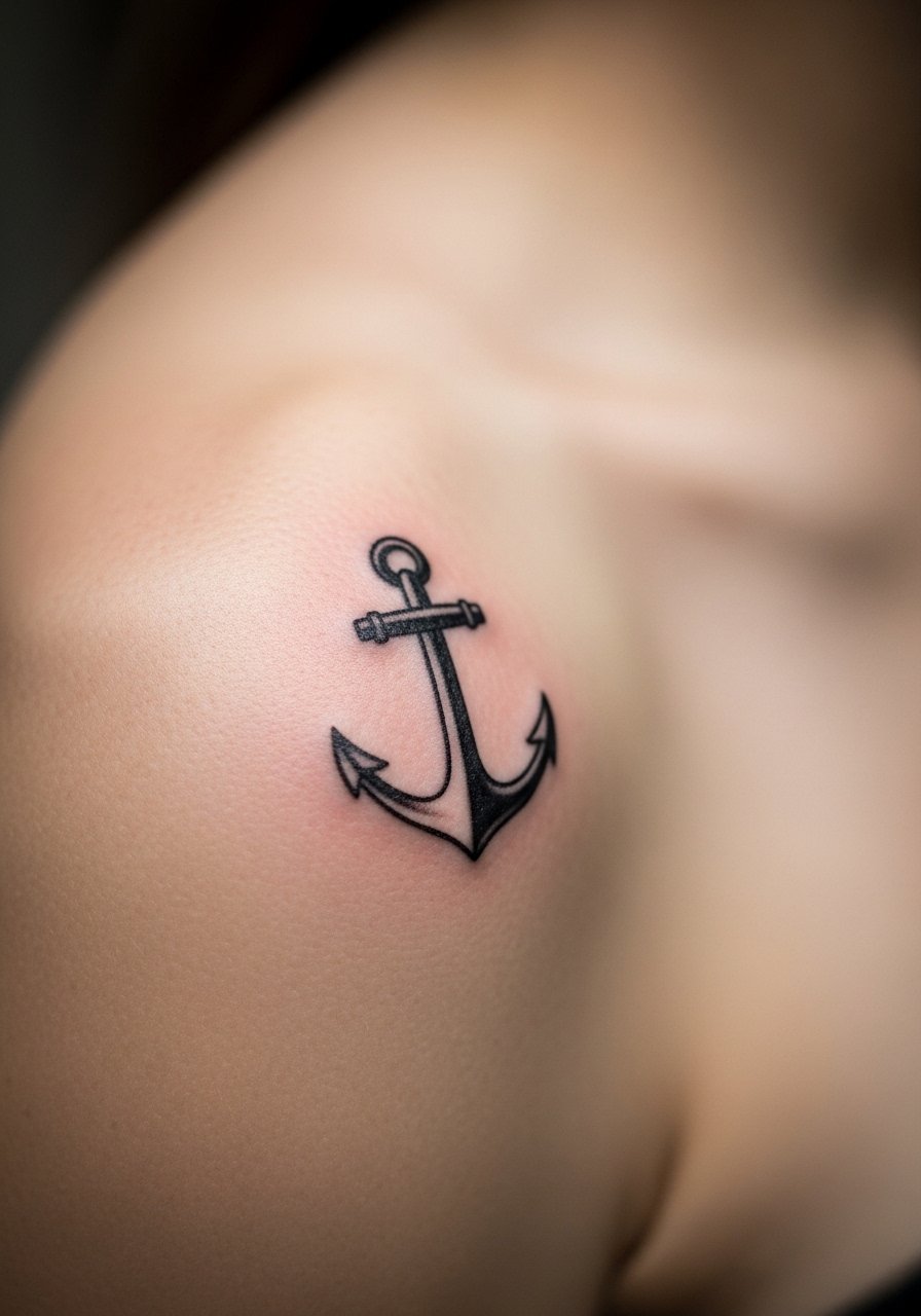
A compact symbol like an anchor or glyph fits snug gaps and acts as a seed for future additions. Keep the symbol slightly larger than micro to avoid edge loss on curved skin. Pain is low and the session is quick. Avoid overly ornate symbols at tiny scale because inner details disappear. Symbols like these usually need touch-ups only when exposure or friction increases. A short styling tip is to pair with a zip-up hoodie on travel days so straps and bags do not rub the area.
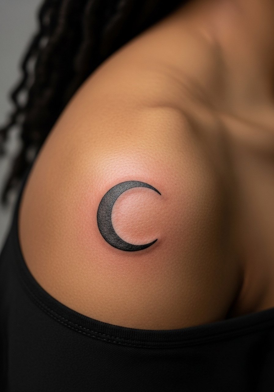
19. Crescent Moon in Soft Gray Wash Near the Deltoid
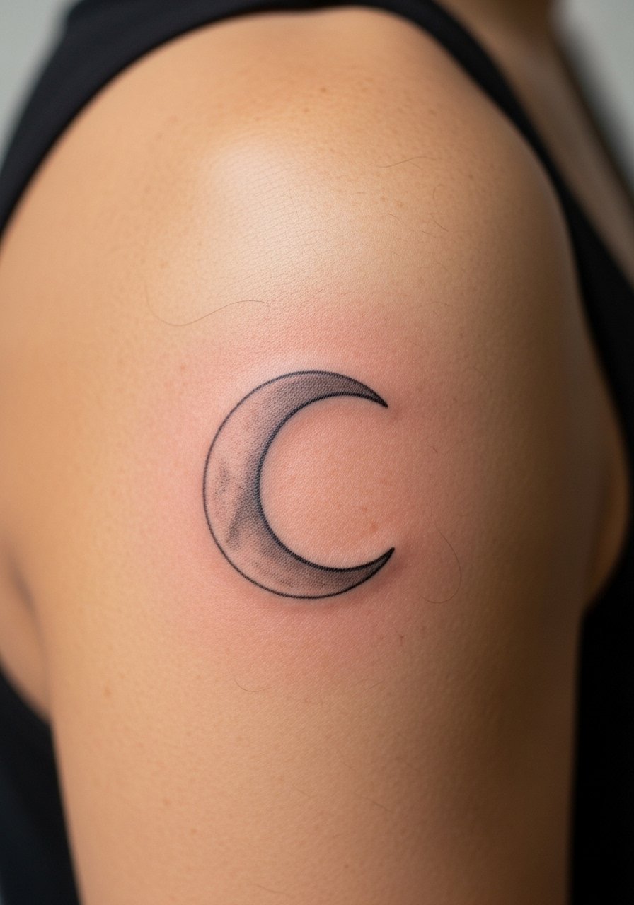
A gray-wash crescent uses soft gradients to fill shallow gaps without hard edges, which helps integrate older saturation patches. Ask for subtle wash and avoid dense black shadows on the shoulder curve. The shoulder accepts wash well but dense gray can pool. Sessions vary by complexity. The usual error is asking for high contrast shading that the shoulder topology does not support. At two years the wash will soften into a gentle shadow, often needing only cosmetic attention. For nights out, a bandeau top shows the crescent while keeping most of the chest covered.
20. Tiny Chain-Link Segment That Connects Motifs
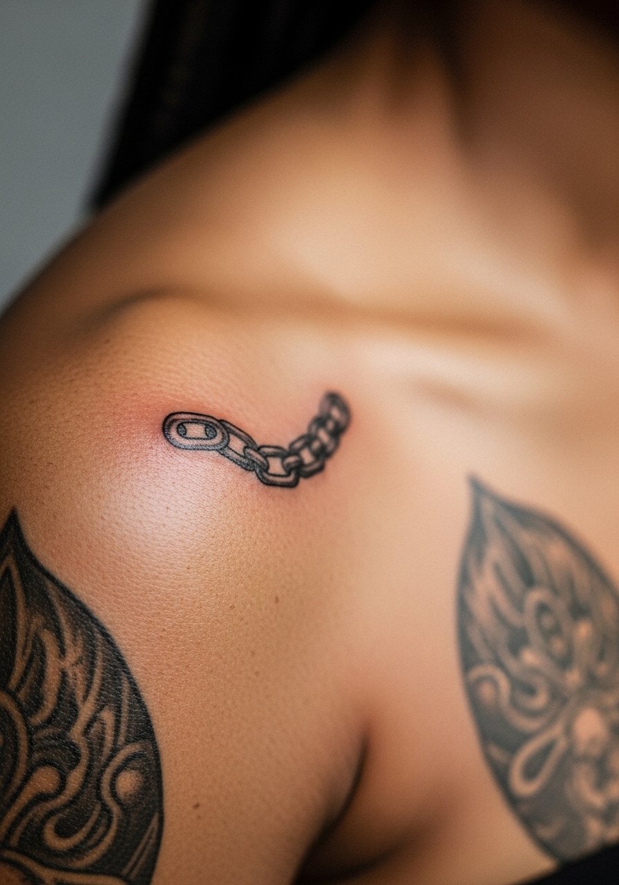
Chain-link segments work like visual seams, tying two motifs without adding mass. Ask the artist to vary link thickness slightly to avoid a mechanical, repetitive look. The shoulder handles this well but tight repeating links at tiny scale can merge. Sessions are short. Common mistakes are rigid, identically sized links that read like a solid band later. Expect a predictable fade pattern and touch-ups only if you want crispness. For practical session wear, choose a loose drawstring linen pant and a top that exposes the shoulder so movement is minimal during healing.
21. Small Floral Badge Anchoring an Array
A compact floral badge acts as an anchor point, making scattered filler pieces feel intentional. Ask for a slightly bolder outline with airy centers so the badge keeps shape as surrounding dots or leaves soften. Pain is moderate and one short session usually finishes it. The common mistake is wanting intricate inner petals at a tiny scale which melt into a gray mass. A well-executed badge holds for years with minimal upkeep. For display, a crew neck tee with rolled sleeves frames the shoulder without hiding the anchor.
Frequently Asked Questions
Q: How do I decide between fine line filler and bold blackwork for gaps on the shoulder?
A: I look at surrounding saturation and skin movement. If the neighboring pieces are saturated and bold, blackwork or a slightly heavier graphic keeps visual consistency. If existing work is airy and delicate, fine line with careful spacing will read better. Also consider sun exposure at that spot and your tolerance for future touch-ups.
Q: Will small geometric or dotwork fillers blow out on the shoulder over time?
A: Blowout risk exists anywhere skin is thin or moves a lot. On the shoulder it is lower than on inner arms, but tight single-needle work with no spacing is more vulnerable. Ask your artist about dot spacing and line weight so the design has room to age.
Q: Can I wear normal bras and straps during the first week after a shoulder filler?
A: Yes, but pick looser straps and soft fabrics to reduce friction. A front-closure sports bra or a wide-strap style minimizes rubbing. If the piece sits under a narrow strap, bring a loose shirt to wear for the first three days.
Q: How long before I can show bare shoulder skin after getting a filler tattoo?
A: You can expose the area as soon as you leave the shop if the artist’s dressing allows it. For sun protection and hygiene, avoid strong sun and pool water for two to three weeks, and choose wardrobe that does not stick to the scabbed area while it heals.
Q: Should I disclose that the tattoo is a filler during consultation, and what should I ask the artist?
A: Yes, say it is filling negative space between other pieces and bring photos of the surrounding work. Ask about suggested line weight for longevity, recommended spacing to avoid merging, and a realistic touch-up timeline. That specificity gives a better outcome than general phrasing about "filling gaps."